Friday, January 31, 2014

It doesn't matter what people think

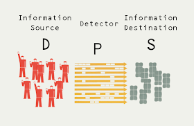
Brad DeLong linked to a review of the neuroeconomic foundations of choice for his class and Noah Smith posted about unstable preferences. The information transfer model, though, takes an agnostic view of what people think. People are communicating something to the market by purchasing a bag of apples at the grocery store for $5, but we really can't be sure of what that is. Maybe they think it's a deal. Maybe it isn't a deal, but the store where they are cheaper is far away. People will create rationalizations for their choices that may or may not have anything to do with the real reasons.

In essence, a decision to purchase an asset at a price p can only communicate so much information. Typically humans pay attention to the left-most digits and the decimal place Although prices ending in 99 may have come to signal "on-sale" or "bargain" whereas whole number prices tend to signal "luxury" (just look at a menu for a fancy restaurant). This is an evolved conditioning ... the 99 didn't always mean that ... which makes the point even more forcefully that we can't be certain of what someone is thinking when they purchase at a given price. One thing we can be certain of is that a price p only transfers ~ log p  bits of information**. These bits may represent compressed information (like the 99 heuristic above), but then you'd have to account for channel coding, error-correction, etc which means that even less actual information is coming through the channel -- this number is a bound.

That is to say that the quantity of information being transferred from the demand paying that price to the supply accepting that price that is being aggregated by the market is far larger than can be communicated by a number. And that's the key. That number is just detecting the information being transferred. It tends to go up when a lot of people want apples e.g. for pies or just to sit on your counter and make you feel like you have a healthy diet; it goes down when there are a lot of apples to go around. It is aggregating information about weather and food trends; it is not communicating that information.

That is why I think the idea of modelling macroeconomics as agents with preferences -- even if those preferences are modeled on human behavior -- is doomed. If you think too much information has been destroyed in aggregating the price of apples, then imagine how much has been destroyed in aggregating all the prices in an economy? Too much information has been destroyed in the aggregation that it couldn't possibly matter what any particular agent was thinking. Noah Smith says macroeconomic data is "uninformative". I think this is the reason. A series of NGDP numbers can't tell you much of anything because almost all of the information being transferred in the economy has been destroyed in the aggregation.

Wait. Couldn't possibly matter? I slipped that one in there. Because we know that it can matter: economic bubbles, for example. Ah, but that is when the behavior of agents becomes highly correlated. And since people are complex, that correlation likely happens in a single dimension (or low dimensional subspace), making it the only one that matters. Or another way, when the detailed information about individual agents' preferences and behavior is destroyed, that behavior might become tractable. I think this is the key to understanding economics. Economics may be tractable only when agents' individual behavior is irrelevant.

I brought this up near the beginning of this blog:

One could take this further and make the argument that IQdIQs represents a condition for a well defined concept of "economics" to exist, and that studying things where little information is transferred by a ill-defined price is actually something else ... like sociology. Does market failure represent a boundary of applicability in a similar way that nonequilibrium systems can lack a well defined concept of temperature? 

Only when the aggregation of information into well-defined prices alongside the destruction of the details in the microfoundations occurs can we say that we are studying economics. In the quote from my earlier post I make the analogy with thermodynamics. Essentially it ways that when the behavior of individual atoms matters, it stops being thermodynamics.

This is the assumption in the information transfer picture of economics. There are no agents, only ensembles of information. How good is this assumption? Well, it seems to find the trends, but doesn't explain correlated deviations:


But correlated deviations seem like the best opportunity to use behavioral economics! Agent behavior becomes relevant, but only a low dimensional subspace of that behavior. Call it the mob or muddle heuristic: either behavior is super-organized with a single relevant dimension (mob = deviations) or it is totally disorganized (muddle = trend). The key is to get the right trend, and that's where I hope that the information transfer model can help.

** For widgets. For commodities, there is effectively a price per unit weight/volume/etc opening up the possibility of effectively tiny fractions of a cent. However, this just represents a linear shift in the logarithm.

Thursday, January 30, 2014

RGDP growth does not have unit root

The latest GDP numbers came out today and many people in the blogosphere are declaring the results are consistent with their priors; I will be no different, but I hope to add to the discussion by showing that RGDP growth does not have a unit root. This was inspired by a post by Scott Sumner.

What does unit root mean? Well, basically if a random process does not have a stationary trend, then it has a unit root and if it does, then it doesn't. That definition hinges rather precariously on knowing the trend, which is judged by a pretty squishy metric. I previously extracted a trend in a couple of different [1] ways [2] from the information transfer model (ITM) and it captures the empirical observation that RGDP growth has fallen over the post-war period. Various economic explanations are given for this fall: a productivity slowdown, or that GDP is hit by both supply and demand shocks with the former being more persistent. In the information transfer model, it follows from the diminishing marginal utility of monetary expansion. The most efficient way to increase economic growth in an economy with little money is to add money which allows the market to transfer more information from the demand to the supply. However, the bang for the (literal) buck tends to fall once there's enough money around which results in a slowly falling RGDP growth rate. There's no productivity slowdown or persistent supply shocks; your economy just ran out of low hanging fruit that could be grabbed by printing money. 

And now, the unit root test!

Using the updated GDP data, I extracted the RGDP trend as I did in the links [1, 2] above. The RGDP growth data is shown in blue, the trend is shown as a dark blue line and the ITM de-trended data is in red:


I performed a unit root test on the two data sets (a Dickey-Fuller test using annual averages) and the results are on the graph. The de-trended data rejects a unit root at the p = 0.01 level while the RGDP growth data appears to have a unit root. Essentially, RGDP growth is consistent with random fluctuations around the ITM trend in blue on the graph such that there is a tendency to return to the trend -- there is a "bounce back" after a recession. However, due to the fall in RGDP growth trend, the "bounce back" appears to get smaller and smaller over the post-war period.

Tuesday, January 28, 2014

Rich countries, poor countries, Japan and Argentina

The title reference is a joke I read on twitter (I'm now @infotranecon) via Matthew Yglesias; it prompted me to see if the information transfer model worked for Argentina. It works quite well across the years for which there is data (green = CPI data, blue = model result):


However, there are news reports lately that Argentina's inflation rate is not faithfully reported by the government (especially since 2008, or so they say) -- a 26.6% expected rate is only shown as a 10.9% official rate in the inflation numbers [1]. Conservative groups like the Cato institute say the rate is even higher. (Though their methodology is suspect -- how do you obtain a "black market" exchange rate? It would seem that there is a premium charged to wealthy individuals that wish to evade capital controls.) The 2008 date for distrusting the official statistics is also interesting; the populist Kirchner took office in December 2007. Is this all part of some sort of global elite consensus that dislikes policies for the poor? The information transfer model shows that while the monetary base is growing at an average of 25.6% per year since 2008, it could be consistent with the inflation rate of 8.7% in the official statistics through 2012 (in the graph above). What should we believe?

Truth be told, we should probably hold back on any conclusions. Macro data is fairly uninformative, especially over a short period in a single country. I decided to do a little more analysis anyway and dust off the information transfer hyperinflation model [2] and test a question: did the hyperinflation start before or after the election of Kirchner? In the plot below, I show two fits to the hyperinflation model (starting in 2008 = dotted red and started after 2004 = dotted blue) as well as the expected path from the model fit at the top of this post (blue dashed line):


I would say that the non-hyperinflation model is ruled out fairly decisively. It effectively predicts a Japanese style lost decade. The two hyperinflation scenarios warrant some discussion. The pre-Kirchner hyperinflation scenario (blue) fits with the early data and is more consistent with the 26.6% inflation above (it has an average of  20.4% inflation 2012-2014). The post-Kirchner hyperinflation scenario (red) is actually more consistent with the official statistics (a 12.0% inflation rate vs 10.6%). So that leaves a dilemma for the proscriptive economists: trust the official data and blame Kirchner or keep the estimates and place the blame elsewhere?

I'd like to reiterate that the macro data isn't that informative so it's really hard to draw any conclusions. However, I think it is an interesting way to think about what is going on. As for Japan (per the title), the model already did a good job:


[1] I used numbers from the IMF and FRED (Argentina's monetary base).

[2] The hyperinflation model essentially posits that the monetary base is exogenous  -- changes to the base come from decisions that do not hinge on macroeconomic variables (the central bank stops taking information from the economy) -- while aggregate demand is endogenous. The basic model used to get the first graph at the top of this post posits that both are endogenous.

Sunday, January 26, 2014

Two kinds of stickiness

Last week I identified sticky prices with a high information transfer index (κ) environment (e.g. Japan since the 1990s or the US now). Effectively, a κ closer to 1 means that P ~ MB^(1/κ -1) → MB^0 ~ 1 and the price level (P) becomes constant under changes in the monetary base (MB). For smaller κ, we get P ~ MB^x with x large; small changes in MB result in large changes in P. [1] This is one type of stickiness -- relative stickiness. It is dependent on a changing κ so that the response of the price can be considered "sticky" for some values of κ (e.g. ~1) relative to other values of κ (e.g. <<1). You can see the effect of this kind of stickiness in the price level graph:


The the same size changes in the monetary base result in larger movements in the price level in the 1970s versus the 1990s. If κ weren't changing (or there wasn't another κ to compare to), then it would be impossible to say κ was big or small ... big relative to what?

However, there is another type of stickiness I identified in the information transfer model a few months ago. It seems entirely plausible that the labor market could have been described by P1:NGDP→NW, where NW are nominal wages. Shifts in aggregate demand (NGDP) could result in a price signal for workers to lower nominal wages by taking pay cuts, but they don't (in fact, economists tend to puzzle over why this doesn't happen). The price P1 in that market is effectively a constant (~2.1). It's the price P2:NGDP→L where L is the labor supply that detects signals from the aggregate demand, and the labor market responds to recessions by people becoming unemployed rather than taking wage cuts. You can see this in this graph:


The wage market is approximately constant while the labor market is affected by the price level [2] (this is related to Okun's law). The wage market adjusts to keep NGDP ~ 2.1 NW by workers becoming unemployed an no longer adding their wage to NW. This is a type of absolute stickiness [3] (as opposed to relative stickiness above) and appears to be indicated by the market for the value of X showing far less response (price elasticity) that the market for the number of X. Essentially, there is always NGDP/2.1 of wages to go around, and the market finds the number of people that make the labor market clear. Other markets tend to work the other way: there are N widgets and the market finds the price that makes the market clear.

So there are (at least) two types of stickiness: relative and absolute. The former is visible in the money market (price level stickiness, i.e. the general stickiness of all prices in an economy) and is path dependent (the monetary base must be large relative to some earlier time) while the latter is visible in the labor market and seems to be invariant over time.

[1] Note: κ is related to the price elasticities of supply and demand.

[2] Note: the market P2:NGDP→L is not a perfect fit (green line vs the blue line); there is a small amount of nominal wage flexibility.

[3] Absolute in this sense doesn't mean prices can't change; i.e. it doesn't mean infinitely sticky, but rather sticky without reference to another price (or at different time).

Friday, January 24, 2014

Fiscal expansion in irregular economics

This is a fiscal follow-up to my monetary expansion post. What does a one-time fiscal expansion do to interest rates, inflation, etc?


Well, if there isn't a negative NGDP shock that it is compensating for, it basically does what economists say it does: it raises interest rates (dark blue curve). It increases NGDP at the expense of reducing NGDP growth. There is a weak impact on inflation (green curve), raising it only a little. What if it is offset by a simultaneous comparably-sized monetary contraction? This is where it gets interesting. If the monetary base is small relative to NGDP (we are in a low information transfer index environment and the quantity theory of money is a good approximation ... i.e. Robert Barro's "regular economics**"), then it almost completely offsets the impact on interest rates (dark blue). In a world with a large MB relative to NGDP (where the IS/LM model is a better approximation, i.e. "irregular economics**"), the offsetting effect of the monetary expansion is reduced.


The effect is better seen in a graph of NGDP. The effect of fiscal expansion is shown as the solid orange line, while the effect of fiscal expansion and monetary offset is the dotted line. Basically, what you see here is that the monetary contraction has to be bigger than the fiscal expansion in a high information transfer index environment, but can be much smaller than the fiscal expansion in a low information transfer index environment.


It is interesting to note that the idea of monetary offset comes from a time when the quantity theory of money was a good approximation.

** What is that sarcasm mark again?

Strange new monetary worlds

Scott Sumner and Nick Rowe are blogging about what Sumner refers to as "a central puzzle of monetary economics—the fact that easy money both lowers and raises interest rates". I had previously discussed an older Sumner post on this subject here; it included market reactions as way of reconciling the difference between long run and short run. This time, I'm just going to show actual results of the information transfer model (ITM) based on a somewhat idealized version of the US economy split into two domains: 1960-1980 and 1980-2000.

Sumner breaks monetary expansion into four scenarios (his A, B, C, D with some shorthand notation for his arguments with i being inflation rate, n being NGDP growth rate, r being nominal interest rates and P being the price level -- which of course has growth rate i):
  • A: Increase in the rate of expansion of the money supply (i ↑, n ↑, r ↑)
  • B: Increase in the rate of expansion of the money supply with sticky prices (long run i ↑, r ↑)
  • C: One time increase in the money supply (P ↑, NGDP ↑, r →)
  • D: One time increase in the money supply with sticky prices (P →, r ↓, long run = P, r)
I broke the scenarios up in a way that was more relevant to the information transfer model:
  1. Increase in the rate of expansion of the monetary base with small base (1970s)
  2. Increase in the rate of expansion of the monetary base with large base (1990s)
  3. One time increase in the monetary base with small base (1970s)
  4. One time increase in the monetary base with large base (1990s)
For 1 and 2, here are the results (baseline are the dotted lines, n is red, r is dark blue, i is green ... real rates are also shown in light blue but are not relevant for our discussion here):


We can see that an increase in the rate of expansion raises nominal interest rates r (dark blue) when the base is small, but lowers them when the base is larger. In both cases it raises the rate of inflation as well as the rate of NGDP growth, but by a smaller amount for both metrics when the base is large. In the long run we have a fall in inflation and NGDP growth (because increasing the base growth rate makes the base even larger, making the price level even "stickier" in the information transfer model). The one time increase has less strange long run behavior. Here are the results for 3 and 4 (baseline are the dotted lines, n is red, r is dark blue, i is green):


A one-time increase in the base has the effect of lowering the inflation rate even though the price level increases. This may seem odd, but it makes sense if you think of the previous rate of growth was a percentage increase of the lower base level, thus the same magnitude increase would be a smaller percentage increase of a larger number [1]. The interesting thing is that nominal interest rates again go in opposite directions in the 1970s (up) and the 1990s (down), so there isn't much difference between the increase in rate (1, 2) and the one-time increase (3, 4) scenarios.

I'll summarize the effects using the notation above (I bolded the differences between the model and Sumner's arguments):
  1. i ↑, n ↑, r ↑
  2. short run i ↑, n ↑, r  ↓
  3. P ↑, NGDP ↑, r ↑
  4. P ↑, r ↓, long run = P, r
Let's discuss the differences:

  • Scenario 2/B Sumner is vaguest about this scenario. He effectively adds and then removes the sticky prices assumption ("assume that prices are sticky ... Trend rates by definition involve long periods of time, and prices are flexible over long periods of time"). Additionally he makes the identification of this scenario with the "great inflation" -- which is paradoxical with the sticky prices assumption since prices are increasing at the fastest rate in the post-war economy. Overall, the ITM says that this scenario is similar to scenario 4/D.
  • Scenario 3/C Sumner says nominal interest rates are unchanged. The ITM says they increase because the increase in NGDP is not proportional to the increase in the base (it is somewhat greater). There is some point between 1970 and 1990 where the effect goes from an increase to a decrease in interest rates because the size of the NGDP increase goes from being larger to being smaller in proportion to the size of the base increase. Sumner goes from unchanged rates to a fall in rates as stickiness is turned on (4/D), the ITM goes from a rise to a fall as "stickiness" is turned on.
  • Scenario 4/D Sumner says that the price level is unchanged (sticky prices) while the ITM says they go up a bit. I think this comes down to a question of how sticky prices are. Sumner has absolute stickiness, the ITM has just 'some' stickiness.
Overall, I'd say the ITM captures a lot of what Sumner is saying. Sticky prices can be mapped onto the large monetary base/low inflation/high information transfer index scenario of the period 1980-2000 in the ITM. Especially if you consider his core aim: to understand how easy money can both raise and lower interest rates. The information transfer model allows both to happen. One key difference is that this effect is path dependent in the information transfer model. It depends in part on the size of the monetary base relative to the size of the economy. 

While Sumner likely believes all four scenarios could have occurred any time between 1960 and 2000, the ITM reserves more traditional quantity theory reasoning (easier money raises rates) to the first half of that period and more IS/LM-based reasoning (easier money lowers rates) to the second half. The key parameter is again the information transfer index (see also here).

[1] It is certainly possible to have a one time increase that keeps the inflation rate continuous. I don't know if this is what Sumner meant by a one-time increase, but he rather carefully shifts to talking about the price level instead of the inflation rate when he discusses scenarios C and D so I believe he really did mean a one-time lump sum addition to the base time series (which is what I implemented above).

Wednesday, January 22, 2014

Rational behavior at the ECB?

I forgot to make a point on my post on counterfactuals in the US and EU that is important enough to be promoted from a comment on the post to a post in its own right. The monetary policy coming from the ECB could be seen as a rational response to empirical data:


In response to the financial crisis, the ECB appears to have expanded the base a small amount (EU institutions have better safety nets than in the US, so less monetary stimulus might have been called for in order to offset inflation delflation). However, the lack of a strong response in NGDP in either direction gave them an indication that monetary expansion was ineffective. As new NGDP (an unemployment) numbers came out, adjustments were made, but there was still no empirical response to monetary stimulus. It's not until 2012 when a double dip recession seemed imminent that a larger expansion was undertaken. There was still no response in NGDP, therefore it was retracted ... which, even if inflation is still below target, still hasn't led to downright deflation.

UPDATE: Correction above.

It really does seem to be about the size of your base

I commented on my own post about the fact that MB/NGDP ought to be the primary variable to describe an economy based just on dimensional analysis and quickly realized that the equation of exchange is just MB/NGDP = k P MB/NGDP = k, so, well, duh. [Thanks Mike for catching the typo in the equation.] But that sent me down the rabbit hole of trying to show a graph that captures the picture in my head. The best result was this graph of the price level versus the monetary base:


The graph has the (normalized) data for several countries (US, EU, Sweden, Australia, Japan, Canada as well as the US 1929-1944 as colored points) along with the fits (dashed lines) to the function:


We can see that as the monetary base grows, the price level flattens out. Note that the model fit lines actually happen on a 3D surface (you can see they sidle back and forth a bit in places), so here is the same data along with the 3D plot of the function above (σ = MB/MB0):


Since κ is in a very tight range (roughly  κ = 0.6 to 1.0) you end up with what looks like a line in the first graph at the top when you graph P versus MB. Interestingly, you can rotate the 3D image to make all the data points fall on a better line (I removed the surface for clarity):


Is this showing a universal behavior of economies?

Tuesday, January 21, 2014

Counterfactuals and natural experiments: the US and EU

There seems to be some sort of new blog feud (see e.g. 1,2,3,4) about a David Beckworth graph that purports to show that 1) given the US and EU have engaged in "the same amount" of fiscal austerity, but different monetary policies and 2) since NGDP growth has been steady in the US and falling in the EU, we can conclude that 3) fiscal policy is ineffective.

Never mind that the market monetarist position is that different NGDP growth is the indicator of whether monetary policy is different in two countries; I want to see if we can make sense of the situation. [I'm not going to get into the argument about what the graph shows or if it is valid to look at year over year growth rates ... snoozefest!]

Let's use the US and the EU models built in the information transfer framework to look at some counterfactuals: what would have happened had monetary policy not been as aggressive?

First let's set up our counterfactuals. In the following graph, the actual monetary base for the US and EU are given in blue and red, respectively. The US counterfactual (dashed blue) is based on linear extrapolation from 2008. There are two EU counterfactuals. In the first (dashed red), the pre-2008 trend is linearly extrapolated. In the second (dashed orange), we assert a flattening out similar to the US extrapolation.


In the next graph I show the size of the monetary expansion (actual minus counterfactual) with solid lines (US in blue, EU in red and orange) alongside the effect on NGDP following this post.


We can already see that at least initially, monetary expansion in the US was met by a comparable boost in NGDP, while in the EU there was only a weak response. In fact, we can see this more dramatically if we look at the cumulative "money multiplier" (the relative size of the cumulative integrals of the base expansion and the NGDP effect):


The US starts at 1.5, while the EU counterfactuals start at about 0.3. Both decrease from there. Of course the key thing to note (and the reason for why the difference between the US and EU) is that the EU monetary base is huge relative to the size of the EU economy -- it on the scale of Japan's. 


Monetary effects have saturated, but fiscal policy still could have a role. We are looking at the same amount of austerity in the presence of differentially effective monetary policies. Of course the EU is having a harder time. That means, in my view at least, the David Beckworth graph demonstrates the exact opposite conclusion he makes with it!

Now this isn't some sort of proof market monetarists are wrong -- they are using a different model. Loop quantum gravity doesn't disprove string theory. However, market monetarists are unable to show counterfactuals -- it's hard to figure out what would have happened differently with, say, different forward guidance in a particular country. Market monetarists rely instead on natural experiments (historical or concurrent) where seemingly every aspect of two situations is the same except the one you're trying to test. The example here is the assumption that the US and EU are the same except for monetary policy. The problem with this is that not every aspect of economics is understood. I've presented a perfectly good theory of macroeconomics that basically says the market monetarists may have neglected importance of the size of the monetary base. The US and the EU are not the same. A larger MB/NGDP ratio in the EU makes it different in more than one way from the US than just monetary policy since 2008. It may still be a natural experiment, but only for theory where MB/NGDP matters.

Like the information transfer model.

Monday, January 20, 2014

The effect of "the sequester"

After updating the model and doing some counterfactuals about quantitative easing and the fiscal stimulus, I thought I should do another counterfactual: the effect of "the sequester". The CBO estimated that it would shave off 0.6 percentage points of GDP growth and result in about 750,000 fewer jobs. Well, my top-line results indicate it shaved 0.4 percentage points off GDP growth and resulted in 730,000 fewer jobs. The basic methodology followed the first linked post above. Now, let's get to the graphs! The first one is the effect on NGDP (purple), shown alongside the "sticker price" (green):


The multiplier is again about 1.3, in line with IMF estimates of 0.9 to 1.7. There is a black dotted line that shows the effect of the sequester without the more aggressive monetary expansion that began at the beginning of 2013; the monetary expansion shaved off only $1.2 billion of the $71 billion change in NGDP. The effect on the number of people employed is shown in the next graph (734k fewer jobs at the end of 2013):


Again there is a black dotted line that shows the effect of the more aggressive monetary expansion in 2013. The $1.2 billion in monetary offset results in 12,000 additional jobs. There would have been a total of 747k fewer jobs without the monetary expansion.

All of these effects are in line with the CBO estimates (actually including monetary offset makes the CBO estimates even better), so what does this mean for the broader debate about "austerity" and monetary offset?  Our results here show that monetary offset was only about a 2% effect relative to the fiscal effect. Scott Sumner claimed that market monetarism passed a test (set up by Mike Konczal via Paul Krugman) because growth in 2013 turned out to be a little better than in 2012. But really, we should have expected much larger growth since we are recovering from a recession (recessions tend to be followed by a brief spurt of above average growth as the economy returns to trend). A 2013 that's similar to 2012 when we've had the largest recession since the Great Depression represents a massive failure, and at least part of that failure can be blamed on "the sequester".

For completeness, here was the estimate of the counterfactual less aggressive monetary base (black) vs the actual monetary base (blue). I made the assumption that the change in the slope at the beginning of 2013 was an adjustment made by the Fed to offset the effects of the sequester. However it is likely that the counterfactual should be even closer to each other (not all of the more aggressive stance was due to the sequester), meaning monetary offset should be even smaller.


Sunday, January 19, 2014

What is and isn't explained by the information transfer model

This is partially a follow up to the previous two posts with the unemployment rate model update to 2014 and partially a clarification about what is and isn't explained by the information transfer model. Here is the unemployment rate model (the "natural rate" is the blue curve that comes from the information transfer model, while the data is in green):


The information transfer model doesn't explain the "business cycle" or the series of shocks, or even the obvious regularity in the recovery from high unemployment. These deviations likely occur because the market imperfectly transfers information and that imperfection could be explained by e.g. expectations-based theories or behavioral economics. These same kinds of fluctuations occur in e.g. the interest rate market:


One interesting observation I had was that there appears to be some correlation in the fluctuations in these two markets (taking the ratio of the model and the data, unemployment rate in orange, interest rate in red):


There is probably a piece that is highly correlated because of the business cycle as well as fluctuations in the market itself (e.g. interest rates have some much higher frequency fluctuations that would be due to Fed announcements while the unemployment rate is unaffected or affected with a lag).

Additionally, the information transfer model trends could be bounds (like Friedman's "plucking model") on the observed world. This makes a great deal of sense if one looks at the underlying information theory: information received at the destination must be less than or equal to the information transmitted from the source. Only in the limit of perfect information transfer are these exactly equal. The size of the deviations could give us a measure of how imperfect the information transfer is.

Saturday, January 18, 2014

An information transfer framework analysis of the US economy, part 2

Since I updated the US model of the real world in part 1, I thought I would show what the counterfactual world would look like in three scenarios: no ARRA ("the $787 billion fiscal stimulus"), no QE (quantitative easing) as well as neither QE nor ARRA. This is partially in response to a back and forth on "monetary offset" in the comments on this Yglesias post. The key point is that one needs a model to extract counterfactuals; a graph of NGDP on its own shows nothing of the effect of monetary or fiscal policy.

First we'll look at the price level (or rather the change in the price level) due to ARRA and QE:


The ARRA had a small effect on the price level; QE -- a much larger effect. Next we'll look at the effect on NGDP:


Here we can see the effect of QE was about twice as big as the ARRA. Additionally, if we compare the "sticker price" of the ARRA (green curve) to the effect the ARRA on NGDP (blue curve), we get a "fiscal multiplier" of 1.25 (somewhat less than the 1.5 used to estimate the effect of the stimulus, but near the 1.3 estimated by the IMF, or between 0.9 and 1.7). However, if we look at the effect of the ARRA without the monetary stimulus (the difference between the purple and red curves) we get a multiplier of only 1.07. A failure of monetary policy would have reduced the multiplier by about 15%; that gives a us scale of how much monetary offset we might expect.

Next we look at the effect of the ARRA and QE on interest rates. In this case the effect is almost entirely monetary:


We can see a small deviation raising interest rates on the order of 20 basis points due to the ARRA (one could imagine this is the scale of "crowding out"), but monetary policy dominates the change.

In the final graph we look at the labor markets, in particular the unemployment rate (calculated by looking at the change in employment in the labor model P:NGDP→L from part 1):


One thing that immediately appears is how misguided claims that the fiscal stimulus "failed" based on the original estimates of the effect of the ARRA. Those estimates were predicated on a particular counterfactual world that was actually a much rosier picture than was even known at the time. Here we see that the size fo the effect of the ARRA was pretty much as predicted, reducing the unemployment rate from a peak of 13% to a peak of 10% (as opposed to reducing a peak of 9% to a peak of 7%).

And that's why model-based counterfactuals are important.

An information transfer framework analysis of the US economy, part 1

I realized that a) I didn't have a really good post to link to for the US model results and b) it's now 2014, so here is an information transfer framework analysis of the US economy updated through Q2 of 2013 (quarterly GDP data from FRED haven't been updated with Q3 and Q4 yet). I've put the model equations and fit parameters on the graphs as well along with some notes about phenomenology (monetary offset, sticky wages, liquidity traps). It's broken into three sections: Price level and RGDP growth, Interest rates, and The labor market. I'm going to follow up with Part 2 which is going to be about counterfactuals and the Great Recession.

Price level and RGDP growth

We'll start with the price level model P:NGDP→MB [1] with endogenous AD [2] and money supply (model in blue and data in green):


Here is the 3D view in {MB, NGDP, P} space that I find very useful (the information trap criterion ∂P/∂MB = 0 a.k.a. the "liquidity trap" is shown as a black dotted line):


Phenomenologically, one has strong monetary offset on the steep part of the surface, but e.g. fiscal policy (ΔG) can move AD more than monetary policy near the ∂P/∂MB = 0 line if it directly causes changes in NGDP = C + I + G + X - M. The price level model does an excellent job with RGDP growth as well (model in blue, data in green):


Interest rates

The second model in the framework is the interest rate model r:NGDP→MB with exogenous AD (in contrast to the price level model above). Here is the graph (again, model in blue, data in green):


One of the main things I am unhappy with right now is the constant c in the interest rate model which does not come from the information transfer framework (we should have c = 1); I've done some hand-waving about how c allows us to adjust for interest rate periods (a 3 month rate given as an annual rate vs an annual rate given as an annual rate vs a 10 year rate, etc), but the math doesn't quite work out. I'm still working on it, but the model does really well (including before the depression) even if we just take it at face value and just say it's motivated by the information transfer framework.

Here are the price level (gray contours) and interest rate (red contours) models combined on the same graph (the actual path of the economy is in blue) that is based on an overhead view of the 3D plot above:


The labor market

And finally there is an information transfer framework model of the labor market P:NGDP→L where L is the labor supply (total non-farm employees). AD is exogenous. The phenomenon of sticky wages is captured in this model (in the sense that the model P:NGDP→L describes the price level better than P:NGDP→W where W is nominal wages). Here is the model calculation of the price level (blue) vs the empirical data:


Note there is some deviation between the model and the data which is due to wages not being perfectly sticky. Another way to show this information is in a graph of Okun's law: the rate of change of the total number of employed is proportional to the rate of change of RGDP (in the information transfer model with perfectly sticky wages, this relationship is exact):


Note that coupling the labor market and the price level (by fitting the labor market model to the model price level at the top of this post instead of the empirical price level) produces almost identical results (κ = 0.433 instead of 0.428). However we will use this coupled version to look at the counterfactuals in Part 2.


[1] The notation Price:Demand→Supply is shorthand an information transfer process where information is transmitted from the Demand (information source) to the Supply (information destination) and the information transfer is detected by the Price.

[2] Endogenous AD means that κ P ~ MB^(1/κ - 1) rather than κ P ~ NGDP/MB as in the interest rate model.

Wednesday, January 15, 2014

Say it ain't so

Apparently François Hollande has gone and dug up some debunked economic theory. Instead of rehashing the silliness of the idea that "supply creates it's own demand", I'd like to take a moment to point out that if one thinks in terms of the information transfer framework, Say's law (as it's known) never should have come up in the first place.

There are people who like to defend Say by saying Say didn't say that and it really was Keynes who put those words in his mouth, but really, what Keynes said is an excellent distillation of what Say says over the course of a paragraph:
It is worthwhile to remark that a product is no sooner created than it, from that instant, affords a market for other products to the full extent of its own value. When the producer has put the finishing hand to his product, he is most anxious to sell it immediately, lest its value should diminish in his hands. Nor is he less anxious to dispose of the money he may get for it; for the value of money is also perishable. But the only way of getting rid of money is in the purchase of some product or other. Thus the mere circumstance of creation of one product immediately opens a vent for other products. (J. B. Say, 1803: pp.138–9)
What Say says here is that the supply of one product immediately creates a demand for money which immediately creates a demand for other products. Now any one product is going to be a small segment of the economy so "other products" can be approximated closely by "products"; demand for products in general is "aggregate demand". Say also says that money performs "but a momentary function", effectively meaning that the intermediate transaction, according to Say, is not relevant to the overall transaction. Additionally if A → B → C (with "momentary" B) then saying the process is A → C is perfectly valid. Finally, replacing the supply of one product with the aggregate supply in the economy (since it is purportedly true for each product in the economy), we are left with "aggregate supply creates aggregate demand", or Keynes' version of Say's law.

After this long trip, the main point I wanted to make is that in the information transfer framework the supply is a destination for information. Say's law is effectively saying that a thumb drive creates the jpeg that will be stored on it. It is actually the demand that is the source of the information and the jpeg creates the demand for a thumb drive which creates incentives for the production of a supply of thumb drives. Prices are a means to detect the transfer of information from the supply to demand, allowing the coordination economic activity to solve the resource allocation optimization problem (how many jpegs and thumb drives given the needs of the rest of the economy).


Tuesday, January 14, 2014

Three dimensional thinking

Scott Sumner has a post up where he asserts that monetary policy and fiscal policy represent vectors in the same single dimension rather than separate directions (i.e. alternatives) in two dimensions. This is because he believes in monetary offset (i.e. monetary policy can completely cancel changes fiscal policy) which means that the vector sum of the effect of monetary policy [1] on (for argument's sake) the price level and the effect of changes in fiscal policy on the price level can exactly cancel.

How good of an assumption is this? I think some three dimensional thinking may help here. Let's look at the path of the US economy through the 3D space {MB, NGDP, P} where MB is the monetary base, NGDP is nominal GDP and P is the price level (CPI):


Here is the plot of log P versus time:


If we look at the 3D graph of P(MB,NGDP) from a particular viewpoint we can see that we can reproduce the price level fairly accurately (I've overlaid the two graphs):


The interesting thing about this is that the fit requires us to look in a direction that is neither along the MB nor NGDP axis, but rather a vector in the plane {MB, NGDP}. There are two solutions at this point: one is that log NGDP = a log MB + b (i.e. a variant the quantity theory of money where NGDP ~ MB^a) and monetary offset still applies or that monetary policy and fiscal policy (ΔG) [2] represent two different directions in a more complicated space containing the path of the economy. 

UPDATE (title reference):


[1] Note, I do not say changes in monetary policy. We are assuming there is some target and that changes due to fiscal policy are canceled by the expectation that monetary policy will be on target.

[2] NGDP = C + I + G + X - M