Monday, March 30, 2015

The Keynesian part of Abenomics is the part that works

Both Noah Smith and Scott Sumner have drank the Kool-Aid on Abenomics, both crediting the monetary component -- you know, the quantitative easing that doesn't do anything to the price level. Here's Sumner:

Abenomics has raised the price level in Japan, reversing a secular decline.

Actually, it looks like a pretty strong claim if you look at the data in a model-independent way:


Right when Abe takes over (vertical line), there is a big reversal in the direction of inflation. But that's a model independent take. Like this (rather hilarious) model independent take on global warming. What happens if we apply some knowledge of how economies actually work?

I looked at the required path of NGDP in the information transfer model to reproduce a continued fall in CPI from 2013 onward


In order to produce continued deflation, if NGDP was the only effect, NGDP would have had to continue on its downward trajectory. Now lets look at the difference between this counterfactual and actual NGDP and compare it to government expenditures in Japan:


Actually the reverse seems to have begun in 2008. The financial crisis gave the Japanese government a reason to expand spending -- it had been flat since 2002.

A Keynesian increase in government spending could explain the entire effect -- no need for market expectations, monetary policy or even Abe taking office (he did vow to continue the increase in government spending, so fiscal Abenomics, aka Keynesian economics, works continued to work).

Update 3/31/2015

Commenter LAL asked (below) if counterfactual deflation was smaller, would it lead to similar results. It does -- there is a slight difference in that the same increase in spending leads to a smaller increase in NGDP:


The difference is visible at the end after the vertical line (that is where the less deflation counterfactual differs from the more deflation counterfactual in the post above).

The four percent solution

I wrote a post that seems to have fallen by the wayside back about two months ago about what the US would have looked like had it focused like a laser on an inflation target of 2% starting in 1960. Anyway, I was reminded of it when I read Tony Yates on inflation targets over lunch today.

In that post, Yates mentioned India's prospective inflation target:
[Cecchetti and Schoenholz] make an interesting point about the fact that the Reserve Bank of India has just chosen to target 4% [inflation].
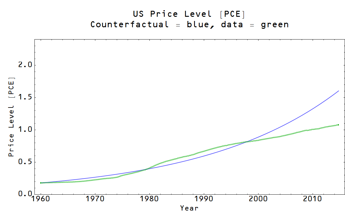
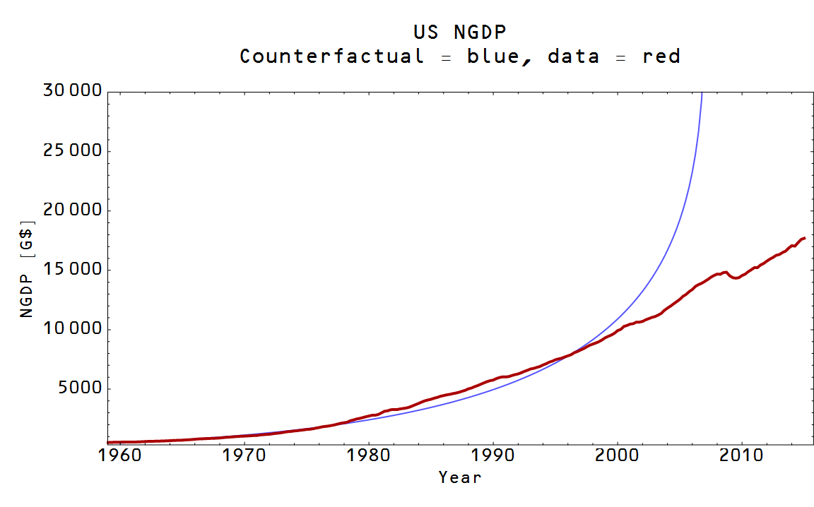
So naturally I asked -- what would the US have looked like had it been capable of focusing like a laser on 4% inflation. The results are below. The thing to keep in mind is that this isn't how an economy would behave under a sustained 4% inflation target for 50 years -- it is how an economy would have had to look in order to produce sustained 4% inflation for 50 years. The simplest way to understand this distinction is to realize a sustained 4% inflation target would have actually been impossible -- the required hyper-exponential increase in RGDP (shown in the graph) is a reductio ad absurdum. Here are the graphs -- the required path is in blue and the actual path is in red (or green):


What is funny is that the quantitative easing sort of looks like the required hyper-exponential growth -- I include it as a curiosity as reserves have little to no impact on inflation. [Update: added link.]

Sunday, March 29, 2015

Non-ideal information transfer, tail risks and news shocks


I'm still looking at how shocks behave in the ideal information transfer model, but I'd like to discuss non-ideal information transfer for a minute.

The information transfer model of supply $S$ and demand $D$ essentially has the 'invisible hand' operating as an entropic force -- I have some animations here (and here is the underlying model). In the ideal case we have the price $P$ of a good given by:

$$
P = \frac{dD}{dS} = k \; \frac{D}{S}
$$

where $k$ is a constant. In general we have:

$$
\text{(1) }\; P = \frac{dD}{dS} \leq k \; \frac{D}{S}
$$

and we call this case non-ideal information transfer. What does this look like? Well here is a demand shock, sending the price lower:


The ideal price is black and an example non-ideal price satisfying equation (1) is in gray ... it falls below the ideal price. The information transfer model doesn't tell us what that non-ideal price is -- it is the result of any number of effects: expectations of agents, confidence, 'frictions', network effects, asymmetric information, etc. As a physics analogy, one of the sources of non-ideal behavior are interactions between molecules like attractive forces.

The loss in ideal NGDP (total supply × ideal price) is proportional to the loss in entropy [1] as can be seen in the next pair of graphs:


When the fall in the number of points occurs on one side (the fall in demand), there are temporarily unequal numbers of points on each side representing a coordinated state with lower entropy (an uncoordinated state would have equal numbers of points on each side, the highest entropy state [2]). This is the sense in which I mean coordination causes recessions (and is equivalent to entropy loss). Once the coordination is over -- in the model, points aren't being taken away from the demand side -- the situation returns to an uncoordinated state with equal numbers on each side. That is the maximum entropy state (although at lower absolute entropy since there are fewer points).

The fall in the non-ideal price leads to a larger fall in NGDP than the ideal price -- so there could be a component of a recession, for example, that is due to other factors beyond the operation of an ideal market. So in general we can say that:

$$
\Delta NGDP = \Delta NGDP_{ideal} + \Delta NGDP_{nonideal}
$$

This brings me to two recent voxeu.org articles, a paper (H/T John Cochrane and Mark Thoma) and an old post from Scott Sumner:

Item 1:
Confidence, aggregate demand, and the business cycle: A new framework 
George-Marios Angeletos, Fabrice Collard, Harris Dellas 16 March 2015 
The authors propose that confidence shocks could impact the macroeconomy without seeming changes in the "fundamentals". As the authors put it: The appealing feature of [confidence-based] models was that they could accommodate coordination failures and movements in economic confidence without any commensurate movements in ‘hard’ fundamentals, such as peoples’ abilities and tastes or the economy’s know-how, or expectations of such fundamentals.

We could interpret this as saying in macro situations we sometimes will have:

$$
\Delta NGDP_{ideal} < \Delta NGDP_{nonideal}
$$

Item 2:
News Shocks in Open Economies:Evidence from Giant Oil Discoveries [pdf] 
Rabah Arezki, Valerie A. Ramey and Liugang Sheng 5 Jan 2015 
This paper shows that news shocks seem to describe one particular market pretty well without any bells and whistles (see John Cochrane for a partial, but extensive, list of mechanisms this leaves out). Noah Smith refers to the paper as an existence proof of cases where real business cycle (RBC) theory works.
We could interpret this as saying in specific markets we have:

$$
\Delta NGDP_{nonideal} \simeq 0
$$

and that the reason RBC theories like the one in the paper get e.g. unemployment going the wrong way is that elevated unemployment arises chiefly from the non-ideal component.

Item 3:
Microeconomic origins of macroeconomic tail risks 
Daron Acemoglu, Asuman Ozdaglar, Alireza Tahbaz-Salehi 27 March 2015 
This paper shows that large macroeconomic deviations could be the result of small fluctuations combined with network effects. As put by the authors: In this sense, our results provide a novel solution to what Bernanke et al. (1996) refer to as the ‘small shocks, large cycles puzzle’.

We could interpret this as saying that because of network effects in macro situations we again have:

$$
\Delta NGDP_{ideal} < \Delta NGDP_{nonideal}
$$

There is a problem with this particular mechanism, though -- a priori we should assume the network amplification factors are distributed evenly (or logarithmically equally) between large and small. That is to say for a set of small shocks, these should result in small, medium and large cycles. But as we see in the next item, we don't see medium effects.

One way to rescue this is something like the thresholds in random graph theory. In adding random links to a graph, above a certain threshold number, there is almost surely a giant connected component. Basically in this sense, there are either large connected networks or small pieces disconnected from most of the network -- leading to either large cycles from small shocks when the shocks hit the giant connected component, or small cycles from small shocks when they don't. The linked paper doesn't have anything to say about this (at least not in a language I understand as as a mathematician or physicist).

Item 4:
Scott Sumner 20 Dec 2011 
Sumner put forward the puzzle of the lack of what he termed mini-recessions. As he describes it: It’s often said that nature abhors a vacuum. I’d add that nature abhors a huge donut hole in the distribution of “shocks.” Suppose there were lots of earthquakes of zero to six magnitude. And occasional earthquakes of more than seven. ...  But nothing between 6 and 7. Wouldn’t that be very odd?
From the previous item, we could understand this as shocks being amplified by network effects when they hit the giant connected component of the random input-output graph. We could interpret this as saying in macro situations we again have:

$$
\Delta NGDP_{ideal} < \Delta NGDP_{nonideal}
$$

while additionally positing that $\Delta NGDP_{nonideal} \simeq 0 $ when the shock behind $\Delta NGDP_{ideal}$ is in a disconnected market.

However there is an additional way we could interpret this observation. When shocks randomly rise above the noise, a different non-market amplification effect takes over though e.g. the news that coordinates group behavior. What I have in mind is something like this paper [pdf] from Salganik, Dodds and Watts (2006) where they set up multiple online music sites that differed in whether other people could see which songs were downloaded or not. In that scenario, when social interaction was allowed, the songs that went to the top not only went a lot farther relative to the second or third place, but it was also more unpredictable which songs would go to the top. In a sense, what I'm describing here would be something like which "shocks" unpredictably become the most "popular" through media like CNBC or Bloomberg (or even market indices like the Dow or S&P500). That bad economic news cycle triggers $\Delta NGDP_{nonideal}$ to become large, resulting in a much bigger impact than the fundamentals would suggest. 

Overall, these four items paint a picture where $\Delta NGDP_{nonideal}$ may be the most important effect in macroeconomic fluctuations -- but not during "normal times". In recessions, complicated economic models dominate, but the situation simplifies to a simple model with a few variables outside of recessions.

Footnotes:

[1] This is one thing that makes statistical economics different from statistical mechanics -- the second law of thermodynamics ΔS > 0 does not always apply. Most of the time there is economic growth and  ΔS > 0 and  ΔN > 0, but during recessions there is a spontaneous fall in entropy (ΔS < 0) and ΔN < 0.

[2] Imagine throwing balls into the two buckets at random -- you'd end up with approximately equal numbers in each side. In order to get unequal numbers, you'd need to coordinate your throws.

Friday, March 27, 2015

Potential RGDP and forecast RGDP


Brad DeLong had a post up a month ago on a study (well, blog post) of the various forecasts of potential RGDP and their changes over time. He quotes the study's (well, blog post's) authors Cecchetti and Schoenholtz:
We should all be wary of anyone who claims to be able to forecast trend growth accurately and reliably. Even after the fact, it takes some time to discern the underlying trend.
I (sort of) reproduce the authors' chart 2 (shown at DeLong's link), and add the information transfer model (ITM) trend in gray derived from the partition function approach:


Note that potential RGDP isn't some sort of speed limit, although there are some interpretations that are more like one. Like the Fed's estimate of potential RGDP, the ITM trend isn't a speed limit -- it's more of an equilibrium level above which there is a greater tendency to fall.

With the exception of 2000-2015 [1], the ITM lines up relatively well with the Fed's estimate. Of course, both of these measures are looking at trends in the roughly the same data so this overlap is not surprising. It's the differences that are interesting.

One way to interpret these two measures over the past 30 or so years in the graph is that both the ITM and the Fed say the 1990s dot-com boom was sustainable (it was recovery from low performance after the financial crises of the late 1980s and early 90s), but they differ on the housing boom of the 2000s. The ITM effectively says that boom was unsustainable [2], while the Fed's estimate shows potential RGDP decaying away -- as if something could have been done in the aftermath of the 2008 financial crisis.

One useful feature of the Fed's estimate is that the differences between potential and measured RGDP match up with the unemployment rate (modified by the "natural rate"):


This is not true in the ITM. However this is not much more than Okun's law (already a part of the ITM) -- changes of RGDP relative to any smooth baseline will result in a pattern that looks like the unemployment rate because changes in RGDP and changes in employment are correlated (i.e. Okun's law). The Fed's version does this without a derivative -- the absolute difference between potential RGDP and actual RGDP is proportional to the unemployment rate. Mathematically we have the Fed's

$$
u \sim RGDP - RGDP_{p}
$$

versus the ITM's

$$
\frac{d}{dt} \log u \sim \frac{d}{dt} \log (RGDP - RGDP_{p}) \sim \frac{d}{dt} \log RGDP + c
$$

where we've used the smoothness of potential RGDP to reduce it to a constant $c$.

Footnotes:

[1] And in the longer view, there's a discrepancy between the Fed's estimate and the ITM for 1960-1980. Here is the longer view:


[2] Actually, the ITM hints that the boom (and its inevitable bust) was caused by Fed policy.

Update 4/8/15: For the comments below, the Fed effectively begins raising interest rates in 2004 or 2005 (both long term and short term interest rates) relative to where they would have been if monetary policy had followed a linear trend. The relevant posts are here and here and here are the two relevant graphs:


Swiss update

It's been two months since Switzerland let their currency appreciate (although it seems to have rebounded from much of its original fall -- but that may just be because markets have the incorrect theory). In most monetary theories of the price level, this would imply that the price level should fall. There is no sign of that yet -- to be sure, it's still to early to tell. I am mostly just setting up my data ingest and graphics output so I can more easily produce updates to the information transfer model prediction that not much will happen.

Here is the graph [1]


The red lines aren't supposed to be exact model predictions -- they're just general trends to be expected based on a generic monetarist-view theory. Looser monetary policy should increase the price level (it actually decreased after the currency depreciation) and tighter policy should decrease the price level.

The dotted green is the data the information transfer model prediction is based on (I used data up through December of 2013). The solid green is data from after Dec 2013. And the black line is the data that has come out both since the model prediction and since the CHF appreciation (15 January 2015).

Footnotes:

[1] Here is the zoomed-out version of the whole data set:


Wednesday, March 25, 2015

Entropy and NGDP, take two

I guess I was a little over-zealous in the results in the previous post. I discovered an error in the programming -- effectively the price at which items were being bought and sold was constant, not fluctuating with the market.

In correcting the behavior and the error, I've discovered that it's not the entropy of the money distribution, but rather the goods distribution that is (approximately) proportional to NGDP. The reason I write "approximately" is that I've also turned up a bias in NGDP  that isn't the result of an immediately obvious programming error. It could be a real effect (the entropy changing impact of the shock has some effect) or it could be some error I haven't discovered (my initial intuition was that it had something to do with rounding errors in using whole numbers of money units, but it doesn't seem to go away with increased money resolution).

Anyway, here are the graphs again (each line is one of the 10 sectors on the Wicksellian roundabout, with the red line being the first sector). Here are the goods and money graphs:


You can see the effect that an increase demand for money by the first sector and the consequent fall in goods held. You can also see the "cyclic" fluctuations brought on by the initial shock as the excess supply of money makes its way back around the roundabout. Here are the prices:


As the first sector decides to hold more money, the price for its goods (now more scarce) shoots up. And finally is the problematic graph:


There is some discrepancy between the goods entropy (black) and the goods NGDP (blue). The entropy of money (green) is shown not to be the same as NGDP.

Still investigating.

Monday, March 23, 2015

Entropy and NGDP

I had previously shown analytically that the change in economic entropy is approximately given by the change in NGDP (times a constant).
UPDATE: 25 March 2015: There are some issues with this post. See the next post for the issues. The results generally seem to hold, but ΔS ~ ΔNGDP is only approximate.
This time I've taken the Wicksellian roundabout (with the first sector suddenly increasing its demand for money -- and I'm using 10 sectors here), added goods flowing in the opposite direction of money, and used the information transfer model definition of the price to calculate the change in "NGDP" both directly (i.e. from price × amount of goods exchanging hands) and from the entropy of the distribution of money. They turn out to be proportional to each other, explicitly verifying that ΔS ∝ ΔNGDP (in this model).

Here is the money demand shock in the first sector (red):


 Here are the goods flowing in the opposite direction:


Here are the market prices for the different goods:


And here is the change in entropy (- ∑ p log p, in black) and the change in NGDP (prices × amount of goods, in blue):


The Wicksellian roundabout probably isn't necessary -- it is simply a device to have the output of one sector dependent on the output of the others. In fact, looking at the price figure, you can see that the actions of the first sector have diminishing impact on the following sectors (orange is the most, then less on through green, blue and purple).

Supply and demand as entropy


Continuing in a series with the previous posts, here I'd like to show the forces of supply and demand as entropy. At the moment of the shock, we either add or remove points from the supply or demand. This produces shifts in the supply and demand curves (shocks), and the system returns to equilibrium. I used the differential equation:

$$
P = \frac{dD}{dS} = k \; \frac{D}{S}
$$

to determine the price. The model for partial equilibrium (i.e. supply and demand curves) is here for reference. Here are the four cases ... (demand is in blue on the left, supply in red on the right)

Increase in demand, leading to an increase in price:


Increase in supply, leading to a fall in price:


Fall in demand, leading to a fall in price:


Fall in supply, leading to an increase in price:


Saturday, March 21, 2015

Entropy and unemployment

Here's the same model from this post, except without the periodic boundary conditions and transitions can happen from any cell to any cell. In this case, I called the first cell the "unemployed sector" and during the recession a point (i.e. a member of the labor force) in the first cell can't leave the unemployment sector. The results are basically identical to the previous post, except now the fraction of people in the cell gives us the unemployment rate. It falls at a fairly linear rate (which I noted in this post from awhile ago), whereas output rises faster immediately after the recession and slower later. Here are the results:


The fraction of points in the first cell (the unemployment rate) is given in red. Here is the animation as well:


The Wicksellian roundabout and entropy

Nick Rowe wrote a post a year ago about a model of an economy as a "Wicksellian roundabout":
Imagine a large number of cars forever circling around a very large roundabout. Initially they are all going the same speed, and are evenly spaced. What happens if one car slows down temporarily?
This morning I remembered the post (mostly because of this and related discussion) and was inspired to look at the story as an entropy problem. I considered 5 cells where points (think of them as money) were randomly allowed to move counterclockwise one cell -- also, the fifth cell is next to both the fourth and first cell (i.e. periodic boundary conditions). Update 3:50pm: here is a picture of the 5-cell roundabout ...


If we start with all the money in the first cell (above the 3 o'clock position), the average configuration moves toward the maximum entropy distribution (equal amounts of money in each cell):


Note that the blue paths represent the entropy of a particular configuration (in the Monte Carlo simulation), while the black line represents the entropy of the average configuration. You can watch this in the following animation:


Rowe wanted to consider a pile-up (traffic jam) on this Wicksellian roundabout. I started with a maximum entropy configuration and added a period where the first cell (the one that starts with all the points in the picture above) increased its demand for money. During that period, that cell doesn't let a point leave its cell. Here is the entropy of the average configuration in that case:


The entropy takes a hit, and then starts heading back towards the maximum entropy distribution. Here is an animation for that case:


What does a loss in entropy mean for an economy? A fall in entropy is a fall in output. What the picture above shows is a recession.

What is interesting is that a decrease in the demand for money in the first cell also causes a recession. I modeled this by making it more likely that the first cell gives up one of its points. The result is similar:


And here is the animation:

The effect is less pronounced because in this case the first cell only affects the distribution using points that are in its own cell. In the first recession case, the first cell is interrupting the flow from all five cells. What a decrease in the demand for money in the first cell does is create an effective increase in demand in the second cell (it ends up with more money than maximum entropy would indicate).

Thursday, March 19, 2015

The yield curve in 3D

Not to be outdone by the NYT, here's a 3D picture of the theoretical yield curve. Actually, just a yield line since I only have long (10 year) and short term (3-month) interest rates in the model:


Effectively, the difference between the two sides is entirely due to central bank reserves. Short interest rates are lower because reserves are non-zero.

Here is the model (blue) with data (green):


The points where the short term rate (near side) data are above the theoretical surface are signs that a recession is coming. The periods when the data for the short rates are above the blue surface is also when the yield curves tends to invert (short rates are higher than long rates).

One could imagine this figure as a string fixed at the far side (long term interest rate) and flapping around in the wind at the near side. Like this (this shows data minus theory for log of the interest rate):


Ok, that is probably less exciting than the 3D graphs.

The slowly variying information transfer index approximation


Previously, I had looked at the changing information transfer index as an approximation (see e.g. here). What if we look at the exact result assuming the functional form of $k$

$$
k(N, M) = \frac{\log N/c}{\log M/c}
$$

So that

$$
\frac{dN}{dM} = k(N, M) \; \frac{N}{M} = \frac{\log N/c}{\log M/c} \; \frac{N}{M}
$$

Re-arranging and integrating the differential equation

$$
\frac{dN}{N \log N/c} = \frac{dM}{M \log M/c}
$$

$$
\int_{n_{0}}^{N} \frac{dN'}{N' \log N'/c} = \int_{m_{0}}^{M} \frac{dM'}{M' \log M'/c}
$$

$$
\log \log N/c - \log \log n_{0}/c = \log \log M/c - \log \log m_{0}/c
$$

$$
\log \frac{\log N/c}{\log n_{0}/c} = \log \frac{\log M/c}{\log m_{0}/c}
$$

$$
\frac{\log N/c}{\log n_{0}/c} =\frac{\log M/c}{\log m_{0}/c}
$$

$$
\log N/c = \frac{\log n_{0}/c}{\log m_{0}/c} \log M/c
$$

If we define the constant

$$
k_{0} \equiv \frac{\log n_{0}/c}{\log m_{0}/c}
$$

We have

$$
N = c \left( \frac{M}{c}\right)^{k_{0}}
$$

And the price level is

$$
P = \alpha k_{0} \left( \frac{M}{c}\right)^{k_{0} - 1}
$$

where $\alpha$ represents the freedom to define the price level to be $P = 100$ for any given year. This is basically the same result where we take $k$ to be constant, which means the approximation where we take

$$
\int_{n_{0}}^{N} \frac{dN'}{N'} \approx k(N,M) \int_{m_{0}}^{M} \frac{dM'}{M'}
$$

for slowly varying $k(N,M)$ represents simply moving to a local fit rather than a global fit.

[Assuming my math is right.]

Wednesday, March 18, 2015

FRB shifts projections by one year, calls it a day

The results of the recent FRB meeting are out and they basically seemed to have slid their projection forward one year. Here is the old projection from 2014 (compared with the information transfer model projection):


And here is the new one:


Let's see if I have this straight ...

Shorter FRB in 2014: core PCE inflation will begin its return to normal.

Shorter FRB in 2015: core PCE inflation will begin its return to normal.

Got it.

I just want to tell you good luck, we're all counting on you ...

Entropy and the Walrasian auctioneer

Simon Wren-Lewis has a post about the microfoundations (or lack thereof) for the so-called Walrasian auctioneer. It was actually his footnote that captured my attention:
[2] As Stephen Williamson points out, these microfoundations would do a pretty poor job at explaining the behaviour of any particular individual, but instead model common tendencies that emerge within large groups of individuals.
I don't think there is a more perfect way of summing up the concept of entropic forces (here, here, here and here, for a few this blog's references).

The Walrasian auctioneer was essentially designed such that no single agent can affect prices in perfect competition. The auctioneer surveys every agent's supply and demand schedules, runs the calculations, and outputs a price such that there is no excess supply or demand. On Wikipedia, it is suggested that Walras envisioned a search process that finds the equilibrium (tâtonnement, not unlike Jaynes' dither). The picture at that link is this:


You can imagine Walras' tâtonnement as the entropy climbs to the maximum and the number of particles on left and right side equalize (imagine excess supply and demand going to zero). No single point moving from the left to right side or vice versa strongly affects the result, but the collectively they find the maximum entropy solution.

The macroeconomic picture (in a single good economy) we'd have is in the following graph. Each box represents a price change "state", with the vertical line representing zero change. Wren-Lewis refers to interest rate targets, but I'll use an inflation target to simplify the picture. The central bank sets the mean of this distribution of price changes at the inflation rate:


Moving any single box (red arrow) has zero -- well, o(1/N) where N is the number of boxes -- effect on the distribution. In the limit where all the boxes are the same and N → ∞, no single agent has an impact on prices ... the desired effect of imposing a Walrasian auctioneer.

The equilibrium price is an emergent quantity in this picture, made from millions of price changes.