Sunday, November 24, 2013

Monetary policy: Good is good?

The always excellent David Glasner posted this almost a week ago. I think the title was meant to be "The internal contradiction of quantitative easing opposition" as he points out that opponents seem to simultaneously hold the prima facie contradictory views that QE is ineffective and QE is dangerous. For the record, the information transfer picture says that QE is effective in some cases but not others, but never dangerous. As strong action by the Fed can help as a psychological backstop for a panicked market, QE can be of some help. This is outside the information transfer model; the model explains the "secular trend" around which the random fluctuations of the market (or measurement errors!) occur.

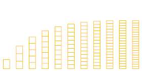
The post also made me think about what "good" monetary policy really is in the information transfer model. In one sense, good is good: high growth (the 1960s in the US), low inflation but not too low. However, to maintain that trajectory requires what might be called the monetary version of the caloric restriction diet: barely enough money to gather information from the aggregate demand. This leaves the monetary authority with the most control over the economy allowing it to speed up the economy or slow it down at will. In the graphic below, this scenario is keeping the economy on the left side where monetary expansion (adding boxes) moves you the farthest up or down (price level).


Should we let unelected central banks control our economies? If you say no, then living on the right side of the curve may be preferable. The central bank has little to no power over the economy; large changes in the number of boxes (monetary expansion/contraction) have little effect on the height of the stack (price level). Instead of caloric restriction, you can have as much food as you need. Japan has lived on the right side for the past couple of decades. In this scenario, you need a strong welfare state with automatic fiscal stabilizers because monetary policy can't alleviate the suffering in economic downturns.

The US (and the UK) have followed the cycle of advancing up the slope from the left side to the right (1890s-1930s, 1960s-2000s), having a major recession (Great Depression, Great Recession), undergoing accelerating inflation to reset the monetary system back to the left side (WWII, ???), then beginning again (in the 1960s, ???). I left question marks for the pieces we haven't done yet in the current cycle. This overall seems like terrible policy -- and is basically the result of not having the information transfer model and instead muddling through.
I was unable to find Good is Good by Kaito for the title reference, so here is Driving Manual Auto.

Thursday, November 21, 2013

Sweden: Great monetary policy or the greatest monetary policy?**

I am frequently inspired by things Scott Sumner says; this one is no different (his posts tend to have the perfect combination of stuff I disagree with alongside sufficiently technical arguments that are interesting). Per my previous post, my answer to Sumner's correspondent is: Yes, the great recession would have still occurred. But Scott mentions Sweden in passing, so I decided to run the model for that country.

Here are the monetary base and GDP data I was able to cobble together from the Riksbank website along with the Swedish statistics database and FRED (only for 1986-2012, though):


We get a great fit for the CPI:


The related information transfer index makes me think that the Riksbank has a secret copy of the information transfer model they've been using since the 1980s:


An almost constant information transfer index of 0.67 means they have an economy that is almost perfectly described by the quantity theory of money. Here's the 3D path, almost parallel to the ∂P/∂MB = 0 liquidity trap line (black):


Sweden jumped over the line twice: once during their financial crisis in the early 1990s and once during the global financial crisis of 2008. It seems it is possible to come back from these episodes if your information transfer index was low going in if you just return to the previous path. While inflation will probably be a little lower looking forward, it shouldn't be inconsistent with inflation before the 2008 crisis. The US may be able to take a lesson from this -- all the discussion of dire results of "tapering" and "exit" from QE may be unwarranted (part of my previous post was intended to say that QE didn't actually do anything since ∂P/∂MB = 0).

However, Sweden didn't experience "liquidity trap" interest rates in the 1990s crisis. Here are the interest rate model results:


What happened in the 90s? Well, for one thing there was that financial crisis I mentioned. But why didn't rates fall to near zero? As best as I can tell, the answer lies in the same place as the answer for Australia: foreign denominated debt controlled the interest rates for Sweden.

UPDATE: Krugman and Wren-Lewis have written about Sweden's recent monetary tightening; unfortunately the only data I have for all relevant variables (CPI, GDP, MB) only goes to 2012 (the interest rate rise appears as early as mid-2010) so I don't have much to say about this ... except the statement that they have left the recent liquidity trap may have been premature. Since the interest rate model doesn't work very well (likely due to foreign currency denominated debt in the 1990s) there some difficulty in determining the liquidity trap interest rate. However, comparing to the two graphs directly above it appears the liquidity trap rate is near 1% which is where interest rates are right now.

**I am in no way trying to sway members of the economics Nobel committee with this title.

Wednesday, November 20, 2013

QE and inflation

After reading this Scott Sumner post, I thought I'd try to be more explicit about the differences between the information transfer model, Sumner's monetarist view and, say, Krugman's Keynesian view. Let's do it with through four questions:

Was the great recession peculiar to 2008?

Sumner: No. It could have happened in the 1970s, the 80s or the 90s for example. It was caused by bad monetary policy.

Krugman: Yes and no. Interest rates were too low in 2008 and a shock hit that conventional monetary policy couldn't handle. (However, there is no reason interest rates had to be too low in 2008 and they also were low in the early 2000s and the 1960s ... the shocks experienced at the time just weren't big enough.)

Smith (i.e. me): Yes. The circumstances had been building since after WWII, making the probability of a "great recession" more and more likely. A "great recession" could not have happened in the 1960s.

Why didn't QE cause inflation?

Sumner: QE is expected to be temporary and thus inflation will stay at the long run target. If QE had been done with literal currency, then it would either not be expected to be temporary or would change expectations about future inflation. (n.b. The expectation that it is temporary is really hard to justify given Japan is apparently expected to cut its monetary base by 80% sometime in the near future.)

Krugman: Liquidity trap conditions exist and conventional monetary policy has no traction at zero or near zero interest rates. Unconventional monetary policy like QE only works through expectations (promising to be irresponsible) limiting the impact.

Smith: Monetary policy has become steadily more ineffective since WWII (which is mistaken as falling inflation expectations or secular stagnation). Many states are past, at or near the point where monetary policy is totally ineffective (∂P/∂MB = 0) including Japan since the 1990s, the UK and EU. Canada and Australia are not yet at that point. This loss of effectiveness has nothing to do with interest rates, except that it happens when interest rates are "low" compared to rates in the past. The interest rate at which ∂P/∂MB = 0 depends on the size of the economy and other factor: it ranges from 2% in the EU to 0.1% in the US. This rate also steadily increases as the economy gets bigger.

How did we get inflation in the 1970s?

Sumner: Post-war Keynesian economics didn't believe inflation and the money supply were tightly linked. Excessively loose monetary policy caused inflation, basically the quantity theory of money.

Krugman: Essentially the same reasoning as Sumner.

Smith: The inflation of the 1970s was normal except for the two big oil shocks. It's low inflation in the 1960s that's mysterious. Since then, inflation has steadily decreased as the low hanging fruit of capturing under-utilized NGDP by simply expanding the monetary base to allow information to flow was eaten up.

How do we get inflation today?

Sumner: NGDP targeting. Or at least something that makes people expect inflation (e.g. higher inflation target). The situation will likely persist for an extended period (indefinitely?) if some other monetary policy is not adopted.

Krugman: Keynesian stimulus. There is potential for the economy to return to normal eventually through internal deleveraging but secular stagnation may make that take a really long time.

Smith: Start conducting monetary policy without regard to economic indicators. New monetary targets (NGDP, higher inflation) will not work. Generate hyperinflation through monetizing the debt. Print money and give it to people. Set interest rates by fiat as done by the US and UK during WWII.  Keynesian stimulus will work because ∂P/∂NGDP ≠ 0.

Secular stagnation and the EU

There was a bunch of blogging about Larry Summers secular stagnation speech ... and posts about the posts ... and then posts about those posts. And since the EU had only 0.7% CPI inflation in its last measurement, there were posts about that and secular stagnation. Here is a flavor:

Secular Stagnation, Coalmines, Bubbles, and Larry Summers

The Secular Stagnation Puzzle Restated

Focus on NGDP expectations, not interest rates

The Biggest Problem in Economic Policy Today

Two more nails in the Keynesian coffin

Europe’s Remarkable Achievement

Saying everything everyone is saying is explained by your model is probably one of the surest ways to prove that you are some sort of crackpot and ergo your model is the ravings of a lunatic. But! Everything everyone is saying is explained by my model. (And the things Scott Sumner said about nails in the Keynesian coffin are wrong; you don't need to be at the zero lower bound to be in a liquidity trap and switching to a new data series that agrees with your preconceived notions is bad methodology. And is it just me or is the first thing that comes in your head when you hear "GDP-plus" is milk-plus?)

1) Secular stagnation is the diminishing marginal utility of monetary expansion

As countries have tended to use monetary policy to increase economic growth without generating too much inflation, the result has been that most countries are on a path towards diminishing marginal utility of monetary expansion. Central banks set about expanding the monetary base to capture all the economic growth (information) they can. Eventually additional monetary units ("bits") stop allowing you to capture more information and instead mean each monetary unit captures less information relative to the size of the economy. In this diagram you can imagine the US in the 1970s on the left side and today on the right side. Or Brazil on left side and Japan on the right side. (You could even imagine the quantity theory of money being a more accurate description on the left side and the IS/LM model being more accurate on the right [1].)


The result is a price level that flattens out (low stable inflation) or even goes negative (Japan). As the price level determines the level of employment given NGDP (due to sticky wages), you end up with stagnation. The way out is probably via accelerating inflation (hyperinflation) which re-adjusts the size of NGDP relative to the monetary base.

UPDATE: I wanted to make the point that this is purely a monetary/economic issue (efficiently capturing the information in an economy with a monetary system) and has absolutely nothing to do with technological innovation or investment. We could invent warp drive today and this wouldn't help. Read Cosma Shalizi on how markets are a particular way to solve an optimization problem (as part of a review of Red Plenty). Then imagine the monetary system as the number of bits you devote to solving that optimization problem. Initially, they help a lot. Later on, you reach some real bottlenecks that have more to do with the dimension of your problem than your resources.

2) The information transfer model expects near zero inflation for the EU

I've updated the graph for the EU price level (data in green, model in blue) and it shows the price level is approximately flat, i.e. inflation should be near zero.


3) The EU can be in a liquidity trap above the zero lower bound

I've also updated the interest rate (red lines)/information trap (black dashed line)/path of the economy (blue line) diagram for the EU. The EU is still in the region ∂P/∂MB ≈ 0 near the black dashed line and that region is still near 2% interest rates.


4) If information transfer is correct, then Keynesian solutions are the only viable solutions

If we are in secular stagnation as a result of coming close the point where ∂P/∂MB = 0, then, quite literally, ∂P/∂MB = 0 so that we can only use the fact that ∂P/∂NGDP ≠ 0 or the Keynesian subset ∂P/∂G ≠ 0 to generate inflation and therefore jobs (because of sticky wages). The other possibility is hyperinflation.

[1] Techincally, the IS/LM model always works to a degree of accuracy, say 10% error, while the traditional quantity theory of money goes from 1% error to 100% error from the left side to the right side of the graph.

Tuesday, November 19, 2013

Light blogging and coming soon

Sorry for the light blogging of late; I'm busy with the real job. I will have a post about the secular stagnation meme that's been bouncing around the econoblogs up soon, but I'm mostly working on a short YouTube animation covering the basics of information transfer economics.


Wednesday, November 6, 2013

Three ideas

There are a three major ideas in information transfer economics:
(1) It creates a framework of supply and demand in which to build models to test against empirical data. You identify the demand (D), the supply (S) and the price (P) detecting signals of one to the other. I've written this Price:Demand→Supply which means that P = (1/κ) (D/S) in its simplest form. I'll call this equation the "first law" of information transfer economics (κ is just a parameter). On this blog, I've used P:NGDP→MB,  P:NGDP→LS, P:NGDP→U, r:NGDP→MB and r:NGDP→AS (where NGDP stands in for aggregate demand, MB is the monetary base, LS is the labor supply aka the total number of people employed), U is the total number of people unemployed, an AS is a generic aggregate supply. P, the price level (CPI) and r, the interest rate (short term) have acted as "prices". I've used this type of model to e.g. determine interest rates, study sticky wages, recover Okun's law and understand the Phillips curve.
(2) The framework allows you to create more complicated models of interacting markets using the same price signal like the IS-LM model (which uses r:NGDP→MB and r:NGDP→AS) and a labor-money model I called LS-MS for labor supply-money supply (which uses P:NGDP→MB and  P:NGDP→LS). In these cases I've used the "second law" of information transfer economics P = (1/κ) (dD/dS) in conjunction with the first law which has different solutions depending on whether you consider the variables D and S to be "exogenous" (set outside the model) or "endogenous" (set inside the model). Heuristically, these are D ~ S^(1/κ), D ~ exp S and D ~ log S. The first is related to the quantity theory of money, the second describes e.g. accelerating inflation and the third is used to describe supply and demand curves, either microeconomic or macroeconomic (e.g. IS-LM).

The first two ideas are really not much more than a series of proportionalities that allow you to say NGDP ~ MB (i.e. the quantity theory of money) or an increase in the money supply ceteris paribus lowers the interest rate (IS-LM model). Of course it also allows you to set up proportionalities you might not though of otherwise (P ~ NGDP/U). And it is pretty cool that these two laws follow from some basic arguments using information theory (hence the information transfer in information transfer economics).

However, there is a third idea that uses more information theory, relates specifically to one market (P:NGDP→MB) and produces weird conclusions (from the standpoint of conventional economics). The parameter κ is called the information transfer index and is used to measure the different information content in the definition of the "bits" that measure the information coming from D and going to S.
(3) The effect of the "unit of account" function of money (defining the dollar, yen, pound, etc.) can be combined with the "medium of exchange" function of money (how the market values the components of the aggregate demand) can be included in the market P:NGDP→MB by allowing κ to be a function of NGDP and MB. In terms of information theory, the monetary base defines the unit "bit" [1] and determines how many "bits" are being moved around in the economy. In this manner it becomes easy to see how there are two competing effects. More bits (dollars) allow for more information (bigger economy), but more bits (dollars) means each bit (dollar) carries less information (purchases fewer goods). I generically refer to this as the unit of account effect and it can lead to what I call an "information trap".
This third idea is a different unification of monetarist and Keynesian views of macroeconomics than the more traditional new Keynesian models. There are excellent returns to increasing the monetary base when it is small compared to the economy -- essentially allowing more bits to capture more information in the aggregate demand, the low hanging fruit of expanding your economy. This is when quantity theories of money work best to describe your economy. The gains slow down eventually and at some point you've captured all the information you can. At this point, interest rate theories based on the first and second laws above have better luck. Also at this point monetary expansion will fail to significantly increase NGDP or the price level -- sound familiar? This is the basic idea behind the liquidity trap (including the related zero lower bound) or the expectations trap (where the central bank must credibly promise to be irresponsible). However in the case of the information transfer this has nothing to do with zero bounds on interest rates or expectations. Your economy simply ran out of low hanging fruit that could be grabbed with monetary policy which is why I refer to it as an "information trap". This situation describes the US, the EU and Japan particularly well. Since it is not based on the zero lower bound, you can be in the trap at positive interest rates (like the EU). Additionally it shows how monetary expansions in Australia (see here also) and Canada could offset the shock of the financial crisis (those countries haven't consumed the low hanging fruit yet), but do far less in e.g. the US.

In the blog, when I've referred to "the" information transfer model I'm usually referring to the third idea. However, I work with all three from post to post and they form the basis of information transfer economics [2].
[1] I'm using "bit" here in a more generic way than the technical 1's and 0's; they can be "nibbles" aka hexadecimal values 0-9 + A-F or "bytes" aka ASCII characters. Actually the recent US economy appears to be operating in approximately base 283 (and climbing). 
[2] I also use a lot of data from the FRED database as well as other sources. If you have a question about the data or I forgot to link to it, just ask and I can provide it.

Sunday, November 3, 2013

The labour supply, part 2

In the previous post, I noted that the deviation of the empirical data from the model P:NGDP→LS becomes large over the long time series from the BOE. I also noticed that it seems like this deviation prevented us from defining a "natural rate" of unemployment in the model P:NGDP→U unless we account for the effect. So starting from P:NGDP→LS for the US we have this fit to the price level:


And here is the ratio of the blue line to the green line:


So if we account for this in the model P:NGDP→U by dividing
$$
P = \frac{1}{\kappa_{U}} \frac{NGDP}{U}
$$
by the factor
$$
\frac{1}{P} \frac{1}{\kappa_{LS}} \frac{NGDP}{LS}
$$
Using the parameter $\kappa_{LS}$ derived from the previous fit and then fitting on the parameter $\kappa_{U}$ we get the following best fit curve to the price level:


If we then use the price level (green curve) to represent the "natural rate" of unemployment (i.e. what the blue curve $\sim NGDP/U$ should be), we can show this plot of the unemployment rate (black) and the "natural rate" (blue dashed):


If you go through the algebra, it follows that the "natural rate" is given by
$$
u^{*} = \frac{\kappa_{LS}}{\kappa_{U}} \frac{LS}{L}
$$

where $L$ is the civilian labor force and $LS$ is the total number of people employed. The latter term is effectively the "employment rate" and is typically $\simeq 1$.

We can do a similar manipulation for the UK data resulting this fit of the model P:NGDP→U to the price level:


Which is an improvement over the naive result here. The natural rate can then be derived using the green in the previous graph as we did for the US data above:


This result has a remarkably constant "natural rate". Too remarkable -- I imagine the data for the total number of employed, the total number of unemployed and the unemployment rate are all based off of the same measure. However, the important result is that $u^{*} \simeq \kappa_{LS}/\kappa_{U}$.

The labour supply, part 1

I am continuing to work with this rather excellent data set from the UK. In some previous posts, I looked at the models P:NGDP→LS and P:NGDP→U (where P is the price level, LS is the total number of employed aka the labor supply, and U is the total number of unemployed [1]). I wanted to see what I could glean from using these models with the UK data.

First I looked at P:NGDP→LS with fit parameter κLS, and like in the case for the US, the model works to some degree (model in blue, price level data in green and in the second graph the ratio of these two functions is shown in red):


This result appears similar to the US result, the slight deviation being related at least in part to nominal wage stickiness. If you are watching carefully, you'll notice I pulled a selective-windowing fast one. If you cover the entire range of available data (1855-2009), you can see that there's quite a large divergence:


Still, it's a pretty good model for having a single fit parameter. As comes as no surprise, small amount of nominal wage flexibility over the course of 150 years can accomplish a lot. Note the shape of that red curve; besides indicating wages became more flexible after WWII, it will be relevant later.

How about the model P:NGDP→U with fit parameter κU? Well in the results for the US, the model is actually not a terribly good one -- there are large fluctuations in the model solution for the price level P around the empirical data. In those results I did ask the question whether the result could be used to define the "natural rate" of unemployment (or at least a mean level). The UK data gives us a somewhat worse result than the data for the US, but this may come back to help us figure out what's really going on. Here is the fit to the price level (model in blue, empirical data in green):


If I try to use the green line to defining the "natural rate" as I did in the link above (I used the unemployment rate given in the BOE data and the number of unemployed to define a "civilian labor force"), I get a mess:


Yikes. But! Check out the red line two graphs prior ... it looks remarkably similar. The deviation of the red line from 1 is at least in part due to nominal wage flexibility, but whatever the source of the effect it must be removed from the unemployment model in order to see the "natural rate". This means we need to remove it from the US unemployment model as well. This effect would have been largely invisible had we not had the three centuries of data aggregated by the BOE from economic researchers cited in the spreadsheet.

UPDATE I forgot in the original post to add this graph of Okun's law derived from the labor supply model of the price level P:NGDP→LS:


[1] The model p:x→y means that p = (1/κ) x/y which follows from the information transfer model of supply and demand.

Saturday, November 2, 2013

The long run in the UK

Paul Krugman linked to three centuries of economic data for the UK a few days ago. I decided to see how the information transfer model works over such a long time period. One limitation was that monetary data only went back to 1870, so we only have 140-odd years to work with. I had seen how the model does with data from 1986-2013 in this post (although it still involved extrapolation of monetary data). It turns out I needed to do a split monetary regime (monetary phase transition) around WWII, much like I did for the US. I highlighted the region where interest rates were pegged (see the previous link) from 1933 to 1949 in gray in the following graphs. Overall, I'd say the results are pretty good.

First, here is the price level model (I split the monetary regimes arbitrarily in 1950, model in blue and data in green, model description here):


Second, here is the interest rate fit (model in blue and data in green, model description here). There is no split monetary regime for the interest rates as there is in the price level, just a single fit to all of the data.


One caveat is that the long run monetary data does not include central bank reserves, which become a significant part of the base especially in recent years (which explains the deviations towards the end of the time series data). However, the results for the information transfer model including reserves were previously covered here; here is the plot of the interest rate results using this data:


Here is a different version of the long run data where the fit is to the data from 1870 to 1986, and shows what happens if you add reserve data (in purple) and interest rate data (in red) from 2006 to the present:


This fit seems to do better in the post-war period up until the 1980s where it appears the central bank reserves become significant. I will attempt to fuse all of the monetary data (reserves plus notes and coins, the full monetary base) in a later post.

Third, here is the plot of the path of the UK economy in (MB, NGDP) space in blue with the interest rate level curves shown in red (using the first interest rate fit, not the second) along with the information trap criterion (∂P/∂MB = 0), related to the liquidity trap, as black dotted lines. One thing to note is that the ∂P/∂MB = 0 line is different for the two monetary regimes (roughly before and after the pegged interest rate policy).