Monday, June 25, 2018

Yield curve inversion and a future recession

There was a recent article out on the internet about yield curve inversion. Using the spread between Moody's AAA rate (blue, a decent proxy for the 10-year rate with less noise) and the 3-month secondary market rate (purple) we can see that from the 1950s until today, a low spread has been associated with recessions:


However, in the aftermath of the Great Depression, inversion of this measure wasn't a good indicator. It's only become an indicator since the 1950s. The past few recessions have all been preceded by a closing of this measure, but the degree of closing has gotten smaller since the 80s (actual inversion before the 90s has turned into just entering there error band):


Looking at the recent data and assuming the dynamic equilibrium model is correct along with a linear trend in rate increases, we see that the indicator will enter the error band sometime before 2020:


However, the period of time the spread spends inside that error band ranges from a few months to a year (yield curve inversion is usually described as being an indicator a recession will happen within a year). So unless we have other data, we won't be able to predict the timing of this future recession. We do have other indicators, and this extrapolation is consistent with them.

...

Update 26 June 2018

I've done a better analysis of the estimate of the US recession onset via the yield curve inversion indicator by aggregating several different measures of the spread (collected here). I looked at the median (yellow), average (blue), and a principal component analysis (green). These gave nearly identical results:


Since those were practically identical, I used the mean median for the subsequent calculations. I then extracted the slope of the approach to the three previous recessions (early 1990s, early 2000s, and the "Great Recession" of 2008, dropping the first year after the start of the previous recession) using a linear model, and used that slope to estimate the most likely recession onset (first quarter of the NBER recession) for a future recession (assuming the current decline in spreads will eventually lead to a recession). That value is 2019.7 ± 0.3 (two standard deviation error). This is what the current approach to the recession looks like in that context (the previous three recessions are shown in blue, yellow, and green and labeled by the end of the NBER quarter — i.e. 0.5 is the end of calendar Q2):


The blue band represents the 90% confidence on the single prediction errors of the linear model (dashed line). Since the declaration of an NBER recession typically lags the first indications of a recession in unemployment and JOLTS data, we should be seeing the first signs in those data series in the next 6 months to a year. Since we are already seeing some signs in the JOLTS data, these indicators all seem consistent.

Note that the above analysis in this update is "model agnostic" in the sense that it just relies on the empirical regularity of a trend towards yield curve inversion between recessions, but no specific model of how yield curve inversion works or which way causality goes. It does imply a certain inevitability of a recession. Since the mean spread rose to about 3 percentage points after each recession, and the slope is -0.36 percentage point per year, this implies about 8.3 years between recessions — which is what a Poisson process estimate says based simply on the frequency of recessions (λ ~ 0.126/y, or an inter-arrival time of 7.9 years as mentioned here).

...

Update 3 July 2018

Apparently I mislabeled the variables medianData and meanData in my code, switching them up. Anyway, the above result uses the median, not the mean (average). I also added post-forecast daily data in red, which is more rapidly updated than the monthly data time series.

Tuesday, June 19, 2018

Q: When is bad methodology fine?

A: When you clearly say it's bad methodology.

For example, I am currently playing around with housing starts data and the dynamic information equilibrium model (DIEM). It really only looks like the data from about 1990 on can be described by the model (which interestingly matches up with a similar situation with the ratio of consumption to investment).

However, I noticed something in the data -- if you delete the leading edges of recessions, the DIEM works further back. It's possible that a step response is involved; here's the log-linear transform of the data:


It's totally bad methodology to just willy-nilly delete segments of data by eye, and I wouldn't create a forecast with this model result that I'd take seriously. I won't even transform back to the original data representation to help prevent this graph from being used for other purposes. But sometimes I notice prima facie interesting things, and as this blog effectively operates as my lab notebook [1] I try to document them. They could turn out to be nothing! Why? Bad methodology!

Footnotes


[1] There's apparently an "open notebook" movement that I guess I've been a part of since 2013.

Monday, June 18, 2018

[Insert new approach to economics] isn't empirical


Going beyond a sub-tweet into an entire sub-blog, my least favorite genre of econ writing is the "economics should try [insert new approach to economics]" that is entirely supported by only two pillars: subjective analogies and that the writer himself (nearly always a him) studies [insert new approach to economics]. The gaping hole in these pieces is whether or not [insert new approach to economics] actually describes any real world empirical data [1]. The galling thing about this is that a common (although tired and largely over-simplified) criticism of economics is that it "isn't empirical". The worst offenders are the ones hypocritically doing both [2].

Sometimes calls for economics theories — fundamentally about social phenomena — to be more empirical are taken as calls to make economics more like physics and remove any messy human imprecision. This is not what I am talking about. Darwin's book [3] doesn't have math or numerical data for the most part, but still represents an empirical study conducted through observations. The theory not only presents and organizes the data, but explains many observed things — including things Darwin did not study himself. It also made concrete predictions (e.g. transitional forms). But describing how an aye-aye's middle finger elongated to help get grubs out of wood is not going to be "precise" in the physics sense where you'd be able to put the model in a computer and "predict" the finger based on a set of inputs.

I am not so pessimistic to think that it is impossible to toss a bunch of observations of interest rates and prices into a computer and accurately forecast future GDP, but I am open to the possibility that a successful economic theory may well be more narrative — like Darwin's book.

But as I mentioned, Darwin's book is empirical in the sense that it is based on observations. Not just recording observations, but explaining observations. So when I read things about how economics should use [insert new approach to economics], I am looking for the observable things that [insert new approach to economics] explains. Since the vast majority of macroeconomic data is numerical, the easy way is for [insert new approach to economics] to explain some of that data. Even just a couple time series. We can argue about whether those time series are measuring real things (like here), but at least show something.

Without those explanations of observations, a purported new approach to economics is just an assertion, an untested hypothesis. That [insert new approach to economics] was studied in (usually) the author's own field [4] is not in any way a valid test of its applicability to economics. Quantum mechanics works on electrons, therefore it should work for human brains. Um, really? Evolution works as a theory of how living organisms change over time, therefore it will work for macroeconomies. Okay ... want to show me some macro data it explains?

The econoblogosphere is full of this stuff, and I'm sure it's fun to talk about for some of you. Talking philosophy in a bar can be amusing. Story-boarding is much easier than actually making a movie. It all reminds me of the meetings I've gone into at my real job where the agenda is to find a solution to a specific problem, but everyone in the room just wants to talk about the approach or other generalities. When I was younger, I used to think this was because the people didn't know what they were talking about and they were afraid if they made any concrete statements we'd find out. I'm now a bit more laid back, but I still roll my eyes. I'm interested in trying to figure things out. That's why I became a scientist. 

That's also why my blog, papers, and presentations have been focused on explaining empirical data. The econoblogosphere doesn't need yet another white male spewing hot air  about "money" or saying "economists should try" [insert new approach to economics] because of analogies or "logic". Economists should try information theory because it provides a pretty accurate model of several labor force measures.

If you think your pet theory [insert new approach to economics] is so cool, do some actual work [5] and show how it improves our understanding of micro- or macro-economic phenomena we observe. Rational agents and methodological individualism may be flawed constructs, but they've almost certainly produced results that have been compared to more empirical economic data than your precious [insert new approach to economics].

...


Footnotes

[1] I understand this last phrase is redundant; it's written for emphasis.

[2] Actually, the worst offenders are the people that claim their model explains empirical data when it doesn't.

[3] I am not saying Darwin was the complete and last word on evolution — much research has been done since then. I am using it as a common example where the empirical "data" isn't numeric as a way of saying both "physics isn't the only good science example" as well as "social sciences can be empirical without numbers".

[4] That author almost invariably has only a limited knowledge of economics as well. That's because the typical place this kind of "you should be using [insert new approach to economics]" comes from seeing macro struggle with empirical validity and assuming everything economists must have learned must be garbage. The reason macro struggles with empirical validity is that it's difficult — every macro theory will struggle with empirical validity to some degree. Even [insert new approach to economics]. I've had a few models built with the information equilibrium framework that I've rejected.

[5] I wanted to add "you lazy feckless windbag" here, and really just a lot of invective almost everywhere. You're not helping, and you're just feeding an "evidence-free" approach to macroeconomic policy (because that's what your half-baked ideas about how economies work become).

Thursday, June 14, 2018

Wage growth showing signs of a downward shock

The latest wage growth data from the Atlanta Fed came out a few days ago, and like the JOLTS data is showing possible signs of a recession (or at least the undoing of the prior upward shock that might have been associated with a post-Lilly Ledbetter decline in the gender pay gap). Here's the latest data on the original forecast:


Also, I looked into the Employment Cost Index (ECI) which is another measure of wages and compensation. First the original model of the log derivative:


And since I was comparing with this picture from Ernie Tedeschi:


... I reconstructed the year-over-year model adding the extra data from the previous graph by digitizing it (for some reason, it wasn't on FRED):


Because this data is noisier and less frequently updated (only quarterly, roughly a month after the quarter ends), we can't really see any sign of a recession yet even if there was one.

...

PS Note that I use the Atlanta Fed's raw data, not the 3-month moving average they display on the website linked above.

Wednesday, June 13, 2018

Explaining recessions with definitions?

Nick Rowe is an excellent educator, and always has really nice "parables" to explain some point; this recent one is about the excess demand for money (the medium of exchange) causing recessions.

But it's a just-so story. The only way agents can satisfy their demand for goods is through monetary exchange of money earned through monetary exchange, and satisfying that demand is defined as equilibrium. Therefore non-equilibrium (i.e. recession) is effectively defined as insufficient monetary exchange (i.e. excess demand for money).

Actually, I could use the same exact system (with the same effects) but have a recession defined completely differently: agents huddling in a particular corner of state space.

When Nick says the agents get an excess demand for money, I'd say agents decide to occupy a particular corner of the available opportunity set (state space) that involves holding (not spending) as much money, cutting off a segment of it. Agents no longer fully explore the state space and entropy is no longer maximized. This generalizes to exactly the same generalization Nick makes:
It is not an excessive desire to accumulate assets that causes recessions; it is an excessive demand for one particular asset (the medium of exchange) relative to other assets. It's about the composition of their portfolios of assets, not about the total size of that portfolio.
There is a maximum entropy distribution (subject to some constraints) over assets (portfolio), and deviations from it represent a loss of (information) entropy. I've suggested before that this kind of correlation in state space is a possible description of a recession. Notably, I don't define this as a recession. I just look at the consequences and note that it describes a recession without getting into the details of why agents have decided to correlate in a corner of state space. 

Here's an example where one agent on the Wicksellian circle decides to have an excess demand for "money" (you can imagine goods flowing in the opposite direction):


The key point here is that we've abstracted what Nick defines as an excess demand for money (observable only as a recession) as a correlation in state space. Nick defines a specific correlation in state space as an excess demand for money, whereas we leave it open.

That's because looking at the data, it's hard to say exactly what it is humans are doing as an economy heads into a recession. Job Openings take a hit (as well as hires) before unemployment begins to rise. Of course, that could be defined as firms having an excess demand for money (i.e. not spending it on employees). However, that doesn't add much information unless somehow giving firms money would cause them to put out more job openings. Does it? That seems like an empirical question, not one answered by a logical parable. And of course you could characterize a decline in conceptions as an excess demand for money (i.e. not spending it on a baby). 

But now we have a question of why the excess demand for money shows up first in conceptions and then later in hires and job openings (with the latter coming in different orders in different recessions). Why does this excess demand for money show up last in wages firms pay employees? Firms first hold back on hiring, and then hold back on raises (actually it's wage acceleration) — but both could be characterized as an "excess demand for money" by firms. Nick's definition of a recession is now seriously lacking in explanatory power for the details. Is demand for some kinds of money (i.e. reduced spending on certain things) different from other kinds? The correlation in state space framework doesn't necessarily restrict exactly how the firms correlate: they could first correlate in hiring decisions and then later in wage decisions. Different parts of state space are going to be different and there's no reason to expect them to behave in the same way.

In Nick's example (assuming that world actually existed for a moment), what if data showed the recession first showed up as a decline in banana production, and then later apples and cherries? As constructed, the model could only explain a recession where the onset of the recession was the same across each fruit. You could add in ad hoc delays to the production of each good (i.e. apples take longer to grow than bananas, so banana production is more pro-cyclical).

I've noted this before, but I see this as a general problem with people who study macro — mainstream to heterodox, econophysics to complexity: defining a recession. Your conceptual framework should not define what a recession is. A recession is one of the main subjects of study of the field of macro. Defining what a recession is assumes the answer. Now in some cases assuming the answer and trying to work out what the theory has to look like to produce that answer is a useful theoretical tool. But it's a useful theoretical tool for finding the answer, not explaining the answer.

In the previous link, I came up with what I thought was a good analogy to assuming what a recession is in order to explain it:
If I said I was a doctor studying Alzheimer's and my conceptual framework included a tenet that Alzheimer's disease was defined by amyloid plaque build-up (rather than, say, the stereotypical symptom of memory loss) and lo and behold I put up some micrographs of amyloid plaque build-up in a neuron and said that caused Alzheimer's ... exactly what is my conceptual framework helping me understand?
Nick defines a recession as the excess demand for money, and lo and behold his parable shows that an excess demand for money produces a recession!

But recessions in data are defined by a bunch of people squinting at it (NBER) or heuristics like two consecutive quarters of negative GDP growth. If a recession is an excess demand for money, why does it only last two quarters? That's a joke, but you can see what I'm getting at. The excess demand for money explanation basically shifts the question to why people have excess demand for money for short periods where it manifests in reduced spending in different amounts on different things at different times. That is to say: it's no explanation. 

Tuesday, June 12, 2018

CPI inflation forecast from 2017 still going strong

I made a forecast of CPI (all items) that I've been tracking since 2017, and it's still doing fine with the latest data (showing the ending of "lowflation" in the wake of the Great Recession due to a drop in labor force participation):


...

Update

I'll throw in this S&P 500 forecast comparison with the latest data for absolutely free:


Women in the workforce and labor share

I saw a couple of graphs of labor share of GDP on Twitter yesterday and so I thought I'd look into it using the dynamic equilibrium model. The dynamic equilibrium model of wages has roughly similar structure to that for NGDP; using that model [1] we can produce a description of this measure of wages (W):


If we divide this by the NGDP model, we obtain a really nice description of W/NGDP:


While the shock structure is formally similar, the actual parameters differ — if they were the same, this would be a horizontal line. Shocks occur at slightly different times and have slightly different sizes. The main shock to wages in the 70s starts slightly earlier, but overall is almost identical to the shock to NGDP in every aspect except size:


How much of the deviation from a straight horizontal line is due to this difference? It is shown as the dashed line in the graph of W/NGDP. That's most of the difference. Pretty much when you're talking about declining labor share, it is due to the difference in the shock to wages and the shock to output.

Most stories told about this declining labor share of national income is about capital claiming it for themselves — and on the surface, that's essentially what is happening. A major surge in output in the 70s went disproportionately to capital instead of labor.

However, let's take a step back and think about the cause of that surge in output: women entering the workforce (see links here or here). If that's the cause, then the difference in the shock to NGDP and to wages could be almost entirely accounted for by the fact that women make on the order of 70% as much as men for the same job. As women entered the workforce, the same output growth would go towards more income for capital by pocketing that extra 30%. A back of the envelope calculation shows it's the correct order of magnitude (about 5 percentage points). It's not declining unions or deregulation, but rather simply adding more people that are paid less because of sexism behind the decline in labor share of national income. At least that's the hypothesis.

After women entered the workforce, the pay gap did drop from 40% to roughly 20% (I used 30% as an average above). Actually, that data can be modeled with the dynamic equilibrium model as well:


Interestingly a possible new post-Lilly Ledbetter shock (dashed line) appears roughly where the shock in wage growth (and drop in unemployment rate) appears in other data.

...

Footnotes:

[1] Within error, the estimate of the dynamic equilibrium rate is approximately the same for wages and NGDP (3.8% ± 0.1%).

Thursday, June 7, 2018

Measuring labor demand

On Twitter, I've gotten into an extended discussion with "Neoliberal Sellout" @IrvingSwisher ("NS") about my bold claim that we are seeing the leading edge of a recession in the JOLTS job openings data using the dynamic information equilibrium model (DIEM).

Calibration is a general issue in time series data that involves different collection methods or models. It becomes a more significant issue if the calibration is done with knowledge of the model you are testing using the calibrated data! For example, if we corrected the aforementioned HWOL data using the DIEM as a prior, that would be extremely problematic. But that isn't what has been done here.

The main issue (I think — I might be wrong) is whether a) we can trust changes in the JOLTS data as representing information about the business cycle, and b) whether specifically "job openings" maintains a constant definition over time. Let me address these points.

The "Help Wanted OnLine" (HWOL) case study

NS points to a study of the "Help Wanted On-Line" (HWOL) index created by the Conference Board. The study documents how changes in Craigslist's pricing affected the HWOL metric, and it's true that price change appears as a non-equilibrium shock in the DIEM:


Actually, the DIEM is remarkably precise in ascertaining the timing of the shock (the gray band represents the beginning and ending of the shock) as November 2012 (dashed line). However, this shock doesn't represent information about the business cycle — it is a measurement issue. This is NS's point: the data's deviation from the job openings DIEM I used to make a bold claim about an upcoming recession may well be a measurement problem rather than a signal about the business cycle.

This is a reasonable point, and as I show in the model analysis above, something that is not related to the business cycle (except possibly indirectly in that being swamped with ads, Craigslist needed to raise the price to keep their servers from crashing from the traffic) indeed shows up as what might be interpreted as the onset of the "2013 recession".

It could well be that the deviation observed in the JOLTS data is a JOLTS specific shock — note that it appears to affect all the JOLTS series (hires, quits, etc are also showing a correlated model error), so it's not a job openings-specific shock. But this is where additional evidence comes in such the trend towards yield curve inversion as well as the general fact that the timing of recessions is consistent with a Poisson process with a mean time between recessions on the order of 8 years — therefore the probability we will see one in the next couple years is rising. If this was 2011 and T-bill spreads were above 3%, I'd probably put much less confidence in the prediction (however, I'd still make it because predictions are a really nice test of models). But with the 10 year - 3 month spread below 1% and on a declining trend since 2014, I'm much more confident the deviation visible in the JOLTS job openings data represents the leading edge of a recession rather than issues with JOLTS data collection methodology.

Measuring job openings

NS also has issues with measuring job openings/vacancies in particular (concatenating some tweets):
... The definition of job openings is not at all constant. An index that links across cycles must rely on varying definitions and makes strong assumptions about how they must be linked. That makes the time series have a long history but still makes for a young vector ... Prior methods for constructing a job vacancy measure in other countries have often had to be discontinued or re-constructed. It’s hard to keep a constant methodology that keeps up with technological shifts while avoiding cyclical distortion. ... It may prove empirically negligible (hard to say given changing def’ns) but vacancy measurement is vulnerable to tracking biz cycle here. Might be robust for other purposes but the Craigslist-HWOL is instructive ...
The DIEM fits with previous data from Barnichon (2010) [1] that uses entirely different mix of data sources (i.e. mostly newspapers as there was no world wide web) and therefore necessarily requiring different definitions of "vacancy". The model also describes the other JOLTS series (hires, quits, separations) as well as the unemployment rate [2] and employment rates across several countries. This is not to say we should therefore believe the DIEM, but rather we should put little weight on the hypothesis that it's just a coincidence the JOLTS job openings data is also well-described by the DIEM with a comparable level of error to other time series because the job openings data suffers from a series of methodological problems specific to the job openings data that somehow results in a time series that looks for all the world as if it doesn't suffer from those methodological problems. We can call it the "immaculate mis-calibration": despite being totally mis-calibrated, the JOLTS job openings data looks as if it is a well-calibrated, reasonably accurate measure of the labor market.

Additionally, the estimate of the dynamic equilibrium is robust to the "business cycle" (i.e. recession shocks) due to the entropy minimization described in the paper. The prediction of the recession is based on the deviation from this dynamic equilibrium, not the "cyclical" (actually random) shocks in the model -- these are exponentially suppressed.

However we have the further check on the JOLTS job openings data: we can use the model to solve for the job openings given the unemployment level and the number of hires. The hires number is less dependent on the methodological issues involved with vacancies (online vs print ads, what constitutes "active recruiting") since it more directly asks if a firm has hired an employee, and NS specifically states the unemployment data is reasonably valid. This check tells us the JOLTS job openings data (yellow) is reasonably close to what we would expect as reconstructed by the model (blue):


Additionally, using the model with this "expected" data series constructed from the hires and unemployment levels, we still see the deviation from the DIEM (blue dashed) for which we posit a shock and a recession.

Summary

Overall, this addresses most of NS's points. I'm not entirely sure what the end result we're aiming for is. We should always keep an open mind. I'm not arguing that the model is correct and we shouldn't question it — I'm arguing that the model predicts a shock to JOLTS JOR that will be associated with a rise in the unemployment rate (that we typically associate with a recession). That is to say I am perfectly aware that this prediction may be wrong, and that will be determined by future data. If it is wrong, then we can do a post-mortem and many of the points NS raised will become more salient. If the prediction is correct, NS's points will still be salient for future predictions but less so for this (hypothetically) successful prediction.

Whether or not we believe the prediction going into the "experiment" is in a sense irrelevant. You might select H0 = model is true versus H0 = model is false based on this, but I (and most other people) pretty much always select the latter as good methodology (i.e. not giving my model the benefit of being the null hypothesis). This is a prediction that was made in order to test the model. That the prediction might be wrong is precisely the point of making the prediction.

Basically, NS is arguing why the prediction will be wrong — itself a prediction. This is fine and it's definitely part of Feynman's "leaning over backwards" to present everything that could go wrong (which is why I've written this post to document the points NS makes [3]). But it prejudges the future data to say this information invalidates the prediction before the prediction is tested.

...

Footnotes:

[1] DIEM for Barnichon (2010) data (click to enlarge):


Also, the resulting Beveridge curve (click to enlarge):


[2] The unemployment rate (click to enlarge):


[3] What's somewhat ironic is that I could use NS's points post hoc to rationalize why the prediction failed! I'm not going to do that because I'm genuinely interested in a model that demonstrates something true and valid about the real world. I am not interested in the model if it doesn't do that — and it's not like it has some political ideology behind it (it's basically nihilism, which doesn't need mathematical models) that would cause me to hold onto it. While I have put a lot of work into information equilibrium, I don't have any problem moving on to something else. That's actually been how most of my life has gone: working on something for 5-10 years and moving on to something else — QCD, synthetic aperture radar, compressed sensing, economic theory. It's not like I'd even have to give up blogging because very few people care about the information equilibrium models and forecasts. Most of you come for the methodology discussions and macro criticism. 

Tuesday, June 5, 2018

Rethinking interest rates?

One of the forecasts I've been tracking for nearly 3 years is the 10-year Treasury interest rate. With the recent interest rate hikes, the data has headed off on a 3-sigma deviation from the model. As discussed in the post on it, it may well be the sign of the upcoming recession (yield curve inversion). That was in the back of my mind when I tried the dynamic equilibrium model on the Moody's seasoned Baa corporate bond yield data (I recently referred to this post which had the time series in it, prompting me to take a look).


The model basically fits the data except for the freak-outs in the Great Depression, the 80s, and the Great Recession.

When I saw these results, I immediately thought back to when I tried this same trick using 10-year Treasury data, but never blogged about the results because it was so uncertain (the shock is incomplete as the data on FRED only goes back to the 1950s). The AAA corporate bond is close enough to the 10 year that it could be a proxy as well as serve as a higher probability Bayesian prior for the 10-year rate model.

Here's the AAA bond and model (dashed) in blue:


The 10-year rate data added in purple:


And here's the 10-year rate model (dashed) in purple:


We can see the recent rise in interest rates is still on a deviation from the model (outside the 90% confidence interval), but it's much less significant. However, if we compare the IE model (green) with the dynamic equilibrium model they are largely consistent [1]:


Zooming in to the same region as the forecast I've been tracking:


Again, consistent. In a sense, this is a good check on the methodology since they should be consistent (the dynamic information equilibrium model is a more generic version of an IE model because the latter specifies what the market is while the former just says the observable is a "price" of some kind — see [1]). Notationally, IE claims "A B" while dynamic equilibrium just claims "p" for some A and B [2].

...

Footnotes:

[1] This of course makes sense because the interest rate is acting as a price in both models, it's just that the information equilibrium model specifies the price of what (i.e. nominal output is demand for "money", with the interest rate being the price of "money") while the dynamic equilibrium approach is agnostic — only making an assumption that the supply of whatever and its demand are both growing at some rate (if we took it to be the IE specification, these growth rates would be NGDP growth ν and M0 growth μ such that the dynamic equilibrium is (k − 1) μ = ν − μ).

[2] Dynamic equilibrium can also just claim "A/B".

JOLTS data and the "2019" recession

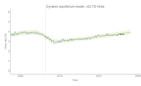
Another month, another JOLTS data release. However it looks like this time I can with a certain level of confidence say that the "2019" recession [1] is underway. It's still not as visible in the hires or quits data (only as biased model error), but job openings (vacancies) are definitely showing a deviation. Job openings appears to have lead the early 2000s recession (but that conclusion is uncertain as JOLTS data is only available from December 2000). Since this is a bold prediction, let me show the updates for all the JOLTS data series I've been watching. Click to enlarge the images.

Job Openings


Separations


Hires


Quits


And here are a couple of animations of counterfactual recession centers from June 2018 to June 2019:


To be specific, my prediction is that the current JOLTS job openings data is going to continue to deviate forming a shock (a logistic step function after subtracting the log-linear component) that will become visible (i.e. detectable with e.g. this algorithm) in the unemployment rate as originally described here but also in my paper. The exact timing of the NBER recession is uncertain (since it seems to depend more on the unemployment rate, which lagged the JOLTS indicators in the previous recession), but the time scale appears to be 2-4 quarters (6 months to a year). The unemployment shock center matches up with the NBER recession centers within a month or two on average.

One issue is possible data revisions; they appear to come with the March update (per ALFRED) with February data with the big Fed March meeting, so we won't see any until March 2019. However, the revisions all appear to be on the order of the model error so the only worry would be biased errors that shift all the data one way (this happened last March for the quits and hires rates). But overall, I'd say I'm at least 80% confident in this prediction inasmuch as I can put a qualitative Bayesian prior on the model.

...

Update:

Here's the Beveridge curve also discussed in my paper:


...

Footnotes:

[1] I put quotes around the 2019 because the recession is technically already visible in the Job Openings data, but NBER will likely say it began (i.e. the business cycle peaked) in some quarter of 2019 as the unemployment rate shock is probably at least 6 months in the future.

Monday, June 4, 2018

Consumption over investment


Steve Roth looked at Yaneer Bar-Yam (of NECSI) et al's paper [pdf], writing some notes on it on his blog. I'm not sure about the rest of the paper, but the ratio of consumption to investment as a leading indicator of recession piqued my interest.

In the dynamic information equilibrium framework, if we posit that consumption and investment are in information equilibrium ($C \rightleftarrows I$), then the ratio $C/I$ should follow (per my paper):

$$
\frac{d}{dt} \log \frac{C}{I} \sim \alpha + \sum_{i} \sigma_{i}(t)
$$

which in basic terms means that we should see lines of constant slope on a log graph possibly interrupted by "shocks" $\sigma_{i}$. Using the same methodology as my paper, this is in fact what can be seen:


The model is generally good, except for a bit of overshooting in the Great Recession. And compared to some other purported leading indicators I've looked at on this blog, it's not too bad! It definitely seems to lead the early 90s recession, and roughly tied with conceptions for the Great Recession [1] (click to enlarge for all images):


However, $C/I$ has a somewhat inconsistent relationship over time, sometimes leading and sometimes lagging (which is part of Steve's point). But it also falls apart if we look at earlier data:


This was interesting to me because the transition is where I've also posited a qualitative change in the behavior of the economy — in the wake of the end of the demographic shift of women into the workforce:


In the 90s and 2000s, women's labor force participation stops generally rising and becomes more correlated with the business cycle (as well as men's labor force participation). The $C/I$ ratio does this as well. In fact, Bar-Yam et al also note a transition from an exponential to a cyclical behavior around the same time for another time series (their Figure 5). This also matches up with the transition from the "Phillips curve" economy to the "asset bubble" economy I've described before.

It's that latter part that makes me doubt the cyclic nature of the indicator and these recessions in the paper. The asset booms and busts since the 90s correspond to the dot-com and housing bubbles — these involved entirely different causes and mechanisms making it exceedingly unlikely that they represent a first and second oscillation of one "cycle" that is supposed to continue [2].

More likely, the $C/I$ ratio will just continue to decline until it is hit by another "shock" (possibly a recession in the 2019-2020 time frame based on other indicators) with random timing (see this discussion of the "linear with random shocks" approach versus "nonlinear/chaotic dynamics").

...

Update 4 June 2018

Another ratio came up today (Justin Fox via Noah Smith) that I labeled $S/L$: service sector payrolls over total non-farm payrolls (FRED SRVPRD/PAYEMS). The growth rate (dynamic equilibrium $\alpha$) is about −0.0007/y (−0.07% per year) which is close enough to zero.


Overall, this appears to be the flip side of the loss of manufacturing employment (I didn't resolve the individual recessions in this one):


...

Footnotes:

[1] The different measures are:

C/I = Consumption over investment ratio
Cons = Conceptions
JOR = JOLTS Job Opening Rate
U = Unemployment
EPOP M = Prime age employment population ratio (men)
EPOP ratio = Prime age employment population ratio
Wage growth (ATL Fed) = Atlanta Fed's wage growth data

[2] Notably, Bar-Yam et al leave out data after 2015 (which would have been available in December of 2017) which would show the bump up in 2016 (possibly associated with the mini-boom of the mid-2010s which included a bump up in wages as well as bump down in unemployment).

Unemployment rate time series is on trend


The latest unemployment data came out last Friday, and despite the current president wanting to take credit (read Justin Wolfer's twitter thread) it's really just a continuation of the dynamic information equilibrium model trend.

It's true it is a bit below the 90% confidence region, but we should expect at about two of the 17 post-forecast points to fall out side it (which is roughly what's happened). If fewer than 10% of the points fell outside the region, we've likely estimated our errors too conservatively (or there is a model that could do better). Plus, there are the annual data revisions from BLS that come with the January numbers.

Overall, the continued decline in the unemployment rate is expected and the possible turnaround with the next recession will be first seen in e.g. JOLTS data.