Tuesday, March 11, 2014

Information theory, black holes and finance

From the Santa Fe Institute, a lecture by Seth Lloyd on some analogies between black holes and finance through information theory (he also presents this as part of his information theory class at MIT available online):

)

Monday, March 10, 2014

Macroeconomic predictions for 2016

Update 25 January 2017: These predictions ended up being successful.
Here are some macroeconomic predictions through 2016 (the start of a presidential election year in the US), barring a significant shock [1]. First, I based all the estimates on a simple quadratic extrapolation of (the log of) data from 2013-2014 for NGDP, M0 and MB. These constitute my predictions for these variables, and from them I derive inflation, RGDP, interest rate and unemployment predictions. First, the assumptions:


One thing is that there is a slight curvature to the MB data (including reserves) that seems to indicate tapering is beginning, at least to the quadratic fit. The impact of this falls entirely on the prediction of the 3-month interest rate (addressed later on).

One thing is that the predicted NGDP and M0 paths are consistent with a linear extrapolation of the NGDP shocks (i.e. the change in NGDP after accounting for monetary expansion):


I looked at year-over-year inflation in order to compensate for the seasonal effects; here is the model, data and the prediction:


The model is predicting the Fed will on average undershoot it's 2% (or 2.5%) inflation target for the next two years.

The level of RGDP and its growth will be approximated by a linear extrapolation (constant growth rate) of a little under 3% year over year:


This must be "later on". The interest model gives a bound on the 10-year interest rate that is translated into an estimated bound on the 3-month interest rate. The predicted interest rate is then given by the data's average distance from this bound (and a +/-1 standard deviation window is shown):


I'm actually presenting some new work regarding the unemployment rate. The model predicts a constant "typical" level of unemployment (in our case 5.7% for 1960-2016), but does not immediately indicate much beyond that. However, in plotting the unemployment rate and a simple extrapolation of the current trend, I discovered that the "typical" rate appears to indicate a metastable level of unemployment, passing though almost all of the areas of quasi-constant unemployment rates (shown as bars of red, blue and green):


The typical rate passes through 50% (or more if you make the definition more restrictive) of those metastable periods. Including this information, the model predicts that unemployment rate will stabilize in Q3 of 2014 to Q1 of 2015. I zoomed in on the region shown as a box in the previous graph in order to make the extrapolation and the prediction clearer:


I'm not sure what could cause this metastability, but it seems ripe for investigation.

[1] The model does not predict when macroeconomic shocks will strike. In order to avoid the appearance of hedging by me, I'd like to set some parameters for these "shocks". They will appear as a significant deviation from the linear extrapolation in the "shocks" graph above, and will be considered the onset of an NBER recession.

Sunday, March 9, 2014

The Texas economic miracle?

I was inspired by this post by Scott Sumner to run the information transfer employment model for Texas using data from FRED (1997-2014); one thing I did was average the CPI less food and energy for the Dallas area and Houston area (the only ones available) to estimate a Texas-wide price level. Effectively the model is given by 1) P = (1/κU) (NGDP/U), which is an information transfer model from aggregate demand (NGDP) to the number of unemployed (U) that is detected by the price level (P:NGDP→U in the notation I've adopted) and 2) P = (1/κL) (NGDP/L), which is an information transfer model from aggregate demand to the number of employed (L) that is detected by the price level (P:NGDP→L).

This is the model result (blue) for the total number of unemployed (data in green estimated from the TX civilian labor force and the state unemployment rate):


If we use the price level to define a typical level of unemployment (as we do here), then we can graph the unemployment rate for Texas (green, data) relative to this mean level (model, blue):


We can compare this to US data (where I've done the fitting to 1997-2014 as well):


I would say the lower unemployment rate in Texas is likely due to the peak not being as high. Overall, any claims of more or less jobs in Texas seem mired in the noise. The late 90s national economic boom didn't reduce unemployment in Texas as much as it did in the US overall and the bust was worse. In general it looks like booms don't drive unemployment very far below the "typical" level of unemployment in Texas.

This doesn't like good evidence against or in favor of a Texas "miracle" in terms of employment. However if we look at the unemployment rate relative to the "typical" rate (based on NGDP and the price level), we can start to see an effect:


Texas seems to have had a higher unemployment rate than the US as a whole relative to its typical rate before the recession hit and lower afterwards. This means that the Texas "miracle" had an onset sometime after 2005. It is even more obvious if we look at the "double difference" =  (USA - typical) - (Texas - typical), i.e. the difference between the curves in the previous graph:


Here we have a constant level that takes off as the housing boom busts, reaches a peak in the financial crisis and then starts fading. The onset also coincides with the oil (and gas) boom that takes off in 2005. My guess is that the Texas "miracle" is one part oil (and gas) boom and one part not being as badly hit by the housing bust. Before the 2005s, under-performance was the norm. Sumner claims he knows the reasons for the low unemployment rate in Texas in his post I linked to above:
Sorry liberals, but there really is a Texas miracle, and it has nothing to do with “multipliers.”  It is explained by the fact that working class people like to move to states with low living costs (due to flexible zoning), and businesses and high skilled professionals like to move to states with low income taxes.  The working class cares more about the low living costs than the fact that Texas offers less expensive welfare programs than California.  They come to Texas to work, not to collect welfare.  The businesses bring them the capital they need to be productive workers.
This is incorrect. Texas had all of these things in place before 2005. Only the (lack of a) housing bust and the oil boom have serious enough macroeconomic implications to explain why Texas seems to be doing better in the current recession and why that started after 2005.

PS I grew up in Texas and my Dad worked for the oil and gas industry since he left college (until he retired last year). Anecdotes about Texas or the oil industry used in attempts to refute this analysis will be summarily ignored :)

Saturday, March 8, 2014

Information transfer and Cobb-Douglas matching functions

Editor's note, 6 Feb 2017: This is the beginning of a post that approached the topic incorrectly. I have subsequently wrote up a new approach a couple of years later; it is available here.
In looking for inequality data for the previous post, I came across a presentation at Emmanuel Saez's homepage with the slide that looked very much like the information transfer model turned on its side. It was on matching theory; here is slide from Pascal Michaillat and Saez alongside a slide describing the information transfer model:


I made some suggestive edits to the slide from Michaillat and Saez. Can we use the information transfer model to arrive at the same conclusions as matching theory does in the labor market? Yes, we can. First we'll start with some matching theory. Essentially, I'd like to derive a matching function in Cobb-Douglas form

$$
\text{(1) } h = M(U, V) \sim U^{\alpha} V^{1-\alpha}
$$

where $h$ is the number of hires, $U$ is the number of unemployed and $V$ is the number of job vacancies (assuming constant returns to scale, i.e. the exponents are $\alpha$ and $1-\alpha$). The diagram from Michaillat and Saez above shows what we mean by "matching". There are so many job applicants and so many job vacancies and the matching function describes how these match up and turn into new hires. Where do we start in the information transfer model?

...

Please refer to this post.

Inequality and information theory


Another speculative post, this time on inequality. I've mentioned inequality before in couple of places (see [1], [2]). This time I plan on using some more fundamental arguments based on the underlying information theory and also use this as an opportunity to generalize the information transfer model. The model uses the Hartley definition of information $I = K n$ where $K = K_{0} \log s$ and s is the number of symbols ($K_{0}$ accounts for the unit of information). Using this definition makes the assumption that all symbols s are equally likely. In general, the Shannon information is 

$$
I = - \sum_{i}^{n} p_{i} \log p_{i}.
$$

This accounts for different probabilities of each symbol (the Shannon information reduces to the Hartley definition in the case that all the $p$'s are equal with $p = 1/s$ so that $I = - \log 1/s = \log s$). In the model, the values for K for supply ($K_{S}$) demand ($K_{D}$) are combined into a single "information transfer index"  $\kappa = K_{S}/K_{D}$. Higher kappa is associated with lower elasticity of demand (demand is less responsive to price changes) individual markets as well as price stickiness and less effective monetary policy in macroeconomics. 

My questions were: Can we model consumption/income inequality by having the symbols have unequal probabilities? What effect would that have? We'd imagine the demand symbols (defining $K_{D}$) not being equally distributed with each symbol representing an agent (think of it as an agent's ID). Some agents have more money meaning that their symbol is more likely to be allocated a piece of the supply. We'll take each supply symbol to be equally likely. This makes intuitive sense in the case of single markets as each iPad is the same as any other, or in the macro models as each dollar is the same as any other. In the labor market, this simplification is probably wrong as there are different skills, duration of unemployment, etc. The equal population has all symbols (economic agents) with equal probability. 

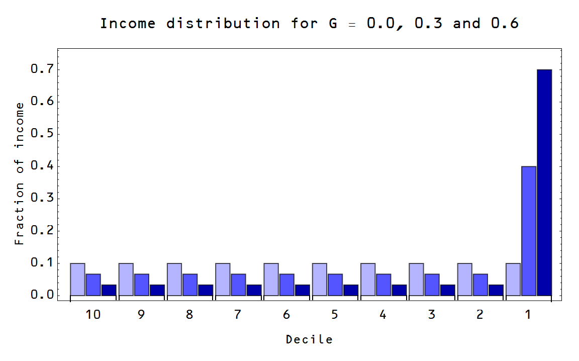
I used and extremely simple model of an unequal population where I assigned equal probabilities to every symbol except one ("the rich", the top 1%, etc). Here are couple of sample populations with different Gini coefficients:


The math is pretty straightforward (I'll spare you the details), but I managed to derive the rather beautiful result (in terms of Gini coefficient) in the limit $s \rightarrow \infty$ (large number of agents)

$$
\kappa \sim \frac{s \log s}{(G s - s + 1) \log \frac{G s - s + 1}{s-s^{2}} - (G s + 1) \log (G + 1/s) }
$$

$$
\kappa \sim \frac{1}{1-G}
$$

Here is the plot of kappa versus Gini:


Or in terms of elasticity of demand $e^{D} \sim -1/\kappa \sim G - 1$ [corrected in update]


Effectively, higher Gini is higher inequality which is higher kappa.

Is there a signal of this effect in macro data? I looked at the difference between the local approximation of kappa fit to the price level compared to a baseline where $\kappa$ is given by $\log MB/\log NGDP$ as I showed here.  Here is the graph of DELTA kappa alongside the Picketty-Saez inequality data:


It's not very convincing, but it was interesting to think about.

Wednesday, March 5, 2014

The Fed's effective unemployment rate target

I thought this would be an interesting way to present the model results from the previous post: if we use the effective Fed funds rate instead of the 3-month rate, what we'd get is an estimate of the effective Fed target unemployment rate. Here is the graph (actual unemployment rate in green, model result in red):


This puts a different spin on the mid-2000s peak. The Fed appears to be unsuccessfully trying to raise the unemployment rate from this perspective.

Modeling macroeconomic fluctuations

Since I've been heavy into the policy implications of the information transfer model in the past few posts, I thought I'd return to some more speculative research. I've touched on the topic of macroeconomic fluctuations before (see e.g. [1], [2]), but I thought I'd do some thinking out loud.

The main idea is that the information transfer model P:D→S with where demand information (ID) is equal to supply information (IS) represents an upper bound P on the price P in the market**. Since information transferred to the supply can never be greater than the information coming from the demand, the actual price realized P* in the market is going to fall below this level (or the supply or demand will fluctuate). If ID > IS for aggregate demand D and aggregate supply S, then let's define 0 < ε < 1 such that ε ID = IS where we will call ε  the information transfer efficiency. Our model of macroeconomic fluctuations is then a model of fluctuations in ε where the efficiency in each individual market {ε1, ε2, ε3 ...} are all proportional to ε. This model will turn out to be at best a first order approximation but interesting nonetheless. Yes, this can be considered just a re-hash of total factor productivity, but I think macroeconomic fluctuations arising from information transfer inefficiency in the market rather than animal spirits or that the cycle represents a real thing is a useful re-framing of the conversation.

To be concrete, we'll look at two markets: r:NGDP→MB (interest rate) and P:NGDP→U (unemployment). P will be described by the CPI less food, energy, U is the total number of people unemployed and r is the 3-month and 10-year interest rate (using the monetary base MB =  reserves + currency for the former and just the currency component for the latter -- see here). Here are the model fits and the data:


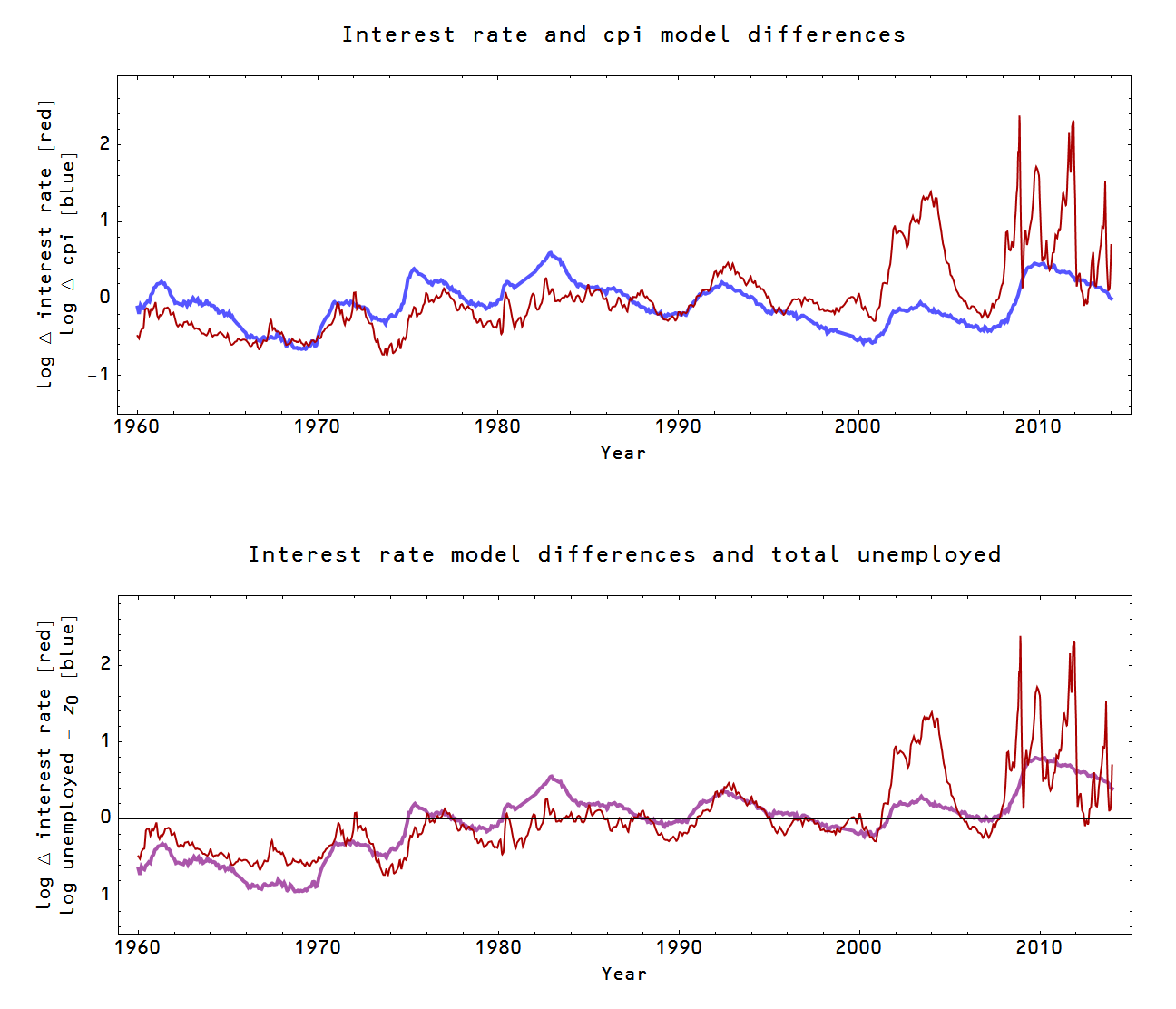
In the interest rate market, the price (interest rate, especially the 3-month rate) appears to do the lion's share of the adjusting to changes in information transfer efficiency ε while in the employment market, the number of people becoming unemployed does the adjusting. This makes intuitive sense: there is an active market for US treasuries while NGDP and the base don't move very fast. Likewise in the unemployment market, NGDP and the price level are slower to adjust, so layoffs do the adjusting. In the picture above, I've drawn a red arrow to suggest the possibility that these fluctuations are related to the same underlying fluctuating information transfer efficiency ε per the thesis of this post. The (log) differences (Δ) in the models -- in the case of the interest rate market it is the double difference (10 year rate model - data) - (3 month rate model - data) -- show qualitatively similar behavior (top graph):


In the bottom graph (purple), I have a simpler model log U - z0 instead of the CPI model differences which seems to work as well if not better. Both the simpler unemployment model and the CPI unemployment model miss the big fluctuation in the interest rate market in the mid 2000s and I believe we are seeing zero-bound related effects in the interest rate market post-2008. 

These results imply that the information transfer efficiency model (ε-model) is a good order of magnitude estimate, but still not ready for prime time. There appears to be a significant fluctuating component unique to each individual market.

** ID = IS. The shorthand notation P:D→S means that the price P is detecting information transferred from the demand (information source) to the supply (information destination). See here.

UPDATE: Edited for a marginal improvement in clarity in red and cross-outs.

Thursday, February 27, 2014

Monetary Abenomics has not generated inflation

Scott Sumner makes the claim (linking to Marcus Nunes) about Abenomics:
The data suggests that the new BOJ policy has raised inflation, and inflation expectations.  There is a mountain of evidence on that point.
I am skeptical that the "evidence" shows what Sumner and Nunes claim it shows. Why? Because my model shows the exact same rise in inflation (the red line is the core inflation cited by Sumner and graphed by Nunes): 


Wait, because I get the same inflation out of the model I say that their claim is unfounded? You heard me right. You see, the model I am using assumes no impact from monetary policy under Abenomics. Basically, you'd see almost the same rise in inflation without the QE under Abenomics. The graph also suggests that the inflation was a result of the fiscal expansion under Abenomics -- it is important to note that model result (which is a function of NGDP and the monetary base) doesn't depend on the fiscal counterfactual (which involves a guess about NGDP without fiscal expansion). But if you assume naively that NGDP' = NGDP + ΔG from Abenomics, then you can account for almost the entire rise in inflation.

Now that I've destroyed the market monetarists' claim that Abenomics is a natural experiment that proves them right, let me go on to claim that any claims about the effect of Abenomics are still mired in uncertainty. You shouldn't trust anyone that makes strong claims about the effect of monetary or fiscal policy.

Let's start with the model: it's pretty good (better than anything I've ever seen), but not perfect. Here is the price level:


Those seasonal fluctuations wreak havoc on the derivative of the price level (inflation). There are a couple of ways economists deal with this. One is to subtract out the seasonal fluctuations -- this involves a model and requires essentially a stable background which makes looking at changes in the background difficult, especially over a short time scale. Another is to look at year-over-year inflation rate. It assumes that monthly measurements should be at the same point in the annual cycle each year, and via the mean value theorem, YOY represents an annual average of the inflation rate. This is the inflation rate used in the graph by Nunes as well as in the graph at the top of this post (it is derived from the same 'core-core' CPI data set).

Using YOY already produces some issues. For example, the first points after Abenomics supposedly begins at the start of 2013 where inflation starts to take off represent an average over several months before Abenomics begins! Another issue is that YOY is very sensitive to data error, especially when your derivative is small (and the result you're after is down in the noise) because it depend on only two data points. In this graph, I show both the derivative (dashed) and the YOY average (solid):


You can see that the derivative is much noisier, but you can also see that the YOY average is way down in the noise and is equivalent to a smoothing of the derivative data. How much would you trust someone who said they smoothed the dotted red curve to the solid red curve and claimed the small rise (on this scale) is significant? This is not to say it is wrong! It's just way too early to tell.

The noisy data, model dependence and general uncertainty all become more apparent when you look at the longer run:


The graph at the top of this post is inside the box. You can see that both the model error as well as the measurement error are significant compared to the size of the effect we're supposed to be seeing. It is even more problematic when you consider what else we're supposed to be swallowing. The market monetarist view requires fiscal policy to have negligible impact, and has no numerical estimate for the actual rise. Not only does the rather simplistic model I'm using give you a numerical estimate consistent with the observed rise in inflation without changes in monetary policy, the addition of a naive model of the impact of fiscal policy is sufficient to account for the entire recent rise in inflation over the 20-year deflationary trend. The model I'm using was also created before we had data from 2013 and works for other countries.

And if that wasn't enough, the recent rise over the low at the start of 2013 is perfectly in line with linear trend that begins in 2010 (shown in the graph), two full years before Abe takes office.

Tuesday, February 25, 2014

Did the Fed offset the ARRA?

In the previous post, I looked at the effect of the ARRA. Now there exist claims of "monetary offset", i.e. that the Fed didn't do as much monetary expansion as would have happened if there was no stimulus, negating all or part of the effect of the stimulus.

This claim is strongly dependent on the counterfactual path of monetary policy, but I plan to address it indirectly by asking how much would the Fed have to do to either negate (offset) the ARRA completely or supplant it (i.e. produce an effect equal to the ARRA in its absence). This analysis boils down to: No, the Fed didn't offset the ARRA -- the ARRA had the effect I show in my previous post (reducing unemployment by about 2.5%, and otherwise having an effect comparable to other estimates of the impact), and Ramesh Ponnuru is incorrect.

Update 9/30/2014: In the following I refer to the "monetary base", but I am ignoring central bank reserves (i.e. this is the currency component of the monetary base).

First I will look at the "money channel", which is the impact of monetary policy on the price level. This is based on the Fed's implicit inflation target. In the graph I show the paths of the monetary policy that would offset the ARRA (dotted) or supplant it (dashed):


The actual path taken appears as a solid red curve. Now, how do we interpret this graph? Since we don't really know what the counterfactual would have been without the ARRA, all we can do is look at the size of the adjustments required and realize they are enormous. It's a reductio ad absurdum arugment: the Fed would have had to keep the base constant at $800 billion or raise it by 20% relative to that constant. In reality, the Fed raised the base by about 10% relative to the $800 billion, but it is impossible to say what the Fed would have done without the ARRA. It would be some path between the dotted and dashed line, but we can't know where exactly.

This argument might be a little clearer when we look at the "interest rate channel" (i.e. the Fed raising interest rates to offset the ARRA or lowering them to achieve the same stimulus as the ARRA). This is based on the Fed's explicit interest rate targets. I previously used the IS-LM model to estimate this effect here using a IS-curve slope ~1. In the graph I show the paths of the monetary policy that would offset the ARRA (dotted) or supplant it (dashed):


The actual path taken again appears as a solid red curve. Here, the Fed doesn't have to make as heroic an effort. In fact, it appears likely that the Fed moved enough (i.e. refrained from lowering rates enough) in the interest rate channel to offset the effect of the ARRA -- but in that channel only. Essentially, in the IS-LM market, the delta G was offset by a delta M. In the counterfactual universe without the ARRA, we might have expected the Fed to have done more [1].

The Fed likely "offset" the entire IS-LM market effect, which makes the analysis in the previous post more accurate since it ignored the interest rate channel [2], showing results for the price level only. Since the monetary policy and fiscal policy were both attempting to improve the economy, the Fed would have done more in the absence of the ARRA, but the effect in this channel would likely have been the same in the two cases (the Fed acts in a universe with the ARRA vs the Fed acts in a universe without the ARRA). The Fed might have lowered interest rates more, but that would have produced the same results as the Fed lowering interest rates less coupled with the ARRA.

[1] The short term rates were driven to zero by rounds of QE, but the long term rates remained above the zero bound. The Fed would have printed more currency, lowering long term rates.

[2] I looked at how the ARRA increased interest rates (crowding out) in the previous post, but did not translate that increase into a negative effect on output.

The effect of the ARRA

I had previously looked into the effect of the ARRA ('the stimulus'), but I forgot to include the effect of the tax cut component (which I was reminded of by this Krugman lecture). So here's an update; I've also updated these with the more accurate monetary model. Here are the results as a rather sparse gallery of graphs.

Here is the effect on the price level (pretty small):


Here is the effect on inflation (it generates a spike of inflation at the onset and takes it back as the stimulus fades):


Here is the effect on interest rates ("crowding out" of about 20 basis points on long term rates, about 5 bp on short term rates):


Here is the effect on unemployment:


Here is the change in unemployment rate (it shaved about 2.5 percentage points off the peak):


Here is the effect on RGDP:


And finally, here is an "apples to apples" comparison with the other estimates from the table in Krugman's lecture linked above (the information transfer model is basically in line with these, the shaded region is the CBO estimate which was given as upper and lower bounds):


This model ignores the "interest rate channel" in the sense of the IS-LM model (see e.g. here). This turns out to be a pretty good assumption as I discuss in the next post!