Monday, August 27, 2018

UK interest rate model performance

I haven't been showing the performance of the UK 10-year interest rate model comparable to this one for the US (that I originally showed here). It turns out that the UK model is doing quite well (as opposed to the US version which appears to be subjected to a bit of a shock sometime between 2015 when the forecast was made and today ...). Click to enlarge:


In fact, just after the Brexit vote the UK rates deviated from the expected model error by about as much as the recent US data has, but by 2017 the "Brexit shock" had faded. Was the Brexit shock to interest rates transitory, while the election shock more durable? The "shock" view does give a reason for the US data to deviate from the model forecast (however, so does the "recession indicator" view).

I would also like to note that the dynamic equilibrium model of the Moody's AAA data doesn't show any major shock:


However, that model also sees the US model at the top of this post as under-estimating the expected interest rate in recent years (for more information see here).

Monday, August 20, 2018

Dynamic equilibrium: inflation forecast update

The inflation data has continued to be consistent with the forecast confidence limits since 2017, and the latest data out over a week ago is no different. It's true these confidence limits are pretty wide. Year over year inflation should've been between −0.1 and +4.0% last month according to the model (the value was 2.9%). Next month, the model says it should be between 0.0% and 4.1%. But this spread is comparable to the NY Fed's DSGE model for PCE inflation nearly two years out (which is a more stable measure than CPI). And the dynamic equilibrium model only has four parameters [1]!

The solid red line is the original forecast and the dashed line shows an update of the shock parameters I made in March of this year (after the "lowflation" shock ended). As the change was negligible (i.e. well inside the confidence bands), it's shown for informational purposes. Below, I show continuously compounded (i.e. log derivative) and year over year changes in CPI (all items) along with the CPI level. (Click to enlarge.)


...

Update 18 September 2018

I didn't think there was any real need to write an entirely new post for the data that came out in September, so here's the graph with the latest post-forecast data:


...

Footnotes:

[1] Over the period from 2010 to 2020. If we include the data back to the 1960s, there is another shock adding three more parameters — but the contribution of those additional parameters has been exponentially suppressed since the 1990s.

Wednesday, August 15, 2018

Shifts and drifts of the Beveridge curve


As a follow up to my post on long term unemployment, I wanted to discuss the Beveridge curve. Gabriel Mathy discusses changes to it in his paper (ungated version here). He shows how there are differences in shifts in the Beveridge curve for short and long term unemployment (click to enlarge):


In an earlier version of the paper, he includes a graphical explanation:


The dynamic information equilibrium approach also describes the Beveridge curve with a formally similar "matching" framework described in my paper. However, one of the primary mechanisms for shifts of the Beveridge curve is actually just a mis-match in the (absolute value of the) dynamic equilibria, i.e.

\begin{eqnarray}
\frac{d}{dt} \log \frac{U}{L} = - \alpha + \sum_{i} \frac{d}{dt} \sigma_{i}(a_{i}, b_{i}; t-t_{i})\\
\frac{d}{dt} \log \frac{V}{L} = \beta + \sum_{j} \frac{d}{dt} \sigma_{j}(a_{j}, b_{j}; t-t_{j})
\end{eqnarray}

with $\alpha, \beta > 0$ — the difference in sign means you get a hyperbola. I can illustrate this using an idealized model with several shocks $\sigma_{i}(t)$. Let's keep $U$ constant, but change the relative parameters of $V$ (altering the dynamic equilibrium $\Delta \alpha$, the timing of the shocks $\Delta t$ and the amplitude of the shocks $\Delta t$). Here are $U(t)$ and $V(t)$ (click to enlarge):


If everything is the same ($\alpha = \beta$, $\Delta t = \Delta a = \Delta b = 0$), then you get the traditional Beveridge curve that doesn't shift:


Changing the dynamic equilibrium ($\alpha \neq \beta$) gives you the drift we see in the data:


This means the drift is due to the fact that (in the regular model) $\alpha$ = 0.084 and $\beta$ = 0.098 (vacancy rate increases at a faster rate than the unemployment rate falls). If we look at changes to the timing $\Delta t$ and amplitude $\Delta a$ of the shocks, we get some deviation but it is not as large as the change in dynamic equilibrium rate:


Combining the changes to the amplitude and timing also isn't as strong as changing the dynamic equilibrium ($\Delta \alpha$):


But if we do all of the changes, we get the mess of spaghetti we're used to:


...

PS I didn't change the widths of the shocks ($\Delta b$) because ... I forgot. I will update this later showing the effects of changing the widths. Or maybe I will remember to do it before this scheduled post auto-publishes (unlikely).

...

Update

The $\Delta b$'s add adorable little curlicues (click to enlarge):


Something has changed in long term unemployment

I read a paper by Gabriel Mathy today (an earlier version appears here) about long term unemployment. We'll use the BLS definition of being unemployed 27 weeks or more, available from FRED here. Mathy notes that in the aftermath of the Great Depression, long term unemployment decreased (relative to unemployment) — and that this hasn't happened in the aftermath of the Great Recession. It's referred to as "hysteresis" in economics, borrowing a term in physics (coined by Ewing in the late 1800s) used to describe e.g. a history dependence in magnetization.

I looked into it using the dynamic information equilibrium model (my paper describing the approach is here), and sure enough it seems something has changed in long term unemployment. Here's the basic model description of the data since the mid-1990s


We find the structure is similar to the unemployment rate. If we look at an "economic seismograph" (which represents the shocks) with various other labor market measures including job openings from JOLTS and Barnichon, we can see the overall structure is similar:


As expected, the shocks to unemployment longer than 27 weeks appear about 27 weeks after the shocks to unemployment (the arrows show the recession as well as 27 weeks later). However, we can see one other difference between the unemployment rate U and the long term measure in the relative size of the shocks (i.e. relative magnitude of the colors). The shocks to long term unemployment are comparable, while the shocks to unemployment show smaller shocks for the recessions prior to  the Great Recession. However, eyeballing this diagram isn't the best way to compare them — a small narrow shock can appear darker than a wider larger shock (it's the integrated color density that matters).

So let's look back a bit further in time:


Here we can see an effect that looks like the same "step response" (overshooting +  oscillations) we see in the unemployment rate, except a bit stronger. It also decreases over time, just like it does for the unemployment rate. But the big difference is that the size of the earlier shocks for long term unemployment are very different from the size of the shocks to the unemployment rate. A good way to see this by scaling the unemployment rate to match long term unemployment; to match the data before the 1990s, you need a scale factor of about α₁ = 2.6, but after the 90s you need one more than twice as big — α₂ = 5.3:


A 1 percentage point increase in unemployment in the 1960s and 70s led to a 2.6 percentage point increase in the fraction of long term unemployment 27 weeks later. In the Great Recession, that same increase in unemployment rate led to a 5.3 percentage point increase in the fraction of long term unemployment 27 weeks later.

Somthing happened between the 70s and the 90s to cause long term unemployment to become cumulatively worse relative to total unemployment.

The "proper frame" in the dynamic equilibrium approach is a log-linear transformation such that the constant rate of relative decline (i.e. the "dynamic equilibrium") is subtracted leaving a series of steps (which represent the "shocks"). We look at 

U(t) → log U(t) + α t + c

I also lagged unemployment by 27 weeks to match up the shock locations. If we do the transformation for both measures, we can see how long term unemployment declined relative to unemployment before the 1990s (labelled a, b, and c) in the graph.


However, the decline was tiny going into the 1990s recession (labeled 'd'), and non-existent afterwards (the ?). The 90s recession was also when the level of long term unemployment started to increase relative unemployment. Looking at the difference between these curves, we can see that starting in the 90s the recession shocks started to accumulate long term unemployment:


In order to keep them at roughly zero difference (i.e. the same scale) in equilibrium (i.e. after recessions), we have to subtract cumulative shocks (arrows). In the figure, I subtracted 0.37, then 0.37 + 0.25 = 0.62, then 0.37 + 0.25 + 0.35 = 0.97.

What is happening here? It seems in the past there used to be a point when labor became scarce enough that employers started hiring the long term unemployed at a faster rate. At some point, e.g. experience outweighs the negative effect of being unemployed for over 6 months. That's just a story, but it's one way to think about it. One possibility to explain the change is that it takes longer for that faster decline in long term unemployment to kick in such that another recession hits before it can happen. Another possibility is that there's just no pick-up in hiring the long term unemployed — employers see no real difference between an experienced worker who has been unemployed for 27 weeks and a worker without experience.

But the data is clear — the past few recessions just add to the fraction of long term unemployed relative to total unemployment and there hasn't been any subsequent recovery.

Monday, August 13, 2018

Wage growth update

The Atlanta Fed has its latest wage growth data up on their website. The post-forecast data is in black while the dynamic information equilibrium model is in green. We could potentially make a case that the "bump" that occurs in 2014 is fading out, but it's within the model error.


...

Update

I didn't think it warranted its own post, so here are a few more labor market measures. Discussion is effectively the same as for this post from a few months ago. Click to embiggen.


Also, Ernie Tedeschi posted a fun graph of changing CBO forecasts for the employment population ratio. Unfortunately, I didn't produce a forecast for the exact measure in the graph, but through the magic of ALFRED, I can show what a forecast I would have made back in January 2017 for this measure would have looked like today:


Update 19 September 2018

Here's the September release data; I didn't think it warranted its own post so I just updated this one.


Wednesday, August 8, 2018

Tractability and scope


Yes, your fantastic model will reproduce all sorts of stuff and will be great at forecasting—for some time, maybe even a long time—, but I will always be able to find some features of reality that will be of some relevance to some people that your model does not capture (as long as it is a model and not a perfect reproduction of reality itself, which I am not sure I would refer to as a model). And, sooner or later, human creativity will produce something that your model cannot forecast. A crisis will happen, and bashers of all types will again be screaming that we have to throw away the entire toolkit and start back from square one.  
That's Fabio Ghironi in his recent note on tractability [pdf] that's worth reading. I chimed in on this discussion back in April with a different focus. However Prof. Ghironi's take brings me back to Noah Smith:
I have not seen economists spend much time thinking about domains of applicability (what physicists usually call "scope conditions"). But it's an important topic to think about.
While this physicist didn't call them scope conditions, the concept is valid enough. One of the questions at my thesis defense was about the scope of the model I was using. I didn't have a great answer [1], so the subject has been burned in my brain. Scope defines where the model is valid and where it isn't. Sometimes you have an explicit mathematical representation (Newtonian physics is valid for velocities that are small compared to the speed of light — v << c). Sometimes it's more qualitative. I wrote more about scope in a post from a few years ago.

Prof. Ghironi's statement [of the criticism] loses a lot of its impact if we have a model with well-defined scope. Sure, you can eventually find a case it doesn't work for — but is it in scope? If no, then it's like saying Newtonian physics doesn't work for relativistic velocities — it's obvious. If yes, then we've learned more about the scope of the model. That's it. We don't have to throw anything away.

The other aspect of scope conditions is that they act like firewalls for your theory or model — just because you find one fact that doesn't agree with your model doesn't mean the entire model is burned to the ground (such that you have to "start back from square one"). There's scope that limits the damage. Quantum mechanics didn't burn down all of the successes of classical physics, just the parts where the change in action dS was comparable to Planck's constant — dS ~ Δp Δx ~ ℏ. Real understanding of a model is in understanding its scope. It's true that for a new model, you might not know the scope at first. Over time, empirical and theoretical results will show the limitations (e.g. physics did not know that Newtonian physics even had explicit theoretical scope conditions until Einstein and Planck).

Part of the problem with the ubiquitous DSGE models is that their scope is ill-defined (at least in my reading of the papers). But this issue is not limited to DSGE. What is the scope of Diamond-Dybvig? What is the scope of a basic supply and demand diagram? One of the benefits of the information equilibrium approach (in my opinion) is that it makes scope more well-defined — an example in my first paper on the subject derives the IS-LM model and notes that because of the assumptions made in the derivation it only applies when inflation is low (the high inflation limit is effectively the "quantity theory of money"). I make an empirical case that "money" (however defined) is only important when inflation is high. With an ill-defined scope, a (purported) failure like not being able to forecast the global financial crisis burns the whole theory down like a building with no fire doors.

However! Every assumption (even an implicit assumption) that goes into a model becomes (or is related to) a scope condition. Newtonian physics implicitly assumes velocities can be infinite. Given the assumptions that go into DSGE models, maybe they only work near a macroeconomic equilibrium? This is basically the idea behind David Glasner's discussion of "macrofoundations" of micro. I've actually made a case that representative agents and utility may only be in-scope near equilibrium (see here, here, and here) — but they are in-scope under those conditions and therefore useful concepts. This may not be comforting to many people, per Keynes famous quote:
In the long run we are all dead. Economists set themselves too easy, too useless a task, if in tempestuous seasons they can only tell us, that when the storm is long past, the ocean is flat again.
If DSGE models are only valid near the E, then maybe they're not useful for understanding major recessions. Of course, this means that a major recession wouldn't invalidate the model — it'd just be out of scope.

This brings us back to the assumptions made for tractability — what scope do they set and where do those assumptions break down? If the assumptions made in order to make your model tractable limit the scope of your model to an epsilon-sized ball in an n-dimensional space, what use is the fact that the mechanisms are now accessible and understandable? In that sense, assumptions made for tractability need to be understood in terms of the scope they limit [2]. For example, the transversality conditions that make the RCK model tractable (i.e. yield sensible solutions) can be seen as the entire economic content of the model (with the rest just being "accounting") effectively yielding a result with zero scope (i.e. the RCK model is invalid outside of the saddle path). That's just a basic econ example, and I think I will try to explain using a more relevant example in a future post.

...

Footnotes:

[1] It was complicated because there was an explicit scope that involved the large-Nc approximation to QCD [pdf], an explicit scale set by the regulator, and an additional scope limitation derived from the lack of confinement that was more qualitative (i.e. not well understood because it is more an empirical fact that is consistent with QCD but not explicitly derived in it — there is an "effective force" that increases linearly with distance implying that as quarks separate they would have to generate almost infinite energy to become "free" but this isn't the same thing as theoretically proving confinement from an SU(3) Yang Mills gauge theory).

[2] Putting my money where my mouth is, there are several assumptions that go into the information equilibrium approach — agents explore the state space ("ergoditicy"), the number of transactions or agents are very large, the time spent in non-equilibrium states like recessions is short compared to the time series data (particularly for the shocks in the dynamic equilibrium approach). These all limit the scope.

Tuesday, August 7, 2018

JOLTS data and the counterfactual 2019 recession update

The latest JOLTS data was released today for the US labor market; the last time I updated the forecasts/recession counterfactuals was here. There's not much to say except that the flattening of the job openings rate continues along with the correlated deviations from the model in the other measures (hires, quits, separations) indicating the start of a possible recession. Here are the graphs (post-forecast data in black) showing both the no-shock and recession shock counterfactuals. Click for the full resolution versions.


Here is the Beveridge curve (latest point is white with black outline):


The model is described in my paper. Some extended discussion of this analysis (in response to comments) is here.

The counterfactual recession date is set for 2019.7 above per the yield curve analysis here based on multiple interest rate spreads. This early in the (hypothetical!) downturn, the shock fits are unstable and fixing the time improves the convergence. In previous analysis, I showed the result for multiple shock timings and presented it as an animation. However I think those animations can be a bit confusing — easily misinterpreted as a progression in time rather than a progression in parameter space that has units of time.

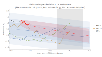
Here's the latest look at those interest rate spreads (recent data in red, with an AR process estimate of the deviation from the linear model). The second graph shows a zoomed-in version.


Monday, August 6, 2018

Validating forecasts: unemployment rate edition

Unemployment rate data was released on Friday, and the points continue to follow the dynamic information equilibrium model (DIEM) forecast (the model is described in my paper). I tweeted on July 31 that the result would be "4.0 ± 0.2 % (90% c.l.)" according to the DIEM which turned out to be correct (3.9%), but like for the May data (released in June) it could easily have been outside that confidence limit. At the time I didn't put too much weight on it, and you shouldn't put too much weight on this single point either. In fact, Noah Smith wrote a needed article on commentary (including his own example) that puts too much weight on the latest single data points. That's one reason why I track these forecasts over extended periods of time. Here's the latest data compared to the DIEM (in gray, all post-forecast data is in black, pre-forecast data is blue) as well as several vintages of forecasts (red) from the Federal Reserve Board of San Francisco (FRBSF) released in their FedViews publications:


However, since I've been tracking this forecast for awhile now, we can probably say with confidence that the FRBSF forecast with December 2016 data from 12 January 2017 (red) was outperformed by the DIEM of comparable vintage made 18 January 2017 (gray). Even if the data was inside the (unknown) error bands of the FRBSF model, those error bands would have to be larger than the error bands of the DIEM meaning it was a measurable improvement (two predictions that predict the same thing with one being more precise — as long as it isn't a single data point — implies the more precise one is the better model). Here's that forecast on its own:


...

Update 7 August 2018

One of the great things about the St. Louis Fed FRED data portal is that it has a related site for vintage time series called ALFRED (for ArchivaL FRED). We can see how the dynamic information equilibrium model would have performed using data available at the time (pre-revisions). Using the data from early 2016, I can show the apples-to-apples performance of the DIEM against a Minneapolis Fed VAR model:


Using the old data nudges the model prediction down a bit, and also increases the 90% confidence bands a bit. I can use the same series to compare against the various vintages of the FRBSF forecast above:


Thursday, August 2, 2018

Interest rates, yield curves, and debt growth

[File under unwarranted speculation.]

This represents a speculative synthesis of some analysis I've done using the dynamic information equilibrium model on [1] debt growth, [2] yield curve inversion, [3] higher than "expected" interest rates, and [4] the possibility of coming recession. In particular, I noticed that the shocks to the debt growth indicator (green) — net debt issuance relative to assets — in Credit-Market Sentiment and the Business Cycle by David Lopez-Salido, Jeremy C. Stein, and Egon Zakrajsek (2015) I looked at in [1] seemed to match up with cases where the flattening AAA - 3 month spread fell within the error of the Moody's AAA model (blue):


Click to enlarge for all graphs. That is to say: is the debt growth indicator another measure of the yield curve indicator? When e.g. the 3-month rate becomes comparable to the AAA rate, does debt growth suddenly slow? Unfortunately the data from Lopez-Salido et al (2015) was too coarse to get a firm estimate of the timing (uncertainty in the location of the "shocks" to debt growth is shown as green bands). Here's a zoom in on the more recent data with the simple linear extrapolation of the 3 month rate:


Latest daily AAA data is in black. This is effectively the same picture I've been showing looking at all the interest rate spreads in [2]:


Latest (daily) data is in red this time. There's also the "above expected" interest rate indicator in [3]; current 10-year rates are above the "expected" (i.e. information equilibrium) value:


This indicator doesn't really get us any timing information, though. Recessions have rarely occured when the rate was below the expected value, but when rates are over the value there is variable amount of time before the recession hits. I've made a speculative analogy with avalanches before — above expected rates are like snow building up on a mountain, and it likely takes some trigger to set off the avalanche (i.e. recession). In general, all of these measures point to a recession in the 2019-2020 time frame that is consistent with the labor market data (JOLTS) in [4].