Tuesday, October 31, 2017

Can a macro model be good for policy, but not for forecasting?

During the course of an ongoing debate with Britonomist sparked by my earlier post, he argued that a model that isn't designed for forecasting shouldn't be used to forecast. But if it's not good for forecasting, it can't be good for e.g. policy changes either. In fact, without some really robust reasoning or empirical validation a model that can't be used to forecast can't be used for anything.

Now Britonomist is in good company as Olivier Blanchard has said almost the exact same thing he said in his blog post on five classes of macro models where Blanchard separated policy models from forecasting models. But I think that's evidence of some big fundamental issues in economic methodology. As I'm going to direct this post at a general audience, please don't take me being pedantic as talking down to Econ — on my own, I'd probably write this post entirely in terms of differential geometry on high dimensional manifolds (which is what the following argument really is).

The key assumption underlying the ability to forecast or determine the effects of policy changes is the ceteris paribus assumption. The basic idea is that the stuff you don't include is either negligible or cancels out on average. It's basically a more specific form of Hume's uniformity of nature. Let's think of the ceteris paribus condition as a constraint on the ocean underneath a boat. The boat is our macro model. You can think of the un-modeled variables as the curvature of the Earth (the variables that vary slowly) and the waves on the ocean (the variables that average out). [After comment from Britonomist on Twitter, I'd like to add that these are just examples. There can also be "currents" — i.e. things that aren't negligible — in the ceteris paribus condition. In physics, we'd consider these variables as ones that vary slowly (i.e. the current is roughly the same a little bit to the west or south), but people may take "vary slowly" to mean aren't very strong which is not what I mean here.]

Here's a picture:


The ceteris paribus condition lets us move the boat to the west and say that the sea is similar there so our boat still floats (our model still works). We only really know that our boat floats in an epsilon (ε) sized disk near where we started, so checking that it floats when we move west (i.e. comparison to data) is still important.

Now let's say east-west is time. Moving west with the boat is forecasting with the model. Moving north and south is changing policy. We move south, we change some collection of policy parameters in, say, the Taylor rule for a concrete example. The key takeaway here is that the ceteris paribus condition under the boat is the same for both directions we take the model: policy or forecasting.


It's true that the seas could get rougher to the south or a storm might be off in the distance to the northwest which may limit the distance we can travel in a particular direction under a given ceteris paribus scenario. But if we can't take our model to the west even a short distance, then we can't take our model to the south even a short distance. A model that can't forecast can't be used for policy [1]. This is because our ceteris paribus condition must coincide for both directions at the model origin. If it's good enough for policy variations, then it's good enough for temporal variations. Saying it's not good enough means knowing a lot about the omitted variables and their behavior [2].

And the truth is that looking at forecasts and policy changes are usually not orthogonal. You look at the effect of policy changes over a period of time. You're usually heading at least a little northwest or southwest instead of due south or due north.

But additionally there is the converse: if your model can't forecast, then it's probably useless for policy as well unless that manifold has the weird properties I describe in footnote [1]. Another way to put this is that saying a model can be used for policy changes but not forecasting implies an unnaturally large (or small) scale defined by the ratio of policy parameter changes to temporal changes [3]. Movement in time is somehow a much bigger step than movement in parameter space.

Now it is entirely possible this is actually the way things are! But there had better be really good reasons (such as really good agreement with the empirical data). Nice examples where this is true in physics are phase transitions. Sometimes a small change in parameters (or temperature) leads to a large qualitative change in model output (water freezes instead of getting colder). Effectively saying a macroeconomic model that can be used for policy but not forecasting is saying there's something like a phase transition for small perturbations of temperature.

This all falls under the heading of scope conditions. Until we collect empirical data from different parts of the ocean and see if our boat floats or sinks, we only really know about an "epsilon-sized ball" near the origin (per Noah Smith at the link). Empirical success gives us information about how big epsilon is. Or — if our theory is derived from a empirically successful framework — we can explicitly derive scope conditions (e.g. we can show using relativity that Newtonian physics is in scope for v << c). However, claims that a macro model is good for policy but not forecasting is essentially a nontrivial claim about model scope that needs to be much more rigorous than "it's POSSIBLE" (in reference to my earlier post on John Cochrane being unscientific), "it's not actually falsified", "it's just a toy model", or "it makes sense to this one economist".

And this is where both Blanchard and Britonomist are being unscientific. You can't really have a model that's good for policy but not forecasting without a lot of empirical validation. And since empirical validation is hard to come by in macro, there's no robust reason to say a model is good for one thing and not another. As Britonomist says, sometimes some logical argument is better than nothing in the face of uncertainty. People frequently find as much comfort in the pretense of knowledge as in actual knowledge. But while grasping at theories without empirical validation is sometimes helpful (lots of Star Trek episodes require Captain Picard to make decisions based on unconfirmed theories, for example), it is just an example of being decisive, not being scientific [4].

...

Footnotes

[1] This is where the differential geometry comes in handy. Saying a model can be used for policy changes (dp where p is the vector of parameters) but not for forecasting (dt where t is time) implies some pretty strange properties for the manifold the model defines (with its different parameters and at different times). In particular, it's "smooth" in one direction and not another.

Another way to think of this is that time is just another parameter as far as a mathematical model is concerned and we're really looking at variations dp' with p' = (p, t).

[2] Which can happen when you're working in a well-defined and empirically validated theoretical framework (and your model is some kind of expansion where you take only leading order terms in time changes but, say, up to second order terms in parameter changes). This implies you know the scale relating temporal and parameter changes I mention later in the post.

[3] |dp| = k dt with k >> 1. The scale is k and 1/k is some unnatural time scale that is extremely short for some reason. In this "unnatural" model, I can apparently e.g. double the marginal propensity to consume but not take a time step a quarter ahead.

[4] As a side note, the political pressure to be decisive runs counter to being scientific. Science deals with uncertainties by creating and testing multiple hypotheses (or simply accepting the uncertainty). Politics deals with uncertainty by choosing a particular action. That is a source of bad scientific methodology in economics where models are used to draw conclusions where the scientific response would be to claim "we don't know".

Monday, October 30, 2017

Another forecast compared to data

New NGDP data is out, so I've added the latest points to see how this forecast of NGDP per employed person (FRED series GDP over PAYEMS) is doing:


Forecast head-to-head performance (and looking back)


Here's the latest data on core PCE inflation compared to my information equilibrium model (single factor production monetary model) along with the FRB NY DSGE model forecast (as well as the FOMC forecast) of the same vintage:


The IE model is biased a bit low by almost as much as the DSGE model is biased high (but the former is a far simpler model than the latter). I've been tracking this forecast since 2014 (over three years now). There's now only one more quarter of data left. What's probably most interesting is how I've changed in looking at this model. If I were writing it down today, I'd define the model as I do in the parenthetical: a single factor production model with "money" as the factor of production. In particular, I'd take the ensemble approach, considering a set of markets that turn "money" $M$ into various outputs ($N_{i}$):

$$
N_{i} \rightleftarrows M
$$

(notation definition here) such that (assuming $\langle k \rangle$ is slowly varying)

$$
\langle N \rangle \approx N_{0} \left( \frac{M}{M_{0}} \right)^{\langle k \rangle}
$$

with the ansatz (consistent with slowly varying $\langle k \rangle$)

$$
\langle k \rangle \equiv \frac{\log \langle N \rangle/C_{0}}{\log M/C_{0}}
$$

and therefore the price level is given by

$$
\langle P \rangle \approx \frac{N_{0}}{M_{0}} \langle k \rangle \left( \frac{M}{M_{0}} \right)^{\langle k \rangle - 1}
$$

The parameters here are given by

$$
\begin{align}
\frac{N_{0}}{M_{0}} = & 0.661\\
C_{0} = & 0.172  \;\text{G\$}\\
M_{0} = & 595.1 \;\text{G\$}
\end{align}
$$

for the case of the core PCE price level and using the monetary base minus reserves as "money".

Saturday, October 28, 2017

Corporate taxes and unscientific economists

I've been watching this ongoing "debate" among Brad DeLong, John Cochrane, and Greg Mankiw (and others, but to get started see here, here, here, and here). It started out with Mankiw putting up a "simple model" of how corporate tax cuts raise wages that he first left as an exercise to the reader, and then updated his post with a solution. The solution Mankiw finds is remarkably simple. In fact, it's too remarkably simple. And Mankiw shows some of the inklings of being an actual scientist when he says:
I must confess that I am amazed at how simply this turns out. In particular, I do not have much intuition for why, for example, the answer does not depend on the production function.
Cochrane isn't troubled, though:
The example is gorgeous, because all the production function parameters drop out. Usually you have to calibrate things like the parameter α [the production function exponent] and then argue about that.
The thing is that in this model, you should be at least a bit troubled [1]. The corporate tax base is equal to the marginal productivity of capital df/dk (based on the production function f(k)) multiplied by capital k i.e. k f'(k). Somehow the effect on wages of a corporate tax cut doesn't depend on how the corporate tax base is created?

But let's take this result at face value. So now we have a largely model-independent finding that to first order the effect of corporate tax cuts is increased wages. The scientific thing to do is not to continue arguing about the model, but to in fact compare the result to data. What should we expect? We should a large change in aggregate wages when there are changes in corporate tax rates — in either direction. Therefore the corporate tax increases in the 1993 tax law should have lead to falling wages, and the big cut in corporate tax rates in the 80s should have lead to even larger increase in wages. However, we see almost no sign of any big effects in the wage data:


The only large positive effect on wages seems to have come in the 70s during the demographic shift of women entering the workforce, and the only large negative effect is associated with the Great Recession. Every other fluctuation appears transient.

Now you may say: Hey, there are lots of other factors at play so you might not see the effect in wage data. This is the classic "chameleon model" of Paul Pfliederer: we trust the model enough to say it leads to big wage increases, but when they don't appear in the data we turn around and say it's just a toy model.

The bigger issue, however, is that because this is a model-independent finding at first order, we should see a large signal in the data. Any signal that is buried in noisy data or swamped by other effects is obviously not a model-independent finding at first order, but rather a model-dependent finding at sub-leading order.

This is where Cochrane and Mankiw are failing to be scientists. They're not "leaning over backwards" to check this result against various possibilities. They're not exhibiting "utter honesty". Could you imagine either Cochrane or Mankiw blogging about this if the result had come out the other way (i.e. zero or negative effect on wages)? It seems publication probability is quite dependent on the answer. Additionally, neither address [2] the blatant fact that both are pro-business Republicans (Mankiw served in a Republican administration, Cochrane is part of the Hoover institution), and that the result they came up with is remarkably good public relations for corporate tax cuts [3]. Cochrane is exhibiting an almost comical level of projection when he calls out liberal economists for being biased [4].

But the responses of DeLong [5] and Krugman are also unscientific: focusing on the mathematics and models instead of incorporating the broader evidence and comparing the result to data. They are providing some of the leaning over backwards that Cochrane and Mankiw should be engaged in, but overall are accepting the model put forward at face value despite it lacking any demonstrated empirical validity. In a sense, the first response should be that the model hasn't been empirically validated and so represents a mathematical flight of fancy. Instead they engage in Mankiw's and Cochrane's version of Freddy Krueger's dreamworld of the neoclassical growth model.

And this is the problem with economics — because what if Mankiw's and Cochrane's derivations and definitions of "static" analysis were mathematically and semantically correct? Would they just say I guess you're right — corporate tax cuts do raise wages. Probably not. They'd probably argue on some other tack, much like how Cochrane and Mankiw would argue on a different tack (in fact, probably every possible tack). This is what happens when models aren't compared to data and aren't rejected when the results are shown to be at best inconclusive.

Data is the great equalizer in science as far as models go. Without data, it's all just a bunch of mansplaining.

...

Update 10 Oct 2017: See John Cochrane's response below, as well as my reply. I also added some links I forgot to include and corrected a couple typos.

...

Footnotes:

[1] In physics, you sometimes do obtain this kind of result, but the reason is usually topological (e.g. Berry phase, which was a fun experiment I did as an undergraduate) or due to universality.

[2] I freely admit I am effectively a Marxist at this point in my life, so I would likely be biased against corporate tax cuts being good for labor. However my argument above leaves open the possibility that corporate tax cuts do lead to higher wages, just not at leading order in a model-independent way.

[3] It's actually odd that corporations would push for corporate tax cuts if their leading effect was to raise wages (and not e.g. increase payouts to shareholders), all the while pushing against minimum wage increases.

[4] In fact, DeLong and Krugman are usually among the first to question "too good to be true" economic results from the left (even acquiring a reputation as "neoliberal shills" for it).

[5] At least DeLong points out that Mankiw should be troubled by the lack of dependence of the result on the production function.

Thursday, October 26, 2017

Investment

Dietz Vollrath examines a paper by German Gutierrez and Thomas Philippon about "Investment-less Growth" asking "Where did all the investment go?" The question that's actually being asked (since FPI and even RFPI are in fact at all time highs) is why investment is so low relative to profits. In the end Gutierrez and Philippon connect at least in part to a complex function of market power (that I've discussed before).

The question I'd like to ask is what baseline should we be looking at? Investment is very volatile (fluctuating strongly through the business cycle), but there appears to be an underlying dynamic equilibrium — much like what happens in the previous couple of posts on real growth and wage growth:


Fixed private investment (FPI) is deflated using the GDP deflator like in the real growth post.

In this picture, we seem to have exactly the same picture we have with NGDP with two major shocks. We could potential describe both shocks in terms of the same demographic effects: women entering the workforce and Baby Boomers leaving/retiring after the Great Recession:


In fact, to a good approximation NGDP ~ FPI (a fact that I use in the information equilibrium version of the IS-LM model):


The above graph shows the FPI model scaled to match NGDP. The transitions (vertical lines) happen in roughly the same place (FPI's transitions are much narrower, however).

So is investment really a different metric from NGDP? Are the reasons FPI is what it is today different from the reasons NGDP is what it is today? Or is investment just given by something proportional to NGDP with an exaggerated business cycle? This doesn't conclusively answer this question, but it does act as a bit of an Occam's Razor: G&P's paper is quite a robust work at 94 pages long but "long run investment is proportional to GDP" captures the data more accurately with many fewer parameters (and no assumptions about e.g. firm behavior).

Tuesday, October 24, 2017

Wage growth

Sandy Black:
Nice discussion of why, since the 1970s, hourly inflation-adjusted wages of the typical worker have grown only 0.2% per year.
The linked article does "discuss" stagnant wages, but doesn't really say why. Their description of what makes wages grow is in fact just a series of mathematical definitions written as prose:
For wages to grow on a sustained basis, workers’ productivity must rise, meaning they must steadily produce more per hour, often with the help of new technology or capital. Further, workers must receive a consistent share of those productivity gains, rather than seeing their share decline. Finally, for the typical worker to see a raise, it is important that workers’ gains are spread across the income distribution.
The first part is a description of the Solow growth model with constant returns to scale, and a fixed exponent. The last bit is just tautological: a typical worker sees gains if and only if those gains are shared across the income distribution. They might as well have said that for a typical worker to see a raise, it is important that the typical worker sees a raise.

But then  the article just whiffs on any substantive explanation, telling us what "decline is plausibly due to" an that "[a]ssigning relative responsibility to the policies and economic forces that underlie rising inequality or declining labor share is a challenge." It talks about "productivity" and "dynamism", which are more quantifying the issues we are seeing than explaining them. While it is generally useful to quantify things, one must avoid creating measures of phlogiston or attributing causality to quantities you defined [2].

Anyway, I looked at hourly wages a couple months ago with the dynamic equilibrium model and found that the dynamic equilibrium growth rate was about 2.3% — therefore with 2% inflation, the real growth rate would be about 0.3%:


In this picture, wages going forward will continue to be "stagnant" because that is their normal state. The high wages of the past were closely linked with the demographic transition.

But this got me interested in the different possible ways to frame the data. Because we don't really have much equilibrium data (most of the post-war period is dominated by a major demographic shift), there's a bit of ambiguity. In particular, I decided to look at wages per employed person. I will deflate using the GDP deflator later (following this post, except with NGDP exchanged for W/L), but first look at these two possible dynamic information equilibria:


These show the data with a given dynamic equilibrium growth rate subtracted. One sees two transitions: women entering the workforce and baby boomers leaving it after the Great Recession (growth rate = 3.6%). The other sees just the single demographic transition (growth rate = 2.0%). These result in two different equilibria when deflated with the GDP deflator — dynamic equilibrium growth rates of 2.2% and 0.6%, respectively:


We can see that the 2.2% dynamic equilibrium is a better model:


The two models give us two different views of the future. In one, wages are at their equilibrium and will only grow slowly at about 0.6%/y in the future (unless e.g. another demographic shock hits). In the other (IMHO, better) model, wages growth will increase in the near future from about 1%/y to 2.2%/y. However both models point to the ending of the demographic transition (and the "Phillips curve era") in the 90s as a key component of why today is different from the 1970s, therefore (along with the other model above) we can take that conclusion to be more robust.

As for future wage growth? There isn't enough data to paint a definitive picture. Maybe wage growth will have to rely on asset bubbles (the first model at the top of this post)? Maybe wage growth will continue to stagnate? Maybe wage growth will happen after we leave this period of Baby Boomer retirements?

My own intuition says a combination of 1 (because they do in both the hourly wage and W/L models [1]) and 3 (because it is the better overall model of W/L).

Update

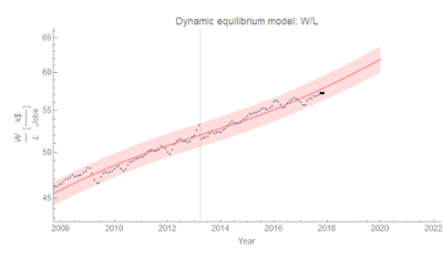
Here's a zoom-in on the W/L model for tracking forecast performance:


...

Footnotes:

[1] In fact, you can see the asset bubbles affecting W/L on the lower edge of the graph shown above and again here — there are two bumps associated with the dot-com and housing bubbles:


[2] Added in update: I wanted to expound on this a bit more. The issue is that when you define things, you have a tendency to look for things that show an effect creating a kind of selection bias. "Dynamism" becomes important because you look at falling wages and look for other measures that are falling, and lump them under a new concept you call "dynamism". This is similar to an issue I pointed out some time ago that I'll call " = 0.7 disease". If you were to design an index you wanted to call "dynamism" that combined various measures together, you might end up including or leaving out things that correlate with some observable (here: wages) depending on whether or not you thought they improved the correlation. Nearly all economic variables are correlated with the business cycle or are exponentially growing quantities so you usually start with some high , and this process seems to stop before your R² gets too low. I seem to see a lot of graphs of indices out there with correlations on the order of 0.8 (resulting in an  of about 0.6-0.7):


The issue with defining factors like productivity or dynamism is similar to the " = 0.7 disease": since you defined it, it's probably going to have a strong correlation with whatever it is you're trying to explain.

Monday, October 23, 2017

The Beveridge curve

Nick Bunker charted some data for the Beveridge curve which made me realize I hadn't shown that the Beveridge curve is a consequence of dynamic information equilibrium. We can fit the dynamic equilibrium model to the JOLTS openings data (V for vacancies) and the unemployment rate data (U) — as done before on many occasions. Here's the result:


Now we can do a parametric plot of openings versus the unemployment rate. The result is here:


There's a lot to unpack in this graph. The data is blue, and the dynamic equilibrium model is red. The data starts at the black point in January 2001, and along the way I show where the shocks to openings (green) and the unemployment rate (purple) occur. These should usually be paired as a "recession" (labeled with years, with shocks to openings preceding shocks to unemployment as found here). However there is the single positive shock to unemployment in 2014 (that may be associated with Obamacare going into effect). The gray lines represent potential dynamic equilibria — any parallel hyperbola in U-V space can be realized. They are derived from the dynamic equilibrium growth rates (0.1/y and -0.1/y for openings and unemployment, respectively). If there were no shocks, the economy would simply climb one of these towards the top left. However, recessions intervene and send us towards the lower right. Depending on how well the shocks to openings and unemployment match (which they don't in general), you can shift from one hyperbola to another. From 2001 to the present, we've shifted between three of them with the early-2000s recession, the Great Recession, and the 2014 mini-boom. I've projected out to January 2020, but that depends on whether another recession shock occurs between now and then.

Bunker adds to this time series:


From the unemployment rate dynamic equilibrium model alone (I don't have access to the data Bunker uses for the openings before 2001), we can see most of the previous shifts from equilibrium to equilibrium occurring during recessions. This implies that the shocks to the openings and the shocks to unemployment almost never match — they are possibly independent processes or at least effectively so given the limited data.

The main point here is that the dynamic information equilibrium model predicts these hyperbolic paths in U-V space.

Thursday, October 19, 2017

Real growth

In writing my post that went up this afternoon, I became interested in looking closely at US real GDP (RGDP) in terms of a dynamic equilibrium model for nominal GDP (NGDP) and the GDP deflator (DEF) where RGDP = NGDP/DEF. So I went ahead an tried to put together a detailed description of the NGDP data and the DEF data. This required several shocks, but one of the interesting aspects was that there appears to be two regimes:
1. The demographic transition/Phillips curve regime (1960-1990)
2. The asset bubble regime (1990-2010)
The DEF data looks much like the PCE data that I referenced in talking about a fading Phillips curve. The NGDP data is essentially one major transition coupled with two big asset bubbles (dot-com and housing):


These are decent models of the two time series:


Taking the ratio gives us RGDP, and the (log) derivative give us the RGDP growth rate


It's a pretty good model. The main difference is that for the "Phillips curve" recessions, there are large narrow shocks RGDP near the bottom of those business cycles that both narrower and larger in magnitude than we might expect (these are in fact the shocks associated with spiking unemployment rates). We can also separate out the contributions from NGDP and DEF:


Without the data it's easier to see (and I added some labels as well):


It does not currently look like there is another asset bubble forming. This is consistent with the dynamic equilibrium model for household assets, and you can also tell the dot-com bubble was a stock bubble as it shows up in assets and the S&P 500 model. In fact, today's equilibrium in both NGDP and DEF is actually somewhat unprecedented. We might even call it a third regime
3. The equilibrium (2010-present)
In the past, the things that caused business cycles were war, demographic transitions, and asset bubbles. What if there aren't any more recessions? That would be a strange world for macroeconomics. Maybe macro is confused today about productivity slowdowns and secular stagnation because we've finally reached equilibrium when everyone thought the economy was in equilibrium at least at times in the past? In fact, the mid-50s and mid-90s were actually the only times we were close. 

I am pretty sure there will be some asset bubble (or war) in the future because humans. I have no idea what that asset (or war) will be, but it's something we should keep our eyes on. At least, if this model is accurate — therefore I will continue to test it.

But maybe we've finally reached Keynes' flat ocean?

In the right frame, economies radically simplify

I was reading Simon Wren-Lewis on productivity, this out of NECSI, as well as this from David Andolfatto on monetary policy. It sent me down memory lane with some of my posts (linked below) where I've talked about various ways to frame macro data.

The thing is that certain ways of looking at the data can cause you to make either more complicated or less complicated models. And more complicated models don't always seem to be better at forecasting.

Because we tend to think of the Earth at rest, we have to add Coriolis and centrifugal "pseudo forces" to Newton's law because it is a non-inertial frame. In an inertial frame, Newton's laws simplify.

Because ancient astronomers thought not only that they were seeing circles in the sky, but that the Earth was at rest (in the center) they had to add epicycle upon epicycle to the motions of planets. In Copernicus's frame (with a bit of help from Kepler and Newton), the solar system is much simpler (on the time scale of human civilization).

Now let me stress that this is just a possibility, but maybe macroeconomic models are complex because people are looking at the data using the wrong frame and seeing a complex data series?

As I mentioned above, I have written several posts on how different ways of framing the data — different models — can affect how you view incoming data. Here is a selection:


https://informationtransfereconomics.blogspot.com/2017/03/the-recovery-and-using-models-to-frame.html

https://informationtransfereconomics.blogspot.com/2017/04/macroeconomics-has-no-equilibrium-data.html

https://informationtransfereconomics.blogspot.com/2017/04/productivity-growth-and-verdoorns-law.html

https://informationtransfereconomics.blogspot.com/2017/04/growth-regimes-lowflation-and-dynamic.html

One thing that ties these posts together is that not only do I use the dynamic equilibrium model as an alternative viewpoint to the viewpoints of economists, but that the dynamic equilibrium model radically simplifies these descriptions of economies.

What some see as the output of complex models with puzzles become almost laughably simple exponential growth plus shocks. In fact, not much seems to have happened in the US economy at all since WWII except women entering the workforce — the business cycle fluctuations are trivially small compared to this effect.

We might expect our description of economies to radically simplify when you have the right description. In fact, Erik Hoel has formalized this in terms of effective information: delivering the most information about the state of the system using the right agents.

Whether or not you believe Hoel about causal emergence — that these simplifications must arise — we know we are encoding the most data with the least amount of information because the dynamic equilibrium models described above for multiple different time series can be represented as functions of each other.

If one time series is exp(g(t)), then another time series exp(f(t)) is given by

f(t) = c g(a t + b) + d t + e

And if Y = f(X), then H(Y) ≤ H(X).

[ed. H(X) is the information entropy of the random variable X]

Now this only works for a single shock in the dynamic equilibrium model (the coefficients a and b adjust the relative widths and centroids of the single shocks in the series defined by f and g). But as I mentioned above, most of the variation in the US time series is captured by a single large shock associated with women entering the workforce.

The dynamic equilibrium frame not only radically simplifies the description of the data, but radically reduces the information content of the data. But the kicker is that this would be true regardless of whether you believe the derivation of the dynamic equilibrium model or not.

You don't have to believe there's a force called gravity that happens between any two things with mass to see how elliptical orbits with the sun at one focus radically simplifies the description of the solar system. Maybe there's another way to get those elliptical orbits. But you'd definitely avoid making a new model that requires you to look at the data as being more complex (i.e. a higher information content).

This is all to say the dynamic equilibrium model bounds the relevant complexity of macroeconomic models. I've discussed this before here, but that was in the context of a particular effect. The dynamic equilibrium frame bounds the relevant complexity of all possible macroeconomic models. If a model is more complex than the dynamic equilibrium model, then it has to perform better empirically (with a smaller error, or encompass more variables with roughly the same error). More complex models should also reduce to the dynamic equilibrium model in some limit if only because the dynamic equilibrium model describes the data [1].

...

Footnotes:

[1] It is possible for effects to conspire to yield a model that looks superficially like the dynamic equilibrium model, but is in fact different. A prime example is a model that yields a dynamic equilibrium shock as the "normal" growth rate and the dynamic equilibrium "normal" as shocks. Think of a W-curve: are the two up strokes the normal, or the down? Further data should show that eventually you either have longer up stokes or down strokes, and it was possible you were just unlucky with the data you started with.

Wednesday, October 18, 2017

Miracles

Scott Sumner has a review of the Rethinking Macroeconomics conference in which he says:
On the negative side, I was extremely disappointed by some of the comments on monetary policy. In response to calls for a higher inflation target to avoid the zero bound problem, Jeremy Stein of Harvard University asked something to the effect "What makes you think the Fed can achieve higher inflation?" (Recall that Stein was recently a member of the Federal Reserve Board.) I was pleased to see Olivier Blanchard respond that there is no doubt that we can achieve 4% inflation, or indeed any trend inflation rate we want. But then Larry Summers also suggested that he shared Stein's doubts (albeit to a lesser extent.) 
I kept thinking to myself: Why do you guys think the Fed is currently engaged in steadily raising the fed funds target? What do you think the Fed is trying to achieve? How can a top Fed official not think the Fed could raise its inflation target during a period when we aren't even at the zero bound? Why has the US averaged 2% inflation since 1990---is it just a miracle?
I've addressed almost this exact statement before (with what is going to be less derision), but the emphasized sentence is either the most innumerate claim I've ever seen from a PhD economist or just an incredibly disingenuous one ... to the point of lying on purpose to deceive.

I tried to select the data series that makes Sumner's claim as close to true as possible. It requires headline PCE inflation, but regardless of the measure you use, you get the same result I will illustrate below.

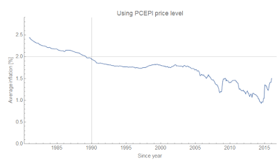
Why does Sumner choose 1990? Well, it is in fact the only year that makes his claim true:


For later starting years, average inflation is lower; for earlier starting years, average inflation is higher. In fact, average inflation since year Y has been almost monotonically decreasing as a function of Y. Therefore, since it was higher than 2% at some time in the past, the statement "inflation has averaged 2% since Y = Y₀" is true for some Y₀ (and since it is almost monotonic, there is only one such Y₀). It just so happens Y₀ ≈ 1990. There's a miracle all right — but the miracle is that Sumner would pick 1990, not that the Fed would pick 2%. I'm more inclined to believe Sumner chose 1990 in order to keep his prior that the Fed can target whatever inflation rate it wants while the Fed says it's targeting 2% [1].

The other possibility here (Occam's razor) is that inflation is just falling and the Fed has no control over it [2]. But regardless of what is actually happening, Sumner is either fooling himself or others with this "evidence". And as we add more data to this series, unless PCE inflation starts to come in above 2%, Sumner's claim is going to eventually become wrong [3]. Will he reconsider it then? 

This kind of numbers game is really upsetting to me. It is the inflation equivalent of the statements by global warming deniers that there's been "no statistically significant warming since 1997" (which uses the fact that a large volcanic eruption caused temperatures to not rise for a few years, and additionally is playing a rather loose game with the words 'statistically significant' — at the time they were making that claim there wasn't enough data to say any increase was statistically significant unless it was huge).

I know: Hanlon's razor. But in the case of global warming deniers it was a deliberate attempt to mislead.

...

Footnotes:

[1] Somewhere, I don't remember where (possibly Tim Duy?) noticed that the Fed seems to actually be looking at average headline inflation of 2%, which would mean that Sumner should choose 2005 instead of 1990. 

[2] In fact, I think it might be a demographic effect. There is a period of "normal" core PCE inflation of 1.7% in the 1990s:


[3] My estimate says it'll be some time after 2020 for most plausible paths of inflation.

Tuesday, October 17, 2017

10 year interest rate forecasts in the US and UK

A couple of continuing forecast validations — this time, it's the interest rate model (which has been used by a Korean blog called Run Money Run for Korea, Japan, and Taiwan). Specifically, we're looking at the 10-year interest rate model for both the US (which has been going for 26 months now) and UK (only  a few months):


The US graph contains forecasts from  the CBO from December of 2016 as well as a concurrent forecast from the Blue Chip Economic Indicators (BCEI) — which I love to point out costs thousands of dollars to access their insights in their journal.

Social constructs are social constructs

Noah Smith stepped into a bit of a minefield with his "scientific facts are social constructs" thread — making fun of the idea here [tweet seems to be deleted; it was referring to this tweet], attempting to get a handle on the utter philosophical mess that followed here. With the latter tweet, he illustrates that there are many different things "scientific facts are social constructs" could mean. We have no idea of the original context of the statement, except that it was in an anthropology class [0].

Clearly on some level, scientific facts are not social constructs in the sense that they fail to exist or function differently in a different society. My computer and the network it is attached to functions in exactly the way it is supposed to based on scientific facts in order for me to deliver this text to you via http. This is the universe of physics, computer science, and engineering. We are crossing model levels and scales here — from the human to the electron. As Erik Hoel shows, it is entirely possible that you cannot begin to even formulate what you mean by "social construct" and "electric current" at sufficient fidelity simultaneously (one is a description of macro states and the other is a description of micro states).

But this was an anthropology class. In anthropology, the process of science and the social constructs of society (including the process of science) are in a sense at the same level. It is entirely possible for the social process of science to interact with the anthropological states. Think of this as a "quantum uncertainty principle" for social theories. The process of measuring anthropological states depends on the social scientific process measuring it in the metaphorical sense that measuring the position of an electron depends on the momentum of the photon measuring it. It's a good thing to keep in mind.

However, in a sense, we have no possible logical understanding of what is a social construct and what isn't because we have empirical evidence of exactly one human species on one planet. You need a second independent society to even have a chance at observing something that gives you insight as to how it could be different. Is an electron a social construct? Maybe an alien society kind of bypassed the whole "particle" stage and think of electrons instead as spin-1/2 representations of the Poincare group with non-zero rest mass. The whole particle-wave duality and Hydrogen atom orbitals would be seen as a weird socially constructed view of what this alien society views as simply a set of quantum numbers.

But that's the key: we don't have that alien society, so there's no way to know. Let's designate the scientific process by an operator P = Σ |p⟩ ⟨p|. We have one human society state |s⟩, so we can't really know anything about the decomposition of our operator in terms of all possible societies s':

P = Σ Σ ⟨s'|p⟩ |s'⟩ ⟨p|

We have exactly one of those matrix elements ⟨s'|p⟩, i.e. s' = s for ⟨s|p⟩. Saying scientific facts are social constructs is basically an assumption about the entire space spanned by societies |s'⟩ based on its projection in a single dimension.

If you project a circle onto a single dimension, you get a line segment. You can easily say that the line segment could be the projection of some complex shape. It could also be a projection of a circle. Saying scientific facts are social constructs in general is saying that the shape is definitely very complex based on zero information at all, only the possibility that it could be. And yes, that is good to keep in mind. It should be part of Feynman's "leaning over backwards" advice, and has in fact been useful at certain points in history. One of my favorites is the aether. That was a "scientific fact" that was a "social construct": humans thought "waves" traveled in "a medium", and therefore needed a medium for light waves to travel in. This turned out to be unnecessary, and it is possible that someone reading a power point slide that said "scientific facts are social constructs" might have gotten from the aether to special relativity a bit faster [1].

However, the other thing that anthropology tries to do is tease out these social constructs by considering the various human societies on Earth as sufficiently different that they represent a decent sampling of those matrix elements ⟨s|p⟩. And it is true that random projections can yield sufficient information to extract the underlying fundamental signal behind the observations (i.e. the different scientific facts in different sociological bases).

But! All of these societies evolved on Earth from a limited set of human ancestors [2]. Can we really say our measurements of possible human societies are sufficiently diverse to extract information [3] about the invariant scientific truths in all possible societies including alien societies? Do we really have "random projections"? Aren't they going to be correlated?

So effectively we have come to the point where "scientific facts are social constructs" is either vacuous (we can't be sure that alien societies wouldn't have completely different sets of scientific facts) or hubris (you know for certain alien societies that have never been observed have different scientific facts [4]). At best, we have a warning: be aware that you may exhibit biases due to the fact that you are a social being embedded in society. But as a scientist, you're supposed to be listing these anyway. Are anthropologists just now recognizing they are potentially biased humans and in their surprise and horror (like fresh graduate students being told every theory in physics is an effective theory) they over-compensate by fascistically dictating other fields see their light?
Yes, anthropology: 
Anthropologists can affect, and in fact are a part of, the system they're studying. We've been here for awhile. 
xoxo, physics.
Now, can we get back to the search for some useful empirical regularities, and away from the philosophical argy-bargy?

...

Footnotes:

[0] Everyone was listing unpopular opinions the other day and I thought about putting mine up: It is impossible understand even non-mathematical things without understanding math because you have no idea whether or not what you are trying to understand has a mathematical description of which you are unaware. This post represents a bit of that put into practice.

[1] Funny enough, per [0], Einstein's "power point slide" was instead math. His teacher Minkowski showed him how to put space and time into a single spacetime manifold mathematically.

[2] Whether or not evolution itself is a social construct, you still must consider the possibility that evolution could have in fact happened in which case we just turn this definitive absolute statement into a Bayesian probability.

[3] At some point, someone might point out that the math behind these abstract state spaces is itself a social construct and therefore powerless to yield this socially invariant information. However, at that point we've now effectively questioned what knowledge is and whether it exists at all. Which is fine.

[4] I find the fact that you could list "scientific facts are social constructs" as a "scientific fact" (in anthropology) that is itself a social construct to be a bit of delicious irony if not an outright Epimenides paradox.

Thursday, October 12, 2017

Bitcoin model fails usefulness criterion

Well, this would probably count as a new shock to the bitcoin exchange rate:


In fact, you can model it as a new shock:


Since we're in the leading edge of it, it's pretty uncertain. However, I'd like to talk about something I've mentioned before: usefulness. While there is no particular reason to reject the bitcoin dynamic equilibrium model forecast, it does not appear to be useful. If shocks are this frequent, then the forecasting horizon is cut short by those shocks — and as such we might not ever get enough data without having to posit another shock thereby constantly increasing the number of parameters (and making e.g. the AIC worse).

Another way to put this is that unless the dynamic equilibrium model of exchange rates is confirmed by some other data, we won't be able to use the model to say anything about bitcoin exchange rates. Basically, the P(model|bitcoin data) will remain low, but it is possible that P(model|other data) could eventually lead us to a concurrence model.

As such, I'm going to slow down my update rate following this model [I still want to track it to see how the data evolves]. Consider this a failure of model usefulness.

...

Update 17 October 2017

Starting to get a handle on the magnitude of the shock — it's on the order of the same size as the bitcoin fork shock (note: log scale):


Update 18 October 2017

More data just reduced uncertainty without affecting the path — which is actually a really good indication of a really good model! Too bad these shocks come too frequently.


Update 23 October 2017


Update 25 October 2017


Update 30 October 2017


Update 1 November 2017


Update 2 November 2017


Update 6 November 2017


Update 9 November 2017


Update 10 November 2017


Update 13 November 2017


Update 14 November 2017


Update 16 November 2017


Update 28 November 2017


Update 30 November 2017


Update 7 December 2017

Despite this having been wrong, it's been fun following it. One thing I have come to recognize is that even in the unemployment forecasts there is a tendency to undershoot and then overshoot the magnitude of shocks.  A few more graphs:


Update 15 December 2017

I re-graphed the solutions with the expanded scope since December 11th on the same y-axis and added the latest data:


Update 19 December 2017


Update 20 December 2017


Update 25 December 2017


Update 02 January 2018


Update 08 January 2018


Update 15 January 2018


Update 5 February 2018 (with Jan 22 and Jan 31)


26 February 2018


17 April 2018