Saturday, November 2, 2013

The long run in the UK

Paul Krugman linked to three centuries of economic data for the UK a few days ago. I decided to see how the information transfer model works over such a long time period. One limitation was that monetary data only went back to 1870, so we only have 140-odd years to work with. I had seen how the model does with data from 1986-2013 in this post (although it still involved extrapolation of monetary data). It turns out I needed to do a split monetary regime (monetary phase transition) around WWII, much like I did for the US. I highlighted the region where interest rates were pegged (see the previous link) from 1933 to 1949 in gray in the following graphs. Overall, I'd say the results are pretty good.

First, here is the price level model (I split the monetary regimes arbitrarily in 1950, model in blue and data in green, model description here):


Second, here is the interest rate fit (model in blue and data in green, model description here). There is no split monetary regime for the interest rates as there is in the price level, just a single fit to all of the data.


One caveat is that the long run monetary data does not include central bank reserves, which become a significant part of the base especially in recent years (which explains the deviations towards the end of the time series data). However, the results for the information transfer model including reserves were previously covered here; here is the plot of the interest rate results using this data:


Here is a different version of the long run data where the fit is to the data from 1870 to 1986, and shows what happens if you add reserve data (in purple) and interest rate data (in red) from 2006 to the present:


This fit seems to do better in the post-war period up until the 1980s where it appears the central bank reserves become significant. I will attempt to fuse all of the monetary data (reserves plus notes and coins, the full monetary base) in a later post.

Third, here is the plot of the path of the UK economy in (MB, NGDP) space in blue with the interest rate level curves shown in red (using the first interest rate fit, not the second) along with the information trap criterion (∂P/∂MB = 0), related to the liquidity trap, as black dotted lines. One thing to note is that the ∂P/∂MB = 0 line is different for the two monetary regimes (roughly before and after the pegged interest rate policy).


Sunday, October 20, 2013

More on sticky wages

Back in this post, I mentioned that the observed distribution could produce the slight deviation from from a constant price P in the market P:NGDP→NW (aggregate demand sending signals to nominal wages). I'll put a little bit of meat on that claim here. Let's start with a population with a distribution of incomes:


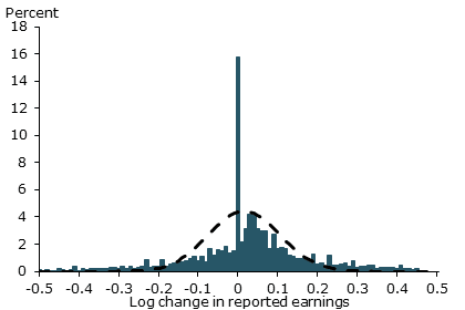
Now let's select some fraction of this distribution to receive a normally distributed raise. This is accomplished by drawing from a Bernoulli distribution and a normal distribution and taking the product; the 0's of the Bernoulli draw mean zero raise and the 1's mean a normally distributed raise. Here is the resulting distribution (over the entire period from 1960-2013):


Compare this with the distribution here. And here is the model result from the sticky wage post (red) alongside this simulation (black), which shows the plausibility of this observed distribution leading to the deviation from sticky wages:


Is there a sign of inequality in the price level?

When I was writing this post, I noticed that the aggregate demand-labor supply model (NGDP-LS) didn't do so well at the edges of the data (it did well from 1970s-1990s, but had deviations before and after) and it made me wonder if inequality didn't have something to do with it. In the post itself, I mentioned that the tiny amount of wage flexibility accounted for some of it. Here I want to speculate about a different mechanism: income inequality.

The mechanism would be that NGDP growth would be faster than labor supply growth as gains are taken by the rich, meaning that the derivative of the model (NGDP/LS) would be greater than the derivative of the price level P. This is what happens in the graph from the post linked above (model is blue, price level data is green):


I grabbed some inequality data from Saez to see if the ratio of the derivatives was correlated. It turns out it isn't unless you add an 18 year lag to the inequality data. It is possible it takes awhile for the price level to catch up with inequality, but I'll chalk this one up as inconclusive. Here is the relevant graph with the inequality data in green and the derivative data in blue along with a smoothing of the data:


Saturday, October 19, 2013

O-Canada

Scott Sumner linked to Nick Rowe today which inspired me to run the numbers for Canada. Unfortunately I was only able to find monetary base data up to June of 2009 (any help?). At least it shows the start of the recession (which Nick Rowe says does not show up in the CPI data). Here is the reference for the model I'm using for the price level, and here is the reference for the interest rate model.

And here are the graphs (model in blue, data in green):


And here is where Canada appears in the scrum (see here for the definition of this plot):


Basically, Canada is sort of halfway between the US and Australia hence it had a mild recession instead of not having one at all (AU) or a severe one (US). Canada returned to its pre-2009 trend after the recession, having only increased its monetary base by a small amount. Since I didn't have the actual data after 2009, I did an extrapolation from the piece of the trend I did have in the graph (small dotted green line). Canada appears to still be farther away from the "liquidity trap" (indicated by the information trap criterion, the dotted black line) than the US, Japan, the UK or the EU. Here is a graph of the path of the Canadian economy in MB-NGDP space analogous to this one for the US:


The liquidity trap rate is about 0.5%, but the current rates in Canada are above 1%.

Thursday, October 17, 2013

Scientific controls and sampling

I'm not sure I completely understand what Scott Sumner (or Mark Sadowski) is getting at in this post. You can't see the effect of fiscal policy if your sample has the same monetary policy (e.g. US states or EU member nations)? For reference, Sumner's description of monetary offset is laid out in the paper linked in this post. Basically, it says if fiscal policy increases AD, this will raise inflation which will cause the central bank to react to bring inflation back to target. In the long run, the AD boost is offset by monetary policy.

In the cases we are looking at (EU member nations), each has the same monetary authority (the ECB) so the monetary policy is an EU-wide aggregate while the fiscal policy is local to the member nations. While Sumner's model has a plausible mechanism for the ECB to offset the average fall in AD due to austerity, it wouldn't offset the relative fall between nations. The nations engaging in more austerity will be worse off than those engaging in less. This still makes Paul Krugman's point that austerity is bad.

On a more fundamental level, you'd think you'd want to control for monetary policy which means you'd want to have the same monetary policy in the sample population. If having the same monetary policy makes the effect you want to see unobservable, then how do you know the offset exists in the first place? A mysterious force counteracting another force resulting in no effect? It's like saying my glass of whisky here is experiencing a force to the right that is always counteracted by a force to the left [1] -- how did I ever know about either? 

Speaking of forces, I'd like to bring up the information transfer picture. It's actually a picture:


Depending on the current location of the economy in the space of monetary base (MB) and NGDP, the direction of the "force" due to fiscal shifts and monetary shifts range from almost parallel (a quantity theory economy) to orthogonal (a liquidity trap economy). In the former, you can have almost complete monetary offset. In the latter, monetary policy isn't even pushing in the right direction (it has no projection along the NGDP axis). This goes back to Krugman's sample and Sadowski's "unskewed" version: if the countries are all in a liquidity trap, then you're going to see the effects of austerity. If you're not, then monetary policy would have offset the fall in AD from the recession in the first place an no austerity would've been necessary (and if it had been tried it would have been offset).

[1] Well, it actually is from air pressure -- but we know about that from different experiments. Which is kind of my point.

Wednesday, October 16, 2013

The Phillips curve

Earlier this year John Quiggin made the bold claim that macroeconomics went wrong in 1958 after the discovery of the Phillips curve. I've been working over the past couple months trying to figure out how the Phillips curve comes about in the information transfer framework and I basically come to the same conclusion. Here is my bold claim:

The Phillips curve is real but barely useful regularity in the data that has been completely misinterpreted.

OK, let's begin. The curve is generally drawn as a downward sloping curve in unemployment rate-inflation rate space. In the information transfer model, this immediately says that the information source is aggregate demand (NGDP), the information destination is the supply of unemployed people (U, e.g. this metric -- and n.b. here and throughout U is the total number of unemployed, not the unemployment rate), and the price level P is detecting signals from the demand to the supply. In my notation, P:NGDP→U. Therefore we can write 

$$
\text{(1) } P = \frac{1}{\kappa} \frac{NGDP}{U}
$$

We can do a fit to the data (price level in green, model in blue)


This fit works as well as the fit to the interest rate in the IS-LM model, so it gives some hint that we may be able to extract information from it. One interesting thing to consider is that the price level curve could define a "natural rate" of unemployment (actually more of a mean level of unemployment, blue):


The graph divides the number of unemployed by the size of the civilian labor force (L) to get the unemployment rate. Here is the graph of deviations from the blue curve:


I've excised the recessions in the data points (dots) in the graph above. It becomes clear that most of the data points and nearly all of the non-recession data points represent an unemployment rate that is falling. This is a major point in understanding the Phillips curve in the information transfer framework. Of course, to get to our final destination requires a little math. Start with the price level equation (1) above and take the logarithmic derivative:
$$
\frac{d}{dt} \log P = \frac{d}{dt}\log \frac{1}{\kappa} \frac{NGDP}{U}
$$
Expanding that out a little
$$
\frac{d}{dt} \log P = \frac{d}{dt}\log NGDP -\frac{d}{dt}\log U -\frac{d}{dt}\log \kappa
$$
Identifying the inflation rate $\pi$ (borrowing from the notation in the wikipedia entry) and the NGDP growth rate $n$, and taking $\kappa$ to be constant ($\simeq 0.6$ by the way), and fiddling with the $U$ term:
$$
\pi = n -\frac{1}{U}\frac{d}{dt}U
$$

If we expand around the number of unemployed at natural rate $U^*$ (or really any fixed level of unemployed rate) and taking $dU/dt = U'$ we can write:

$$
\pi = n -\frac{U'}{U^*} + \frac{U'}{U^{*2}}(U-U^*)
$$

Or in terms of the unemployment rate $u = U/L$ where $L$ is the civilian labor force:

$$
\pi = n -\frac{U'}{U^*} + \frac{U' L}{U^{*2}}(u-u^*)
$$

Where we make the notational identifications $n -U'/U^* = \pi^e + \nu$ and $B = U' L/U^{*2}$ we finally obtain the new classical form of the Phillips curve:

$$
\pi = \pi^e + \nu + B (u-u^*)
$$

... except there's a problem: the sign of the $B$ term is "wrong". This is where the observation in the previous graph comes in. Nearly all the data has $U' \lt 0$ so in most descriptions of the data we can take $b = |U' L/U^{*2}|$ positive and write

$$
\pi = \pi^e + \nu - b (u-u^*)
$$

The regularities of the Phillips curve essentially result from the fact that recessions tend to cause unemployment to shoot up quickly and then drift back down slowly over a longer period. With this knowledge we can see what the data looks like when excluding data where $U' > 0$:


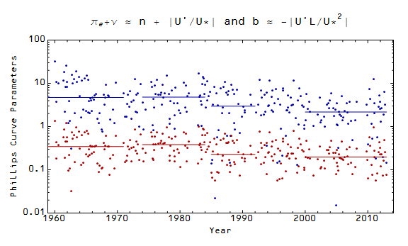
Graphs of the Phillips curve tend to be broken up into "regimes" (from the wikipedia article we have 1955-1971, 1974-1984, 1985-1992 and 2000-2013); we can see how this segmentation approximates the behavior of the parameters $b$ and $\pi^e + \nu$:


Basically, the Phillips curve "regimes" represent relatively constant segments of the parameter values. Here are the graphs of the resulting Phillips curves for the different "regimes":


This allows us to posit a reason for the failure to find microfoundations for the Phillips curve. It is a property of the unemployment rate (quick rise, slow fall) that is only marginally connected to inflation (the slow fall in unemployment occurs during a recovery hence during a temporary increase of the inflation rate from a low level brought on by the recession). The real nugget of statistical regularity is that a recession causes unemployment to rise and inflation to fall with the Phillips curve describing the subsequent return to normal (unemployment to fall and inflation to rise). Or another way, the Phillips curve is just mean reversion. And mean reversion doesn't really need microfoundations, does it?

In any case, the Phillips curve is dependent on the dominance of data where $dU/dt < 0$ after recessions.

Sunday, October 13, 2013

Sticky wages

Simon Wren-Lewis calls the lack of acceptance of downward nominal wage rigidity (sticky prices) a methodological failure in macroeconomics:
I suspect nearly all economists are naturally reluctant to embrace cases where agents appear to miss opportunities for Pareto improvement ... However in most other areas of the discipline overwhelming evidence [in favor of wage stickiness] is now able to trump these suspicions. But not, it seems, in macro. 
While we can debate why this is at the level of general methodology, the importance of this particular example to current policy is huge. Many have argued that the failure of inflation to fall further in the recession is evidence that the output gap is not that large.
Paul Krugman adds his perspective to Simon's:
You see, the question of wage (and price) stickiness, and hence of real effects of changes in nominal demand, was what the great rejection of Keynesianism was all about. And I mean all about. Back in the 70s, there was hardly any discussion of the determinants of nominal demand; what Lucas and his followers were arguing was that Keynesianism must be rejected because it was unable to derive wage stickiness from maximizing behavior.
Sticky wages form the basis of the explanation of the existence of unemployment in Keynesian economics. If there is a fall in aggregate demand, basic microeconomic arguments suggest that people as maximizing agents will lower their "reserve wage" in order to keep the economy at full employment. This is not what is observed. People do not lower their reserve wage; people become unemployed. There are many reasons given for this (e.g. nominal wage cuts or hiring new employees at a lower wage are bad for morale, the coordination problem where no one person wants be the one to lower their reserve wage, etc). It is a fruitful arena for study in economics.

I had previously considered that sticky wages might be the result of imperfect information transfer, but I am going to tackle the problem from a different perspective. I'm not going to figure out the reason for sticky wages here. However, I will show how sticky wages manifest themselves in the information transfer framework.

In this earlier post, I built a model where the price level P detects signals from the aggregate demand (NGDP) to the labor supply (LS) which I denote P:NGDP→LS. The basic equations of the information transfer framework then tell us that P ~ NGDP/LS. Now what this suggests is that the number of employees responds to changes in aggregate demand. It also allows us to derive Okun's law where changes in real demand (NGDP/P = RGDP) are equal to changes in employment (see the link at the beginning of this paragraph). What would it look like if nominal wages (NW) responded to changes in aggregate demand?

Well, you'd have a market P':NGDP→NW where P' ~ NGDP/NW, but we don't know what the price P' is. Let's first have a look at NGDP (solid) and NW (dashed):


These two nominal aggregates are effectively proportional to each other with NGDP/NW = 2.1, which means that P' is a constant (which I have normalized to 1). Here are the two prices (blue, red) shown on the same graph (with the CPI in green standing in for the price level):


A constant price means we must always have the same signal from the aggregate demand to nominal wages which means falling aggregate demand causes nominal wages to fall primarily as a reduction in the number of employed people, not a change in their nominal wage. There are still some fluctuations in P' so nominal wage rigidity is not absolute, but these fluctuations are small ... which is in fact what is observed:


This is an empirical observation. There is no a priori reason that P':NGDP→NW must have a constant price P'; it could have had the changing relationship observed in the analogous graph to the one above between the aggregate demand (solid) and the labor supply (dashed):


This small variation seen in P' can be used to slightly improve the fit to the price level P by taking P→P*P'  (old fit in blue, new in purple with the price level in green):


But overall nominal wage rigidity is the observed dominant market interaction with nominal wage changes being a small effect. To reclaim the physics analogy using the Hydrogen atom from Brad DeLong, sticky prices are the Schrodinger equation and wage flexibility is the Lamb shift.

Deviations from the trend using the GDP deflator

While these results used the CPI (less food and energy), this version uses GDP deflator data. I claimed that inflation during the 1960s was unnaturally low and wanted to see if that conclusion was robust under different measures of inflation. It is:


Saturday, October 12, 2013

The population, the monetary base: Is there a connection?

Ostensibly there should be an overall correlation with a larger population meaning a larger monetary base, but in the process of constructing this post, I noticed an interesting correlation in the fluctuations around that overall relationship:


Is the distance from the origin in (log MB, log NGDP) space directly related to the population size?


The effect of cohort size on income is called the Easterlin effect in sociology, see e.g. this review. The effect here is different since it looks at contemporaneous population size. The economy is farther out along the R = (log NGDP, log MB) axes than it "should" be in the 80s and 90s, and this is corresponding with a lower population. I wouldn't put very much money down on this being more than a coincidence, but I thought I'd jot it down.

Friday, October 11, 2013

Revealing the true business cycles


In an earlier post I tried to extract the deviations from the trend that are the bread and butter of economics. In that post I link to Noah Smith explaining that:
You take a jagged time-series and you smooth it out, and you call the smoothed-out series the "trend". That's it. Whatever is left you call the "cycle", and you make theories to try to explain that "cycle". 
But how much do you smooth? That's a really key question! If you smooth a lot, the "trend" becomes log-linear, meaning that any departure of GDP from a smooth exponential growth path - the kind of growth path of the population of bacteria in a fresh new petri dish - is called a "cycle". But if you don't smooth very much, then almost every bend and dip in GDP is a change in the "trend", and there's almost no "cycle" at all. In other words, YOU, the macroeconomist, get to choose how big of a "cycle" you are trying to explain. The size of the "cycle" is a free parameter.

My opinion is that this procedure is garbage.

I think the idea of the expected path I developed in my recent post is much better grounded; so what do the de-trended cycles look like according to that picture? First, here's inflation:


There were a couple of spikes in 1974 and 1979 (probably due to the oil crisis) but the big anomaly is that inflation in the 1960s was unnaturally low (as well as appearing to have some data issues). This is contra the prevailing narrative that inflation was high in the late 1960s through the 1970s and was countered by the resurgence of monetarism in 1980s.


How about RGDP growth?


The recessions (red) line up nicely with significant deviations from the mean (which is slightly less than 0 meaning that the expected RGDP growth rate is potentially an upper bound). In fact, if we excise the recessions (see this post), we get a nice random sequence:


You can see the distribution of the residuals is pretty close to normal after subtracting out the recessions (the mean is -0.6% and the standard deviation is +/- 3.1%, the skewed piece from the recessions is also pretty obvious in the black line):