Wednesday, July 31, 2013

All hail linear extrapolation

I didn't know there was going to be some prediction fun or I would have made a more explicit prediction. From this post however, I effectively predicted 1.8% RGDP growth until 2020 (barring any major monetary interventions). Before anyone says "Wow, that sounds awesomely close to the 1.7% figure reported today" let's make it clear that the average value of RGDP growth since 2010 has been 2.1% ... with the average since 2012 being 1.8% (effectively the linear extrapolation). Scott Sumner's and Mark Sadowski's also had on the order of 2% predictions, with the former predicting somewhat less due to the sequester (I gathered from the linked post that Sumner predicted 2% for 2013 overall, but Q2 would be less due to the sequester).

As Sumner notes in the linked post, these things get revised. If you take a look at the last figure in my prediction post, you can see that the model estimates and the real values have quite a bit of variability.

Anyway, the main point seems to be that not much has happened to the trajectory of the economy due to monetary and fiscal policy.

Monday, July 29, 2013

All your BASE

There are several measures of the so-called money supply. Which measure is the "correct" measure is a matter of debate and seems to depend on the effect you are trying to model (which seems like a terrible way to do things, but as I am about to make a case for one measure in particular base on an effect I am trying to model that probably comes across as a bit hypocritical). Here are a few that the Fed still publishes:
M1 (currency and checking deposits, dark blue), M2 (M1 and close substitutes, orange), Money with zero maturity (MZM, red), the St. Louis Adjusted Monetary Base (AMB, light blue) are shown in the graph. Originally I did most of my work with AMB because it was available on FRED, went back to 1917 and seemed to look like the graph that most people put up when complaining about the money supply.

I subsequently did some calculations with other countries; however, FRED seems only to have M1 for other countries. I thought this might suffice as a proxy since M1 and AMB are roughly the same order of magnitude. M1 includes money created by fractional reserve banking (i.e. your checking account) but doesn't include deposits/credit with the Fed itself. In the information transfer model (ITM) we are concerned with money acting as a unit of measurement which means that AMB is probably the best measure because that is the source (base) from which all other money comes from. It also happens to work better at measuring the price level (on the left is the best fit to the CPI, on the right is the fractional difference from the CPI):
Mostly bad fits with AMB winning out, but the same "secular trend" as they say in economics. However, if we look at the model results in the normalized sigma-kappa space, we get very different stories:
The question of whether the US have crossed the ridge into the region where expansion of the money supply is contractionary (and thus the US is like Japan, at least in the ITM) depends on which measure you use. For M1 and the AMB the US was relatively near the ideal quantity theory of money (kappa = 1/2) and has drifted away relatively slowly. For M2 and MZM, there is a rapid divergence. Additionally if you use AMB, there aren't large fluctuations in the price level that exist for other measures. It is interesting to note that Japan is on the other side of the ridge regardless if you use the MB or M1. I haven't done the calculation, but it seems that if you were to use M1, then there would be fewer countries near kappa = 1/2 and so the quantity theory would not work as well as it does. In the data from the previous link, you can see Indonesia and Mexico are already far from kappa = 1/2.


All your M1

As a follow-up to this post, I show what the graphs look like if I use M1 for the US instead of the St. Louis adjusted monetary base (left is the normalized sigma-kappa space and the right are the fits to the price level):
Note that M1 and the monetary base are different things: the former measures currency + deposits outside the Fed and the latter measures currency + deposits at the Fed. I had previously used M1 as a proxy for the base (when I couldn't find proper data) because they are at least of similar magnitude for the US (as opposed to say M1 and M2), but this shows that prescription leads to quite different results. Altogether, using M1 looks like a mess.

And since I found monetary base data for Japan, here is what the US and Japan data look like in terms of monetary base:
Additionally, it is the base that fits the inflation data for the US relatively well; for Japan there are still some wiggles. I'd venture to say that inflation measures things over a longer average period than the relatively instantaneous effect in this model. Here are the fits (empirical data = dashed curves, model fit = solid curves):

Sunday, July 28, 2013

A summary of the information transfer model

Commenter evilsax asked for a summary of the information transfer model. Here is a first attempt (it is unfortunately a bit wordy at present):

The idea behind the information transfer framework is that an information source (identified with the demand in economics) is sending information to a destination (identified with the supply) with a gauge measuring the information transfer. The number measured on that gauge is the price. It turns out the math behind this gives you supply and demand diagrams like the ones frequently used in economics. There are a few parameters you can use to fit to the data you see but all of the basic structure is captured.

Now economists don't just apply this supply and demand reasoning to single goods; it's been applied to macroeconomics as well. For example, the AD-AS model and the IS-LM model use what appear to be supply and demand curves. What happens if you plug one of these models, say, the quantity theory of money, into the information transfer framework?

If that were all there was to it, then most economists would say: "Who cares? The equations are equivalent to the equation of exchange so all you've done is re-label things." And the answer would be some mumbling about rigorous foundations. But that is not all there is to it.

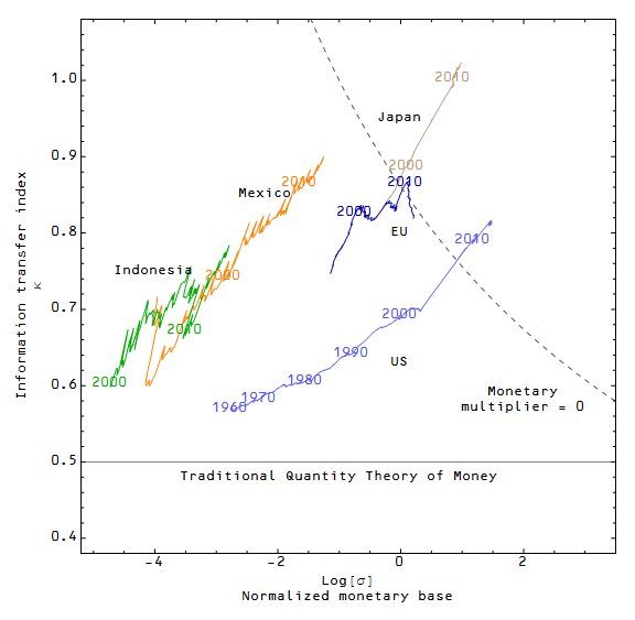
One of the parameters mentioned above is called the information transfer index (I've usually labeled it $\kappa$ following the original source for the information transfer framework). In the basic supply and demand theory, $\kappa$ is a constant and is related to the price elasticities of supply and demand. In the information theory, $\kappa$ counts the relative number of symbols used to hold the information in the demand (information source) and the supply (destination). One way to think about it is the number of digits in the number containing the information. Now the important point to recognize is that money is both the unit of account and the medium of exchange. That means the money supply also measures the size of the set of symbols holding information, therefore $\kappa$ becomes a function of the money supply.

This is where the model goes from being just a relabeling of variables to a potentially useful theory:

  • It does a really good job of calculating RGDP growth for a two-parameter model.
  • It allows a quantity theory of money to explain low inflation countries and high inflation countries at the same time. The traditional "long run inflation rate" = "long run monetary base growth" works really well for high inflation countries, but not low inflation. The information transfer model fixes that.
  • It explains why high inflation countries follow the traditional quantity theory of money.
However, there is a hitch. Or maybe we'll call it a counterintuitive claim. In the model, as the monetary base increases, the price level increases ... but only to a point. After it reaches a certain point (based roughly on the size of the economy), increasing the monetary base decreases the price level. Here is the plot of the price level vs the monetary base for the year 1980 in the US:
This result would likely get me laughed out of an economics conference. One of the reasons I haven't given up is that this effect allows the model to explain the US since 2008 and Japan since the 1990s. In both linked cases I have a red curve that shows what a "normal" quantity theory would look like. There are more traditional (but not necessarily universally accepted) economic explanations of the US and Japan in terms of a liquidity trap.

Why does the model do this? Here is one way to think about it. Imagine you are given a (demand) number written in a series of 10 boxes. You have to copy down this information, but you are only given three (supply) boxes in which you can write the digits 0-9:
Well, one way to do this is to put 2, 3 and 9 in the boxes and say that the number is $2.3 \times 10^{9}$, then you send 3, 3, and 7 so that you add $3.3 \times 10^{7}$ resulting in $2.333 \times 10^{9}$. And so on. Another way to code this is as 1, 2, 3 and then 3, 3, 3 and then 5, 2, 1 meaning "in box 1 and the next box put 2 and 3, in box 3 and the next box put 3 and 3", etc. There are lots of ways to code this number and send it in packets. Now if you are given more boxes, it takes fewer steps ...
This could be sent in two steps as 2, 3, 3, 3, 2, 1, 9 and 2, 5, 6, 7, 0, 0, 3. However, as you add boxes, the marginal improvement in the number of packets that have to be sent goes down. Eventually you reach a point where adding boxes adds nothing to the ability to capture the information:
So you will see a large improvement in the number of boxes that eventually slows and reaches a peak somewhere below the point where there are the same number of boxes for the supply and demand. Basically, the picture in the graph above.

One way to think about the price level then is as a measure of the marginal utility of adding money to the economy. As the economy gets bigger, the marginal utility also changes (the dashed curve is for 1990); you can see in this graph that having the same size monetary base as you did in 1980 in 1990 would lead to deflation (the dashed curve at the 1980 point falls below the solid curve):
This is not an established "stylized fact" in economics; most mainstream economists believe that increasing the monetary base will always in the long run lead to inflation (related to the neutrality of money in the long run). In the short run, most economists believe that increasing the base too slowly can lead to deflation and some believe it is possible that increasing the base might not lead to inflation e.g. in a liquidity trap. The counterintuitive effect in this model is that increasing the base too much can lead to deflation (or reduced inflation, called disinflation) in both the short run and the long run. The low inflation environments of the US and Japan may be the evidence that backs up this claim in the information transfer model.

Saturday, July 27, 2013

Extracting nominal shocks, continued

I briefly outlined the calculation of how increasing the monetary base creates real wealth in the previous post. I decided to show how much wealth creation is going on. The answer is not much most of the time -- the size of the monetary base relative to the economy is actually pretty small, so even a doubling would not result in a huge change in NGDP. Here is the graph. The nominal shocks from the previous post are in blue and the real wealth increase is shown in red (i.e. if the government prints $3 and $1 is eaten up by inflation, then what would be shown in red is the remaining $2):
It appears that the Fed's reaction to the Great Recession offset about half of the impact of the nominal shock (~10% of GDP). If you add in the federal deficit spending, it appears that the overall nominal shock was ~15%, with monetary stimulus and fiscal stimulus each offsetting ~5% leaving the ~5% NGDP reduction (which was observed).

I also wanted to show these numbers on a shorter time scale. Here is the same plot using monthly increments instead of annual:
One thing to notice is how narrow the nominal shock associated with the great recession was. The peak can be fairly precisely timed to September 2008 (e.g. the failure of Lehman Brothers). While there is some small decline before the crisis the bulk of it happens between July and November. Additionally, there are no negative nominal shocks (i.e. GDP growth was always ahead of where you would expect from changes in the MB) from about 2003 until 2008. This cuts against the theory that the financial crisis did not cause the recession.

Another thing to notice thing to notice is that if we zoom in on the Great Recession we can see that before 2008 monetary wealth creation was much smaller than the nominal shocks; after 2008,  monetary wealth creation is of the same order as the nominal shocks. 

Friday, July 26, 2013

Extracting nominal shocks

In this post I will extract "nominal shocks". I mean this in a very generalized way. If we take the diagram from this post, we can see the effect of what small changes to the monetary base or NGDP look like. Each of the arrows represents a pure increase in NGDP (blue arrow) or a pure increase in the base (red arrow) both of the same (fractional) size. The empirical path is shown in light blue.
If we zoom in on some of the years shown, we can see some details and come up with a way to extract "shocks", i.e. the difference from where we are expected to be vs where we actually are. Here are some zooms for 1970, 1980, 1990 as well as 2000 and 2010 in the same graph.
If we look at 1970 and 1990, the empirical path appears to follow the monetary arrow. We ended up where we expected if there was no change in NGDP except due to changes in the monetary base. It is tempting to refer to this situation as a lack of real growth, i.e. NGDP growth = inflation rate. However, this is not the case. Since the information transfer index is > 1/2 (we are not near the QTM line), the price level growth rate is not equal to the monetary base growth rate -- in fact the inflation rate is only about ~ 30%  post 1980 (using the long run limit of 1.31 from this calculation) of the monetary base growth rate. For every three dollars created by the Fed/Treasury in 1990, only about one was eaten up by inflation. The remaining two became new wealth. In the 1970s, this was a somewhat smaller amount (using an information transfer index of 0.6, two dollars would be eaten up, leaving one for new wealth). 

If we look at 1980, 2000 and 2010, we see that we ended up somewhere different than expected by the red arrow. I will refer to this as a nominal shock -- basically we ended up at some different NGDP than expected by MB growth alone. My procedure to extract these nominal shocks will be to calculate where the change in the monetary from e.g. 1970 to 1971 takes you in MB-NGDP space (along a red arrow that will have a different length based on the change in the MB) and then see what delta-NGDP (nominal shock) will bring from the expected point to the empirical point.

Note that there is still an ambiguity in terms of resolving these differences from the expected path in terms of, say, AD and AS shocks (the coordinate system is not orthogonal, except at a subset of points). Therefore I will just refer to the difference between the real and expected point as a "nominal shock", which can be both positive (say, an uptick in productivity) and negative (say, a sudden increase in perceived risk).

I will also note that the definition of AS I've been using in the model (money supply) differs from what is typically thought of as AS (the total supply of goods in an economy) and is closer to the LM curve of the IS-LM model. This further motivates why I am just referring to these differences as nominal shocks.

On to the nominal shocks!

Here is the plot of the nominal shocks by year from 1960 to 2012 (in blue). 
The dashed red line is the Federal deficit. Why did I put that there? Well,  NGDP = C + I + G + NX. To first order, then, deficit spending by the government simply creates NGDP. Now there are two arguments made against that bold claim. The first is Ricardian Equivalence. If the government engages in deficit spending, C and I pull back immediately in anticipation of future taxes to cover G. The second is crowding out. If the government engages in large scale borrowing, it drives up interest rates reducing I. 

I have two responses to this. First, it is unlikely that C or I will respond to exactly cancel the deficit spending (it is by definition a second order effect, responding to perturbations of G relative to the total NGDP and the first order effect must be larger or else the whole thing is non-perturbative and we can all just go home right now). Second, I think it is interesting to figure out what the shocks are if we can take out one contribution we already know -- the crowding out (and Ricardian equivalence) will remain as a negative contribution to the nominal shock after the deficit spending has been removed. The remainder is then = crowding out + Ricardian equivalence + productivity changes + technology changes + random noise + ... whatever else.

Therefore, here are the results (nominal shocks in blue, nominal shocks minus the federal deficit for the following year in dashed dark blue).
In case there is any quibble with taking the deficit number for the following year (the deficit number is the realized deficit from the prior year, so that makes sense to me) here is what it looks like if you take +/- 1 year.
Anything to take away form this? Well, it's a small data set so probably not. But here goes some unwarranted speculation and random facts.
  • Before 1980 the recessions appear to precede large positive shocks whereas after 1980 the recessions seem to follow large negative shocks.
  • The Great Recession appears to have resulted from a negative shock on the order of 15% of GDP (the observed NGDP change was on the order of 5% of GDP). The Great Depression had an observed NGDP change on the order of 30%.
  • I would like to stress that the >10% of GDP nominal shock is what is left over after taking into account monetary policy, i.e. we were >10% below where we would expect to be if all change in NGDP was due to a change in the price level alone due to increasing the base.

Wednesday, July 24, 2013

Universalizing the model: $\kappa$-$\sigma$ space

In the last post I mentioned I wanted to try and look at a way to see model results from different countries on the same graph. Here is the process I went through. First, I set up the variables 
$$ \kappa = \frac{\log Q^s/C_0}{\log Q^d/C_0} $$
$$ \sigma = \frac{Q^s}{Q^s_{ref}} $$
I call these the information transfer index (from the original theory) and the normalized monetary base, respectively. Defining the constant
$$ \alpha = \frac{Q^d_{ref}}{Q^s_{ref}} $$
we can write
$$ P = \alpha \frac{1}{\kappa} \sigma^{1/\kappa-1} $$
I plotted the fits of the data for Japan and the US on the same graph in the $\kappa\sigma$-plane. I also plotted the location of the ridge line in the linked posts, i.e. the place where  $\frac{\partial P}{\partial\sigma} = 0$ such that monetary policy has no effect on the price level (I will refer to this as the monetary multiplier being zero). This is the result (on the right: blue is US, brown is Japan and the dashed lines represent the location of the ridge). I noticed how close the ridge lines come to falling right on one another. The question I had was what if we constrained the equations (i.e. the fit parameters) such that these lines coincided?

Calculating the derivative above (after dividing by $\alpha$), one obtains 
$$ \frac{\partial P(\kappa,\sigma)}{\partial\sigma} =\frac{\partial}{\partial\sigma}\frac{\log Q^d/C_0}{\log \sigma Q^s_{ref}/C_0} \sigma^{\frac{\log Q^d/C_0}{\log \sigma Q^s_{ref}/C_0}-1} = 0 $$
$$ \frac{P(\kappa, \sigma)}{\sigma} \left[ \frac{\log Q^d/C_0}{\log \sigma Q_{\text{ref}}^s/C_0} \left(\frac{\log \sigma }{\log \sigma Q_{\text{ref}}^s/C_0}-1\right)+\log \sigma Q_{\text{ref}}^s/C_0 + 1 \right] = 0 $$
The bracketed term must be zero since the piece outside the bracket is positive, so therefore, after some substitutions 
$$ -\frac{1}{\kappa}\log \left(\frac{Q^s_{\text{ref}}}{C_0}\right)+\log \left(\frac{\sigma Q_{\text{ref}}^s}{C_0}\right)+1=0 $$
And we arrive at
$$ \sigma = \frac{C_0}{ Q_{\text{ref}}^s} \exp \left( -\frac{\kappa + \log \frac{C_0}{ Q_{\text{ref}}^s}}{\kappa} \right) $$
Note that this function is only of $\sigma$, $\kappa$ and $C_0/Q_{\text{ref}}^s \equiv \gamma$. This means if I use the parameters for the US to find $\gamma$, I can then constrain the subsequent fits for Japan (and other countries) to maintain $C_0 = \gamma Q_{\text{ref}}^s$ (reducing one degree of freedom). This constrains the fits so that the ridge lines coincide. 

I used the US data to fix $\gamma$ and then fit data for the EU, Japan, Mexico and Indonesia to the two parameters $\alpha$ and $Q_{\text{ref}}^s$. The former parameter is only an overall normalization that depends on the reference year for the price level, so once $\gamma$ is fixed, all subsequent fits are effectively one-parameter fits. Here are the graphs of the fits to the price level:  

The next graph shows the final "universal" results with all of the countries in the same $\kappa\sigma$-plane along with the location of the ridge line (dashed curve, monetary multiplier = 0):

Some notes:
  • This is really cool if I do say so myself.
  • It looks like the US, Japan and the EU have entered the space where monetary policy is ineffective (or has the opposite of the intended effect).
  • Mexico has recently entered into a period of relative stagnation that may correlate with the country nearing the multiplier = 0 line.
  • The traditional quantity theory of money, which I define as the inflation rate being equal to the growth rate of the monetary base, applies when $\kappa = 1/2$, shown on the graph.
  • All the data is from the FRED data base, using M1, Nominal GDP and the GDP deflator (except the EU data which uses the Euro Area CPI, less food and energy). The US data uses the Adjusted monetary base and the US CPI.

Tuesday, July 23, 2013

Fiscal and monetary stimulus

 
In the figure above, I plotted the vectors for a local perturbation from a point in MB-NGDP space for an increase in MB (red, "+ Monetary") and an increase in NGDP (blue, "+ Fiscal"). Since a change in the MB changes the price level, NGDP is changed as well in most cases, whereas an increase in NGDP, by say increasing government spending doesn't change the base. Well, at least to first order. The green line is the actual path the US has followed (with years labeled). The location where $\kappa = 1/2$ and hence the inflation rate is equal to the growth rate of the monetary base (i.e. the quantity theory of money) is the dashed light gray line. The dark dashed line shows where the vectors described above are orthogonal; specifically since all the blue vectors are the same this line shows where an increase in MB does not change the price level. To the left of this line is where monetary policy behaves conventionally ... increasing the base (expansionary monetary policy) leads to inflation. On the right side of this dashed line monetary policy behaves unconventionally ... increasing the base is contractionary! (This is a perverse effect if you have a conventional view of monetary policy. It would lead to something looking like Japanese-style deflation -- attempts to increase the base/stimulate would lead to more and more deflation.) 

I think this helps visualize the effects I talk about here. I am in the process of trying to universalize this diagram in the sense of allowing one to plot different countries in the same space. Particularly, I think plotting this in $\kappa-\sigma$ space where $\sigma = Q^s/Q^s_{ref}$ will allow me to put US and Japanese data on the same graph. It will be the subject of an upcoming post; stay tuned.

A diffusion analogy for the quantity theory of money

One of the applications of the information transfer framework to describe physical processes is for diffusion. In that context, we look at the equation $$ (\Delta u)^{1/\kappa} \sim \Delta q $$ Which becomes $$ (\Delta x)^{1/\kappa} \sim \Delta t $$ $$ (\Delta x)^{2} \sim (\Delta t)^{2 \kappa} $$ The authors of the linked paper take $\kappa = 1/2$ and recover Fick's law. In the model of supply and demand, we have $$ (Q^s)^{2} \sim (Q^d)^{2 \kappa} $$ The quantity theory of money ($\kappa = 1/2$) corresponds to standard diffusion. The results in this blog have $\kappa > 1/2$, which would correspond to "anomalous diffusion" or "superdiffusion". See, e.g. here. Superdiffusion has a tendency to exhibit Levy flights which are observed in markets. However, the analogy is not terribly intuitive. "Time" can go forward (GDP growth) or backward (recession).

Saturday, July 20, 2013

The information transfer model and the equation of exchange

This is a quick post about the equation of exchange as viewed in the information transfer framework. The equation of exchange is: $$ M V = P Y $$ where $M$ is the money supply, $V$ is the velocity of money, $P$ is the price level and $Y$ is real value of aggregate transactions. In the information transfer model, we take $M = Q^s$ and $P Y = Q^d$, so that $$ Q^s V = Q^d $$ or, suggestively, $$ V = \frac{Q^d}{Q^s} $$ If we compare to the relationship in the information transfer model (Equation 4) $$ P = \frac{1}{\kappa}\frac{Q^d}{Q^s} $$ we can identify $$ V = \kappa P = \left( \frac{Q^d_{ref}}{Q^s_{ref}} \right) \left( \frac{Q^s}{Q^s_{ref}} \right)^{1/\kappa -1} $$ Note that the "Cambridge $k$" is $k = 1/V = 1/(\kappa P)$. In this sense, one could view the information transfer model as a model for the velocity of money.

The price level surface with real variables

In the continuing series of pretty pictures, here are the graphs of the price level surface from this post with the independent variables being real GDP (GDP/price level) and the real MB (MB/price level). They are normalized to the value of the dollar in 1992 because that happens to be where log P goes through zero in this fit:


Friday, July 19, 2013

Insights from the information transfer model?

Here is a list of random thoughts derived from these predictions and these results (i.e. the last three posts):

  • I've had an intuition that the relationship of the MB to NGDP in the information transfer model (ITM) is a bit like the fuel-air mixture. As such, the US and Japan appear to have flooded their engines, reaching a point where monetary policy has little effect on the price level.
  • The situation in Japan may be worse because it appears both deficit spending to boost NGDP as well as monetary policy have been used. Japan has a base of comparable size to GDP and a dept to GDP ratio of over 200%. The path out of the deflationary trap (in the information transfer model) requires a way to boost NGDP (i.e. deficit spending, because markets will panic) while reducing the monetary base ... which could involve a much higher debt to GDP ratio. 
  • It is possible Japan could just reduce its monetary base. The psychological effect (i.e. the standard economic reasoning) will be that tighter money and deflation will result; markets will panic. However, if the ITM is correct, there will be no decrease in the price level -- it should actually increase (specifically, cutting the MB in half should increase the price level by 5%). I have no idea how it would work in practice. The potential panic could upset the entire power stucture and cause the country to collapse. 
  • I will note that there is no conventional economic reasoning that leads to the conclusion that we (or the Japanese) need to decrease the monetary base to create inflation as far as I know. Krugman's liquidity/expectations trap model seems to indicate that expansionary monetary policy has little effect (unless the central bank can effectively "promise to be irresponsible"). This is at least consistent with the ITM predictions where increases in the monetary base have little effect, but I don't think Krugman's model is consistent with the inverted relationship between the money supply and inflation (i.e. where decreasing the base leads to inflation) in the ITM.
  • I will also note that no conventional economic reasoning seems to explain Japan since the 1990s either.
  • The ITM has no conflict with the concept of NGDP targeting; in fact the ITM is a quantity theory of money far from the ridge line (the dashed gray line in the figures here). It would just call for a relabeling of what you mean by expansionary monetary policy when you are near (or over) the ridge (i.e. contraction of the base becomes expansionary).
  • As opposed to the Great Recession, the ITM explanation of the Great Depression is the similar to the standard monetary viewpoint. Money was too tight. The ITM reduces to the quantity theory of money for years before the 1960s. However, boosting NGDP through fiscal policy isn't necessarily offset by tighter monetary policy. They represent two independent dimensions on the price level surface. Therefore the story is not entirely the monetarist story and a complete telling would include part of the Keynesian story (FDR's demand stimulus measures and the effects of WWII).
I may add some points in the future.

Predicting 2020 with the information transfer model

I'm using the fits here as the basis for some extrapolations. I am using this framework for the predictions along with two new pieces. The new pieces are a linear extrapolation of the NGDP and MB (purple) as well as a linear trajectory to the maximum price level for the MB in 2020 given the linear extrapolation of NGDP (red). For the latter line, I took the extrapolated NGDP in 2020 and used that to find the value of MB that maximizes P in 2020. The line is formed by taking a straight path in MB-NGDP space from the empirical end point in 2013 to this extrapolated point in 2020. All of this is probably easier to see with a picture.

Here are the extrapolated MB and NGDP. The "inflation maximizing path" is in red and the "extrapolated path" is in purple. The extrapolated NGDP is in gray and is the same for both paths.
Now I'll show these paths along with a set of points (in blue) near the empirical end point (like I did here) on the 2D price surface:
These result in the following price level predictions (red for the inflation maximizing path and purple for the linear extrapolated path).
[I did do something slightly different with the spread; I took the set of points where MB doesn't decrease (lighter blue) and the set of points where MB and NGDP don't decrease (darker blue).]

Here are the inflation rate predictions (red for the inflation maximizing path and purple for the linear extrapolated path). Note both are about 2% (the gray line), with the extrapolated path coming in at slightly below.
Looks like there is little difference between an inflation maximizing path and the linear extrapolation in terms of inflation, but there is about a $615 billion in the size of the monetary base (about a 20% cut). Interestingly, Japan undertook a 20% cut in the monetary base in 2006 but there was little visible effect on inflation.

Dotting ジ and crossing タ

Following the previous post, I thought I'd do the same for the Japanese results.

Using the FRED data sets for CPI less food, energy for Japan normalized to 1 instead of 100, M1 for Japan and the nominal GDP for Japan): $C_0 = 2.01 \text{ G}\yen$, $Q^d_{ref} / Q^s_{ref} = 0.99$, and $Q^s_{ref} = 350401 \text{ G}\yen$. 

While $Q^s_{ref, \text{ Japan}} \sim 5 Q^s_{ref, \text{ US}} $ in terms of current exchange rates, $C_{0, \text{ Japan}} \sim 0.02 C_{0, \text{ US}}$. The latter seems somewhat unnatural (in my eyes) for a fit parameter. I don't know if there is a reason. 

Anyway, here are the graphs with these fit parameters (again, the conclusions remain unchanged):


From the last graph, it appears that that the US entered in 2009 the situation Japan entered around the year 2000 (crossing over the ridge line).

Dotting i's and crossing t's

Given that my primary source of pageviews is no longer a Russian indexing bot, I thought I should dot some i's and cross some t's. I realized I hadn't been completely rigorous in the fitting (and reporting of the fit parameters) in some of the previous posts. Specifically, the prescription that 
$$ \kappa = \frac{\log MB(t)/C_0}{\log NGDP(t)/C_0} $$
left out a normalization factor/units of measurement (effectively taken to be $C_0 = 1 \text{ G}\$$ in the previous results). There is an overall normalization to the CPI (and GDP deflator) that I mentioned before, as well as the reference constants $Q^s_{ref}$ (the reference constant $Q^d_{ref}$ can be subsumed into the CPI normalization). That means that there are effectively three degrees of freedom in the model. 
$$ P = \frac{1}{\kappa} \left( \frac{Q^d_{ref}}{Q^s_{ref}} \right) \left( \frac{Q^s}{Q^s_{ref}} \right)^{1/\kappa - 1} $$
The fit parameters with this form of the model are (using the FRED data sets for CPI less food, energy normalized to 1 instead of 100, the St. Louis Adjusted Monetary Base and the nominal GDP): $C_0 = 1.17 \text{ G}\$$, $Q^d_{ref} / Q^s_{ref} = 1.38$, and $Q^s_{ref} = 732.3 \text{ G}\$$.  I show the graphs from the previous results using these parameters at the bottom of the post.

A couple of points about the naturalness of the fit:
  • There is an overall unit reparameterization invariance. I can change the units from Dollars to Euros and I would get the same results as long as I changed the dimensionful constants from Dollars to Euros.
  • Why is  $C_0 = 1.17 \text{ G}\$$? Well, one way to justify it is to invoke an anthropic principle: the reason these constants are what they are is because we are near the time when the quantity theory of money was discovered and so $\kappa$ must be approximately $1/2$.
Additionally, the solution of the differential equation, Equation 19, here left out mentioning the assumption that $\kappa$ was slowly varying, so that $\kappa$ can be taken outside the integral. The solution to the differential equation actually has a closed form with $\kappa$ taken to be the first equation in the post using this integral 
$$ \int \frac{dQ^s}{Q^s (c_0 + \log Q^s)} = \log (c_0 + \log Q^s) $$
I will explore that in a future post.

Here are the graphs, as promised (the blue lines and the white surface are from the model, green is the empirical result using the CPI less food, energy and the red dashed line assumes $\kappa$ is constant from 1960 ... I also show the inflation rate and price level graph in both linear and log scale):


Note that the results look essentially the same as before -- there are no changes to the previous conclusions.


Sunday, July 14, 2013

Optimal monetary policy

Given that I've made a couple of random comments in this direction, I thought I might try and figure out what "optimal" monetary policy should be. I'm continuing from these results; you can back up from there to figure out what I'm doing. I decided to graph the price surface vs a variable $\alpha = Q^s/Q^d$, i.e. the ratio of the monetary base to NGDP. Here is the price surface:
Now I have graphed a few lines on the surface ...
  • Dark gray line: The actual path of monetary policy.
  • Dashed gray lines: These two lines represent $\kappa = 0.5$ and $\kappa = 0.9$. The first one (which is toward the left side of the figure) is what is required for the traditional quantity theory of money to apply where growth of the price level is equal to the growth in the monetary base. I chose $0.9$ somewhat arbitrarily -- something close to $1$, but not $1$.
  • Colored lines: These represent the path of "optimal" policy starting from the years 1950, 1960, 1970 and 1990 (and going from the blue end of the rainbow toward the red, respectively). What did I define as "optimal" policy? I started at the empirical location for the given year and found the smallest gradient (i.e. the lowest inflation rate), subject to the conditions 1) the price level must increase (no deflation) and 2) NGDP must increase.
Some interesting points ...
  • The optimal policy lines make a bee-line for the ridge (the zero derivative point in the $\alpha$ direction) and then follow the ridge. For 1950 and 1960, this involves a rather sharp change in the angle.
  • There is obviously a major change in the 1960s in what optimal policy looked like going forward. However this is not really a phase transition in terms of the steps you make at each point -- in the calculations from 1950 to 1990, the algorithm remains the same.
  • From the 1970s to the Great Recession, monetary policy was fairly close to optimal. The quantitative easing after 2008 pushed us away from the optimal path, which would require a relative tightening of monetary policy (slowing the growth of the base relative to NGDP -- this is not necessarily actual tightening, but it is a tightening from the current rate of growth).
  • The above discussion neglects fiscal policy, which could be used to guide $\alpha$ by changing NGDP. In particular, the best fiscal + monetary policy seems to be a large fiscal stimulus that allows a reduction in the monetary base. Simply reducing the base and undoing the rounds of QE would cause deflation. NGDP must be pushed forward while the base shrinks slightly. Overall, we are not that far optimal policy and it is possible we could drift back towards the ridge line without major changes in monetary policy.
Additionally, I graphed all of the above lines in the 2D $\alpha-NGDP$ plane as well as the $MB-NGDP$ plane for your viewing pleasure.


Saturday, July 13, 2013

The fragility of expectations

Monetary stimulus advocates appear to be discounting empirical evidence and reconfirming their strong priors by appealing to expectations. The Nikkei took off on what appeared to be hints that the government wanted monetary expansion, which based on, say, a quantity theory of money should lead to increased inflation in the long run and pull Japan out of its low inflation lost decade. Unfortunately this has since led to nothing but a fall in the Nikkei.

The explanation given by monetary stimulus advocates is that subsequent comments by the Bank of Japan made these expectations evaporate. This view is adopted even by people skeptical of monetary stimulus; this is a good reference. Here is Paul Krugman talking about the effect of Federal Reserve's tapering comments. His argument to exiting a liquidity trap is that the Fed must "promise to be irresponsible", which is hard therefore fiscal stimulus is preferable. This is the first form of what I mean by the fragility of expectations in the title. Different individuals talking about monetary policy in the public sphere affects monetary policy.

There is another explanation of a failure of monetary policy: a lack of "concrete steps" by the BOJ to set monetary policy. Nick Rowe calls this set the People of the Concrete Steppes (I liked the post I linked to, though it is not the defining post). Scott Sumner has a very good argument and collection of evidence against this view and in favor of the expectations mechanism (in reference to US monetary policy).

The model presented in this blog, while it may not be correct, raises some interesting questions. First, the Quantity Theory of Money in the Information Transfer Model framework (ITM + QTM) independent of expectations. If $NGDP = x$ and $MB = y$, then the price level is $P = f(x,y)$. The QTM is also independent of expectations in the long run, i.e. regardless of whether you think increasing the monetary base will create inflation expectations in the short run, it leads to a quasi-deterministic increase in the price level in the long run. The ITM + QTM is even more deterministic. Changes in the monetary base lead immediately to direct changes in the price level. Allowing for noise in the empirical data, the model nails the price level and its derivative.

Therein lies the a second form of the fragility of expectations: model dependence. The ITM + QTM predicts that monetary policy should not be helping the US or Japan regardless of expectations. The price surface in the US is flat in both directions and in Japan the price surface actually decreases for increases in the monetary base in the short run (in the long run NGDP growth would eventually cause the price level to increase). If the ITM + QTM theory takes the world by storm, then the expectations following a monetary base increase would be the opposite of the the expectations resulting from a traditional QTM (under present conditions).

We return to the first sentence of this post; monetary stimulus advocates appear to be discounting empirical evidence and reconfirming their strong priors by appealing to expectations. The theoretical priors in this case are a quantity theory** and an expectations mechanism for the short run effects of monetary policy ... but the latter derives its explanatory power from the former quantity theory. That means there really is a single prior -- the efficacy of monetary policy in the short run. Therein lies a third form of fragility: a lack of theoretical robustness. A model that is ostensibly a mathematical relationship between aggregate economic variables becomes philosophical musings about how humans behave.

[I do want to say it's not that I don't believe expectations can have effects on markets in the short run. If a buyout is announced, the stock price of the purchased company rapidly converges on the buyout target price. In our discussion here, the Nikkei likely rose because people believed that the BOJ would loosen monetary policy and that looser policy would lead to economic growth. In the QTM, this rise would have been sustained in the long run if the monetary base actually did increase; in the ITM +QTM, this rise would have eventually evaporated as the increase in the monetary base led to deflation.]

** This could also be some kind of more complicated quantity theory like new Keynesian models.

Friday, July 12, 2013

Aggregate supply and aggregate demand curves during the Great Recession

Following this post, I show the AD (blue) and AS (red) curves (with 5% shifts shown as dashed lines) quarterly from 2008 to 2012:

Again, I'm not sure if this is what the model is showing, but it appears that in 2008 Q3, the economy screamed out for looser monetary policy. The supply curve went horizontal and the demand curve became unresponsive to boosting AD. After the crisis hits, the economy appears to call for either fiscal or monetary stimulus, with monetary stimulus being better dollar for dollar. But I must emphasize that this is speculation at this point.

Aggregate supply and aggregate demand curves

Continuing from this post, I decided to look at what the Aggregate Demand (AD = NGNP) and Aggregate Supply (AS = MB) curves look like in these next two posts. Basically, I looked at a fixed point on the surface for a given year and looked at the curves at fixed AD (a demand curve) and fixed AS (a supply curve). I also showed what the curves looked like for a 5% boost in AD and AS from the fixed point. The former are shown as solid red (supply) and blue (demand) lines, the latter (boosted) are shown as dashed versions. Here is the graph for 2012:
And here is what the curves look like from 1940-2010 by decade:
Note the weird parallel curves in 2000 (it persists over most of the early 2000s until the financial crisis). Speculation: does this have anything to do with the strange flattening out of the monetary base growth in the 2000s? Did the economy become unresponsive to changes in the monetary base (and NGDP) and lead the Fed to think its tight money policy was appropriate? Would a slowly tightening policy would go unnoticed in the aggregate data? I don't know the answer to these questions. I don't even know if this model should actually be able to suggest them! In the next post, I show the series as we go through the financial crisis.