Thursday, May 31, 2018

Latest PCE inflation data

Here is how the forecast of core PCE inflation is doing (both log derivative/"continuously compounded annual rate of change" and year-over-year). Click to embiggen ...


Wednesday, May 30, 2018

Vacancy yield and labor market analysis

Nick Bunker's labor market analysis are the go-to for detailed, nuanced — and yet "mainstream" — views. By this I mean that if you're not all that into listening to crackpots, he's definitely a good way to go. But then, I'm a crackpot with my own theory of how labor markets work (paper here).

Bunker is attempting to explain why wages haven't risen as much as they have in the past, and halfway down he notes the "vacancy yield" (hires per vacancy, or H/V):
Hiring has not been particularly strong during this recovery in the U.S. labor market, particularly when measured against the number of vacant jobs. Part of the decline in hires per job vacancy—a metric known as the vacancy yield or the job-fill rate—is due to the tightening of the labor market, but even accounting for the low unemployment-to-vacancy ratio hiring is down. (See Figure 2.)

Here's that Figure 2:


Of course, back in September 2017 I modeled H/V and made a forecast that shows the decline in H/V is about what we should expect (and the decline is actually a bit less than we'd expect which might be due to the leading edge of an upcoming recession):


I show a counterfactual recession as a dashed line and the post-forecast data as a black line. However, Bunker also notes this:
But only certain kinds of hiring are down. Hiring of workers who were previously unemployed or out of the labor market is in-line with the previous labor market recovery. The hiring that is down is the hiring of already-employed workers.
You could read this as a lower risk tolerance: fewer people with jobs out looking for new, better jobs — a kind of hunkering down against the uncertain future. A similar sentiment may be measured in the conceptions data.

In any case, this made me want to look at separations in the JOLTS data (which I had for some reason neglected). It tells a similar story to job openings (vacancies) — a possible leading edge of a turnaround (click to enlarge):


*  *  *

PS I also wanted to note that wage growth is also about where it should be based on this model:


Speculation: is this lack of wage growth evidence of sexism? As male labor force participation falls, the rate of wage growth falls with it:


Is wage growth falling because men get better raises than women, but are becoming less and less of the workforce?

Thursday, May 24, 2018

Inflation and the labor force in Japan

Noah Smith has called Japan the place where macro models go to die, and recently tweeted about high employment and low inflation creating a definite puzzle. However, in the dynamic information equilibrium model, Japan seems mostly like a normal economy just will really low equilibrium inflation (0.1% per year). 

In the data below, I removed the effect of the VAT increase in 2014, but not the 1997 one (I actually modeled it as a shock to the price level). The reason I did this is that the 1997 shock comes roughly when the CPI is at equilibrium (0.1% inflation) after the previous transition is ending, while the 2014 comes right in the middle of a transition/shock that follows the Great Recession.

I also left off the data from the 70s and 80s because it contains at best half a transition which makes it problematic for the parameter estimation algorithms especially when including multiple shocks. It's not that I wouldn't be able to find a fit, it's just that I'd have to carefully adjust intial conditions — a process that is tedious and wouldn't add any useful information besides saying inflation surged in the 70s. (Which we know; it's the recent lack of inflation that makes Japan a difficult case for macro models.)

Also note that I switch randomly between references to the labor force, labor force participation, and the employment rate. It should all be employment rate (per the data). But as Japan's unemployment rate is low and fairly constant, there isn't a lot of difference between the basic structure of these different measures of employment. I therefore elected to write this paragraph instead of editing and correcting the references in this post.

Here are the model results (click to embiggen):


The basic story is as follows:

  • CPI surge follows the surge in women’s labor force participation in the 70s and 80s. This increase in the employment rate is cut off by early 90s recession.
  • Early 1990s recession shows loss of employment for both men and women, and cuts off the inflation surge.
  • The 1997/8 Asian financial crisis negatively impacts employment (for both men and women), but not inflation (the 97 blip is due to VAT tax changes).
  • Early 2000s recession impacts both employment and inflation in a normal fashion.
  • The Great Recession impacts inflation and men’s employment, but just cuts off the surge in women’s employment that began after the early 2000s recession. After the Great Recession, women’s employment rate begins to surge again (while men’s just grows at its equilibrium rate). The recent inflation "surge" (to just 1%) closely follows this rise.

This is all to say Japan has a pretty normal relationship between employment and inflation in terms of dynamic equilibrium (i.e. rates of change): when employment falls, so does inflation. The overall employment rate increased from the 70s until the 90s (inflation was higher), fell though the 90s (Japan's "lost decade" where inflation fell), and began to increase again in the 2000s (with a pause at the Great Recession). Inflation caught up a small amount, and it is possible it will continue to increase with the increasing size of the labor force (inflation lags labor force increases).

However, Japan does not have a normal relationship between unemployment and inflation in terms of numerical values. Equilibrium inflation is almost zero, so the labor force can increase at its equilibrium rate and inflation will be almost zero. A surge in the employment rate causes inflation to rise ... to 1%. But that 1% is 1% above equilibrium; it would be analogous to US inflation rising to 2.7% (PCE), 3.5% (CPI), or 3.4% (DEF). That would be major news in macro! But since we expect Japan to have 2% inflation for some reason (I guess the BoJ said it wanted 2% inflation at one time), we see 1% inflation as a "failure" of monetary and/or fiscal policy [1].

Japan seems to have low inflation because it has a very low employment rate dynamic equilibrium: it is about 1/3 the rate of the US (see graph below), so if US core inflation is 1.7%, we might expect Japan to have an equilibrium inflation rate of 0.6%. In that context, 0.1% isn't that far off from this back of the envelope estimate. This is probably directly related to low population growth. Australia, with its higher population growth, has a higher equilibrium inflation rate (deflator inflation of 2.8% compared to US of 2.4%).


...

Update 26 May 2018

Here's the picture with both employment rates from women and men in Japan at the same scale (click to embiggen):


...

Footnotes:

[1] If "Abenomics" is responsible for the increase in women in the workforce, then Abenomics "worked". If we just think of Abenomics as fiscal and monetary policy, those appear to have done nothing.

The price level in Germany

I fit the model for the CPI in Germany and came up with the same general story as most of the rest of the countries I've been looking at. The only thing I don't really understand is a sudden drop in inflation (deflation) the mid-80s. Otherwise most of the shocks are associated with recessions. Here is CPI, year-over-year inflation, as well as two zoomed-in graphs of the post Great Recession period. As always, click to embiggen.


One thing to note is that I used the US model code which ignores data after the forecast date (used to compare the latest data with forecasts, and usually shown in black). However, I technically had all the data so this is really more of a reserved subset out-of-sample forecast than a genuine forecast. Therefore I changed the color to dark blue.

This was going to be another post about the relationship between inflation and the labor force, but alas I was only able to find data organized by gender going back to 2005:


So instead, there will be another post on Japan and the relationship between the labor force and inflation.

Monday, May 21, 2018

Women in the workforce and investment

Sri Thiruvadanthai‏ questioned the "quantity theory of labor" model on Twitter, showing some relationships between the labor force and investment [1] with the latter being causal. However in my "Twitter talk" (also available as pdf from a link here), the general causal structure of the 60s-70s period is lead by impacts on women's participation in the labor force:


However, this did not look at investment; so I've added two measures (Gross Private Domestic Investment, as well as the (nominal) Capital Stock). Women entering the labor force (as well as the general increase in the labor force) also precede [2] the shocks to investment and the capital stock (click to expand):


I will put up a "seismograph" version when I get a chance.

...

Update 21 May 2018

Here it is (click to expand):


One modification I did make was to decrease the scale of the "Great Recession" shock in GPDI because it made the 70s expansion difficult to make out (low contrast). This should actually be telling; the size of the expansion in GPDI relative to its typical growth rate is small, making it one of the smallest shocks.

...

Footnotes:

[1] I was unable to figure out exactly which measure of investment he was using, though it was in a ratio with GDP. One issue with dividing measures that might have independent temporal structures is that it can produce a result with a much different temporal structure as an artifact:


Combined with using 10 year moving averages and e.g. 20 quarter changes, the exact timing and causal structure can get confusing. I tried to show this in some graphs where I show both the 20 quarter percent change compared to the instantaneous (continuously compounded rate of change) for the CLF total and for women:


[2] By precedes, I am using the "2-sigma" shock duration (middle 95%) as demarcation lines for the beginning and end. The "Great Recession" shock does peak in investment first. However, the shock to inflation (which is small) still lags the shock to the labor force (the former in 2013-2014 (PCE) or even 2015 (CPI), the latter in 2011):


Here's the Great Recession shock to investment preceding the shock to the labor force:


Update: That was the 1-sigma width above. However, the 2-sigma width does show the shock to CLF preceding the shock to investment. Incorporating uncertainty in the estimate of the width does not completely eliminate the possibility that it was a change in labor force participation that preceded the Great Recession (!)


Thursday, May 17, 2018

Market & business cycle forecasts: update

Checking in on my forecasts of the S&P 500 and the 10-year interest rate (click to expand):


The 10 year rate has increased its deviation from the model, but the S&P 500 is tracking the forecast fairly well despite heading towards a deviation in early 2018.

Also, I shared this set of counterfactual recessions using the JOLTS job opening rate on Twitter. Each frame is a different assumption for the center of a possible recession between 2018.5 (~ July 2nd) and 2020 (December 31st) in steps of 0.1 year (36.524 days) because metric system is best:


A center of 2019.8 produces a shock with amplitude parameter a₀ = 1.4 ± 0.6 and width parameter b₀ = 0.9 ± 0.2 year. That's somewhat wider and larger than the 2008 recession (a₀ = 0.84 ± 0.01 and  b₀ = 0.37 ± 0.03 year), but largely consistent with it. A center of 2018.8 produces a smaller shock of comparable width (a₀ = 0.6 ± 0.1 and  b₀ = 0.8 ± 0.2 year). I chose a year + 0.8 because that puts us in October which has a history (actually exactly at October 19th which was the date of 1987's "Black Monday", close to 1929's "Black Tuesday", as well as around the time of the biggest losses of the 2008 recession). The silver lining of a 2018.8 recession would be potential amplification of a "blue wave" in the midterm elections. Such a recession would likely also send the interest rate data closer to the model as well.

The only signs of a recession (in the information equilibrium framework) are the abnormally high interest rates and the negative deviation in the job openings data. If those evaporate, then so does any evidence of a possible recession. There are other more traditional signs out there as well, such as yield curve inversion.

A list of macro meta-narratives

In my macro critique, I mentioned "meta-narratives" — what did I mean by that? Noah Smith has a nice concise description of one of them today in Bloomberg that helps illustrate what I mean: the wage-price spiral. The narrative of the 1960s and 70s was that the government fiscal and monetary policy started pushing unemployment below the "Non-Accelerating Inflation Rate of Unemployment" (NAIRU), causing inflation to explode. The meta-narrative is the wage-price spiral: unemployment that is "too low" causes wages to rise (because of scarce labor), which causes prices to rise (because of scarce goods for all the employed people to buy). In a sense, the meta-narrative is the mechanism behind specific stories (narratives). But given that these stories are often just-so stories, the "mechanism" behind them (despite often being mathematically precise) is frequently a one-off model that doesn't really deserve the moniker "mechanism". That's why I called it a "meta-narrative" (it's the generalization of a just-so story for a specific macro event).

Now just because I call them meta-narratives doesn't mean they are wrong. Eventually some meta-narratives become a true models. In a sense, the "non-equilibrium shock causality" (i.e macro seismograms) is a meta-narrative I've developed to capture the narrative of women entering the workforce and 70s inflation simultaneously with the lack of inflation today.

Below, I will give a (non-exhaustive) list of meta-narratives and example narratives that are instances of them. I will also list some problems with each of them. This is not to say these problems can't be overcome in some way (and usually are via additional just-so story elements). None have yielded a theory that describes macro observables with any degree of empirical accuracy, so that's a common problem I'll just state here at the top.

Macro meta-narratives

Meta-narrative: Wage-price spiral
Narrative: e.g. Exploding inflation in the 70s/"stagflation"
Problems: Doesn't seem to apply to today

Meta-narrative: Human decisions impacting macro observables
Narrative: e.g. Rational expectations and 70s inflation
Problems: Leads to theories that do worse than VARs

Meta-narrative: Monetary policy primacy
Narrative: e.g. Volcker disinflation
Problems: Monetary policy seems ineffective today

Meta-narrative: The Phillips curve
Narrative: e.g. Observed inflation/employment trade-off in the 50s and 60s
Problems: Flattening to the point of non-existence

Meta-narrative: Boom-bust cycles
(von Mises/Minksy investment/credit cycle, Fisher debt-deflation)
Narrative: e.g. The Great Depression, the Great Recession
Problems: Post hoc ergo propter hoc reasoning; recessions aren't cyclical making each investment boom a just-so story of a particular length and critical point ("Minsky moment")

Meta-narrative: Money as a relevant variable
Narrative: e.g. 70s inflation, Friedman-Schwartz account of the Great Depression
Problems: No specific measure of money makes sense of multiple periods of inflation or deflation; extrapolated willy-nilly from hyperinflation episodes to low inflation; lack of inflation with QE

Wednesday, May 16, 2018

Limits to knowledge of growth

Via Twitter, C Trombley was looking at a model of growth used in a report called "Limits to Growth" [LtG] from the 1970s and a more recent update looking at the forecasts [pdf]. I'm just going to focus on the population growth model because I happened to put one together using the dynamic information equilibrium model last year based on (likely problematic for multiple reasons) estimates of world population since the Neolithic (click to expand):


Let me show a couple of the scenarios in LtG (red, green) alongside the dynamic information equilibrium model (blue dashed) (click to expand):


The blue line is the data used for the dynamic equilibrium model and the black line was the data available to LtG. The dynamic equilibrium model is basically consistent with the two LtG scenarios — except for the presence of non-equilibrium shocks centered in 2065 and 2080 with widths of 55 and 24 years respectively.

Before 2030, the data is essentially log-linear which means there's a big problem. The problem is that that the data required to estimate the future deviations in the LtG model from log-linear growth was not available in the 70s, is not currently available, and won't be available until at least 2030. That is to say we don't have any knowledge of the parameters for the process responsible for those futures. Given we have never observed a human population crash of that magnitude (literally a decline billions of people) happening over those timescales (a few decades), the estimates for the model parameters resulting in those paths are pure speculation [1].

Now you may ask: why doesn't the dynamic equilibrium model also have this problem? As you can see in the top graph of the estimates of human population since the Neolithic, we actually have multiple shocks to validate the approach. But the more important point is that the latest shock estimated was centered in the 1950s and therefore we have more complete knowledge of it. It's true that estimating the magnitude of an incomplete shock may lead to under- or over-shooting. But the model isn't positing a deviation from log-linearity about which all of the information needed to estimate it lies in the distant future.

This isn't to say that the LtG models will be wrong — they could get lucky! The Borg might land and start assimilating the population at a rate of a few million a year (until we develop warp drive in 2063 and begin to fight back) [2]. But you should always be skeptical of models that show we are on the verge of a big change in the future [3].

...

Footnotes:

[1] In fact, looking at the shocks I'd surmise that the LtG model just assumes the population in the 1970s was approximately the "carrying capacity" of the Earth so something must get us back there in the long run.

[2] I loosely based this scenario on Star Trek: First Contact.

[3] I will inevitably get comments from ignorant people: What about climate models? None of these show a qualitative change in behavior and basically just represent different estimates of the rate of temperature increase:


And the policy models just show the effects of different assumptions (not their feasibility or likelihood):


The analogy with the LtG model would be if the LtG model just assumed a particular path for birth/death rates (it does not; in fact, it claims to predict them).

Tuesday, May 15, 2018

UK productivity and data interpretation

The UK presents an excellent case for the ambiguity in interpreting data without a model. I saw this tweet about labor productivity in the UK:
Of course, there's an implicit model where productivity is expected to grow at a constant rate such that log P ~ α t + c. On a log-plot it's even more astounding of a shift. However, I'll also show that model (green) alongside a dynamic information equilibrium model with a single non-equilibrium shock (yellow) and a more complex model with four shocks (red):


The dynamic equilibrium model is essentially

log α t + c + Σₐ σₐ

with logistic functions for the σₐ.

The implicit model of constant growth says just that: productivity growth was constant from the 70s up until the Great Recession — at which point it fell. Nothing affected that growth rate. As far as productivity was concerned, nothing happened for forty years. Forty years of an economy just chugging along with a constant rate of improvement.

I hope my repetition of the model assumption that nothing changed made you ask: Wait, nothing happened!?

The dynamic equilibrium models take into account that something happened in the 70s and 80s to cause inflation to surge, and growth to be much higher than today (see the analysis at the end of the post here). I call it the "demographic transition" where women entered the workforce, but we can be agnostic about the actual cause right now. The more complex one notes there was major growth in real estate and the financial industry ("financial bubble") and that the Great Recession actually had an aftershock in the EU which impacted the UK.

The interesting piece is that both of the dynamic equilibrium models not only improve the agreement with the data after the recession — they improve the agreement before it. The percent error for the three models are in this graph with the same color coding:

The point here is not just to brag about the dynamic equilibrium model, but to show that interpreting macroeconomic data — even when that interpretation looks as obviously log-linear before 2007 as it does — is difficult and fraught with ambiguities. We should be careful when we think the data "obviously" shows something.

...

Update 16 May 2018

I found another productivity time series that could be matched up (via a log-linear transform) with the UK productivity data, and we can see that the simple log-linear model is more confined to literally the period for which the quarterly data is available before the Great Recession (1970-2008). Including other data makes the mid-20th century shock in the more complex model larger and earlier (purple) [1], but overall tells the same story:


Interestingly, the US does not appear to have the same Great Recession shock in comparable data:


Note that this could be because in the US the shock to hours H was comparable to the shock to RGDP (so that RGDP/H ~ constant) whereas the same did not happen in the UK. The shock to UK RGDP was somewhat larger than to the US, but the shock to unemployment was smaller (click to expand):


...

Footnotes:

[1] The shock parameter fits typically under- or over-estimate the size of shocks when the data does not contain a bit more than half the shock.

Comparing dynamic equilibria

I thought I'd try to create a better visualization that uses the dynamic information equilibrium model to understand relationships between macroeconomic observables that I talked about in my post from yesterday. I'll first work through the process visually for the relationship between the unemployment rate and wage growth. First, if we look just at the data, there's a hint of an inverse relationship (high unemployment means low wage growth):


However, a lot of the data is in a period where one or both time series is undergoing a non-equilibrium shock (i.e. recessions, but also one positive shock in 2014). Let's excise that data (I discarded data that was within "two-sigma" of the center of the shock, see footnote here):


We can see that inverse relationship much clearer now. However, we can also see that the inverse relationship has nothing to do with the level, but rather the slope. In the dynamic information equilibrium model, it's the logarithmic slope (i.e. log differences).

In order to show how much removing the non-equilibrium shocks helps us see that relationship between the (logarithmic) slopes, I've estimated the local slope across the entire data set (red) and also using the excised equilibria (blue):


The black and white point is the dynamic equilibrium estimated from the minimum entropy procedure described in my paper. You can see that removing the non-equilibrium periods collapses the data around the dynamic equilibrium point.

The same thing happens when comparing e.g. the employment population ratio for men and women, as well as comparing the employment population ratio for men with wages and unemployment [1]. Here are those graphs (click for larger versions):


...


Footnotes:

[1] I only used men in these cases because a large segment of the data for women's employment population ratio contains the approximately 40-year period (from 1960-2000) of non-equilibrium demographic shift of women entering the workforce.

Monday, May 14, 2018

Labor force participation and wages: latest data

Nick Bunker wrote a Twitter thread on what I could only say is economists dealing with making an inexact meta-narrative square with the data. The narrative: the traditional one about inflation, wages, employment, and so-called "slack" in the economy. As employment increases, wages should increase. But the traditional narrative isn't specific about rates and levels, or what the relationship to "slack" is. The dynamic equilibrium approach gives us a way to understand the connections (or at least the empirical regularities).

But first, here is the latest prime age (25-54) Civilian Labor Force (CLF) participation data (black) shown with the forecast from 2017 (red):


Click for larger versions. There are two models because the existence of a small positive non-equilibrium shock is a hypothesis (
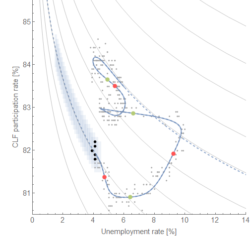
discussed here) possibly related to one apparent in the unemployment data, and which also leads to a novel "Beveridge curve" between unemployment and CLF participation:


The red and green points represent the center of the shocks to the two measures. Unlike the more traditional Beveridge curve, the non-equilibrium shocks are more spread out in time making the curves more difficult to see (and therefore why they hadn't been posited to exist). Their "equilibrium" (i.e. following the curves) values are directly related (rising CLF participation rate is directly proportional to declining unemployment).

In his Twitter thread, Bunker also references a graph from Jason Furman talking about the non-stationary trend in men's employment population ratio. It's times like these when I feel like the information equilibrium framework may really be a novel insight into macro; where Furman notes a negative trend, in my blog post from over a year ago I noted a positive trend (dynamic equilibrium) interrupted by recessions:


The decline is essentially due to a Poisson process (or similar) of recessions on top of an increasing trend. Since the recessions occur often enough with a great enough magnitude, the result is a general decline. In fact, the dynamic equilibrium forecast of an increasing EPOP has held up for over a year (a naive application of that secular trend would have been wrong by almost a full percentage point):


The other measure Bunker discusses is wage growth; I began tracking a forecast of the Atlanta Fed's wage growth data with the dynamic equilibrium model here:


Note that this also shows a non-equilibrium shock in the post-recession period. This is a model of dynamic equilibrium in wage growth, not levels, and so represents a constant wage "acceleration" [1].

Putting all of this information on a "macroeconomic seismograph", we can see the causal structure in the past two recessions (which are slightly different):


Click for higher resolution. A general trend appears of 1) a shock to unemployment, 2) a shock to wage growth, followed finally by 3) a shock to CLF participation. In between shocks there is a direct relationship between falling unemployment, rising wage growth, rising employment-population ratio, and rising CLF participation dynamic equilibria. However, the shocks to CLF participation are wide (the red and blue areas on the diagram above) so the limited areas where the variable follows the dynamic equilibrium (gray) make CLF less useful of a measure (it's more often away from equilibrium) — answering one of Bunker's questions.

But additionally, these dynamic equilibrium models describe the data well since the 1960s (where it exists) meaning they have a single dynamic equilibrium. There's no empirical backing to the concept of "slack" where wage growth might slow as unemployment or CLF participation reach some value. Unemployment will continue to fall until it rises again due to a recession. Wage growth will continue to rise until that recession happens. Those two things will happen with a 1-to-1 relationship, except where the non-equilibrium shock of recession has a different causal structure in the two time series.

Mathematically,

(d/dt) log (d/dt) log W ~ (d/dt) log U ~ (d/dt) log EPOP 

outside of a recession.
...
Footnotes:

[1] Continuously compounded wage growth is (d/dt) log W. Wage "acceleration" is (d/dt) log (d/dt) log W. It is the latter which appears to have a dynamic equilibrium.