Tuesday, December 24, 2019

Random odds and ends from December

I thought I'd put together a collection of some of the dynamic information equilibrium models (DIEMs) that only went out as tweets over the past couple weeks.

I looked at life expectancy in the US and UK (for all these, click to enlarge):


The US graph appears to show discrete shocks for antibiotics in the 40s & 50s, seatbelts in the 70s, airbags in the 90s & 2000s along with a negative shock for the opioid crisis. At least those are my best guesses! In the UK, there's the English Civil War (~ 1650s) and the British agricultural revolution (late 1700s). Again — my best guess.

Another long term data series is share prices in the UK:


Riffing on a tweet from Sri Thiruvadanthai I made this DIEM for truck tonnage data — it shows the two phases of the Great Recession in the US (housing bubble bursting and the financial crisis):


There's also PCE and PI (personal consumption expenditures and personal income). What's interesting is that the TCJA shows up in PCE but not PI — though that's likely due to the latter being a noisier series.


Here's a zoom in on the past few years:


Bitcoin continues to be something well-described by a DIEM, but with so many shocks it's difficult to forecast with the model:


We basically fail the sparseness requirement necessary to resolve the different shocks — the logistic function stair-step fails to be an actual stair-step:


A way to think about this is that the slope of this time series (the "shocks") are a bunch of Gaussians. When they get too close to each other and overlap, it's hard to resolve the individual shocks.

That's all for now, but I might update this with additional graphs as I make them — I'm in the process of a terrible cold and distracting myself with fitting the various time series I come across.

Saturday, December 14, 2019

Dynamic equilibrium: consumer sentiment

I looked at the University of Michigan's consumer sentiment index for signs of dynamic information equilibrium, and it turns out to be generally well described by it in the region for which we have monthly data [1]


The gray dashed lines are the dynamic equilibria. The beige bands are the NBER recessions, while the gray bands are the shocks to consumer sentiment. There might be an additional shock in ~ 2015 (the economic mini-boom) but the data is too noisy to clearly estimate it.

Overall, this has basically the same structure as the unemployment rate — and in fact the two models can be (roughly) transformed onto each other:


The lag is 1.20 y fitting CS to U and −1.24 y fitting U to CS meaning that shocks to sentiment lead shocks to unemployment by about 15-16 months. This makes it comparable to the (much noisier) conceptions metric.

Of course, this is not always true — in particular in the conceptions data the 1991 recession was a "surprise" and in the sentiment data the 2001 recession was a surprise. It's better to visualize this timing with an economic seismogram (that just takes those gray bands on the first graph and puts them on a timeline, colored red for "negative"/bad shocks and blue for "positive"/good shocks):


As always, click to enlarge.

Note that in this part of the data (and as we'll see, the rest of the data), CS seems to largely match up with the stock market. I've added in the impossibly thin shock in the S&P 500 data (along with a boom right before that looks a bit like the situation in early 2018) in October of 1987  — the largest percentage drop in the S&P 500 on record ("Black Monday", a loss of ~ 20%). Previously, I'd left that shock out because it's actually very close to being within the noise (it's a positive and a negative shock that are really close together, so it's difficult to resolve and looks like a random blip).

If we subtract out the dynamic equilibrium for consumer sentiment and the S&P 500, and then scale and shift the latter, we can pretty much match them except for the period between the mid 70s and the late 90s:


Remarkably, that period is also when a lot of other stuff was weird, and it matches up with women entering the workforce. It does mean that we could just drop down the shocks from the S&P 500 prior to 1975 into the consumer sentiment bar in the economic seismogram above.

I don't know if anyone has looked at this specific correlation before over this time scale — I haven't seen it, and was a bit surprised at exactly how well it worked!

...

Update 22 December 2019

Noah Smith tweeted a bunch of time series of surveys, so I took the opportunity to see how well the DIEM worked. Interestingly, there may be signs of running into a boundary (either the 100% hard limit, or something more behavioral — such as the 27% 'crazification factor'). Click to enlarge as always. First, the Gallup poll asking whether now is a good time to get a quality job:


And here is the poll result for the question about the economy being the most important issue in the US:


Both of these series are highly correlated with economic measures — the former with the JOLTS job openings rate (JOR), the latter with the unemployment rate:


...

Footnotes:

[1] Since many shocks — especially for recessions & the business cycle — have durations on the order of a few months, if the data is not resolved at monthly or quarterly frequency then the shocks can be extremely ambiguous. As shown later in the post (the S&P 500 correlation), we can look at some of the other lower resolution data as well.

Sunday, December 8, 2019

Unemployment in France (and Germany)

I thought I'd look in to the unemployment rate in France using dynamic information equilibrium after seeing a tweet from Manu Saadia. Originally, this appeared as a twitter thread, but I've expanded it into a blog post. Manu tells the story ...
The main economic problem of France is endemic, mass unemployment. It has been going on since I was born, in the early 70s. Left and Right governments have come and gone, reformed this and reformed that but mass unemployment has remained.
And that story is pretty much what the data says:


We have a series of non-equilibrium shocks that could easily be considered one long continuous shock from the late 60s until the 80s. Politically, this was under French Presidents de Gaulle, Pompidou, and Giscard — coming to an end under Mitterand. This set the stage for the persistently high unemployment rate.

The unemployment rate does not come down as fast as in France as it does in the US — the dynamic equilibrium is about d/dt log U = −0.05/y in France versus −0.08/y in the US, −0.09/y in Japan, or −0.07/y in Australia. A 10% unemployment rate will come down nearly a full percentage point in the US or Japan in a year on average in equilibrium, but only half a point in France. 

France also experienced the double dip that the entire EU experienced in the global financial crisis. Without that double-dip, unemployment in France would be closer to 5% today (assuming the dynamic equilibrium model is correct, of course). Adding a shock in 2000 in France didn't improve the metrics much. It's likely a genuine shock (like in the broader EU), but it seems a borderline case in the data.


Well, that double dip was not exactly experienced by the entire EU ...

Germany doesn't really experience the global financial crisis except as a bit of "overshooting" in a recession that starts in the early 2000s and additionally has no subsequent 2012 recession.


Germany turns out to be a counterexample to claims about that −0.05/y is representative of a structural problem unique to France made by Lars Christensen:
And there you have the answer: THERE is a major STRUCTURAL problem in France - otherwise wages would adjust faster to shocks. This combined with the lack of a proper monetary policy is the cause of France's unemployment problem.
Germany has a similarly low 'matching' dynamic equilibrium rate on the order of −0.05/y. France is actually a bit better at  −0.054/y compared to Germany at −0.049/y however we should be careful of reading too much into what is likely unrealistic precision. And Spain's matching rate appears to be closer to −0.12/y making it the "best" managed country of the three on this metric.

The main policy failure — if there is one — is to be found in the shocks (or single big shock) to the French economy in the 70s that raised unemployment to the higher level. This is similar to the "path dependence" in the unemployment rate for black people in the US compared to white. The shocks and matching rate/dynamic equilibrium are almost identical — it's just that the black unemployment rate was at a higher level sometime before the 1970s (Jim Crow & general racism) and so experiencing the same shocks to the same economy remained higher ever since.

Germany experienced a lesser version of those shocks to unemployment in the 60s and 70s as well as that lack of a second shock in 2012 in the global financial crisis putting it in a slightly better position today. 

It's a possibility that Christensen may be right about France's lack of an independent monetary policy with Eurozone policy set just right for Germany but too tight for France leading to a "double dip" and 2.5 percentage points higher unemployment. But like with Spain having the best labor market when judging by the dynamic equilibrium, it becomes pretty weird pretty quickly to make this "double dip" story work.

In addition to Germany, monetary policy must have been just right for Estonia, Greece, and Ireland by this "lack of a double dip" metric. In addition to France, monetary policy was also too tight for the Netherlands, Spain, Italy, Portugal, Finland, Slovenia, Luxembourg, and Austria. Again, that's if we use this "double dip" metric. Turkey and Australia also experience a negative shock at the same time despite not being on the Euro.

A more likely explanation is much simpler — a huge surge in the price for oil in 2011 (in part due to the Arab Spring uprisings):


In fact, the oil shocks of the 70s are blamed for the economic malaise in France and the end of the Trente glorieuses. Not every country has the same exposure to commodities prices — for example, unemployment in the US continued on its downward path unabated.

A country's unemployment history could also be caused by the oldest factor on record — just a bit of bad luck. For example, the US could have been in a similar state in at least one of these Monte Carlo unemployment rate histories:


Saturday, December 7, 2019

Money velocity, interest rates, and ... robots?

I'd been ruminating on a question from commenter Anti on my end of the year wrap-up post:
I can't get past the idea that monetarism is legitimate, but you seem to have a point about women entering the workforce. How likely is it that such demographic changes change money velocity and that central banks seem to take a long time realizing such changes occur? Perhaps the surge in working women increased velocity in the 70s, making it easier to spur inflation, and we've seen the trend reverse since.
As a recovering monetary model-curious person myself, and having looked at the correlations between money velocity and interest rates (like here for MZM, or money with zero maturity), I can agree that there is probably macro-relevant information in those relationships. In fact if you look at a long run interest rate series (like Moody's AAA corporate rate, which tracks the 10-year rate quite closely), it appears that money velocity and interest rates are basically measures of the same underlying thing [click to enlarge]:


That dynamic information equilibrium model (DIEM) for the AAA rate was the subject of a blog post from last year, and true to the information equilibrium relationship between rates and MZM velocity, velocity is well-described by a log-linear transformation of the rate model with different non-equilibrium shock parameters.

And if you look closely at those shocks, you can see that a) the shock to interest rates comes well before velocity, and b) the shock to interest rates is actually earlier than the demographic shock to the level of women in the labor force (which is closer to the velocity shock).

Did rising interest rates cause the demographic shock and subsequent inflation ... and everything else? It's kind of a neo-Fisherite view that was the rage in the econoblogosphere a couple years ago. But let's look at the causality in terms of an economic seismogram [click to enlarge]:


First, as a side note, this picture makes the view that spending on the Vietnam war was a factor on interest rates and the Great Inflation look even sillier — the shock to interest rates begins in the late 50s or early 60s ... well before the acceleration in the war.

But does this cause problems for the view that demographics (more specifically, labor force size) are a controlling factor in inflation? Did the rising AAA rate cause velocity to increase, which then caused women to enter the workforce and subsequently inflation to rise?

The issue with this view of the causality between monetary measures and inflation comes down to some of the same problems with the Vietnam war view — specifically:

  • Inflation reaches its peak about 3.5 years after Civilian Labor Force (CLF) growth does, and when CLF declines in the Great Recession, inflation reaches its nadir (“lowflation”) about 3.5 years later in 2013.
  • Those two changes are of comparable magnitude — the smaller CLF decline in the Great Recession results in a commensurately smaller decline in the price level.
  • There is no visible shock to the velocity of MZM or AAA interest rates in the opposite direction ~ 12.5 or 6.5 years before the lowflation shock for AAA and MZM, respectively. These would have to be in June of 2000 and June of 2006 (again, for AAA and MZM, respectively). In fact, at those moments those metrics are at relative highs compared to the DIEM path.
As I talk about both in my post on Granger causality and economic seismograms and in my book, due to the extremely limited nature of macroeconomic data (both in time series as well as in the number of macro-relevant events) we have to be extremely careful about claiming causality. The two shocks to the labor force are of different sizes and in opposite directions — which matches up with the two shocks of different sizes in opposite directions to inflation with almost exactly the same delay

I step on the accelerator and the car speeds up in the next couple seconds; I pull my foot off and it slows down over the next couple seconds. This is the situation we like to see in terms of causality. We don't want "long and variable lags" as Milton Friedman put it — that's just scientific nonsense. If I step on a pedal with the car accelerating a second later, it's hard to justify causality when I let off that pedal and the car accelerates more a few minutes later or worse ... does nothing.

That's the case we have with interest rates and velocity. That does not mean the shocks are unrelated to inflation — lowflation could have been caused by some other factor X. However, we'd then have the simple causal model with fixed lag dt between CLF and CPI = a log CLF(t+dt) + b  compared to a model where CPI = f(AAA, X) where we neither know what X is nor have any other non-equilibrium data with shocks to figure it out. Occam comes to our rescue!

That's one of the major things I tied to get a handle on in my book — causality. Causality is hard, especially in time series [1]. I made sure that I wasn't just relying on a single shock (any two DIEMs with a single shock of comparable width can be transformed into each other), and frequently went to other historical data to make sure any claims I was making bore out. For example, did you know that male paper authors started citing themselves much more in the years after women started working in greater numbers?

...

So why do we have this shock to monetary observables in the 50s and 60s? What is it about?

My guess is that it's about something entirely different: capital stock. There is a surge in capital stock around the same time period as the surge in interest rates. Post-war industrial automation resulted in a lot of investment in lots of new equipment to manufacture consumer goods — including the first robots. As I show on the economic seismogram, GMs first robot (that would show up on the Tonight Show a couple years later) is right at the leading edge of that shock to corporate AAA interest rates.

That's just my guess — but it's where my intuition would take me.

...

Addendum 10 December 2019

Another interesting thing we can add to this timeline are the shocks to the S&P 500 (treated as one extended shock) in the 60s and 70s:


Interest rates and velocity go up, and the S&P 500 comes down (link to more on the S&P 500 shocks).

...

Footnotes:

[1] This is not a serious statement, but rather a play on "Prediction is hard, especially about the future." This being the internet, someone almost certainly would have read that straight.

Monday, December 2, 2019

Information Transfer Economics: Year in Review 2019

It's the Information Transfer Economics Year in Review for 2019!

It's my annual meta-post where I try in vain to understand exactly how social media works. But most of all, it's a way to say thank you to everyone for reading. Perhaps there's a post that you missed. Personally, I'd forgotten that one of the top five below was written this year.

As the years go by (now well into the 7th year of the blog), the blog's name seems to be more and more of a relic. I do find it a helpful reminder of where I started each time I open up an editor or do a site search. Nowadays, I seem to talk much more about "dynamic information equilibrium" than "information transfer". In the general context, the former is a kind of subset of the latter:


All of the aspects have applications, it's just that the DIEM for the labor market measures a) gives different results from traditional econ, b) outperforms traditional econ models, and c) has been remarkably accurate for nearly the past three years.

Thanks to your help, I made it to 1000 followers on Twitter this year! It seems the days of RSS feeds are behind us (I for one am sad about this) and the way most people see the blog is through links on Twitter or Facebook. Speaking of which, the most shared article on social media (per Feedly) was this one:

Most shared
The post notes an interesting empirical correlation between the fluctuations in the JOLTS job openings rate (and even other JOLTS measures) around the dynamic equilibrium (i.e. mean log-linear path) with the fluctuations in the S&P 500 around the dynamic equilibrium. It's a kind of 2nd order effect beyond the 1st order DIEM description.
Feedly's algorithm for determining shares is strange, however. I'm not sure what counts as a share (since it's not tweets/retweets). Adding to the confusion as to what a share means, it didn't make the top 5 in terms of page views (per Blogger). Like most years, the top posts are mostly criticism. Those were:

Top 5 posts of the year

#1: MMT = Keynes + Monetary kookiness 
I wrote this soon after Doug Henwood's Jacobin piece that Noah Smith recently re-tweeted. For me, the whole "MMT" thing is not really theory because it doesn't produce any models with any kind of empirical accuracy. I actually have a long thread I'm still building where I'm reading the first few chapters of Mitchell and Wray's MMT macro textbook. Their entire approach to empirical science is misguided — it'd pretty much have to be because otherwise the MMT would've been discarded long ago. It's also politically misguided in the sense that it does not understand US politics. And as Doug Henwood points out, the US is probably the only country that meets MMT's criteria of being a sovereign nation issuing it's own currency because of the role of the US dollar in the world. But this blog post points out another way MMT bothers me: it's just weird. MMT acolytes talk about national accounting identities like how socially stunted gamers talk about their waifu.
#2: Resolving the Cambridge capital controversy with MaxEnt 
This started out as a tongue in cheek sequel to my earlier post "Resolving the Cambridge capital controversy with abstract algebra". Here I showed that the re-switching argument that eventually convinced Paul Samuleson that Joan Robinson was right turns out to have a giant hole in it if your economy is bigger than, say, two firms. This sucked me into a massive argument on Twitter about Cobb-Douglas production functions where people brought up Anwar Shaikh's "Humbug" production function — which I found to be a serious case of academic dishonesty.
#3: JOLTS day: January 2019 
No idea why this became so popular, but it was an update of the JOLTS data. It turns out the "prediction" was likely wrong (and even if it turns out there is a recession in the next year, it would still be right for the wrong reasons). I go into detail about what I learned from that failed prediction in this post.  
#4: Milton Friedman's Thermostat, redux 
This is one of my fun (as in fun to write) "Socratic dialogs" where I try to explain why Milton Friedman's thermostat argument is actually just question begging. 
#5: Market updates, Fair's model, and Sahm's rule 
This is another post that consists mostly of updates (including the inaccurate model from Ray Fair, who is possibly more well known for his inaccurate models of US presidential elections). But it's also where I talk about Claudia Sahm's "rule" that was designed to be a way for automatic stabilizers to kick in in a more timely fashion based on the unemployment rate. There's a direct connection between her economic implementation of a CFAR detector (a threshold above a local average) and my (simpler) dynamic equilibrium threshold recession detector.

The top 3 of 2019 made it into the top 10 of all time, which had been relatively stable for the past couple years. Overall, I'm posting less (I've been exceedingly busy at my real job this past year), but it seems that ones I do post are having more of an impact. Nothing will likely ever dislodge my 2016 post comparing "stock-flow consistency" to Kirchhoff's laws (in the sense that both are relatively contentless without additional models) with tens of thousands of pageviews for reasons that are still baffling to me.

New book!

I also wrote my second short book and released it in June — A Workers' History of the United States 1948-2020. As you can tell from the title, it's a direct response to Friedman and Schwartz's Monetary History and essentially says the popular narratives of the US post-war economy are basically all wrong. Inflation, unionization, and the housing bubble are manifestations of social phenomena — but especially sexism and racism. Check it out if you haven't already.


Thank you!

Thank you again to everyone for your interest in my decidedly non-mainstream approach to economics. Thank you for reading, commenting, and tweeting. I think the ideas have started to gain some recognition — a little bit more each year.

(Here are the 2018, 2017, and 2016 years in review.)

Thursday, November 28, 2019

Average weekly hours in the UK

I came across this chart (via a re-tweet from Ian Wright) where Alfie Sterling extrapolated the 1946-1980 trend in average hours worked in the UK alongside an extrapolation from data post-1980:


There seems to be an entire industry in the UK built out of extrapolations like this (here's productivity). I've reproduced a version of this — it uses data for all employees, not just full time employees, so the level is a bit higher [click to enlarge]:


But the story is roughly the same — the trend was a steeper decline before 1980 and shallower after. However, plotting the graph on this scale (as well as cutting off the data at 1946) obscures some of the issues with extrapolating linearly willy-nilly. Zooming in a bit and taking that linear fit back to 1900 shows the 1946-1980 trend is unique to the period 1946-1980:


In fact, as I looked at a couple of years ago, this data is pretty well described by a dynamic information equilibrium model (DIEM):


The trend from World War II (WWII) to 1980 is almost certainly part of the demographic shift of women into the workforce in Anglophone countries that seems to govern so many things. The other major effects seem to be WWI and WWII ending in 1918 and 1945, respectively. Aside from those three events, average weekly hours is on a steady decline of 0.13% (consistent with what I found earlier for US data [1]).

This perspective is a lot less policy (or productivity, or wage) dependent, depending more on major social changes (war, women entering the workforce) — a recurring theme in my book. The trends differ across countries (with e.g. France and Germany's annual labor hours falling at closer to a 1% rate) implying that they may be set more by social norms.

...

Footnotes:

[1] Here's the figure showing the -0.13% trend and the same 60s-70s demographic shock:


Saturday, November 23, 2019

The S&P 500 since 2017

One of the forecasts I made when I first worked out the theory behind the dynamic information equilibrium model (DIEM) besides the unemployment rate was for the S&P 500. This forecast has worked out remarkably well — though one might ask how could it not with error bands on the order of 20%? I changed the color scheme a bit since the original forecast, but here's where we are (note that it's a log plot):


The black line is post-forecast data. The vertical blue bands are NBER recessions. The vertical red/pink bands are the non-equilibrium shocks to the S&P 500. The green error bands are the 90% confidence bands for the entire data series since the 1950s and the blue error band over the forecast data was the 90% confidence projection from estimating an AR process on the deviations from the dynamic equilibrium starting from the forecast date. That AR process was trained on the data since 2010.

The AR process error gets fairly close to the error bands for the whole series. My interpretation of this is that the AR process model has captured pretty much nearly the entire range of error except for recessions — that is to say the data from 2010 to 2017 gave us a decent estimate of non-recessionary deviations from the dynamic equilibrium due to news shocks, policy, foreign affairs, et cetera.

I think the past couple years has given us some additional evidence that hypothesis is correct as the current administration has effectively conducted some "natural experiments". I estimated a couple of non-equilibrium shocks to the post-forecast data — we can zoom in to see them better:


The first shock is a positive one taking place at the end of 2017 and the beginning of 2018 — almost certainly due to the TCJA (which incidentally appears to have had other effects). If that had been the only thing that happened since 2017, everyone with a 401(k) account invested in an S&P index fund (full disclosure: that's what I do) would have had 17% more in it today even without contributions.

Instead of being around 3650, we're closer to 3100 today. Why? It appears to be due to the "trade war" with China. The major announcements are shown with black arrows (). The first round of tariffs began before the ink on the TCJA had dried (green arrow) and basically cut what was estimated to be a sizable 20% gain back to zero. A second round of tariffs comes in August and September of 2018, accompanied by a subsequent shock.

The Fed's rate increase in December 2018 did produce a rapid drop in the S&P 500, but the effect seems to have since evaporated. I estimated the tariff shock with and without the data from from December 2018 and January 2019 and got nearly the exact same result in terms of the longer run level in both cases. It's of course not impossible that the effect of tariffs is what evaporated and what we're seeing is purely the effect of the Fed — but this is inconsistent with a) the fact that the tariffs seem to have had a lasting effect in 2018 and b) the December 2015 rate increase also largely evaporated [1].

So it seems that mismanagement of government policy does have sizable & quantifiable effects on the stock market. However, the key conclusion here is that these policy decisions appear to be within the range of the overall 20% error since the 1950s — and that policy changes are basically a 2nd order effect on the stock market after recessions with deviations on the order of δ log SP500 ~ 0.1 with recessions having an effect δ log SP500 ~ 0.6-0.8 or more [2].

...

Footnotes:

[1] The December 2015 rate increase was a shock on the order of δ log SP500 ~ 0.15, but in less than a quarter was only δ log SP500 ~ 0.05 and consistent with zero by 2017. The December 2018 rate increase has almost exactly the same structure: an initial drop by δ log SP500 ~ 0.15 and a quarter later the level was back up to within δ log SP500 ~ 0.05 of the pre-hike level.


[2] And per [1], Fed decisions having an effect on the order of Î´ log SP500 ~ 0.15 that quickly evaporate over the next quarter.


Monday, November 18, 2019

Projections, predictions, accountability, and accuracy

John Quiggin has an entertaining article up at The Conversation that looks at the persistently undershooting IEA "projections" of renewable energy production as a case study in the lack of accountability for statements about the future. This particular case comes up every two years because the IEA updates their "projections" every two years (Quiggin cites a 2017 critique from Paul Mainwood and David Roberts talked about it at Vox two years prior in 2015). It's 2019, so time for another look!

I personally have a soft spot in my heart for these "hedgehog" graphs where the future lines keep missing the data — I keep a gallery of macroeconomic "projections" (predictions? forecasts?) here. Often, the dynamic information equilibrium model (DIEM) is a much better model (such as for the unemployment rate), so I wanted to try it on this data.

Why should the DIEM be an appropriate model? Well, for one thing we can view the generation and consumption of electricity as a matching model — a megawatt-hour of production is matched with a megawatt-hour of consumption. Renewable energy is then like a manufacturing sector job or a retail sector job (... or an unemployment sector job a.k.a. being unemployed). But a more visually compelling reason is that technology adoption tends to follow (sums of) logistic curves per Dave Roberts' article at Vox:


These are the same logistic curves the DIEM's non-equilibrium component is built from. Logistic curves are also seriously problematic for "center predictions" — you really need to understand the error bands. The initial take-off is exponential, resulting in enormous error bands. The center is approximately linear, and only once you have reached that point do the error bands begin to calm down (see here for an explicit example of the unemployment rate during the Great Recession).

One issue was that I had the hardest time finding corroborating data that went back further than the "actual" data in Mainwood's graph. I eventually found this which is claimed to come from the IEA (via the World Bank). It largely matches up except for a single point in the 90s, allowing for error in digitizing the data from the plot. (Be careful about production versus consumption and world versus OECD if you try to find some data yourself.) That point in the 90s is inexplicably near zero in Mainwood's "actual" data. It's possible there are some definition issues (it's non-hydro renewables, which may or may not include biomass). But as this isn't a formal paper, the recent data seems fine, and the details of the fit aren't the main focus here we can just proceed.

I ran the DIEM model for the IEA data from 1971 to 2015, and this was the result:


Overall, the DIEM forecast is highly uncertain, but encompasses the 2012 and 2016 IEA forecasts for the near future. Mainwood's "corrected" forecast (not shown here) is well above any of these — it represents a typical problem with forecasts of logistic processes where people first see a lot of under-estimation, over-correct, and seriously over-estimate the result.

The best way to see the DIEM forecast is on a log scale:


There are three major events in this data — one centered in the early 80s (possibly to due to oil shocks and changes in energy policy such as the Carter administration), a sharp change in the late 80s, and then finally the current renewable revolution with wind and solar power generation due to a combination of policy and technology. The equilibrium growth rate (the "dynamic equilibrium") is consistent with zero — i.e. without policy or technology changes, renewables don't grow very fast if at all.

You can also see that it's likely we have seen the turnaround point in the data around 2010 — but it is also possible the global recession affected the data (causing renewables to fall as a fraction of global energy production). The global recession may be making it look like the turnaround has passed.

Quiggin's larger point, however, is something I've never really even considered. Do people really see projections as different from predictions or forecasts? If someone tried to hide and say their lines going into the future were "projections" and therefore not meant to be "predictions", I would just laugh. Does this really fool anyone?

I cannot come up with a serious rational argument that projections are different from predictions. We sometimes call predictions forecasts because that seems to move a step away from oracles and goat entrails. But any statement about the value of a variable in the future is a prediction. Sure, you can say "this line is just linear extrapolation" (a particular model of expected future data) and that it most certainly won't be right (a particular confidence interval). But it's still a prediction.

That's why the error bands (or fan charts, or whatever) are important! If you draw a line and say that we shouldn't take it seriously when we discover it's wrong, that just means the ex ante error bands were effectively infinite (or at least the range of the dependent variable). As such, there's literally zero information in the "projection" compared to a maximally uninformative prior — i.e. a uniform distribution over the range of the data. You can show that with information theory. Any claim that a projection that shouldn't be compared to future data yet has some kind of value is an informational paradox. It represents information and yet it doesn't!

Is this why a lot of economic and public policy forecasts leave off error bands? Is somehow not explicitly putting the bands down believed to keep the confidence in some kind of unmeasured quantum state such that it can't be wrong?

But as Quiggin mentions, this has ramifications for accountability. People year after year cite the IEA "projections" that continue to be wrong year after year. And year after year (or at least every two years) some rando on the internet takes them to task for getting it wrong, and the cycle begins again.

The thing is that it's not that difficult to explain why the IEA projections are wrong. Forecasting the course of a non-equilibrium shock (in the DIEM picture) is nigh impossible without accepting a great deal of uncertainty. Even if you don't believe the DIEM, a logistic picture of technology adoption is sufficient to understand the data. The only problem is that they'd have to show those enormous error bands.

...

PS I am almost certain those error bands exist in their models; they just don't make it into the reports or executive summaries.

PPS The existence and form of "executive summaries" should be all the evidence we need that CEOs and other "executives" aren't super-genius Ãœbermenschen.

Friday, November 8, 2019

World GDP growth and silly models

In my travels on the internet, I came across this paper (Koppl et al [1]) from almost exactly a year ago. It has the silliest model of the world economy I've ever seen. Here's the abstract:
We use a simple combinatorial model of technological change to explain the Industrial Revolution. The Industrial Revolution was a sudden large improvement in technology, which resulted in significant increases in human wealth and life spans. In our model, technological change is combining or modifying earlier goods to produce new goods. The underlying process, which has been the same for at least 200,000 years, was sure to produce a very long period of relatively slow change followed with probability one by a combinatorial explosion and sudden takeoff. Thus, in our model, after many millennia of relative quiescence in wealth and technology, a combinatorial explosion created the sudden takeoff of the Industrial Revolution.
Caveats about extrapolating that far back notwithstanding, the problem isn’t so much what is written in the abstract but rather that the model cannot support any of the statements in it. Overall, it’s a good lesson (cautionary tale?) in how to go about mathematical modeling.

Just so there are no complaints that I "didn't understand the model", I went and reproduced the results. There's something they kind of gloss over in their paper that I'll come back to later that accounts for the small discrepancies.

First, the population data is basically exactly their graph (I have two different sources that largely match up):


The black dashed line at the end will come back later. Constructing their recursive M function (that represents the combinatorial explosion) and putting it together with the Solow model/Cobb-Douglas production function in the paper allows us to reproduce their graph of world output (GDP in Geary–Khamis international dollars) since the dawn of the Common Era (CE):


Like the population graph above and the M-function graph below, it is also graphed on a linear axis for some reason. They zoom in to 1800-2000 because they want to talk about the Industrial Revolution:


We reproduce this down to the segmented lines drawn between points in the time steps. Although you can't really see it in this graph, this is really part of a continuous curve in the model that goes back to at least the 1600s — it's not the Industrial Revolution (for more on take-off growth, see here or here). A log-log graph helps illustrate it a bit better:


The authors then show their output points alongside a measure of GDP in international dollars. For some reason it’s now points instead of line segments. But at least we’re on a log scale!


I didn’t use the exact same time series for comparison; instead, I used GDP estimates from Brad Delong here [pdf] that I had on hand. However, they're reasonably close to the data they present in their paper. In fact, it’s a bit better fit! I'm doing my best to be charitable. There is an almost exact factor of 4 difference in the level of their data and Delong's, which I think is accounting for “seasonally adjusted annual rate” for quarterly data. Koppl et al actually have two other model fits in their paper with different parameters. I just reproduced the yellow one that was closest to the data  (see the others at the end of this post).

The one graph I’m not reproducing exactly here is their M function. I think they just plotted a version with different parameters than for their yellow model result. As I didn’t care that much, I just did the M function from the yellow model result since that’ll be most germane to our discussion. Like most combinatorial functions, it goes along fairly flat (in linear space) and then jumps up suddenly (again, in linear space):


It starts at M₀, which is 50 in the parameters for their yellow result. The last several numbers in the series are 117.1, 125.3, 136.1, 151.0, 173.7, 213.2, 303.1, 668.8, 9323.4, 326360625.7. The next number is 4.9 × 10^26. Five hundred octillion.

What is supposedly happening in this model is that a current inventory of products (stick, flint, feathers) are at random brought together to produce a new product (an arrow for a bow) with some probability. That new inventory then has elements brought together to craft a new output good. It's basically a Minecraft crafting economy with the number of products you discover increasing combinatorially (roughly on the order of e.g. the gamma function or factorial). The factorials enter through a binomial coefficient.

Combinatorial explosion is building all along, but it really doesn't explain the Industrial Revolution. In fact, you can’t really say this “starts” anywhere with any kind of objective criteria. It starts at M₀, if anything, which is assigned to “year 1” (t = 0) — the beginning of the CE. The location of the super-exponential “take off” point (viewed on a linear scale) is then 60 or so time steps from year 1. But what is a time step? That’s what the authors gloss over. The time is just “scaled” so that the combinatorial series fits in the period from about “year 1” to about the present year.

The time steps turn out to be about 31 years (at least that's what I used), which is remarkably close to a “generation”. But this time scale is a fundamental parameter of their model — telling us where and when the combinatorial explosion occurs. If it had instead been on the order of a quarter, we could go from subsistence to the modern age in about 16 years. Instead whatever combination of current output goods that produces a new product with some probability happens only once every 30 years. You could of course adjust the probability to compensate a change in the time scale — making the probability parameters smaller increases the number of time steps it takes to cover the dynamic range of GDP values. However, since none of these parameters are estimated from some underlying data, the exact location and span of the model result in time is completely arbitrary.

I will pause to note that leaving out time scales like this is a general failing in economics (see here or here), making it impossible to understand the scope of their theoretical models.

The real  problem is when you go to the next time steps (I've also started adding graph labels to the graphs themselves). Combinatorial explosion doesn’t stop once you’ve explained as much of the data you want to explain. It keeps going, and going, and going, and going ...


Of course the GDP data ends so we can't see just how realistic this model is. Remember — their M function is heading towards 10^26 when it's about 600 around the year 2000.

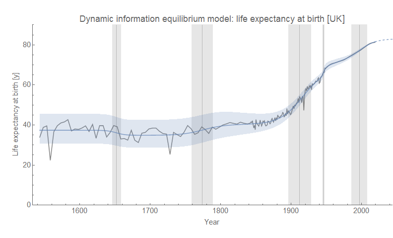
This made me want to use the  the dynamic equilibrium model to extrapolate the data a bit further. In it, we have general exponential growth interrupted by periods of much higher (or lower) growth (“shocks”).

I wrote about population growth and how you might go about modeling it with the dynamic equilibrium model about two years ago with a follow up referencing the well-known 1970s report titled Limits To Growth. The general result there is that the recent population data is consistent with a saturation level of about 12-13 billion people by 2300. That most recent surge in population growth is associated with the advent of modern medicine (others seem to be associated with e.g. the Neolithic revolution in farming or sanitation). Maybe that’s right, maybe that’s wrong. But at least it’s a realistic extrapolation based on a slow decline in world population growth.


I used the world GDP data and population data to create a GDP per capita measure. I then extrapolated that data using another dynamic equilibrium model — one that’s remarkably consistent with the widespread phenomenon of women entering the workforce in larger numbers in the 1950s, 60s and 70s in the world’s largest economies. Again, it’s possible GDP per capita will continue to expand at its current rate for much longer than the next 25 to 50 years, but with growth slowing in most Western countries and even China, it’s entirely possible we’ll see a decline to a rate of growth more consistent with the 1800s than the 1900s.


We can combine our extrapolation of GDP per capita with population to form an extrapolation of world GDP over the next hundred years. The new picture of the longer term output growth shows how silly the combinatorial model is unless we arbitrarily restrict it to the most recent 2000 years.


In 2077 [2], world GDP by this extrapolation is about 513 trillion 1990 Geary–Khamis international dollars instead of the combinatorial version which gives 8.2 duodecillion (10^39) international dollars. We can compare this to world GDP in 2000 which was about 96 trillion international dollars in this data.

An increase by a factor of 5 from the year 2000 is not entirely unreasonable given slowing global growth, but an increase by a factor of a duodecillion (which I had to look up) [3] seems ... um, improbable.

US real GDP grew by a factor of about 10 over 70 years from 1950 to today, but that also includes the period in the middle of the last century where growth was much higher. Plus, the data in the GDP extrapolation also grows by a factor of about 10 over 70 years from 1950 to 2020.

The main take away is that this combinatorial model is both arbitrary in its timing — it's set up to have growth explode after the industrial revolution — but also its scope, being limited to the period from about 1 CE to about 2000 CE [4]. Going a single time step too far gives not just unrealistic but absolutely silly results. The model seems very much like someone (maybe Koppl) had this combinatorial idea (maybe after someone mentioned Minecraft to him) and it was given to a bunch of grad students to figure out how to make it fit the data. Odd parameters, large time steps that result in segmented data graphs, arbitrarily setting terms in sums to zero — it's not a natural evolution of a model towards the data. I saw this in their figure 4 and laughed:


Of course, the default color scheme for Mathematica is instantly recognizable to me (and in part why I tried to reproduce the figures exactly down to the dotted grid lines). But these line segments are all supposed to be aiming for that blue line. None of them are remotely close to even qualitatively explaining the data.

It's not an a priori bad insight for a model — it makes sense! It's kind of a Gary Becker irrational agents meets a Minecraft opportunity set. But combinatorial explosion is just too big to explain GDP, which is much more in the realm of the exponential with varying growth rates. So instead of mathematical modeling, you start building a Rube Goldberg device to make the model output kind of look like the data ... if you squint ... from across the room.

And yet instead of languishing on a grad student's file share or hard drive where it should be, this model ended up LaTeX'd up on the arXiv.

...


Footnotes

[1] It should be noted that Roger Koppl, the lead author, is associated with Mercatus and George Mason University (like one of the other co-authors) with lots of references to Hayek and Austrian economic in any description. Additionally, the paper came up on Marginal Revolution this past week. It should be a huge grain of salt, and in fact this paper is pretty typical of the quality of the work product from GMU-related activities [5].

[2] Chosen due to the time step scale.

[3] This made me think of Graham's number — for a time the largest number that has ever been used for anything practical (in this case it's an upper bound for a graph coloring problem). In part because the Koppl et al GDP is so high itself, but also because like the suspicion of mathematicians that the real answer for Graham's number is about 20, a more realistic estimate of GDP is much, much lower.

[4] There are other choices, such as limiting ourselves to only about 4 items in the combinations that I believe was more a computational limit (my computer has overflow problems if you increase that number or add too many time steps), that basically turn this "model" into a ~10 parameter fit.

[5] The paper goes on a tangent about "grabbing" which is basically a right wing rant:
Our explanation might seem to neglect the important fact of predation, whereby some persons seize (perhaps violently) goods made by others without offering anything in exchange for them. Such “grabbing,” as we may call it, discourages technological change. 
The model put forward has absolutely nothing to do with this and can't explain technological change well enough to warrant speculation about secondary effects like this.

In addition, this is completely ahistorical. Violently seizing others' goods is in fact a major driver of innovation in history — a huge amount of innovation comes in the form of weapons. The silicon chips you're using right now to read this? Needed to make the computations fast enough to accurately guide a nuclear weapon to its target. The basics of computers with vacuum tubes were built to better aim artillery — even physics itself came from this.