One of the forecasts I made when I first worked out the theory behind the dynamic information equilibrium model (DIEM) besides the unemployment rate was for the S&P 500. This forecast has worked out remarkably well — though one might ask how could it not with error bands on the order of 20%? I changed the color scheme a bit since the original forecast, but here's where we are (note that it's a log plot):

The black line is post-forecast data. The vertical blue bands are NBER recessions. The vertical red/pink bands are the non-equilibrium shocks to the S&P 500. The green error bands are the 90% confidence bands for the entire data series since the 1950s and the blue error band over the forecast data was the 90% confidence projection from estimating an AR process on the deviations from the dynamic equilibrium starting from the forecast date. That AR process was trained on the data since 2010.
The AR process error gets fairly close to the error bands for the whole series. My interpretation of this is that the AR process model has captured pretty much nearly the entire range of error except for recessions — that is to say the data from 2010 to 2017 gave us a decent estimate of non-recessionary deviations from the dynamic equilibrium due to news shocks, policy, foreign affairs, et cetera.
I think the past couple years has given us some additional evidence that hypothesis is correct as the current administration has effectively conducted some "natural experiments". I estimated a couple of non-equilibrium shocks to the post-forecast data — we can zoom in to see them better:

The first shock is a positive one taking place at the end of 2017 and the beginning of 2018 — almost certainly due to the TCJA (which incidentally appears to have had other effects). If that had been the only thing that happened since 2017, everyone with a 401(k) account invested in an S&P index fund (full disclosure: that's what I do) would have had 17% more in it today even without contributions.
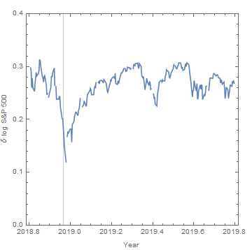
Instead of being around 3650, we're closer to 3100 today. Why? It appears to be due to the "trade war" with China. The major announcements are shown with black arrows (↑). The first round of tariffs began before the ink on the TCJA had dried (green arrow) and basically cut what was estimated to be a sizable 20% gain back to zero. A second round of tariffs comes in August and September of 2018, accompanied by a subsequent shock.
The Fed's rate increase in December 2018 did produce a rapid drop in the S&P 500, but the effect seems to have since evaporated. I estimated the tariff shock with and without the data from from December 2018 and January 2019 and got nearly the exact same result in terms of the longer run level in both cases. It's of course not impossible that the effect of tariffs is what evaporated and what we're seeing is purely the effect of the Fed — but this is inconsistent with a) the fact that the tariffs seem to have had a lasting effect in 2018 and b) the December 2015 rate increase also largely evaporated [1].
So it seems that mismanagement of government policy does have sizable & quantifiable effects on the stock market. However, the key conclusion here is that these policy decisions appear to be within the range of the overall 20% error since the 1950s — and that policy changes are basically a 2nd order effect on the stock market after recessions with deviations on the order of δ log SP500 ~ 0.1 with recessions having an effect δ log SP500 ~ 0.6-0.8 or more [2].
...
Footnotes:
[1] The December 2015 rate increase was a shock on the order of δ log SP500 ~ 0.15, but in less than a quarter was only δ log SP500 ~ 0.05 and consistent with zero by 2017. The December 2018 rate increase has almost exactly the same structure: an initial drop by δ log SP500 ~ 0.15 and a quarter later the level was back up to within δ log SP500 ~ 0.05 of the pre-hike level.

[2] And per [1], Fed decisions having an effect on the order of δ log SP500 ~ 0.15 that quickly evaporate over the next quarter.
That 17% number is about right. I calculate it like this:
ReplyDelete[S&P 500 discount rate / (S&P 500 discount rate - change in NGDP growth expectations)] -1
[~.043 / (~.043 - ~.0063)] - 1 = ~17%
The most recent YOY PCE inflation rate was about 1.73%, so that would mean real GDP growth potential was at least ~3% over this period.
That calculation of mine is just the arithmetic equavalent of using a discounted earnings formula based on an integral, and using current earnings as the multiplier. The discount rate is the same as the earnings/yield ratio.
An interesting potential implication is that there is a related equilibrium condition in which the E/P ratio for the S&P 500 should equal NGDP growth expectations at any given moment, in monetary equilibrium. Divergences would signal a monetary disequilbrium condition.
For example, I created these simple graphs:
https://pbs.twimg.com/media/EJ1z3EnWwAEHsTj?format=jpg&name=large
https://twitter.com/mike_sandifer/status/1197240471313096707/photo/2
I already had thought that r* should equal NGDP growth expectations, in monetary equilibrium, so if I'm correct, the above is another equilibrium condition.
Obviously, at this point, some econometrics will need to be applied to make a case that is at all convincing. It's just a hypothesis at the moment.
By the way, he Bretton Woods period doesn't count, due to the fixed exchange rate regime.
I should address a particularly outrageous potential implication of my nacent hypothesis, which is that, if correct, one could start to argue E/P is the best indicator for ROR on the stocks, and hence the equity premium puzzle is solved. The equity premium would go away in monetary equilibrium.
The logic behind these equilibrium hypotheses is as follows:
If a security existed that paid a dividend equal to NGDP growth expectations, investors should be indifferent between it and risk free bonds. The risks would be equal and opposite.
The same would be said for risk free bonds and equities, if my hypothesis isn't silly. If there were either perfect monetary equilibrium at all times, or if the risk of inflation and disinflation shocks were equal, risk would also be equal.
It's likely I'm making a simple mistake somewhere, and/or that I'm just some combination of crazy, stupid, ignorant, and naive.
I know you're not a believer in the old quantity of money theory, at least the simple version, as usually stated, but correlations here with MZM velocity are also interesting to me.
Thanks Mike.
DeleteThat NGDP-S&P yield graph is a remarkable correlation. One thing that's interesting to me is that segment in the late 60s/early 70s where S&P 500 yield is relatively flat. That actually corresponds to what looks like a major negative shock to the S&P 500 (or a series of smaller negative shocks) dynamic equilibrium that seems unrelated to most other macro shocks.
I'm glad you liked it. I just put up a blog post about it earlier tonight. It is poorly written and very likely silly, but it gets my thoughts out there a bit.
ReplyDeletehttps://thehonestbrokernet.wordpress.com/2019/11/25/an-exact-approach-to-macroeconomics/