Monday, March 5, 2018

Dynamic equilibrium model: fertility as a leading indicator


A new NBER working paper titled Is fertility a leading economic indicator? by Kasey Buckles, Daniel Hungerman, and Steven Lugauer looks at birth data to show that conceptions (in the graph at the top of the page) are a leading indicator of recessions. Their abstract:
Many papers show that aggregate fertility is pro-cyclical over the business cycle. In this paper we do something else: using data on more than 100 million births and focusing on within-year changes in fertility, we show that for recent recessions in the United States, the growth rate for conceptions begins to fall several quarters prior to economic decline. Our findings suggest that fertility behavior is more forward-looking and sensitive to changes in short-run expectations about the economy than previously thought.
I tried to look at the data using the dynamic information equilibrium model; the details of the model are in my paper [1] where I also looked at JOLTS data as providing a leading indicator of recessions. The model turns out to be a pretty decent description of the data:


And it is a leading indicator, beating out JOLTS data by several months (an economic "seismograph" per here) [2]:


Click for the full resolution image. The interesting thing to me is that a human social factor is a leading indicator with a greater lead time than economic factors (like the number of hires or job openings). This points to recession as a predominantly social phenomenon, not economic, being viable hypothesis. There could well be other economic phenomena with longer lead times (I could see e.g. housing coming first in the decision process of having a child [3]), and it could therefore be more of a mixture of social and economic factors. But the big takeaway is that a recession is a complex process that involves the interaction of many variables over the course of years before the thing that gets called an "NBER recession" is said to start.

...

Update 1 May 2018

The conceptions indicator appears to lead the shock to the Case-Shiller index (click to expand):


...

Footnotes:


[1] The information equilibrium model has a particularly clear interpretation here as "male event" and a "female event" meeting in a "conception event" in physical state space.

[2] C = conceptions, HIR = JOLTS hires, JOR = JOLTS job openings, QUR = JOLTS quits, U = unemployment rate, W = wage growth, CLF = Civilian Labor Force participation rate

[3] The actual mix of factors might also depend strongly on the social institutions of the country in question — the US has particularly stingy maternal/paternal leave provisions and therefore a fall in conceptions might not lead recessions in e.g. France which has much more parent-friendly policies.

Thursday, March 1, 2018

Shock cluster analysis and some new visualizations

As part of my attempt to rewrite the macroeconomic history of the United States [1], I've been looking at all of the dynamic information equilibrium model "seismograms" I can. I decided to try some machine learning algorithms to see if there's anything to be extracted. But first, I did some simple clustering using the DBSCAN algorithm. I used only the shock centers (i.e. time) and tried both values (i.e. the years like 1977 or 2008) as well as differences (i.e. the time between shocks like 4 years). The former only seemed to cluster the vectors based on length which is an artifact of the available data. The latter did a bit better [2] and found the following groupings:


For the label definitions, see [3]. In this result, GNP, Case-Shiller housing index, and AMB are all on their own. I believe the JOLTS measures were associated with the CLF measures simply because they were too short — if more JOLTS data was available they'd probably be placed with the unemployment rate. But the most interesting clusters were #2 and #3 which associated NGDP with women's EPOP and the unemployment rate with men's EPOP. This is part of the story about women entering the workforce as a driving factor in growth I've been telling (while men in the workforce are basically a cyclical component).

I've also been trying to come up with a better way to visualize the information — the solid bars (see footnote [1]) do nothing to indicate the relative magnitude of the shocks and only show one measure of the duration (using the width parameter). Here's a first attempt at a "continuous" visualization that also includes magnitude (relative to each individual measure):


In this color scheme, blue are positive (or "good") shocks which red are negative (or "bad") shocks. Inflation is categorized as "good" here. The "beige" regions are where the model is following the dynamic information equilibrium. The demographic shift of women entering the labor force (CLF W) can be seen to precede most of the other macroeconomic measures (NGDP, DEF, etc).

This selection shows the fading Phillips curve (shocks to employment coming alongside falling inflation — the red bands in U following on the falling side the blue bands in DEF fading out by the 2000s) best, with peak "Phillips curve" right in the middle of the shock to women's employment-population ratio:


It also shows how after the demographic shock to women's EPOP, it becomes correlated with men's EPOP (which is correlated with the unemployment rate).

...

Footnotes:

[1] This is part of a longer-term project of self-deprecating hubris. Here's the diagram so far (click for the actual higher resolution version):


[2] "Seismograms" of the clusters:


[3] Legend

GNP = Gross National Produc
NGDP = Nominal Gross Domestic Product
W = Wage growth
EPOP W (M) = Employment population ratio for Women (Men)
SP500 = S&P 500 stock index
U = Unemployment rate
Case-Shiller = Case-Shiller housing price index
CPI (C-S) (cycle) = Consumer price index (Case-Shiller data) (cyclical component)
PCE (cycle) = Personal Consumption Expenditures price index (cyclical component)
HIR, JOR, QUR = JOLTS hire, job opening, and quit rates
CLF W (M) = Civilian Labor Force level for Women (Men)
NGDP/L = Nominal GDP divided by total nonfarm employment
MICH = Michigan inflation expectations
AMB = St. Louis Adjusted Monetary Base
DEF = GDP deflator
CLF part= CLF participation rate


Cyclical component here means that the resolution of the search for shocks was higher (bandwidth of the kernel smoother was smaller). You can interpret these as fluctuations on top of the broad shocks in the low resolution CPI and PCE measures. Since the old "seismograms" don't include magnitude, it is hard to tell that the magnitude of the cyclical CPI/PCE is consistent with the broad shock measure (the largest cyclical shocks happen in the middle of the broad shocks, with the earlier and later ones being much smaller — see the continuous versions above).

Wednesday, February 28, 2018

Forecast performance of a quantity theory of labor


One of the dynamic information equilibrium model forecasts I've been tracking on the order of a year now to measure its performance is what I call the "N/L" or "NGDP/L" model [1] (specifically FRED GDP, i.e. nominal GDP, divided by FRED PAYEMS, i.e. total nonfarm payrolls). Revised GDP data came out today, so I thought it'd be a good time to check back in with the model [2]:


One way to think about this is as a measure of nominal productivity. We are coming out of the aftermath of the shock to the labor force following the great recession, so we can see a gradual increase back towards the long-run equilibrium.

If we use this dynamic equilibrium model instead of NGDP alone as the shocks, we can see in a history "seismograph" that this measure basically coincides with the inflation measures.


There's a good reason for this: this is effectively a model of Okun's law (as described here) if we identify the "abstract price" with the price level P:

$$
P \equiv \frac{dNGDP}{dL} = k \; \frac{NGDP}{L}
$$

which can be rearranged

$$
\begin{align}
L & = k \; \frac{NGDP}{P} \equiv RGDP\\
\frac{d}{dt} \log L & = \frac{d}{dt} \log RGDP
\end{align}
$$

to show changes in employment (and therefore unemployment) are directly related to changes in real GDP.

...

Footnotes

[1] Also, the "quantity theory of labor" per the title because the model implies log NGDP ~ k log L.

[2] Here is the complete model:


Tuesday, February 27, 2018

Women in the workforce and the Solow paradox

Paddy Carter sent me a link on Twitter to a study [pdf] using a different model that came to conclusions similar to the view I've been expressing on this blog:
The increase in female employment and participation rates is one of the most dramatic changes to have taken place in the economy during the last century.
From their conclusions:
Furthermore, the unexplained portion [of the rise in women's employment] is quite large and positive; in other words, for cohorts born before 1955, the simulations overpredict female employment and for more recent cohorts, underpredict it. Therefore, there must have been other changes taking place among married women by cohort. We have shown above that it is consistent with the model to claim that technological progress in household production or a change in social norms has brought down the costs of working outside the home.
As part of my continuing series of dynamic information equilibrium "seismograms" (previously here), I put together another version of the story of women entering the workforce [1] as a driver of dramatic changes in the economy:


A big lesson is about causality. The positive shock to the level of women in the labor force precedes a (smaller relative) shock to the level of men in the labor force, both of which precede shocks to output and finally inflation (both CPI and PCE shown). Women entering the workforce caused a general economic boom — which drew additional men into the workforce and increased output and prices.

In the study linked above, the authors speculate that some of the effect was due to "technological progress in household production" (e.g. household labor-saving devices like washing machines and dishwashers) which made me think of the 'Solow paradox' ("You can see the computer age everywhere but in the productivity statistics."). What if the reason that household technology shows up in the economy is because household technology enabled more people to enter the labor force, while computers were mostly used by people already in the labor force [2]? This idea can be taken a step further to suggest that maybe the high GDP growth and inflation of the 1970s was due to the fact that a significant fraction of work that isn't counted in GDP statistics (household production) was automated allowing people to participate in work that was counted in GDP. That is to say that if household production was counted in GDP, it is possible that there might not have been a "great inflation".

This is of course speculative. However it is a good "thought experiment" to keep in mind to keep you from assuming that GDP is some ideal measure and remind you that the "events" that appear in the GDP data may well be artefacts of the measurement methodology [3].

...

Update

Diane Coyle makes the case [pdf] for the possibility I mention in footnote [2]: transition to more "digital production" behind recent low productivity.

...

Update 28 February 2018

Commenter Anti below mentions inflation expectations, so I thought I'd add the dynamic information equilibrium model of the price level implied by the University of Michigan inflation expectations data [4]. I've added the result to the macroeconomic seismogram:


Note that shock to inflation expectations follows the shock to measured inflation (making a simple backward-looking martingale a plausible model).

...

Footnotes

[1] Here are the CLF models for men and women:


The NGDP model is from here; the inflation models were used in my first history seismogram.

[2] This brings up the question of whether current home production that isn't counted in GDP — much of which is done on computers — is behind the recent "low growth" of a lot of developed economies.

[3] And even the economic system as households (as well as firms) are typically more like miniature centrally planned economies.

[4] The model fit is pretty good (dynamic equilibrium is α = 0.03, or basically 3% inflation):


Thursday, February 15, 2018

Dynamic equilibrium in wage growth


I saw some data from the Atlanta Fed [1] on wage growth that looked remarkably suitable for a dynamic information equilibrium model (also described in my recent paper). One of the interesting things here is that it is a dynamic equilibrium between wages ($W$) and the rate of change of wages ($dW/dt$) so that we have the model $dW/dt \rightleftarrows W$:

$$
\frac{d}{dt} \log \frac{d}{dt} \log W = \frac{d}{dt} \log \frac{dW/dt}{W} \approx \gamma + \sigma_{i} (t)
$$

where $\gamma$ is the dynamic equilibrium growth rate and $\sigma_{i} (t)$ represents a series of shocks. This model works remarkably well:


The shock transitions are in 1992.0, 2002.4, 2009.4, and 2014.7 which all follow the related shock to unemployment. A negative shock to employment drives down wage growth (who knew?), but it also appears that wage growth has a tendency to increase at about 4.2% per year [2] unless there is a positive shock to employment (such as in 2014) when it can increase faster. The most recent downturn in the data is possibly consistent with the JOLTS leading indicators showing a deviation, however since the wage growth data seems to lag recessions it is more likely that this is a measurement/noise fluctuation.

I added the wage growth series to the labor market "seismogram" collection, and we can see a fall in wage growth typically follows a recession:


...

Update 20 March 2021

It's not groundbreaking, but I should add that since $W \rightleftarrows NGDP$, the model is basically (by the transitive property of information equilibrium) that increases in NGDP are informationally equivalent to increases in the rate of growth of wages — a growing economy opens the opportunity set for wage growth.

At least until this happens.

(I've felt that the $\frac{dW}{dt} \rightleftarrows W$ formulation was a bit abstract, but realized I've never updated the post with how I thought about it in a more concrete way.)

...

Footnotes:

[1] The time series is broken before 1997, but data goes back to 1983 in the source material. I included data back to 1987. However the data prior the 1991 recession does not have the complete 1980s recession(s), so the fit to that recession shock would be highly uncertain and so I left it out.

[2] Wage growth it typically around 3.0% lately, so a 4.2% increase in that rate would mean that after a year wage growth would be about 3.1% and after 2 years about 3.3% in the absence of shocks.

Are interest rates inexplicably high?

The interest rate model of the long and short term interest rates are predicting average interest rates below the current observed rates. For example in this forecast:


Now the actual forecast is for the average trend of monthly rates and I'm showing actual daily interest rate data, so we can expect to see occasional deviations even if the model is working correctly.

But how can we tell the difference between some expected theoretical error and a deviation? I decided to look at the elevated recent data in the light of the models' typical error. In the case of the long rate above, we're in the normal range:


The short rate is on a significant deviation:


However these errors basically assume that the model error is roughly constant in percentage (i.e. a 10% error means 100 basis point error on a 10% interest rate while a 10% error means a 10 basis point error on a 1% interest rate). This is definitely not true because the data is reported only to the nearest basis point, but the finite precision effect should only come into play near log(0.01) ~ -4.6. This error is possibly due to the Federal Reserve's implied precision of 25 basis points where log(0.25) ~ -1.4. Since the Fed doesn't make changes of less than a quarter basis point, and the short rate typically sticks close to the Fed funds rate, we'd expect data near or below log(0.25) as shown on the graph to have larger error than points above log(0.25).

I don't see any particular reason to abandon these models without a more significant deviation.

Wednesday, February 14, 2018

Comparing CPI forecasts to data

New CPI data is out today, and here is the latest data point as both continuously compounded annual rate of change and year-over-year change. The latest uptick is consistent with the a general upward trend after the post-recession shock to the labor force.


Tuesday, February 13, 2018

Some historical myths about Einstein and relativity

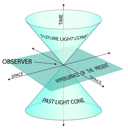
Which "thought experiment" leads you this geometry?

One of the things I've noticed ever since I started doing some "freelance" (or "maverick" or "nutcase") economic research is how many strange accounts of how special relativity came about are out there in the world. It's a story frequently invoked by people from all walks of life from economists to philosophers to general fans of science as an example of an ideal process of science. However the story invoked is often at odds with what actually happened or with how physicists today view the outcome.

The popular re-telling actually has many parallels with the popular but erroneous [1] re-telling of how 70s inflation "proved Friedman was right" in macroeconomics — even to the point where some practitioners themselves believe the historical myths. The popular (but false) narrative goes something like this: Michelson and Morely conclusively disproved the idea of the aether and in order to solve the resulting problems, Einstein used intuition and some thought experiments about moving clocks to derive a new theory of physics that refuted the old Newtonian world.

This should immediately raise some questions. 1) What problems with Newtonian physics would be caused by showing the aether (which doesn't exist) doesn't exist? 2) Why do physicists still use Newtonian physics? 3) Isn't Einstein famous for the equation E = mc² — which thought experiment leads to that?

The real story is more like this: Maxwell had produced an aether-based framework that was unifying the physics of light waves, electricity, and magnetism but there were some counterintuitive aspects of this framework that all had to do with moving charges and light sources involving a bunch of ad hoc mathematical modifications like length contraction, models of the aether, and an inconsistency in the interpretation of Maxwell's equations; Einstein came up with a general principle that unified all of these ad hoc modifications, made the aether models unnecessary, and resolved the asymmetry.

This answers my questions 1) through 3) above. 1) The aether was shown to be unnecessary, not erroneous. 2) Newtonian physics is a valid approximation when velocity is small compared to the speed of light. 3) E = mc² is a result of Lorentz invariance (i.e. math), not the thought experiments that help us get over the counterintuitive aspects of Lorentz invariance.

Now I am not a historian, so you should take this blog post as you would any amateur's. I did an undergraduate research project on the motivations for special relativity as part of my interdisciplinary science honors program [2], presented the result in a seminar, and I'm fairly familiar with the original papers (translated from German and available in this book). I also spent a bit of time talking with Cecile DeWitt about Einstein, but I'd only really use this to confirm the popular notion that Einstein had a pretty robust sense of humor so direct quotes should be considered with that in mind.

Let's begin!

Myth: Einstein was "bad at math"

This takes many forms from denial that the theoretical advances Einstein made were extremely advanced math at the time, to that he was actually bad at math leading him to his "thought experiments". This myth likely arises from a quote from a 1943 letter in response to a high school student (Barbara Wilson) who had called Einstein one of her heroes (emphasis mine):
Dear Barbara: 
I was very pleased with your kind letter. Until now I never dreamed to be something like a hero. But since you have given me the nomination, I feel that I am one. It's like a man must feel who has been elected by the people as President of the United States. 
Do not worry about your difficulties in mathematics; I can assure you that mine are still greater.
This probably was just said as encouragement, and Einstein might even have been thinking about his own crash course in differential geometry and comparing himself to mathematicians he knew like his teacher Minkowski. Einstein was something of a mathematical prodigy when he was younger and all of his work on relativity is mathematically challenging even for modern physics students. It would be hard to look at mathematics like this and say the person who was able to use it to produce an empirically successful theory of gravity was "bad at math". Also, here's the blackboard he left after his death:

You forgot to contract the indices on the Christoffel symbols.

Update 19 January 2019 (H/T Beatrice Cherrier). Apparently the math was so obscure at the time that only Einstein and is close mostly German colleagues really understood it and due to English-German animosity in WWI it took some time to leak out to English physicists. The article that's from also has other things related to the rest of this post.

Myth: Einstein's thought experiments led to relativity

There are quite a few versions of this idea, but really it is more the reverse. Math led Einstein to conclusions he used thought experiments to understand (i.e. explain to himself and others) because of how counterintuitive they were. Maxwell's equations and their Lorentz invariance led Einstein to effectively promote a symmetry of electromagnetism to a symmetry of the universe. Einstein later used Minkowski's mathematical representation of a 4-dimensional spacetime as the framework for what would become general relativity.

It's somewhat ironic because Mach — who coined our modern use of "thought experiment" and that Einstein had learned "relativity" from — believed that human intuition was accurate because it was honed by evolution. But why would evolution provide humans with the capacity to intuitively understand the bending of space and time (or the quantum fluctuations at the atomic scale)? Einstein turned that upside-down, and used Mach's thought experiments to instead explain counterintuitive concepts like time dilation and length contraction. I think a lot of people confuse Einstein's and Mach's ideas of "thought experiments" which led to this myth [3]. You can read more about this here.

I once had a commenter on this blog who decided to argue against even direct quotes from Einstein saying he got the idea of space-time for general relativity from Minkowski's 4-dimensional mathematics. Although some things in physics get named for the wrong person (the Lorentz force wasn't first derived by Lorentz), it's called Minkowski space-time for a reason.

This is a powerful narrative for some reason; I suspect it is the math-phobic environment that seems unique to American discourse. It is fine as an American to freely admit you are bad at math and still think of yourself as somehow "cultured" or "intellectual" (or in fact to elevate your status). The myth that Einstein didn't need math to come up with relativity plays into that.

Myth: The aether was disproved just before (or by) relativity

As I talked about here, there were actually several different theories of the aether (e.g. aether dragging) and various negative results over 50 years from Fizeau's experiment to Michelson and Morely's were often seen as confirmation of particular versions. Experiments continued for many years after Einstein's 1905 paper [3], and despite the modern narrative that Michelson and Morely's experiment led to special relativity it was really more about mathematical theory than experiment [4].

I'm not entirely convinced that the aether has been completely "disproved" in the popular imagination or even among physicists anyway. We frequently see general relativity and gravity waves explained through the "rubber sheet" analogy which might as well be called an "aether sheet". If the strong and weak nuclear forces hadn't been discovered in the meantime it is entirely possible that Kaluza and Klein's 5-dimensional theory that combined general relativity and electromagnetism would have become the dominant "standard model" and the aether could have been re-written in history as what space-time is made of [5].

What the #$@& is this substance that's oscillating here?

Myth: Special relativity "falsified" Newtonian physics

This one can be partially blamed on Karl Popper, but also on various representations and interpretations of Popper. I've frequently found descriptions of Popper's idea of falsification that say something like "Eddington's 1919 experiment falsified Newton's theory of gravity and caused it to be replaced with Einstein's". For example, here:
Popper argues, however, that [General Relativity] is scientific while psychoanalysis is not. The reason for this has to do with the testability of Einstein’s theory. As a young man, Popper was especially impressed by Arthur Eddington’s 1919 test of GR, which involved observing during a solar eclipse the degree to which the light from distant stars was shifted when passing by the sun. Importantly, the predictions of GR regarding the magnitude shift disagreed with the then-dominant theory of Newtonian mechanics. Eddington’s observation thus served as a crucial experiment for deciding between the theories, since it was impossible for both theories to give accurate predictions. Of necessity, at least one theory would be falsified by the experiment, which would provide strong reason for scientists to accept its unfalsified rival.
As best as I can tell, Popper only thought that Eddington's experiment demonstrated the falsifiability of Einstein's general relativity (e.g. here [pdf]): Eddington's experiment could have come out differently meaning GR was falsifiable. I have never been able to find any instance of Popper himself saying Newton's theory was falsified (falsifiable, yes, but not falsified). Popper was a major fanboy for Einstein which doesn't help — it's hard to read Popper's gushing about Einstein and not believe he though Einstein had "falsified" Newton. Also it's important to note that general relativity isn't required for light to bend (just the equivalence principle), but the relativistic calculation predicts twice the purely "Newtonian" effect. That is to say that light bending alone doesn't "falsify" Newtonian physics, just the particular model of photon-matter gravitational scattering.

In any case, both Newtonian gravity and Newtonian mechanics are used today by physicists unless one is dealing with a velocity close to the speed of light or in the presence of significant gravitational fields (or at sufficient precision to warrant it such as in your GPS which includes some corrections due to general relativity). The modern language we use is that Newtonian physics is an effective theory.

More myths?

I will leave this space available for more myths that I encounter in my travels.

...

Footnotes

[1] Read James Forder on this.

[2] Dean's Scholars at the University of Texas at Austin

[3] I sometimes jokingly point out that there is a privileged frame of reference that observers would agree on: the Big Bang rest frame. We only recently discovered our motion with respect to it in the 1990s. This idea also complicates some of the "thought experiments" used to explain special relativity (i.e. an absolute clock could be defined as one ticking in the rest frame of the CMB).

[4] I blame Popper for this:
Famous examples are the Michelson-Morley experiment which led to the theory of relativity
Einstein actually begins [pdf] with the "asymmetries" in Maxwell's equations, and relegates the aether experiments to an aside:
Examples [from electrodynamics], together with the unsuccessful attempts to discover any motion of the earth relatively to the “light medium,” suggest that the phenomena of electrodynamics as well as of mechanics possess no properties corresponding to the idea of absolute rest.
The paper itself is titled On the electrodynamics of moving bodies, further emphasizing that Einstein's motivation was more understanding the "asymmetries" of Maxwell's equations and Lorentz's electrodynamics. Einstein's paper basically reformulates Lorentz's "stationary aether" electrodynamics, but does it without recourse to the aether.

Experiments like Michelson and Morely's (such as Fizeau's 50 years prior, and a long list of others) were part of a drumbeat of negative results of measurements of motion with respect aether. In a sense, Einstein is telling us the aether (and therefore any attempt to measure our motion with respect to it) is basically moot — not that some experiment "disproved" it:
The introduction of a “luminiferous ether” will prove to be superfluous inasmuch as the view here to be developed will not require an “absolutely stationary space” provided with special properties, nor assign a velocity-vector to a point of the empty space in which electromagnetic processes take place.
[5] For example: "In the early 1800s Fresnel came up with the wave theory of light where the electromagnetic vibrations occurred in a medium called the luminiferous aether that we now refer to as space-time after Kaluza and Klein's unification of the two known forces in the universe: gravity and electromagnetism."

Monday, February 12, 2018

Economic seismograms: labor and financial markets


Steve Randy Waldman wrote a tweet asking about whether the stock market falls imperfectly predicted recessions or caused them, to which I responded saying the former in the "Phillips curve era" and the latter in the "asset bubble era" (both described here). But I thought I'd show a dynamic information equilibrium history chart that helps illustrate this a bit better for the US data. I first started making these graphs a few months ago partially inspired by this 85 foot long infographic from the 1930s; I thought they provided a simpler representation of the important takeaways from the dynamic information equilibrium models (presentation here or see also my paper) that I plan on using in my next book. Be sure to click on the graphics to expand them.

The light orange bars are NBER recessions. The darker orange bars represent the "negative" shocks (in the sense that you'd consider a bad change in the measure — unemployment rate goes up or the stock market goes down) with the wider ones meaning a longer duration shock. The blue bars are "positive" shocks (unemployment rate goes down, stock market goes up). The models shown here are the S&P 500, unemployment rate, JOLTS (quits, openings, hires), and prime age Civilian Labor Force participation rate

As you can see in the top graph, major shocks to the S&P 500 precede recessions (and unemployment shocks) in the Phillips curve era (the 1960s to roughly the 1980s) and are basically concurrent with recessions (and unemployment shocks) in the asset bubble era (late 90s to the present).

At the bottom of this post, I focused in on the latter five labor market  measures. This graph illustrates the potential "leading indicators" in the JOLTS data with hires coming first, openings second, and quits third. I don't know if the order is fixed (if there is a recession coming up, openings appears to be leading a bit more than hires). The other interesting piece is that shocks (in both directions [1]) to prime age CLF participation lag shocks to unemployment. There's an intuitive "story" behind this: people become unemployed, search for awhile, and then leave the labor force.


PS I thought I'd include these measures that illustrate my contention that the "great inflation" of the 1970s was primarily a demographic phenomenon of women entering the workforce that I describe here in order to have a single post to reference for some of my more outside the mainstream conjectures. I present two measures of inflation (CPI and PCE) as well as the civilian labor force (total size) alongside the employment population ratio for men and women.


...

Footnotes

[1] You may be asking why there's a positive shock to unemployment, but no (apparent) shock to any of the JOLTS measures. That's an excellent question. The answer probably lies in the fact that shocks to unemployment are made up of a combination of smaller shocks to the other measures as well as a shock to the matching function itself. Therefore the shock to hires and openings might be too small to see in those (much noisier) measures. One way to think about it is that the unemployment rate is a sensitive detector of changes in both hires, openings, and the matching function.

Wednesday, February 7, 2018

What is the chance of seeing deviations in three JOLTS measures?

JW Mason had a post the other day wherein he said:
The probability approach in economics. Empirical economics focuses on estimating the parameters of a data-generating process supposed to underlie some observable phenomena; this is then used to make ceteris paribus (all else equal) predictions about what will happen if something changes. Critics object that these kinds of predictions are meaningless, that the goal should be unconditional forecasts instead (“economists failed to call the crisis”). Trygve Haavelmo’s writings on empirics from the 1940s suggest third possibile goal: unconditional predictions about the joint distribution of several variables within a particular domain.
To that end, I thought I'd look at the joint probabilities of the JOLTS data time series falling below the model estimates. First, let's look at some density plots of the deviation from the model (these are percentage points) for JOLTS hires (HIR), openings (JOR), and quits (QUR) for the data from 2004-2015 and then place the data from January 2017 to the the most recent (Dec 2017) on top of it (points):


Can we quantify this a bit more? I looked at two measures using the full 3-dimensional distribution: the probability of finding a point that is further out from the center as well as the probability that at least one of the data series has a worse negative deviation than the given point and plotted both of those measures versus the distance from zero:


The first measure doesn't account for the correlation between the different series very well, but does give a sense of how far out these points are from the center of the distribution. The second measure gives us a better indication of not only the joint probabilities but the correlation between them — even if one of the three series is far from the center, it can be mitigated by one that is closer especially if they are correlated.

While there is 19% chance that one of the hires, openings, or quits data could've come in worse than it did on Tuesday based on the data from 2004-2015, that's not all that small of a probability leaving open the possibility that the data is simply on a correlated jog away from the model. This is basically capturing the fact that most of the deviation is coming from the openings data while the other two are showing smaller deviations: