Saturday, June 29, 2013

Is there structure to the behavior of monetary base growth rates?

One side note from the model described in the previous post (where I assumed NGDP = monetary base growth rate + 5%, a quantity theory of money in the information transfer framework) ...

Here is a plot of the information transfer index vs annual monetary base growth rate and time (in years):
There seems to be a change in the structure of the "ideal economy" (NGDP ~ exp{(r+0.05)*t} and MB ~ exp{r*t}) at an monetary base growth rate of around r = 7% where the information transfer index starts growing (as opposed to shrinking) over time. Here are three cross sections through the previous graph at an monetary base growth rate of r = 2%, 7% and 50%:
Where this separation occurs depends on the relative normalization of the monetary base and NGDP, but it is an interesting result. High inflation economies approach an information transfer index of 1 in the long run while low inflation economies have a steady decline in the information transfer index. Note that an information transfer index of 1 is the ideal: the size of the quantity supplied (or the number of supply symbols) is equal to the demand (or the number of demand symbols).

Note that the inflation rate does not have such a separation:
(I apologize for Mathematica's placement of the contour labels.)

Which is failing: ITM or QTM?

Here is the difference between the information transfer model and the empirical data for RGDP growth (in red) from the previous post. I also indicate recessions with gray bands and the standard deviation (over a 2 year interval centered on the year the value is indicated) as a blue band (the width of which is 2 sigma).

The question I want to explore is which (if any) model is failing here: the information transfer model (ITM) or the quantity theory of money (QTM). The particular model developed in the past several posts is a QTM in an ITM framework. The question we are asking here is analogous to the question of what is failing when we measure a deviation from g-2 for a muon: is it the quantum field framework or the standard model (which is implemented in a quantum field framework)?

The short answer to this is that since the QTM says the monetary base controls the price level in the long run,  neither have actually failed,  but let's explore further.

I took data from Robert Barro's text listed here and plotted it in black as inflation vs increase in monetary base (MB). In this case, the pure QTM (without the ITM) says that the increase in MB should be equal to inflation in the long run (it appears as a diagonal line in the graph). Scott Sumner points out that the QTM seems to break down at low levels of monetary base increase or inflation, but works better for large values of both. The blue points are the instantaneous values for the model calculations in the previous post. We can see the QTM in the ITM framework actually works rather well for the low inflation data points where supposedly the QTM breaks down.
I wanted to see how the ITM + QTM worked for larger values of inflation, so I posited a constant increase in the MB for various rates over 30 years and NGDP was set to the increase in the monetary base plus 5% (for real growth). Taking the average over the 30-year interval (and the standard deviation), we see that the increase in the monetary base approaches the inflation rate for large values of inflation (the QTM result), but deviates from it consistent with empirical data for low values of inflation.
There is an overall bias above the pure QTM result for large inflation rates that may derive from the choice of normalization (the choice of the reference constants), but the result is pretty remarkable. Basically, the QTM + ITM appears to work even for low values of inflation as opposed to the pure QTM.

So the answer to my question in the title is: the pure QTM is failing (and we already knew that). The QTM + ITM model is doing as well, if not better than a pure QTM in the relatively low inflation environment of the post-war US economy.

Friday, June 28, 2013

Real growth

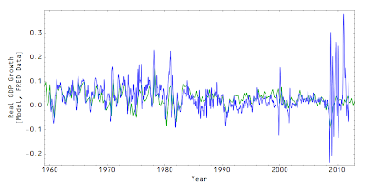
I keep forgetting to output the real GDP growth rate (nominal GDP growth rate minus inflation). Using the results from the previous post, here is the RGDP growth rate (LOESS smoothed is darker blue):
Here is the smoothed RGDP growth rate (blue, from the previous graph) compared to data from the FRED database (green): 
This isn't saying too much more than the previous results -- we take NGDP growth and subtract the inflation rate which means if you get inflation almost right (as we did), you get RGDP growth almost right. The problem areas are in the same place (near the Volcker disinflation and the Bernanke quantitative easing).

It is not as obvious with the smoothed model results how well this actually nails RGDP growth (except during the Bernanke quantitative easing); here is the non-smoothed version:


Deriving the price level from NGDP and the monetary base

I'm not sure which way solving the system of equations would give the biggest bang for the buck for an economist. As a physicist, you would want to compare against the most direct measurement. In our case, a physicist would want to solve for the monetary base like the previous entry -- it used NGDP (which uses a statistical model) and the price level (another statistical model) and solved for the monetary base (supposedly directly measured by the Fed) and the information transfer index (a variable fixed by the model I'm using). This entry does a similar thing, but solves for the price level/inflation rate and the information transfer index given NGDP and the monetary base. Determining the price level seems to be of value to at least one economist, e.g. here. (Actually, there is an overall normalization to the price level that is the free parameter here, set to 374.65 [billion $]; much like in renormalization.)

Anyway, using the system of equations here, I set the demand to NGDP and supply to the (seasonally adjusted) St Louis adjusted monetary base (both from FRED) and solved for the price level and the information transfer index. I compared these to the CPI less food and energy (also from FRED). The derivative of the price level and CPI are the measurement of the inflation rate. I also show the smoothed inflation rate. Again, the inflation rate seems to do worst at moments when monetary policy is noteworthy: the  Volcker disinflation and the Bernanke quantitative easing.

In order, the graphs are the price level, the inflation rate 1960-2008, the smoothed inflation rate 1960-2008, the inflation rate 1960-2012 and the information transfer index. Model calculations are in blue, the empirical data is in gray.


Monday, June 24, 2013

This is getting interesting (the monetary base from inflation and aggregate demand)

I took the system of equations
$$ \frac{Q^{d}}{Q^{d}_{ref}} = \left(\frac{Q^{s}}{Q^{s}_{ref}}\right)^{1/\kappa} $$
$$ P = \frac{1}{\kappa}\left( \frac{Q^s}{Q^{s}_{\text{ref}}}\right)^{1/\kappa - 1} $$
And numerically solved for $\kappa$ and $Q^{s}$ (the monetary base) using the empirical nominal GDP for $Q^{d}$ and  the CPI (less food and energy) for $P$. Here are the results: 


The first graph shows the model (blue) for $Q^s$ and the St Louis Adjusted Monetary Base from the FRED database (gray); the second graph shows the model for $\kappa$ (blue) and the empirical estimate
$$
\kappa \sim \frac{\log MB}{\log NGDP}
$$
(the latter in gray).

I did the same thing using the GDP deflator instead of the CPI and got a similar result

Nothing Earth-shattering here. They give remarkably similar results and the results largely match the the empirical data. The interesting aspect is that both formulations miss the rounds of quantitative easing occurring since 2008. The index $\kappa$ has a more well behaved monotonic increase (my opinion -- $\kappa$ seems like it should be slowly varying).

However, it is pretty cool that now we have only NGDP and the price level as inputs to the model instead of the previous results which used the empirical $\kappa$ so is based on the monetary base, the NGDP and the price level.

Inflation rate derived from the information transfer index

Quick post; I went back and re-did the inflation rate calculations using seasonally adjusted data (this takes out some of the noisy yearly cycle stuff that was in the picture in the last post). I also show where "QE1", "QE2" and "QE3" occur on the graph (gray bars). Model is in blue, CPI is in dark gray:
Here we zoom in on 1960-2008 (leaving off the last bit where QE starts):
I note that the CPI data seems biased against inflation rates < 0.

I also did some smoothing to see the general trend; interestingly the biggest deviations of the CPI data (gray) from the model (blue) come at times when monetary policy was ... unconventional? The Volcker disinflation and the latest rounds of QE under Bernanke (marked with gray bars).
I'd call this a major success; we derive the inflation rate from nominal GDP and the monetary base with a single parameter (a normalization of the monetary base).

Sunday, June 23, 2013

Even more on the information transfer index (deriving the price level)


Continuing from the previous post, here again is the empirically derived information transfer index $\kappa$, this time with a quadratic trend shown:
The previous attempt to derive the price level used the raw monetary base, however the equation actually contains a normalization factor
$$
P = \frac{1}{\kappa}\left( \frac{Q^s}{Q^{s}_{\text{ref}}}\right)^{1/\kappa - 1}
$$
If we use this normalization factor as a fit parameter, we find a value of $\sim 375$ which gives the following normalized monetary base (the dashed curve is a counterfactual I will discuss later):
This value minimizes the difference between the the equation above and the CPI (less food, energy), and creates a relatively good fit (blue is the equation above with empirically derived $\kappa$, gray is the CPI):
This is actually a really good fit given that it has only a single parameter (normalization of the monetary base) and is a function of only the monetary base and nominal GDP. Note the normalized monetary base alone (shown in green below, with the CPI in gray) doesn't fit the CPI very well (nor does GDP/MB, except as combined as the equation at the top of this post):

I am trying to show that this model actually describes something non-trivial given its inputs. Additionally, the model (blue) fits the inflation rate (gray, derived from the CPI data) relatively well (I show  both the raw version and a LOESS smoothed version of both curves):


Now for the counterfactual I mentioned earlier. If we assume that $\kappa$ follows the quadratic fit in the first graph at the top of this post and that the Fed didn't engage in Quantitative Easing (the dashed green curve in the monetary base graph above), we get the dashed blue curve in the graph below:
This is much more serious deflation than actually occurred.

One thing to we can see from this model is that the measured CPI may either be missing some deflation or there is another kind of inflation such as here. A second thing we can see is that the quantitative easing conducted by the Fed was insufficient (and needed to be roughly twice as big).

This is the first time I have believed the information transfer model may have some real capability beyond some notional aspects of supply and demand.


Saturday, June 22, 2013

More on the information transfer index

The information transfer index is defined as 
$$ \kappa = \frac{K_0 \log \sigma^s}{K_0 \log \sigma^d} $$ 
where we are measuring information in the same units (defined by $K_0$). Now we take the floating information source solution 
$$ \frac{Q^{d}}{Q^{d}_{ref}} = \left(\frac{Q^{d}}{Q^{d}_{ref}}\right)^{1/\kappa} $$ 
and solve for $\kappa$ 
$$ \kappa = \frac{\log Q^{s}/Q^{s}_{ref}}{\log Q^{d}/Q^{d}_{ref}} $$ 
I believe we can make the identification 
$$ \sigma^x \sim Q^{x}/Q^{x}_{ref} $$ 
i.e. the "number of demand symbols" is basically proportional to the size of the demand which makes intuitive sense (well, to me). We next plot how $\kappa$ behaves vs $\sigma^s$ and $\sigma^d$. The colors indicate high magnitude (in red) or low magnitude (meaning zero, in blue) of the gradient. The line across the figure show where $\log \kappa = 0$ i.e. $\kappa = 1$.

One interesting thing that appears is that as both $\sigma^s$ and $\sigma^d$ become large, $\kappa \rightarrow 1$. Random thought at this moment is that as aggregate demand and aggregate supply become large, we should see both growth rates converge across international data as economies become large and, from a monetarist perspective, growth rates approach the monetary base growth rate (see $r_0$ here). Maybe. I will in a future post look at this information in this light.

I decided to use some empirical data to play around with these concepts. For example, if we say that $Q^d$ is nominal GDP (aggregate demand) and $Q^s$ is the (St. Louis Adjusted) Monetary Base, we can measure $\kappa$

This is somewhat close to $\kappa = 1$ as we might expect for a large economy (although any value of $\kappa$ can be acheived given any $\sigma^s$). It seems we should be approaching 1 more monotonically as the scale of the economy grows.
If we use
$$
P \sim \frac{1}{\kappa} \left( Q^s\right)^{1/\kappa - 1}
$$
With the empirically defined $\kappa$ we get the picture above for the equilibrium price level $P$ (in an AD/AS model).

Do these results make sense? I would say no. But I'm going to think about it some more.

Wednesday, June 19, 2013

What role does the information transfer index play?

Other than the solutions to the ODE (see Eqs. 8 and 9 here) for constant information source/destination, there is the solution for "floating" source/destination where: 
$$
Q^d = (Q^s)^{1/\kappa}
$$
and
$$
P = \frac{1}{\kappa} (Q^s)^{1/\kappa - 1}
$$
Let's assume $Q^s(t) \sim \exp r_0 t $ so that we have
$$
Q^d \sim \exp r_0 t/\kappa
$$
and
$$
P \sim \exp r_0 t (1/\kappa - 1)
$$
I plotted these functions for $\kappa = 0.5, 1.0 and 2.0$ (Green, blue and red in the picture -- I orignally used a Wiener process with drift in place of the $r_0 t$, but then turned down the variance so it would be easier to see).
The dashed lines show $P$ and the solid lines show $Q^d$. The black dashed line (coinciding with the solid blue line) is $Q^s$. We basically get the story that when demand outpaces supply ($\kappa \lt 1$), the price level goes up. The opposite happens when $\kappa \gt 1$. My next thought, based on the idea that no one knows where economic growth comes from (i.e. total factor productivity), was to ask: what if $\kappa$ controls the fluctuations of the economy from recessions to growth rates? So I fixed $Q^s(t) \sim \exp r_0 t $ and let $\kappa$ be a function of time (this time an autoregressive process; I'm all over the stochastic map):
Here we have the demand (blue solid) outpacing the supply (gray dashed) since $\kappa< 1$ on average and the price level rising (blue dashed). Here is $\kappa$
Now $\kappa = K_{\sigma}^{Q^s}/K_{\sigma}^{Q^d}$ where $K_\sigma \sim\log \sigma$ where $\sigma$ is the number of symbols used to encode information in the source/destination. This allows us venture a few hypotheses:
  • "Inflation" is when $\langle \kappa \rangle < 1$, i.e. $\langle \sigma^s \rangle < \langle \sigma^d \rangle$, or the number of symbols used in the demand information source is on average greater than the number in the supply information destination. (This mechanism could still be involved.)
  • "Recessions" occur when $\sigma^d$ increases and/or $\sigma^s$ decreases such that $\kappa$ falls below its mean.
  • The selection rate of symbols must be lower for higher $\sigma$ in order for information transfer to remain "ideal" $I_{Q^d} = I_{Q^s}$; a recession in this sense is a slowdown in the selection rate of an increasing number of demand symbols (or an increase in the selection rate of a decreasing number of supply symbols).
  • For small amounts of inflation in a normal economy, this would imply the selection rate for supply symbols is typically slightly faster than the selection rate for demand symbols.
I don't currently know what the deeper meaning is here or if this will lead anywhere. It is interesting, though!

Does multiplying the monetary base by 2 cut the value of cash by 2 or ... e?

A quick note on the idea seemingly accepted throughout economics that an instant doubling of all the cash would ceteris paribus decrease the value of that cash by half (and e.g. prices would double). See this diagram here; the curve is reproduced as a dashed gray curve above. It seems to derive from a particular marginal utility model of cash (where value is inversely proportional to the quantity).

If we use the information transfer framework, instead of ~ 1/x, we have ~ log 1/x behavior (shown in blue in the figure above, see Eq. 8a,b here). For small changes the 1/x scaling approximates the curve (log 1/x ~ -1 + 1/x near x = 1), but for larger shifts 1/x underestimates the decrease in value (and over estimates the increase in value)

The information transfer framework shows that under a doubling of the monetary base (ΔM/M = 1) the value of cash decreases to ~ 1/e ≈ 0.37 < 0.5.

Instead of an "inversely proportional fall in marginal utility", you would see a "logarithmic fall in relative bandwidth utilization". If I double the number of bits available to describe the economy, the quantity of states goes up by much more than a factor of two.