Friday, March 31, 2017

The recovery and using models to frame data

Scott Sumner at the end of his recent post wrote a line referencing "the weakest recovery in American history". And looking at NGDP data that is a defensible statement:


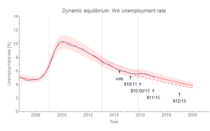
Of course, it makes little sense in terms of unemployment, which has declined at pretty much the same (fractional) rate in every recession (in fact, it declined a bit faster after 2013):


It is important to note that both of these interpretations of the data require some sort of model (I discussed this in terms of RGDP and productivity in a post from awhile ago). The former uses some kind of constant NGDP growth (RGDP growth tells a similar story) model to say that recent NGDP growth is "lower" compared to some previous average level. The latter uses the dynamic equilibrium model (and is connected to matching theory).

It turns out that we can use the dynamic equilibrium model to show that NGDP growth in the US since the recession has been "normal" and key to that understanding is that the housing bubble was not "normal" (as I've discussed before). If we give very low weighting to the data from 2004-2008, the dynamic equilibrium model is an excellent description of the post-WWII data:


The other interesting piece is that the broad trend of NGDP data since 1960 is well-described by a single shock [1] centered at 1976.6 (with width ~ 12 years) which is consistent with the single-shock description of the inflation data (a single shock centered at 1978.7 of similar width). I have hypothesized this was a demographic shock involving women entering the workforce. Using this model to frame the data trend (rather than an average as above), we have a picture of declining NGDP growth resulting from the fading of this shock ‒ a fading that had started in the 1980s. Recent NGDP growth has been consistent with an average of 3.8% [2] (the horizontal line in the figure representing the dynamic equilibrium in the absence of shocks). In this picture, the housing bubble (gray) represents a deviation from the trend (and potentially a reason why the Great Recession was so big).

It is important to point out however that this is just another model being used to frame data. One thing this model has going for it is that there's not a lot of room for policy (fiscal or monetary) choices to have had an impact on the aftermath of the Great Recession. Certainly policy choices were involved in women entering the work force (e.g. Title VII of the Civil Rights Act of 1964) and the housing bubble (e.g. deregulation). However other than those, the recovery from the Great Recession in terms of NGDP has been as it should have been expected: no tight monetary policy, no fiscal stimulus or contraction. This does not mean various policies did not have an effect on e.g. unemployment.

Just to reiterate the important point: you need a model to frame the data. Some people use average growth rates (i.e. log-linear growth). Some people eyeball the data and make an assessment (in a sense, that's what I  did here regarding the housing bubble [3], although I eyeballed a particular transformation of the data [4]). But know that the model you use to frame the data can have a strong impact on your interpretation of the data.

PS Here are the results zoomed in to more recent times:


As well as the deviation from trend growth:


...

Footnotes:

[1] There is a second shock centered at 1950.9 associated with the Korean War.

[2] Coupled with core PCE inflation equilibrium of 1.7%, real growth should be about 2.1% in equilibrium (which is roughly the growth of the labor force).

[3] I did look at  a version where the housing bubble represents two smaller shocks (a positive and negative one). It basically does what you'd expect: fits the red line to the housing bubble. Not very illuminating, however.

[4] That frame is this one:


Another possible frame is this one (which does make the post-recession recovery look like below-trend growth):


The difference between the two frames? The first represents equilibrium NGDP growth = 3.8%, the second NGDP growth = 5.6%. Note that this is the log of the inverse of the NGDP data with the trend growth rate subtracted. I think it helps get rid of some optical illusions caused by growth. Think of it as looking at the moon upside down from between your legs when it is at the horizon (which helps mitigate "moon illusion").

Thursday, March 30, 2017

Explaining versus defining (models vs model definitions)


Nick Rowe tweeted his old post on his "minimalist model of recessions" and comes to the conclusion that: 
This minimalist model of recessions gives us a very simple message: recessions are a reduction in the volume of monetary exchange caused by an excess demand for the medium of exchange. Recessions reduce utility because some mutually advantageous exchanges do not take place.
Emphasis in the original. However, this conclusion is based on the following procedure
  1. Assume three markets: firms producing A, B and a "money" market M
  2. Assume utility functions for A and
  3. Maximize utility subject to constraint
  4. Solve for Nash equilibrium to obtain A = B = 100/P
The question is: Does this explain anything or rather just define recessions as an excess demand for money? Steps 2 through 4 are just mechanical mathematical procedures that effectively transform the assumptions of step 1 into the result of step 4. In fact, you really need nothing more than Walras' law with an aggregate goods market and a money market. An excess demand for money is then equal to a deficit of demand for aggregate goods. The "embroidery" (Rowe's term) the minimalist model adds is just to say that if there are two goods markets, both will suffer from a deficit of demand (Walras' law only tells us at least one must).

As it stands, this model just defines recessions to be an excess demand for money. I think this is part of a more general problem in macroeconomics: instead of developing frameworks to study what a recession is, macroeconomic frameworks just define what a recession is.

On its own, simply positing assumptions that lead to a conclusion via mechanical procedures is really no different than positing the inevitable conclusion. There are two cases where it becomes interesting. The first is where you don't know where the mechanical procedures lead ‒ deriving a completely new result. For the second, I will take you through a a different mechanical procedure that leads to a well-known result.

Let's start by assuming there is a constant acceleration due to gravity that has units of distance/time². Integrating this with respect to time (mechanical procedure) we obtain:

v(t) =  -g t + v₀

Integrating again, we obtain

s(t) = -½ g t² + v₀ t + s₀

This minimalist model of ballistic trajectories gives us a very simple message: trajectories are parabolic functions of time. (I'm intentionally paraphrasing Rowe above.) But does the explanatory power of this procedure derive from the assumptions or the procedure itself? No. It comes from the assumptions and the procedure plus empirical data:


Without the data, I'm just defining the function s(t).

In a sense Arrow-Debreu general equilibrium and Nash equilibrium are, on their own, equally devoid of explanatory power. Both are essentially applications of the Bouwer fixed point theorem (not detracting from these examples as mathematical results, but rather as economic ones). The question is whether the system set up (Rowe's three good economy, Arrow & Debreu's markets in time and space, Nash's N-player games, constant acceleration due to gravity) explain empirical data. They don't have to explain it perfectly (even the gravity model above neglects air resistance), but they do have to match data to some level of precision before they can be considered "explanations" rather than just "definitions" (or if you prefer "model definitions").

In writing that, I think that might be a good phrase to introduce to a wider audience. A model is something that explains data. A model definition is just a collection of assumptions and mathematical procedures that relate variables. A model starts off as a model definition, and becomes a model after it is compared to data.

Nick Rowe's minimalist system above is a model definition. The projectile motion equations I wrote down are a model. The IS-LM model as usually presented is a model definition, as are a great deal of DSGE models out there. In fact most of macroeconomics deals not with models but model definitions. Model definitions are only wrong inasmuch as they contain math errors. Models are wrong if they are rejected by empirical data. Conclusions reached via a model definition do not "explain" anything about the real world any more than defining a new term explains anything.

Wednesday, March 29, 2017

Mainstream macro is the worst form of macro, except for all those other forms

But these same economists then invoke ‘economics’ in a similar way to justify their own policies. In my opinion, this only reinforces the dominance of economics and narrows the debate, a process which is inherently regressive. ... Reclaiming political debate from the grip of economics will make the human side of politics more central, and so can only serve a progressive purpose.
Unlearning Economics (emphasis mine).

I have read the debate between Unlearning Economics (UE) and Simon Wren-Lewis (and joined by Brad DeLong) about the criticism of mainstream macroeconomics with what could only be described as a sense of growing dread. I am coming from a place where I believe there is much to criticize about how macroeconomics has been practiced, but also that the criticisms (as well as the alternative ideas) that have popular traction replicate some of the exact same problems just from a different viewpoint (or just make little sense from a scientific viewpoint).

I originally wrote a much longer post, but then thought I'd condense it to three main points. And then that was too long, so I decided to condense that post into this even shorter one that only tries to make one point.

UE seems to believe that the outcome of a more human political economy will be progressive policies; I could not disagree with this conclusion more. The outcome of a more human political economy will be zero-sum policies, populism, oversimplified heuristics, and just-so stories. More generally, it would be motivated reasoning in favor of conclusions justified by human gut instincts. You don't need academic macroeconomic theory to do this. 

In fact, many examples UE cites of mainstream macro being harmful are precisely examples of human-political macroeconomics:
  • Mainstream academic macro told us that "austerity" was bad. It was really the human-political approach i.e. looking at (at the time) extremely recent non-peer-reviewed working papers (the infamous Alesina and Ardagna paper was from October of 2009, the infamous erroneous Reinhart and Rogoff paper was from January of 2010) that buoyed the case for austerity.
  • The impacts of low inflation targets could be considered entirely a human-political result. People want low inflation because they think inflation is bad (and use the good begets good heuristic). Mainstream academic macro is much more mixed on the subject.
  • The free trade and Friedman/Pinochet stories are entirely human-political macro. One thing that I believe is forgotten is that those right-leaning economists of the Chicago school genuinely believed that their ideas would help bring people out of poverty. Friedman's philosophy was that free trade and free markets made free people. He probably would have called it progressive if given the choice between progressive and regressive. Regardless of whether this is true or not (I personally don't believe it), this is an example of the human side of politics being more central and not serving a (left) progressive purpose. And it is zero-sum human-politics that fills the void if mainstream academic macro is excluded.
  • Although it isn't macro (but rather finance), effectively blaming LTCM's failure on the Black-Scholes equation misses the source of the failure. The equation is only valid (has scope) over time periods where asset prices are approximately random walks. If it was the equation, it was the human side that ignored the academic caveats.
In fact, there are many places where UE points out that mainstream academic macro doesn't actually say the things that are supposedly econ gone wrong ("I’ve always acknowledged that economists themselves are probably more progressive than they’re usually given credit for" ... "The economics textbooks may be against monopoly" ... "[mainstream econ's] more complex economic models ... do imply that trade will harm some people while benefiting others" ... "Economists may complain that economic ideas have been misused by vested interests" ... "[Wren-Lewis] complain[s] (perhaps correctly) that these are inaccurate representations of the field").  If we ignore the defense's case, mainstream macro sure does appear guilty.

This is not to say that there aren't problems with mainstream academic macro. As DeLong says, Reinhart and Rogoff "came from inside the house!" We should also think of Max Planck's quote [1] when it comes to mainstream academic macro. The fact that the generation of mainstream academic macroeconomists who think that monetary policy is always better than fiscal policy because they were working during the 1970s haven't died yet doesn't mean that academic macro favors regressive policies (and as Noah Smith and UE point out it is actually much more progressive than many critics think). Coupled with the need for long time series, the paucity of empirical data, and the political ramifications of macro results we should always take the conclusions of mainstream macro with a grain of salt. But that doesn't mean we should fill the void with heuristics, zero-sum thinking, and just-so stories that come from the human side of politics.

Paraphrasing Churchill's comment on democracy:
Many forms of political economy have been tried, and will be tried in this world of sin and woe. No one pretends that academic macroeconomics is perfect or all-wise. Indeed it has been said that academic macroeconomics is the worst form of political economy except for all those other forms that have been tried from time to time...
*  *  *

Footnotes

[1] "A new scientific truth does not triumph by convincing its opponents and making them see the light, but rather because its opponents eventually die, and a new generation grows up that is familiar with it." (Max Planck)

"Improved" quantity theory of labor and capital

I added the modification from this post to the "quantity theory of labor and capital" (QTLK, aka the "nominal Solow model" without TFP dynamics) to the information equilibrium GitHub repository. The Mathematica notebook starts from the basic labor model of the first link, shows Okun's law, adds capital to obtain the QTLK of the second link, and then finally shows the "improved" QTLK described below.

In the information equilibrium notation the modified model is: 

P : NGDP ⇄ L
     NGDP ⇄ K

         CPI ⇄ P

The modification is essentially changing the abstract price/detector in the first relationship to an unknown quantity P and adding the relationship CPI ⇄ P (that is to say we don't measure the abstract price P directly, but rather just something ‒ e.g. core CPI ‒ that is in information equilibrium with the abstract price).

The result is primarily a much improved description of inflation:

Nominal growth

core CPI inflation

core CPI-deflated real growth

PS Why do I call this a "quantity theory of labor and capital"? Because it started out as a simple model of labor where (solving the differential equation described by the relationship P : NGDP ⇄ L)

log NGDP ~ α log L
log P ~ (α − 1) log L

Therefore if Î± = 2, P ~ exp Ï€ t, and L ~ exp λ t, we can say Ï€ = λ. That is to say inflation is equal to the growth rate of the (employed) labor supply. This is directly analogous to the quantity theory of money where inflation is equal to the growth rate of the money supply.

However, in practice Î± < 2. What we end up with is something more like the Solow model where:

log NGDP Î± log L + β log K
log ~ (α − 1) log L

And in the modified version we substitute the latter equation with

log ~ γ (α − 1) log L

Saturday, March 25, 2017

The mystery of Japan's inflation

Noah Smith has said that Japan is where macroeconomic theories go to die (well, except this one), and when I initially looked at Japan's price level it with the dynamic equilibrium model (more here) it looked grim. However, as the Dude says, my thinking about this case had become very uptight. While Japan would not be a good example of the dynamic equilibrium framework on its own, given the framework works for other inflation data (e.g. here or here) we can be a bit more assured that the giant ongoing shock required to fit the price level data isn't spurious. It still could be spurious, but at least it's not a "surely you're joking" ad hoc hypothesis.

Anyway, here are the model results using the same codes available here:


Note that I removed the effects of the VAT increases from the data. The shocks are centered at 1974.6 (positive) and 2006.5 (negative). What's also interesting is that the width (similar to the standard deviation of a normal distribution) of the latter shock is 108 months (9 years) which means it won't be over for many years to come. Instead of "Abenomics", the recent rising/stabilizing inflation is the ending of the giant "lost decade" shock.

Of course, this picture also makes a bold claim that the equilibrium rate of inflation is 4.3% per year (± 0.4 percentage points at 2σ). That seems like something that would be good to test, so here are the relevant forecasts through 2020 (and will be added to the forecast page):


PS For another macro mystery set in Japan, here's my old post on Japan's monetary base.

Thursday, March 23, 2017

Three centuries of dynamic equilibria in the UK

If the price level has a dynamic equilibrium (e.g. per the previous post or here), it should be interesting to look at some very long run historical data ‒ specifically this three century time series available for the UK. It turns out that there are two dynamic equilibria. The first hold from the 1600s to the early 1900s is associated with an inflation rate consistent with zero (call it the gold standard equilibrium); the second holding over the post WWII period is the one I've observed before (links at beginning of this paragraph) with an inflation rate of 2.6%:


The major shocks are centered at 1780.7, 1916.1, 1945.5, and 1976.1. My intuition is that these are associated with the industrial revolution, WWI, WWII, and women entering the workforce. However, I'm open to alternative theories. If you're looking for a demographic cause of the first shocks, there was a major change in population growth in the early 1800s associated with improved sanitation for example.

The "quantity theory of labor" and dynamic equilibrium


One of the earliest models I looked at with the information equilibrium (IE) framework was the relationship $P : N \rightleftarrows L$ where $P$ is the price level, $N$ is nominal output, and $L$ is the level of employment. The relationship effectively captures Okun's law (i.e. changes in real GDP are related to changes in employment), and is a component of what I called the "quantity theory of labor" (and capital). The IE notation is shorthand for the equation:

$$
\text{(1) } \; P \equiv \frac{dN}{dL} = k \; \frac{N}{L}
$$

with information transfer (IT) index (a free parameter) $k$. The price level is shown as the "detector" of information flow, and represents an abstract price in the information equilibrium framework. The solution to this differential equation is

$$
\begin{align}
\frac{N}{N_{0}} = & \left( \frac{L}{L_{0}}\right)^{k}\\
P = & \; k \frac{N_{0}}{L_{0}} \left( \frac{L}{L_{0}}\right)^{k-1}
\end{align}
$$

Note that if $k = 2$, we have $P \sim L$ (hence the "quantity theory of labor" moniker), and we can obtain (one form of) Okun's law

$$
\frac{d}{dt} \log L = \frac{d}{dt} \log R
$$

by simply differentiating the equation (1) above. (We take $R \equiv N/P$ = RGDP.)

Dynamic equilibrium

Now dynamic equilibrium (in the presence of shocks) is another way of looking at the same equation where we look at the growth of the (abstract) price on the left hand side and the growth of the ratio on the right hand side. Symbolically:

$$
\begin{align}
\frac{d}{dt} \log P = & \; (k - 1) \frac{d}{dt} \log L\\
\frac{d}{dt} \log \frac{N}{L} = & \; (k - 1) \frac{d}{dt} \log L
\end{align}
$$

If we take $L \sim e^{\lambda t}$, $P \sim e^{\pi t}$, and $N/L \sim e^{\gamma t}$ then

$$
\text{(2) } \; \pi = \gamma = (k - 1) \lambda
$$

I have previously looked at the core PCE price level, and noticed that it is well-described by a single shock centered at 1978.7 (I hypothesized this was related to a demographic shock of women entering the workforce). My question to myself was: what about $N/L$? The answer turned out to tell us that the abstract price $P$ isn't the measured by PCE (i.e. equation (2) is wrong), but rather something in information equilibrium with PCE. We also gain some new perspective on shocks.

So the basic dynamic equilibrium model gave us this description of the PCE price level:


The same procedure comes up with a similar result for $N/L$:


The biggest shock is centered at 1977.5, which is equal to the location of the shock to PCE inflation within the error. However, the first issue is that there is an additional shock associated with the aftermath of the great recession (centered at 2014.7). This shock is not obvious in the PCE data. This can be cleared up a bit by forcing the model to have an additional shock:


The model places a tiny shock (also centered at 2014.7 [2]) that is basically buried in the noise. Note that this shock may explain part of the low post-recession inflation and the more recent rise (the equilibrium inflation rate is 1.7%). More on this below in the forecasting section. In any case, this shows the small post-recession shock is not a serious issue.

What is a serious issue is that $\pi =$ 1.7% equilibrium inflation rate compared with the ratio $N/L$ growth rate of $\gamma =$ 3.8%. This tells us that the IE relationship $PCE : NGDP \rightleftarrows L$ is at best an approximate effective theory. However, it's not a serious issue that can't be dealt with via a simple fix; much like the interest rate model [1] instead of PCE being the abstract price $P$, we just assume PCE is in information equilibrium with the abstract price $P$:

$$
\begin{align}
PCE & \rightleftarrows P\\
P : NGDP & \rightleftarrows L
\end{align}
$$

This introduces a second IT index we'll call $c$ and take $P \sim e^{\gamma t}$ (required by the theory above) and $PCE \sim e^{\pi t}$ so that

$$
\text{(2') } \; \frac{\pi}{c} = \gamma = (k - 1) \lambda
$$

Now $\pi = $ 1.7% per year and $\gamma = $ 3.8% so $c = $ 0.45. Note that $\lambda \sim $ 2% meaning that $k \sim 2$ (i.e. the "quantity theory of labor").

What does this mean? Well, if we thought this model was accessing some fundamental "truth", we could say that the growth rate of $P$ (i.e. $\gamma$) is the "true" inflation rate that we only measure crudely with measures like PCE (actually CPI would be a slightly "better" measure with $c$ closer to 1). 

But such a simple model is unlikely to be the best possible description of a macroeconomy, so it's probably best to take an agnostic "effective theory" approach. In that view, we just take the model above to be a decent approximation for some scope (e.g. average values over time scales of 10s of years, with errors for e.g. oil shocks).

Addendum: forecasting

The dynamic equilibrium results do lend themselves to (conditional [3]) forecasting, so here is the recent data for $N/L$ and core PCE (and their derivatives) along with a forecast through 2020:


This forecast predicts growth will rise back towards the equilibrium growth rate of 3.8%. Note that this is the growth rate of $N/L$, not NGDP growth.

Here is PCE including the tiny post-recession shock:


The horizontal line is at 1.7% inflation; we can just make out the tiny dip centered at 2014.7 accounting for a 0.25 percentage point drop below 1.7% at the peak of the shock (i.e. about 1.4% inflation during 2014, which is in fact the average during that time ... 1.36%).

For completeness, here is the forecast without this shock:


Footnotes

[1] Instead of being the price of money, the interest rate is assumed to be in information equilibrium with the price of money.

[2] I previously associated the positive inflation shock with a demographic shift (women entering the workforce). The second shock occurs nearly 40 years later (potentially associated with the cohort that entered the workforce in the 1970s leaving the workforce). It could also be that we are seeing the demographic effect of people affected by the great recession leaving the workforce (the drop in the employment-population ratio), or of the baby boomer cohort retiring (the peak of which was centered in in the mid-1950s, meaning the mid-2010s shock is 60 years later).

[3] The condition is that no additional shock occurs during the forecast period.

Tuesday, March 21, 2017

India's demonetization and model scope

Srinivas [1] has been requesting that I look into India's demonetization using the information equilibrium (IE) framework for awhile now. One of the reasons I haven't done so is that I can't seem to find decent NGDP data from before 1996 or so. I'm going to proceed using this limited data set because there are several results that I think are a) illustrative of how to deal with different models with different scope, b) show that monetary models are not very useful.

Previously, the only "experiment" with currency in circulation I had encountered was the Fed's stockpiling of currency before the year 2000 in preparation for any issues:


This temporary spike had no impact on inflation or interest rates. Economists would say that the spike was expected to be taken away, and therefore there would be no impact. Scientifically, all we can say is that rapid changes in M0 do not necessarily cause rapid changes in other variables. This makes sense if it is entropic forces maintaining these relationships between macroeconomic aggregates. Another example is the Fed's recent increases in short term interest rates. The adjustment of the monetary base to the new equilibrium appears to be a process with a time scale on the order of years.

If either interest rates or monetary aggregates are changed, it takes time for agents to find or explore the corresponding change in state space.

India recently removed a bunch of currency in circulation (M0). If the historical relationship between nominal output (NGDP) and M0 were to hold, we'd get a massive fall in output and the price level. However, the change in M0 appears to be quick:


So, what do the various models have to say about this?

Interest rates

The interest rate model says that a drop in M0 should raise interest rates ceteris paribus. However this IE relationship only holds on average over several years. Were the drop in M0 to remain, we should expect higher long term interest rates in India:


However, if M0 continues to rise as quickly as it has in Dec 2016, Jan 2017, and Feb 2017, then we probably won't see any effect at all (much like the year 2000 effect described above). M0 needs to maintain a lower level for an extended period for rates to rise appreciably.

This is to say that the model scope is long time periods (on the order of years to decades), and therefore sharp changes are out of scope.

Monetary model

Previously, like many other countries, India has shown an information equilibrium relationship (described at the end of these slides) between M0 and NGDP with an information transfer index (k) on the order of 1.5. A value of k = 2 means a quantity theory of money economy, while a lower value means that prices and output respond much less to changes in M0.


In fact, as I mentioned in a post from yesterday monetary models only appear to be good effective theories when inflation is above 10%, and in that case we should find k = 2. That k < 2 implies the monetary theory is out of scope and we have something more complex happening.

The quantity theory of labor

The monetary models don't appear to be very useful in this situation. However one model that does do well for countries with k < 2 is the quantity theory of labor (and capital). This is basically the information equilibrium version of the Solow model (but deals with nominal values, doesn't have varying factor productivity, and doesn't have constant returns to scale). unfortunately the time series data doesn't go back very far and there aren't a lot of major fluctuations. Even so, the model does provide a decent description of output and inflation:


The exponents are 1.6 for capital and 0.9 for labor meaning India is a great place to get return on capital investment (the US has 0.7 and 0.8, and the UK has 1.0 and 0.5, respectively).

This model tells us that inflation is primarily due to an expanding labor force, and therefore demonetization should have little to no effect on it.

Dynamic equilibrium

The dynamic equilibrium approach to prices (price indices) and ratios of quantities has shown remarkable descriptive power as I've shown in several recent posts (e.g. here). India is no different and inflation over the past 15 years can be pretty well described by a single shock centered in late 2010 continuing over a time scale on the order of one and a half years:


This model doesn't tell us the source of the shock, but unless another shocks hits we should expect inflation to continue at the same rate as it has over the past 2 years (averaging 4.7% inflation). This also means that the demonetization should have little to no effect.

Summary

The preponderance of model evidence tells us that the demonetization should have little to no effect on inflation or output. The speed at which it was enacted means that the monetary models are out of scope and tell us nothing; we can only rely on other models that are in scope and those have no dependence on M0.

...

Footnotes

[1] Srinivas also sent me much of the data used in this post.

Monday, March 20, 2017

Using PCA to remove cyclical effects

One potential use of the principal component analysis I did a couple days ago is to subtract the cyclical component of the various sectors. I thought I'd take it a step further and use a dynamic equilibrium model to describe the cyclical principal component and then subtract the estimated model. What should be left over are the non-cyclical pieces.

First, here's the model and the principal component data; the description is pretty good:


I won't bore you with listing the results for every sector (you can ask for an update with your favorite sector in comments and I will oblige). Let me just focus on the interesting sectors with regard to the economic "boom" of 2013-2014. There are three different behaviors. The first is a temporary bump that seems to be concentrated in retail trade:


The bump begins in mid-2013 (vertical line) and ends in mid-2016.

The second behavior is job growth. For example, here is health care and social assistance; the rise begins around the date the ACA goes into effect (vertical line):


The third behavior is unique to government hiring, specifically at the state and local level. It drops precipitously at the 2016 election (vertical line):


Note that this doesn't mean hiring dropped to zero, it just mean state and local government hiring dropped back to it's cyclical level after being above it (e.g. because of the ACA, for example).

Belarus and effective theories


Scott Sumner makes a good point that inflation is not only demographics using Belarus as an example. However I think this example is a great teachable moment about effective theories. The data on inflation versus monetary base growth shows two distinct regimes; the graph depicting this above is from a diagram in David Romer's Advanced Macroeconomics. One regime is high inflation and because it is pretty well described by the quantity theory of money (the blue line) I'll call it the quantity theory of money regime. The second regime is low inflation. It is much more complex and is probably related to multiple factors at least partially including demographics (or e.g. price controls).

The scale that separates the two regimes (and that defines the scope of the quantity theory of money theory) is on the order of 10% inflation (gray horizontal line). For inflation rates ~ 10% or greater, the quantity theory is a really good effective theory. What's also interesting is that the theory of inflation seems to simplify greatly (becoming a single-factor model). It is also important to point out that there is no accepted theory that covers the entire data set ‒ that is to say there is no theory with global scope.

In physics, we'd say that the quantity theory of money has a scale of Ï„₀ ~ 10 years (i.e. 10% per annum). For base growth scales shorter than this time scale like, say, β₀ ~ 5 years (i.e. 20% per annum), we can use quantity theory.

At 10% annual inflation, Belarus should be decently described by the quantity theory of money with other factors; indeed base growth has been on the order of 10%.

The problem is that then Scott says:
So why do demographics cause deflation in Japan but not Belarus?  Simple, demographics don’t cause deflation in Japan, or anywhere else.
Let me translate this into a statement about physics:
So why does quantum mechanics make paths probabilistic for electrons but not for baseballs? Simple, quantum mechanics doesn’t make paths probabilistic for electrons, or anything else.
As you can see this framing of the question completely ignores the fact that there are different regimes where different effective theories can operate (quantum mechanics on scales set by de Broglie wavelengths; when the de Broglie wavelength is small you have a Newtonian effective theory).

...

Update 28 March 2017

In this post, I work out a version of a quantity theory/AD-AS model that turns into an IS-LM-like effectively theory at low inflation as a potential example of the two-regime model described above.

...

Update 12 February 2019

I'd like to update this post with another example: MMT. Sparked by a tweet from Steve Roth, I said that MMT might be a theory of hyperinflation. If government deficit spending decisions start to affect inflation (and not — per empirical evidence —multiple demographic & labor factors [twitter talk]), you're out in the "single variable describes inflation" regime in the graph at the top of the page. MMT. QTM. Take your pick. In that regime almost all macro variables are highly correlated.  The subspace collapses to a single dimension so it's projection along any other single dimension (as long as it's a non-zero projection) is just a (non-zero) scale factor. It doesn't matter if it's debt, M2, or NGDP.


Wednesday, March 15, 2017

Washington's unemployment rate, Seattle's minimum wage, and dynamic equilibrium

I live in Seattle and the big thing in the national news about us is that we raised our minimum wage to $15, which just went into effect for large businesses in January of this year. According to many people who oppose the minimum wage, this should have lead to disaster. Did it have an effect? Let's try and see what the dynamic equilibrium model says. I added a couple of extra potential shocks after the 2009 big one:


People who believe the minimum wage did negatively impact could probably see the negative shock centered at 2015.8 as evidence in their favor. However, that could also be the end of whatever positive shock centered at 2013.0 (which I think was hiring associated with the ACA/Obamacare). I showed what the path would look like if those shocks (positive and negative) were left out using a dotted line. If it was the minimum wage, it would have to be based entirely on expectations because it is being phased in (not reaching $15/hour for all businesses until 2020):


However those expectations did not kick in when the original vote happened in June of 2014, so it must be some very complex expectations model. In this second graph I show what the graph looks like in the absence of both the 2013 and 2015.8 shocks (shorter dashes) as well as just the absence of the 2015.8 shock (longer dashes). Various theories welcome!

The Fed raised interest rates today, oh boy

The Fed raised its interest rate target to a band between 0.75 to 1.0 percent at today's meeting, so I have to update this graph with a new equilibrium level C'':


We might be able to see whether the interest rate indicator of a potential recession has any use:


This indicator is directly related to yield curve inversion (the green curve needs to be above the gray curve in order for yield curve inversion to become probable). Here are the 3-month and 10-year rates over the past 20 years showing these inversions preceding recessions (both in linear and log scales):