Tuesday, December 25, 2018

Markets continuing to fall

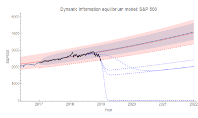
The US markets are closed today for the holiday, but the Nikkei dropped 5% (the Nikkei, however, is far more volatile than the US markets so this doesn't represent anything too out of the ordinary). I've updated the S&P 500 counterfactuals based on the latest data (keeping the "lol capitalizm iz doomd" fit that goes to zero because I love dark humor):


Funny enough (again, dark humor) the unconstrained fit now matches up with "median shock amplitude" fit (the two middle dashed blue curves are basically on top of each other). The truth is that fitting the leading edge of the data to a logistic function (and then taking the exponential) is not terribly stable, so expect many many revisions [1] to that counterfactual until we are about 1/2 the way through the shock.

Here are the Nikkei and the NASDAQ (the latter is pretty similar to the S&P 500). Click to enlarge:


...

Update 26 December 2018

And today it jumped back up a bit. New unconstrained counterfactual amplitude is now a bit smaller than the median shock. Probably a good place to link to this post about volatility regimes. Click to enlarge:


...

Update 7 January 2019

The estimates are back near the originals when we incorporate the recent gyrations:


...

Footnotes:

[1] For an example, see the undershooting and overshooting on the estimate of the size of the Great Recession in the unemployment rate data (click to enlarge):


Saturday, December 22, 2018

Dynamic equilibrium model forecast performance: PCE inflation

This is another dynamic information equilibrium model forecast that has been ongoing for almost two years — core PCE inflation:


Part of the reason for this model is to lend credence to the idea that inflation is about the size of the labor force. We should expect 1.7% core PCE inflation (or 2.5% CPI inflation, all items) unless there are dramatic shifts in the size of the labor force like women entering the workforce in the 70s or men and women leaving the labor force in the aftermath of the Great Recession. The latter is the reason for that slight deviation in 2014 and the "lowflation" which has largely dissipated. Note that the relative sizes of the effects (surging or flagging inflation) agree with the relative size of the causes (labor force changes).

Thursday, December 20, 2018

This is fine.

Title reference.


We're out of the AR process volatility (estimated since 2010, blue region), but not yet out of the approximately 70-year 90% volatility (January 1, 1950-December 31, 2016, red region) of the S&P 500 estimated using the dynamic information equilibrium model (DIEM). In fact, the S&P 500 has been this low before (relative to the the DIEM) — in February 2016. That was towards the end of the period of decline in the months after the first Fed rate increase since the 2008 recession. The index subsequently recovered. Prior to that, we skimmed the lower edge of the 90% confidence interval in 2011 as Europe was going into a double dip recession. We can see both of these in the a longer view:


But also looking at the longer run, most of these dips are just that — dips associated with a recession. There are only two major collapses that warrant adding a shock to the model (dot-com bust and 2008). Of course, it's possible to model the longer negative shock in the 70s as a series of smaller shocks, but none are close to the scale of 2001 and 2008.

Given most of the history of the market, we should expect the current dip — should it extend significantly below the confidence limit — to be just that: a dip likely associated with a recession or at least (seemingly unnecessary) Fed rate hikes. However, given the recent history of the market, we might expect a larger collapse as part of what I've called the "asset bubble era". This period, roughly since the 90s, is period after the demographic shock of the 60s and 70s has faded, inflation has subsided, and e.g. labor force participation ceased rising rapidly.

Note that as part of the asset bubble era, the asset bubble doesn't have to be reflected as a bubble in the market itself. The dot-com bubble was, but the "housing bubble" was accompanied by basically equilibrium growth in the S&P 500 index. However as part of the asset bubble era it might be accompanied by a new shock. Of course, it's quite early so estimates of the shock parameters are going to be wildly uncertain. I included several counterfactuals (dashed blue) with different constraints in this graph:


Two of the paths constrain the amplitude of the shock to be the median (absolute value) amplitude of all the previous shocks. One of those leaves the shock duration and timing to be fit to data, the other just leaves the duration. The timing was constrained to be the value indicated by the timing estimated from yield curve inversion. The third (and smallest) fits all three parameters. This is probably showing the undershooting and overshooting that is a drawback of fitting logistic functions to partial shocks.

I also included my joke path ("lol capitalizm iz doomd") I showed on Twitter the other day where the S&P 500 collapses to zero. I'd say that is unlikely (it is, however, the result of doing the fit with just a fixed shock timing).

Have we entered a new era since the 1990s where recessions coincide with major collapses in the stock market? Or will we return to the era before the 1990s where markets fall during recessions, but rebound quickly? My hunch is the former and I'm not looking forward to the economy in 2019.

...

Update 21 December 2018

We've pierced the toast the 90% confidence interval (updated counterfactuals):


Friday, December 14, 2018

Information transfer economics: year in review 2018

We're coming up on the end of 2018. I'd first like to say thank you to everyone who has been reading and sharing the blog posts and the tweets. I've slowed down a bit — only 169 posts in 2018 up until today, well below the peak of 375 in 2015. And many of those posts were just checking the validity of the forecasts with each data release! In part, that's due to the fact that a project I was working on where I had to travel once a month to the middle of nowhere for one to two weeks ended in 2016. I don't have as many evenings sitting in a hotel room with nothing to do besides research and writing these days. Only one post from this year cracked the top 10 of all time on this blog — it was my critique of macro written from the perspective of having seen both the 10 years of econ criticism since the Great Recession alongside 10 years of defenses. I titled it Macro criticism, but not that kind in reference to the torrent of "lazy econ critiques" as well as Noah Smith's Bloomberg article (Econ Critics Are Stuck in the Past) written a few weeks before. I also think it's relevant that my critique of macro comes alongside empirically accurate forecasts of e.g. the unemployment rate compared to Fed macroeconomists (FRBSF, FOMC) — at least it's not lazy.


Dynamic equilibrium

This year kicked off with me posting the dynamic information equilibrium paper to SSRN. It also included the application to ensembles of information equilibrium relationships (markets) — i.e. "macro". While I had been working on it since the summer of 2017, a message from Fabio Ghironi at the UW econ department prompted me to finish it over the holiday break. That eventually lead to my participation in the "Outside the Box" economics workshop Fabio organized in October.


Heroes

Another unexpected message came from one of my blogging heroes — Cosma Shalizi. Blogging is really about writing that wouldn't find a place in any traditional outlet. Although he's not blogging as much these days, he wrote one of the greatest examples of the form with a perfect title (hilarious enough on its own, although the reference now may be lost on the younger generations). A book review that ties together computational complexity and economics, I link to it any time I can find a way to work it in.

Cosma wrote me to let me know he was reading my book (!) and that he'd had the same interpretation of Gary Becker's paper written up in a draft blog post. I told him he should post it — it does a great job of addressing the supply side (which I sort of skipped over). He did, and I tweeted about it.

I should also add that I owe a debt of gratitude to another great blogger, economist David Glasner, for pointing the paper out to me a few years ago. 


Rethinking interest rates

This year prompted me to rethink the interest rate model that was actually one of the first decent models I put together with the information equilibrium framework. The large deviation that began with the 2016 election is well outside the normal range of errors — but such deviations have been signs of recessions (and model error is generally worse close to yield curve inversions). Recently, interest rates have been coming back down and a future recession could bring the model right back in alignment with data (i.e. we might have just underestimated the errors). As it is, it seems the dynamic equilibrium model where the interest rate is a price is accurate, but the supply and demand related to it are only approximated by the monetary base (minus reserves) and aggregate demand measured by NGDP.


A recession in late 2019?

I put my neck out and said that the negative deviation in the JOLTS openings data was the first signs of an upcoming recession (i.e. a slowing in businesses expanding). The shocks to the JOLTS data series appear to lead the rise unemployment rate by almost a year, and with the yield curve heading for inversion on roughly the same time scale I'm around 80% confident in this forecast. There's also wage growth rising to levels comparable with NGDP growth, which seems to be associated with the past few recessions. At the very least, I hope to learn something!


A new book

At the end of this year, I set myself a deadline for my second bookA Workers' History of the United States 1948-2020 — for the end of next year. Collecting the information together has actually led to some additional insights (e.g. the effect of unions on inequality and the (lack of) a housing bubble).


*  *  *


This has been another great year, and I'd like to thank everyone again for reading and sharing. Without you, this would likely just be a series of crackpot comments on other people's blogs (which is really not too far off the mark).

If you're interested, here's a link to the year in review for 2017. Also, click to enlarge any images above.

Wednesday, December 12, 2018

CPI forecast performance over the past two years

Unlike these forecasts, this one of US CPI inflation has been doing well (both year over year and continuously compounded, click to enlarge):


Here's the CPI level:


Here are the details about the re-estimate of the size of the post-2008 recession demographic shock (shown as the dashed line in the graphs).

Tuesday, December 11, 2018

My neglected Nikkei 225 forecast

I basically forgot that I had made a forecast of the Nikkei 225 almost two years ago until it came up as one of the random posts on the sidebar of my blog. Here it is with the post-forecast data in black (click to enlarge):


And here's a zoomed in version:


And even more:


Monday, December 10, 2018

JOLTS day

Checking in on the dynamic information equilibrium model forecasts, and everything is pretty much status quo. Job openings are still on a biased deviation. Click to enlarge.


Based on this model which puts hires as a leading indicator, we should continue to see the unemployment rate fall through March of 2019 (5 months from October 2018):


The dashed line shows a possible recession counterfactual (with average magnitude and width, i.e. steepness) constrained by the fact that the JOLTS hires data is not showing any sign of a shock.

Here's the previous update from November (with September 2018 JOLTS data).

Friday, December 7, 2018

The last employment situation report of 2018

Next month, this dynamic information equilibrium model (DIEM) forecast will be 2 years old [1]. It's been pretty much spot on (shown alongside some of the forecasts published by the FRBSF's FedViews):


It's biased a little high with today's 3.7% number, but compared to the competition — the FRBSF forecast had us at 4.7% compared to the DIEM's 3.9 ± 0.2% — the miss distance is 5 times smaller (1.0 pp vs 0.2 pp):


The FOMC forecast a 4.5% unemployment rate average for 2018. With almost all the data (which is why the average point is gray inside a black circle instead of white), it's looking closer to 3.9% — a 0.6 pp difference. The DIEM annual average is 4.1% — a 0.2 pp difference (3 times smaller).  


I'm also tracking a couple of forecasts (versus the FOMC and the CBO) based on forecasts made this year. The DIEM is a little lower because the data from 2017 gives us a better indication of the size of the 2014 shock to unemployment (the "mini-boom"). I show some possible counterfactual recessions in the DIEM consistent with the CBO's forecast (i.e. if the CBO forecast is accurate through 2022, then there'd be a recession shock in the DIEM)


Markets

As of writing this, the S&P 500 was down almost 2%. I thought I'd update the S&P 500 forecast (also from almost two years ago [2], and also pretty spot on) to show some more of the recent volatility. The last update was here. We're skirting the edge of the AR process band, but we're still inside the 60-year volatility band of the DIEM model, the lower edge of which (marked by a red dashed line) indicates the need to posit another shock to the DIEM.


The median interest rate spread (which is about the same as the average or the principal component per the original model description) continues to trend downward. Note: this isn't a DIEM model, but rather a simple linear model of yield curve inversion as a leading indicator of recession.


...

Footnotes:

[1] The model itself was born in a January 10, 2017 blog post when I derived it from an information equilibrium relationship for JOLTS data similar to a matching model.

[2] I feel like I just have to show the S&P 500 forecast before all those points:


Wednesday, December 5, 2018

Imagine there's no bubble

It's easy if you try.

I've been writing my forthcoming book — trying to dot all the i's and cross all the t's with the data analysis — and I came across something that was a bit shocking. There seemed to be some trouble in the Case-Shiller housing price index model which had some ambiguity with the shocks. While there was a decent fit to the CS index level, the growth rate was not well-described. This is not a good qualitative fit to this growth rate data:


But if you squint at that data, you see a pattern that looks a bit more like the pattern in wage growth — see the dynamic information equilibrium model (DIEM) described here. So I went to Shiller's (continuously updated) data directly to get a longer term time series, and sure enough a DIEM describes CS index (i.e. housing price) growth pretty well:


The dashed line shows a fit to the small fluctuations in the aftermath of the Great Recession (possible step response to the recession shock) that aren't that big in the growth rate, but create a noticeable effect in the level.

You can then integrate and exponentiate to recover the index level:


Here, you can see the large effect on the level of those two post-recession fluctuations in the growth rate (difference between the dashed and solid green curves). Overall, this is a great description of both the level and the growth rate of housing prices. But it raises a big question:

Where's the housing "bubble"? 

In the aftermath of the S&L crisis of the late 80s, the growth rate for housing prices in equilibrium increases steadily — much like wages. But there's no positive shock sending prices higher, no event between 1990 and 2006, just steady acceleration. Sure, the growth rate becomes insane at the end of that trajectory (> 10%), but that's the result of the equilibrium process. There's no "bubble" unless there's always a bubble.

Did new ways of financing allow this acceleration to increase for a longer time? There's some evidence that wage growth is cut off by recessions (i.e. when wage growth reaches NGDP growth, it triggers a recession). What is the corresponding housing price growth limit? The pattern of debt growth roughly matches the housing price growth starting in the late 80s, but the shock to debt growth in the Great Recession comes well after the shock to housing prices.

However, this improved interpretation of the housing price data puts the negative shock right when the immigration freak-out was happening and the shock to construction hires (not construction openings, but hires). This would raise a question as to why a shock to the supply of new housing would cause prices to fall. I've previously discussed how increasing the supply of housing should actually increase prices because it should be considered more as general equilibrium (supply doesn't increase much faster than demand). But also the dynamic information equilibrium model that produces this kind of accelerating growth rate is (d/dt) log CSCS (just like the wage growth model). This has the interpretation that the demand for housing is related to the growth rate of housing prices (since the left side is demand). 

It's important to note that the shock to housing price growth rate comes before any decline in housing prices. The decline in growth rate would only have become noticeable in early 2006, but whatever the shock was that triggered it could have come as early as mid-2005 — which points to another possibility: hurricane Katrina. Or maybe simply housing prices themselves were the cause. Eventually, regardless of creative financing options, people become unable to afford prices that grow faster than income. It's not so much of a bubble, but supply and demand for a scarce resource. Maybe demand for housing really was that great. Judging by the increase in homelessness in the aftermath (e.g. Seattle), that is a plausible explanation. If it was truly a bubble, then there'd be a glut of housing, but prices seem to have continued on their previous path [1].

...

Update 5 December 2018 

See Kenneth Duda's comment below and my response for a bit more on possible causes, including the OTS decision to loosen requirements set by the CRA. I would like to point out that the difference between the dashed green curve and the solid one in the CS-level diagram above could be interpreted as a result of mis-management by the Fed and the government in 2008. However, it could also be interpreted as a measure of the general level of panic and overreaction (the downturn appears to overshoot the price level path resulting in a deeper dive than indicated by later prices).

...

Update 9 December 2018

Per Todd Zorick's comment below and expanding on footnote [1], here are the housing price indices for Seattle:


And for Dallas:


As you can tell, the shocks are quite different. Dallas doesn't have much of a housing collapse, but seems to be undergoing a fairly large shock over the past couple years. Do note that the time periods are different (since the 90s for Seattle, since 2000 for Dallas) because that was the data on FRED.


...

Footnotes:

[1] I will note that recent data from Seattle shows a decline (a similar turnaround might be visible in the Shiller data as a downward deviation at the end of the graph above):


You can also see the tail end of the drop in 1990 associated with the birth of grunge.

It is possible this is part of the early signs of the hypothetical upcoming recession.