Thursday, November 30, 2017

Comparing my inflation forecasts to data

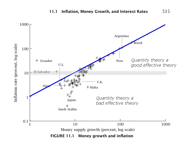
Actually, when you look at the monetary information equilibrium (IE) model I've been tracking since 2014 (almost four years now with only one quarter of data left) on its own it's not half-bad:


The performance is almost the same as the NY Fed's DSGE model (red):


A more detailed look at the residuals lets us see that both models have a bias (IE in blue, NY Fed in red):


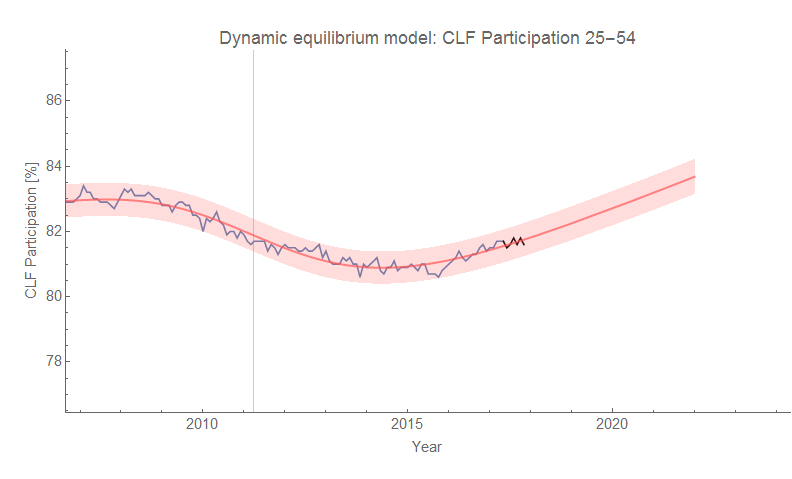
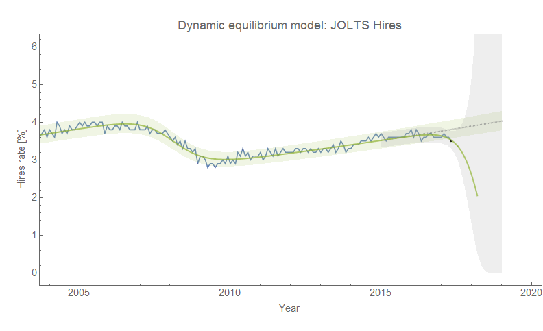
The thing is that the monetary model looks even better if you consider the fact that it only has 2 parameters while the NY Fed DSGE model has 41 (!). But the real story here is in the gray dashed and green dotted curves in the graph above. They represent an "ideal" model (essentially a smoothed version of the data) and a constant inflation model — the statistics of their residuals match extremely well. That is to say that constant inflation captures about as much information as is available in the data. This is exactly the story of the dynamic information equilibrium model (last updated here) which says that PCE inflation should be constant [1]:


Longtime readers may remember that I noted a year ago that a constant model didn't do so well in comparison to various models including DSGE models after being asked to add one to my reconstructions of the comparisons in Edge and Gurkaynak (2011). However there are two additional pieces of information: first, that was a constant 2% inflation model (the dynamic equilibrium rate is 1.7% [2]); second, the time period used in Edge and Gurkaynak (2011) contains the tail end of the 70s shock (beginning in the late 60s and persisting until the 90s) I've associated with women entering the workforce:


The period studied by Edge and Gurkaynak (2011) was practically aligned with a constant inflation period per the dynamic information equilibrium model [3]. We can also see the likely source of the low bias of the monetary IE model — in fitting the ansatz for 〈k〉 (see here) we are actually fitting to a fading non-equilibrium shock. That results in an over-estimate of the rate of the slow fall in 〈k〉 we should expect in an ensemble model, which in turn results in a monetary model exhibiting slowly decreasing inflation over the period of performance for this forecast instead of roughly constant inflation.

We can learn a lot from these comparisons of models to data. For example, if you have long term processes (e.g. women entering the workforce), the time periods you use to compare models is going to matter a lot.  Another example: constant inflation is actually hard to beat for inflation in the 21st century — which means the information content of the inflation time series is actually pretty low (meaning complex models are probably flat-out wrong). A corollary of that is that it's not entirely clear monetary policy does anything. Yet another example is that if 〈k〉 is falling for inflation in the IE model, it is a much slower process than we can see in the data.

Part of the reason I started my blog and tried to apply some models to empirical data myself was that I started to feel like macroeconomic theory — especially when it came to inflation — seemed unable to "add value" beyond what you could do with some simple curve fitting. I've only become more convinced of that over time. Even if the information equilibrium approach turns out to be wrong, the capacity of the resulting functional forms to capture the variation in the data with only a few parameters severely constrains the relevant complexity [4] of macroeconomic models.

...

Footnotes:

[1] See also here and here for some additional discussion and where I made the point about the dynamic equilibrium model as constant inflation mode before.

[2] See also this on "2% inflation".

[3] You may notice the small shock in 2013. It was added based on information (i.e. a corresponding shock) in nominal output in the "quantity theory of labor" model. It is so small it is largely irrelevant to the model and the discussion.

[4] This idea of relevant complexity is related to relevant information in the information bottleneck as well as effective information in Erik Hoel's discussion of emergence that I talk about here. By related, I mean I think it is actually the same thing but I am just too lazy and or dumb to show it formally. The underlying idea is that functions with a few parameters that describe a set of data well enough is the same process in the information bottleneck (a few neuron states capture the relevant information of the input data) as well as Hoel's emergence (where you encode the data in the most efficient way — the fewest symbols).

Tuesday, November 28, 2017

Dynamic information equilibrium: world population since the neolithic

Apropos of nothing (well, Matthew Yglesias's new newsletter where he referenced this book from Kyle Harper on Ancient Rome), I decided to try the dynamic information equilibrium model on world population data. I assumed the equilibrium growth rate was zero, and fit the model to data. The prediction is about 12.5 billion humans in 2100 (putting it at the somewhat middle-higher end of these projections) with an equilibrium population at about 13.4 billion.

There were four significant transitions in the data centered at 2390 BCE, 500 BCE, 1424, and 1954. The widths (transition durations) were ~ 1000 years, between 0 and 100 years (highly uncertain, but small), ~ 300 years, and ~ 50 years, respectively. Historically, we can associate the first with the neolithic revolution following the Holocene Climate Optimum (HCO). The second appears right around the dawn of the Roman Republic. The third follows the Medieval Warm Period (MWP) and is possibly another agricultural revolution that is ending, while the final one is our modern world and is likely associated with public health and medical advances (it began near the turn of the century in 1900). Here's what a graph looks like:


I included some random items from (mostly) Western history to give readers some points of reference. The interesting thing is that "exponential growth" with a positive growth rate of 1% to 2% is really only a local approximation. Over history, the population growth rate is typically zero:


Some major technology developments seem to happen on the leading edge of these transitions (writing, money, horse collar/heavy plow, computers). Maybe a more systematic study of technology might yield some pattern — my hypothesis (i.e. random guess) is that there are bursts of tech development associated with these transitions as people try to handle the changes in society during the population surges. There are also likely social organization changes as well — the third transition roughly coincides with the rise of nation-states, and the fourth with modern urbanization.

Tuesday, November 21, 2017

Dynamic information equilibrium: UK CPI

The dynamic information equilibrium CPI model doesn't just apply to the US. Here is the UK version (data is yellow, model is blue):


The forecast is for inflation to run at about 2.1% (close to the US dynamic equilibrium of 2.5%) in the absence of shocks:


Monday, November 20, 2017

Numerical experiments and the paths to scientific validity

Christiano et al got much more attention than their paper deserved by putting in a few choice lines in it (Dilettantes! Ha!). Several excellent discussions of the paper — in particular this aspect — are available from Jo Mitchell, Brad DeLong (and subsequent comments), and Noah Smith.

I actually want to defend one particular concept in the paper (although as with most attempts at "science" by economists, it comes off as a nefarious simulacrum). This will serve as a starting point to expand on how exactly we derive knowledge from the world around us. The idea of "DSGE experiments" was attacked by DeLong, but I think he misidentifies the problem [1]. Here is Christiano et al:
The only place that we can do experiments is in dynamic stochastic general equilibrium (DSGE) models.
This line was attacked for its apparent mis-use of the word "experiment", as well as the use of "only". It's unscientific! the critics complain. But here's an excerpt from my thesis:
The same parameters do a good job of reproducing the lattice data for several other quark masses, so the extrapolation to the chiral limit shown in Fig. 2.3 is expected to allow a good qualitative comparison with the instanton model and the single Pauli-Villars subtraction used in the self-consistent calculations.
Lattice data. I am referring to output of lattice QCD computations that are somewhat analogous to using e.g. the trapezoid rule to compute integrals as "data" — i.e. the output of observations. Robert Waldman in comments on DeLong's post makes a distinction between hypothesis (science) and conjecture (math) that would rule out this "lattice QCD data" as a result of "lattice QCD experiments". But this distinction is far too strict as it would rule out actual science done by actual scientists (i.e. physicists, e.g. me).

Saying "all simulations derived from theory are just math, not science" misses the nuance provided by understanding how we derive knowledge from the world around us, and lattice QCD provides us with a nice example. The reason we can think of lattice QCD simulations as "experiments" that produce "data" is that we can define a font of scientific validity sourced from empirical success. The framework lattice QCD works with (quantum field theory) has been extensively empirically validated. The actual theory lattice QCD uses (QCD) has been empirically validated at high energy. As such, we can believe the equations of QCD represent some aspect of the world around us, and therefore simulations using them are a potential source of understanding that world. Here's a graphic representing this argument:


Of course, the lattice data could disagree with observations. In that case we'd likely try to understand the error in the assumptions we made in order to produce tractable simulations or possibly limit the scope of QCD (e.g. QCD fails at low energy Q² < 1 Gev²).

The reason the concept of DSGE models as "experiments" is laughable is that it fails every step in this process:


Not only does the underlying framework (utility maximization) disagree with data in many cases, but even the final output of DSGE models also disagrees. The methodology isn't flawed — its execution is.

*  *  *

The whole dilettantes fracas is a good segue into something I've been meaning to write for awhile now about the sources of knowledge about the real world. I had an extended Twitter argument with Britonomist about whether having a good long think about a system is a scientific source of knowledge about that system (my take: it isn't).

Derivation

The discussion above represents a particular method of acquiring knowledge about the world around us that I'll call derivation for obvious reasons. Derivation is a logical inference tool: it takes empirically mathematical descriptions of some piece of reality and attempts to "derive" new knowledge about the world. In the case of lattice QCD, we derive some knowledge about the vacuum state based on the empirical success of quantum field theory (math) used to describe e.g. magnetic moments and deep inelastic scattering. The key here is understanding the model under one scope condition well enough that you can motivate its application to others. Derivation uses the empirical validity of the mathematical framework as its source of scientific validity.

Observation

Another method is the use of controlled experiments and observation. This is what a lot of people think science is, and it's how it's taught in schools. Controlled experiments can give us information about causality, but one of the key things all forms of observation do is constrain the complexity of what the underlying theory can be through what is sometimes derided as "curve fitting" (regressions). Controlled experiments and observation mostly exclude potential mathematical forms that could be used to describe the data. A wonderful example of this is blackbody radiation in physics. The original experiments basically excluded various simple computations based on Newton's mechanics and Maxwell's electrodynamics. Fitting the blackbody radiation spectrum curve with functional forms of decreasing complexity ultimately led to Planck's single parameter formula that paved the way for quantum mechanics. The key assumption here is essentially Hume's uniformity of nature to varying degrees depending on the degree of control in the experiment. Observation uses its direct connection to empirical reality as its source of scientific validity.

Indifference

A third method is the application of the so-called "principle of indifference" that forms the basis of staticial mechanics in physics and is codified in various "maximum entropy" approaches (such as the one used in the blog). We as theorists plead ignorance of what is "really happening" and just assume what we observe is the most likely configuration of many constituents given various constraints (observational or theoretical). Roderick Dewar has a nice paper explaining how this process is a method of inference giving us knowledge about the world, and not just additional assumptions in a derivation. As mentioned the best example is statistical mechanics: Boltzmann assumed simply that there were lots of atoms underlying matter (which was unknown at the time) and used probability to make conclusions about the most likely states — setting up a framework that accurately describes thermodynamic processes. The key assumption here is that the number of underlying degrees of freedom is large (making our probabilistic conclusions sharper), and "indifference" uses the empirical accuracy of its conclusions as the source of its scientific validity.

Update 2 May 2018: Per the Dewar paper, the idea here is that we observing, explaining, and reproducing empirical regularities without controlling the underlying degrees of freedom which means the details of those degrees of freedom are likely irrelevant. It's kind of the converse of an experiment — if you can't or don't control for a huge number of other variables but still get a reproducible regularity, you likely don't have to control for them. This is why I include it as a separate path from observation.

Other paths?

This list isn't meant to be exhaustive, and there are probably other (yet undiscovered!) paths to scientific validity. The main conclusion here is that empirical validity in some capacity is necessary to achieve scientific validity. Philosophizing about a system may well be fun and lead to convincing plausible stories about how that system behaves. And that philosophy might be useful for e.g. making decisions in the face of an uncertain future. But regardless of how logical it is, it does not produce scientific knowledge about the world around us. At best it produces rational results, not scientific ones.

In a sense, it's true that the descriptions above form a specific philosophy of science, but they're also empirically tested methodologies. They're the methodologies that have been used in the past to derive accurate representations of how the world around us works at a fundamental physical level. It is possible that economists (including Christiano et al) have come up with another path to knowledge about the world around us where you can make invalid but prima facie sensible assumptions about how things work and derive conclusions, but it isn't a scientific one.

...

Footnotes:

[1] Actually, the problem seems misidentified in a similar way that Friedman's "as if" methodology is misidentified: the idea is fine (in science it is called "effective theory"), but the application is flawed. Friedman seemed to first say matching the data is what matters (yes!), but then didn't seem to care when preferred theories didn't match data (gah!).

Friday, November 17, 2017

The "bottom up" inflation fallacy

Tony Yates has a nice succinct post from a couple of years ago about the "bottom up inflation fallacy" (brought up in my Twitter feed by Nick Rowe):
This inflation is caused by the sum of its parts problem rears its head every time new inflation data gets released. Where we can read that inflation was ’caused’ by the prices that went up, and inhibited by the prices that went down.
I wouldn't necessarily attribute the forces that make this fallacy a fallacy to the central bank as Tony does — at the very least, if central banks can control inflation, why are many countries (US, Japan, Canada) persistently undershooting their stated or implicit targets? But you don't really need a mechanism to understand this fallacy, because it's actually a fallacy of general reasoning. If we look at the components of inflation for the US (data from here), we can see various components rising and falling:


While the individual components move around a lot, the distribution remains roughly stable — except for the case of the 2008-9 recession (see more here). It's a bit easier to see the stability using some data from MIT's billion price project. We can think of the "stable" distribution as representing a macroeconomic equilibrium (and the recession being a non-equilibrium process). But even without that interpretation, the fact that an individual price moves still tells us almost nothing about the other prices in the distribution if that distribution is constant. And it's definitely not a causal explanation.

It does seem to us as humans that if there is something maintaining that distribution (central banks per Tony), then an excursion by one price (oil) is being offset by another (clothing) in order to maintain that distribution. However, there does not have to be any force acting to do so.

For example, if the distribution is a maximum entropy distribution then the distribution is maintained simply by the fact that it is the most likely distribution (consistent with constraints). In the same way it is unlikely that all the air molecules in your room will move to one side of it, it is just unlikely that all the prices will move in one direction — but they easily could. For molecules, that probability is tiny because there are huge numbers of them. For prices, that probability is not as negligible. In physics, the pseudo-force "causing" the molecules to maintain their distribution is called an entropic force. Molecules that make up a smell of cooking bacon will spread around a room in a way that looks like they're being pushed away from their source, but there is no force on the individual molecules making that happen. There is a macro pseudo-force (diffusion), but there is no micro force corresponding to it.

I've speculated that this general idea is involved in so-called sticky prices in macroeconomics. Macro mechanisms like Calvo prices are in fact just effective descriptions at the macro scale, and therefore studies that look at individual prices (e.g. Eichenbaum et al 2008) will not see stick prices.

In a sense, yes, macro inflation is due to the price movements of thousands of individual prices. And it is entirely possible that you could build a model where specific prices offset each other via causal forces. But you don't have to and there exist ways of constructing a model where there isn't necessarily any way to match up the macro inflation with specific individual changes because macro inflation is about the distribution of all price changes. That's why I say the "bottom up" fallacy is a fallacy of general reasoning, not just a fallacy according to the way economists understand inflation today: it assumes a peculiar model. And as Tony tells us, that's not a standard macroeconomic model (which is based on central banks setting e.g. inflation targets).

You can even take this a bit further and argue against the position that microfoundations are necessary for a macroeconomic model. It is entirely possible for macroeconomic forces to exist for which there are no microeconomic analogs. Sticky prices are a possibility; Phillips curves are another. In fact, even rational representative agents might not exist at the scale of human beings, but could be a perfectly plausible effective degrees of freedom at the macro scale (per Becker 1962 "Irrational Behavior and Economic Theory", which I use as the central theme in my book).

Thursday, November 16, 2017

Unemployment rate step response over time

One of the interesting effects I noticed in looking at the unemployment rate in early recessions with the dynamic equilibrium model was what looked like "overshooting" (step response "ringing" transients). For fun, I thought I'd try to model the recession responses using a simple "two pole" model (second order low pass system).

For example, here is the log-linear transformation of the unemployment rate that minimizes entropy:


If we zoom in on one of the recessions in the 1950s, we can fit it to the step response:


I then fit several more recessions. Transforming back to the original data representation (unemployment rate in percent), and compiling the results:


Overall, this was just a curve fitting exercise. However, what was interesting were the parameters over time. These graphs show the frequency parameter ⍵ and the damping parameter ζ:


Over time, the frequency falls and the damping increases. We can also show the damped frequency which is a particular combination of the two (this is the frequency that we'd actually estimate from looking directly at the oscillations in the plot):


With the exception of the 1970 recession, this shows a roughly constant fairly high frequency that falls after the 1980s to a lower roughly constant frequency.

At this point, this is just a series of observations. This model adds far too many parameters to really be informative (for e.g. forecasting). What is interesting is that the step response in physics results from a sharp shock hitting a system with a band-limited response (i.e. the system cannot support all the high frequencies present in the sharp shock). This would make sense — in order to support higher frequencies, you'd probably have to have people entering and leaving jobs at rates close to monthly or even weekly. While some people might take a job for a month and quit, they likely don't make up the bulk of the labor force. This doesn't really reveal any deep properties of the system, but it does show how unemployment might well behave like a natural process (contra many suggestions e.g. that it is definitively a social process that cannot be understood in terms of mindless atoms or mathematics).

Wednesday, November 15, 2017

New CPI data and forecast horizons

New CPI data is out, and here is the "headline" CPI model last updated a couple months ago:


I did change the error bar on the derivative data to show the 1-sigma errors instead of the median error in the last update. The level forecast still shows the 90% confidence for the parameter estimates. 

Now why wasn't I invited to this? One of the talks was on forecasting horizons:
How far can we forecast? Statistical tests of the predictive content
Presenter: Malte Knueppel(Bundesbank)
Coauthor: Jörg Breitung
A version of the talk appears here [pdf]. One of the measures they look at is year-over-year CPI, which according to their research seems to have a forecast horizon of 3 quarters — relative to a stationary ergodic process. The dynamic equilibrium model is approaching 4 quarters:


The thing is, however, the way the authors define whether the data is uninformative is relative to a "naïve forecast" that's constant. The dynamic equilibrium forecast does have a few shocks — one centered at 1977.7 associated with the demographic transition of women entering the workforce, and one centered at 2015.1 I've tentatively associated with baby boomers leaving the workforce [0] after the Great Recession (the one visible above) [1]. But for the period from the mid-90s after the 70s shock ends until the start of the Great Recession would in fact be this "naïve forecast":


The post-recession period does involve a non-trivial (i.e. not constant) forecast, so it could be "informative" in the sense of the authors above. We will see if it continues to be accurate beyond their forecast horizon. 

...

Footnotes

[0] Part of the reason for this shock to posited is its existence in other time series.

[1] In the model, there is a third significant negative shock centered at 1960.8 associated with a general slowdown in the prime age civilian labor force participation rate. I have no firm evidence of what caused this, but I'd speculate it could be about women leaving the workforce in the immediate post-war period (the 1950s-60s "nuclear family" presented in propaganda advertising) and/or the big increase in graduate school attendance.

Friday, November 10, 2017

Why k = 2?

I put up my macro and ensembles slides as a "Twitter talk" (Twalk™?) yesterday and it reminded me of something that has always bothered me since the early days of this blog: Why does the "quantity theory of money" follow from the information equilibrium relationship N M for information transfer index k = 2?

From the information equilibrium relationship, we can show log N ~ k log M and therefore log P ~ (k − 1) log M. This means that for k = 2 

log P ~ log M

That is to say the rate of inflation is equal to the rate of money growth for k = 2. Of course, this is only empirically true for high rates of inflation:


But why k = 2? It seems completely arbitrary. In fact, it is so arbitrary that we shouldn't really expect the high inflation limit to obey it. The information equilibrium model allows all positive values of k. Why does it choose k = 2? What is making it happen?

I do not have a really good reason. However, I do have some intuition.

One of the concepts in physics that the information equilibrium approach is related to is diffusion. In that case, most values of k represent "anomalous diffusion". But ordinary diffusion with a Wiener process (a random walk based on a normal distribution) results in diffusion where the distance traveled goes as the square root of the time step σ ~ √t. That square root arises from the normal distribution, which is in fact a universal distribution (there's a central limit theorem for distributions that converge to it). Another way: 

2 log σ ~ log t

is an information equilibrium relationship t σ with k = 2.

If we think of output as a diffusion process (distance is money, time is output), we can say that in the limit of a large number of steps, we obtain

2 log M ~ log N

as a diffusion process, which implies log P ~ log M.

Of course, there are some issues with this besides it being hand-waving. For one, output is the independent variable corresponding to time. This does not reproduce the usual intuition that money should be causing the inflation, but rather the reverse (the spread of molecules in diffusion is not causing time to go forward [1]). But then applying the intuition from a physical process to an economic one via an analogy is not always useful.

I tried to see if it came out of some assumptions about money M mediating between nominal output N and aggregate supply S, i.e. the relationship

N M S

But aside from figuring out that if the IT index k in the first half is k = 2 (per above), then the IT index k' for M S would have to be 1 + φ or 2 − φ where φ is the golden ratio in order for the equations to be consistent. The latter value k' = 2 − φ ≈ 0.38 implies that the IT index for N ⇄ S is k k' ≈ 0.76, while the former implies k k' ≈ 5.24. But that's not important right now. It doesn't tell us why k = 2.

Another place to look would be the symmetry properties of the information equilibrium relationship, but k = 2 doesn't seem to be anything special there.

I thought I'd blog about this because it gives you a bit of insight as to how physicists (or at least this particular physicist) tend to think about problems — as well as point out flaws (i.e. ad hoc nature) in the information equilibrium approach to the quantity theory of money/AD-AS model in the aforementioned slides. I'd also welcome any ideas in comments.

...

Footnotes:

[1] Added in update. You could make a case for the "thermodynamic arrow of time", in which case the increase in entropy is actually equivalent to "time going forward".

Interest rates and dynamic equilibrium

What if we combine an information equilibrium relationship A ⇄ B with a dynamic information equilibrium description of the inputs A and B? Say, the interest rate model (described here) with dynamic equilibrium for investment and the monetary base? Turns out that it's interesting:


The first graph is the long term (10-year) rate and the second is the short term (3 month secondary market) rate. Green is the information equilibrium model alone (i.e. the data as input), while the gray curves show the result if we use the dynamic equilibria for GPDI and AMBSL (or CURRSL) as input.

Here is the GPDI dynamic equilibrium description for completeness (the link above uses fixed private investment instead of gross private domestic investment which made for a better interest rate model):


Wednesday, November 8, 2017

A new Beveridge curve or, Science is Awesome

What follows is speculative, but it is also really cool. A tweet about how the unemployment rate would be higher if labor force participation was at its previous higher level intrigued me. Both the unemployment rate and labor force participation were pretty well described by the dynamic information equilibrium model. Additionally, if you have two variables obeying a dynamic equilibrium models, you end up with a Beveridge curve as the long run behavior if you plot them parametrically.

The first interesting discovery happened when I plotted out the two dynamic equilibrium models side by side:


The first thing to note is that the shocks to CLF [marked with red arrows, down for downward shocks, up for upward] are centered later, but are wider than the unemployment rate shocks [marked with green arrows]. This means that both shocks end up beginning at roughly the same time, but the CLF shock doesn't finish until later. In fact, this particular piece of information led me to notice that there was a small discrepancy in the data from 2015-2016 in the CLF model — there appears to be a small positive shock. A positive shock would be predicted by the positive shock to the unemployment rate in 2014! Sure enough, it turns out that adding a shock improves the agreement with the CLF data. Since the shock roughly coincides with the ending of the Great Recession shock, it would have otherwise been practically invisible.

Second, because the centers don't match up and the CLF shocks are wider, you need a really long period without a shock to observe a Beveridge curve. The shocks to vacancies and the unemployment rate are of comparable size and duration so that the Beveridge curve jumps right out. However the CLF/U Beveridge curve is practically invisible just looking at the data:


And without the dynamic equilibrium model, it would never be noticed because of a) the short periods between recessions, and b) the fact that most of the data before the 1990s contains a large demographic shock of women entering the workforce. This means that assuming there isn't another major demographic shock, a Beveridge curve-like relationship will appear in future data. You could count this as a prediction of the dynamic equilibrium model. As you can see, the curve is not terribly apparent in the post-1990s data (the dots represent the arrows in the earlier graph above):


[The gray lines indicate the "long run" relationship between the dynamic equilibria. The dotted lines indicate the behavior of data in the absence of shocks. As you can see, only small segments are unaffected by shocks (the 90s data at the beginning, and the 2017 data at the end).]

I thought the illumination of the small positive shock to CLF 2015-2016 as well as the prediction of a future Beveridge curve like relationship between CLF and U were fascinating. Of course, they're both speculative conclusions. But if this is correct, then the tweet that set this all off is talking about a counterfactual world that couldn't exist: if CLF was higher, then we either had a different series of recessions or the unemployment rate would be lower. That is to say we can't move straight up and down (choosing a CLF) in the graph above without moving side to side (changing U).

[Added some description of the graphs in edit 9 Nov 2017.]

...

Update 9 November 2017

Here are the differences between the original prime age CLF participation forecast and the new "2016-shock" version:


Tuesday, November 7, 2017

Presentation: forecasting with information equilibrium

I've put together a draft presentation on information equilibrium and forecasting after presenting it earlier today as a "twitter talk". A pdf is available for download from my Google Drive as well. Below the fold are the slide images.


JOLTS data out today

Nothing definitive with the latest data — just a continuation of a correlated negative deviation from the model trend. The last update was here.


I also tried a "leading edge" counterfactual (replacing the logistic function by an an exponential approximation for time t << y₀ where y₀ is the transition year which is somewhat agnostic about the amplitude of the shock) and made an animation adding the post-forecast data one point at a time:


Essentially we're in the same place we were with the last update. I also updated the Beveridge curve with the latest data points:


Friday, November 3, 2017

Checking my forecast performance: unemployment rate

Because more young adults are becoming unemployed on account of they can't find work. Basically, the problem is this: if you haven't got a job, then you’re outta work! And that means only one thing — unemployment!
The Young Ones (1982) “Demolition”
Actually, the latest unemployment rate data tells us it continues to fall as predicted by the dynamic information equilibrium model (conditional on the absence of shocks/recessions):


The first is the original prediction, the second is a comparison with various forecasts of the FRBSF, and the third is a comparison with two different Fed forecasts.

In trying to be fair to the FRBSF model, I didn't show the data from the before I made the graph as new post-forecast data (in black). However, in these versions of the graph I take all of the data from after the original forecast (in January) as new:


There also don't appear to be any signs of an oncoming shock yet; however the JOLTS data (in particular, hires) appears to be an earlier indication that the unemployment rate — by about 7 months. That is to say, we should see little in the unemployment rate until the recession is practically upon us (although the algorithm can still see it before it is declared or even widely believed to be happening).

Update + 2.5 hours

Also, here is the prime age civilian labor force participation rate:


Thursday, November 2, 2017

Chaos!

Like the weather, the economy is complicated.

Like the weather, the economy obeys the laws of physics.

Like the weather, the economy is aggregated from the motion of atoms.

Doyne Farmer only said the first one, but inasmuch as this is some kind of argument in favor of any particular model of the economy so are the other two. Sure, it's complicated. But that doesn't mean we can assume it is a complex system like weather without some sort of evidence. Farmer's post is mostly just a hand-waving argument that the economy might be a chaotic system. It's the kind of thing you write before starting down a particular research program path — the kind of thing you write for the suits when asking for funding.

But it doesn't really constitute evidence that the economy is a chaotic system. So when Farmer says:
So it is not surprising that simple chaos was not found in the data.  That does not mean that the economy is not chaotic.  It is very likely that it is and that chaos can explain the patterns we see.
The phrase "very likely" just represents a matter of opinion here. I say its "very likely" chaos is not going to be a useful way to understand macroeconomics. I have a Phd in physics and have studied economics for some time now, with several empirically successful models. So there.

To his credit, Farmer does note that the initial attempts to bring chaos to economics didn't pan out:
But economists looked for chaos in the data, didn’t find it, and the subject was dropped.  For a good review of what happened see Roger Farmer’s blog.
I went over Roger Farmer's excellent blog post, and added to the argument in my post here.

Anyway, I have several issues with Doyne Farmer's blog post besides the usual "don't tell us chaos is important, show us" via some empirical results. In the following, I'll excerpt a few quotes and discuss them. First, Farmer takes on a classic econ critic target — the four-letter word DSGE:
Most of the  Dynamic Stochastic General Equilibrium (DSGE) models that are standard in macroeconomics rule out chaos from the outset.
To be fair, it is the log-linearization of DSGE models that "rules out" chaos, but then it only "rules out" chaos in regions of state space that are out of scope for the log-linearized versions of DSGE models. So when Farmer says:
Linear models cannot display chaos – their only possible attractor is a fixed point.
it comes really close to a bait and switch. An attractor is a property of the entire state space (phase space) of the model; the log-linearization of DSGE models is a description valid (in scope) for a small region of phase space. In a sense, Farmer is extending the log-linearization of a DSGE model to the entire state space. 

However, Eggertsson and Singh show that the log-linearization doesn't actually change the results very much — even up to extreme events like the Great Depression. This is because in general most of the relevant economic phenomena we observe appear to be perturbations: recessions impact GDP by ~ 10%, high unemployment is ~ 10%. In a sense, observed economic reality tells us that we don't really stray far enough away from a local log-linearization to tell the difference between a linear model and a non-linear one capable of exhibiting chaos. This is basically the phase space version of the argument Roger Farmer makes in his blog post that we just don't have enough data (i.e. we haven't explored enough of the phase space).

The thing is that a typical nonlinear model that can exhibit chaos (say, the predator-prey model defined by the Lotka–Volterra equations) has massive fluctuations. The chaos is not a perturbation to some underlying bulk, but is rather visiting the entire phase space. You could almost take that as a definition of chaos: a system that visits a large fraction of the potential phase space. This can be seen as a consequence of the "butterfly effect": two initial conditions in phase space become separated by exponentially larger distances over time. Two copies of the US economy that were "pretty close" to start would evolve to be wildly different from each other — e.g. their GDPs would become exponentially different. Now this is entirely possible, but the difference in GDP growth rates would probably be only a percentage point or two at best which would take a generation to become exponentially separated. Again, this is just another version of Roger Farmer's argument that we don't have long enough data series.

Another way to think of this is that the non-trivial attractors of a chaotic system visit some extended region of state space, so you'd imagine that a general chaotic model would produce large fluctuations in its outputs representative of the attractor's extent in phase space. For example, Steve Keen's dynamical systems exhibit massive fluctuations compared to those observed.

Now this in no way rules out the possibility that macroeconomic observables can be described by a chaotic model. It is just an argument that a chaotic model that produces the ~ 10% fluctuations actually observed would have to result from either some fine tuning or a bulk underlying equilibrium [1].

In a sense, Farmer seems to cedes all of these points at the end of his blog post:
In a future blog post I will argue that an important part of the problem is the assumption of equilibrium itself.  While it is possible for an economic equilibrium to be chaotic, I conjecture that the conditions that define economic equilibrium – that outcomes match expectations – tend to suppress chaos.
It is a bit funny to begin a post talking up chaos only to downplay it at the end.  I will await this future blog post, but this seems to be saying that we don't see obvious chaos (with its typical large fluctuations) because chaos is suppressed via some bulk underlying equilibrium (outcomes match expectations) — so that we essentially need longer data series to extract the chaotic signal.

But then after building us up with a metaphor using weather which is notoriously unpredictable, Farmer says:
Ironically, if business cycles are chaotic, we have a chance to predict them.
Like the weather, the economy is predictable.

??!

Now don't take this all as a reason not to study chaotic dynamical systems as possible models of the economy. At best, it represents a reason I chose not to study chaotic dynamical systems as possible models of the economy. I think it's going to be a fruitless research program. But then again, I originally wanted to work in fusion and plasma physics research.

Which is to say arguing in favor of one research program or another based on theoretical considerations tends to be more philosophy than science. Farmer can argue in favor of studying chaotic dynamics as a model of the economy. David Sloan Wilson can argue in favor of biological evolution. It's a remarkable coincidence that both of these scientists see the macroeconomy not as economics, but rather as a system best described using their own field of study they've worked in for years [2].

What would be useful is if Farmer or Wilson just showed how their approaches lead to models that better described the empirical data. That's the approach I take on this blog. One plot or table describing empirical data is worth a thousand posts about how one intellectual thinks the economy should be described. In fact, how this scientist or that economist thinks the economy should be properly modeled is no better than how a random person on the internet thinks the economy should be properly modeled without some sort empirical evidence backing it up. Without empirical evidence, science is just philosophy.

...

PS

I found this line out of place:
Remarkably a standard family of models is called “Real business cycle models”, a clear example of Orwellian newspeak.
Does Farmer not know that "real" here means "not nominal"? I imagine this is just a political jab as a chaotic model could easily be locally approximated by an RBC model.

...

Footnotes

[1] For example NGDP ~ exp(n t) (1 + d(t)) where the leading order growth "equilibrium" is given by exp(n t) while the chaotic component is some kind of business cycle function |d(t)| << 1.

[2] Isn't that what I'm doing? Not really. My thesis was about quarks. I also hated thermodynamics, and my current job is more signal processing.