Wednesday, May 16, 2018

Limits to knowledge of growth

Via Twitter, C Trombley was looking at a model of growth used in a report called "Limits to Growth" [LtG] from the 1970s and a more recent update looking at the forecasts [pdf]. I'm just going to focus on the population growth model because I happened to put one together using the dynamic information equilibrium model last year based on (likely problematic for multiple reasons) estimates of world population since the Neolithic (click to expand):


Let me show a couple of the scenarios in LtG (red, green) alongside the dynamic information equilibrium model (blue dashed) (click to expand):


The blue line is the data used for the dynamic equilibrium model and the black line was the data available to LtG. The dynamic equilibrium model is basically consistent with the two LtG scenarios — except for the presence of non-equilibrium shocks centered in 2065 and 2080 with widths of 55 and 24 years respectively.

Before 2030, the data is essentially log-linear which means there's a big problem. The problem is that that the data required to estimate the future deviations in the LtG model from log-linear growth was not available in the 70s, is not currently available, and won't be available until at least 2030. That is to say we don't have any knowledge of the parameters for the process responsible for those futures. Given we have never observed a human population crash of that magnitude (literally a decline billions of people) happening over those timescales (a few decades), the estimates for the model parameters resulting in those paths are pure speculation [1].

Now you may ask: why doesn't the dynamic equilibrium model also have this problem? As you can see in the top graph of the estimates of human population since the Neolithic, we actually have multiple shocks to validate the approach. But the more important point is that the latest shock estimated was centered in the 1950s and therefore we have more complete knowledge of it. It's true that estimating the magnitude of an incomplete shock may lead to under- or over-shooting. But the model isn't positing a deviation from log-linearity about which all of the information needed to estimate it lies in the distant future.

This isn't to say that the LtG models will be wrong — they could get lucky! The Borg might land and start assimilating the population at a rate of a few million a year (until we develop warp drive in 2063 and begin to fight back) [2]. But you should always be skeptical of models that show we are on the verge of a big change in the future [3].

...

Footnotes:

[1] In fact, looking at the shocks I'd surmise that the LtG model just assumes the population in the 1970s was approximately the "carrying capacity" of the Earth so something must get us back there in the long run.

[2] I loosely based this scenario on Star Trek: First Contact.

[3] I will inevitably get comments from ignorant people: What about climate models? None of these show a qualitative change in behavior and basically just represent different estimates of the rate of temperature increase:


And the policy models just show the effects of different assumptions (not their feasibility or likelihood):


The analogy with the LtG model would be if the LtG model just assumed a particular path for birth/death rates (it does not; in fact, it claims to predict them).

Tuesday, May 15, 2018

UK productivity and data interpretation

The UK presents an excellent case for the ambiguity in interpreting data without a model. I saw this tweet about labor productivity in the UK:
Of course, there's an implicit model where productivity is expected to grow at a constant rate such that log P ~ α t + c. On a log-plot it's even more astounding of a shift. However, I'll also show that model (green) alongside a dynamic information equilibrium model with a single non-equilibrium shock (yellow) and a more complex model with four shocks (red):


The dynamic equilibrium model is essentially

log α t + c + Σₐ σₐ

with logistic functions for the σₐ.

The implicit model of constant growth says just that: productivity growth was constant from the 70s up until the Great Recession — at which point it fell. Nothing affected that growth rate. As far as productivity was concerned, nothing happened for forty years. Forty years of an economy just chugging along with a constant rate of improvement.

I hope my repetition of the model assumption that nothing changed made you ask: Wait, nothing happened!?

The dynamic equilibrium models take into account that something happened in the 70s and 80s to cause inflation to surge, and growth to be much higher than today (see the analysis at the end of the post here). I call it the "demographic transition" where women entered the workforce, but we can be agnostic about the actual cause right now. The more complex one notes there was major growth in real estate and the financial industry ("financial bubble") and that the Great Recession actually had an aftershock in the EU which impacted the UK.

The interesting piece is that both of the dynamic equilibrium models not only improve the agreement with the data after the recession — they improve the agreement before it. The percent error for the three models are in this graph with the same color coding:

The point here is not just to brag about the dynamic equilibrium model, but to show that interpreting macroeconomic data — even when that interpretation looks as obviously log-linear before 2007 as it does — is difficult and fraught with ambiguities. We should be careful when we think the data "obviously" shows something.

...

Update 16 May 2018

I found another productivity time series that could be matched up (via a log-linear transform) with the UK productivity data, and we can see that the simple log-linear model is more confined to literally the period for which the quarterly data is available before the Great Recession (1970-2008). Including other data makes the mid-20th century shock in the more complex model larger and earlier (purple) [1], but overall tells the same story:


Interestingly, the US does not appear to have the same Great Recession shock in comparable data:


Note that this could be because in the US the shock to hours H was comparable to the shock to RGDP (so that RGDP/H ~ constant) whereas the same did not happen in the UK. The shock to UK RGDP was somewhat larger than to the US, but the shock to unemployment was smaller (click to expand):


...

Footnotes:

[1] The shock parameter fits typically under- or over-estimate the size of shocks when the data does not contain a bit more than half the shock.

Comparing dynamic equilibria

I thought I'd try to create a better visualization that uses the dynamic information equilibrium model to understand relationships between macroeconomic observables that I talked about in my post from yesterday. I'll first work through the process visually for the relationship between the unemployment rate and wage growth. First, if we look just at the data, there's a hint of an inverse relationship (high unemployment means low wage growth):


However, a lot of the data is in a period where one or both time series is undergoing a non-equilibrium shock (i.e. recessions, but also one positive shock in 2014). Let's excise that data (I discarded data that was within "two-sigma" of the center of the shock, see footnote here):


We can see that inverse relationship much clearer now. However, we can also see that the inverse relationship has nothing to do with the level, but rather the slope. In the dynamic information equilibrium model, it's the logarithmic slope (i.e. log differences).

In order to show how much removing the non-equilibrium shocks helps us see that relationship between the (logarithmic) slopes, I've estimated the local slope across the entire data set (red) and also using the excised equilibria (blue):


The black and white point is the dynamic equilibrium estimated from the minimum entropy procedure described in my paper. You can see that removing the non-equilibrium periods collapses the data around the dynamic equilibrium point.

The same thing happens when comparing e.g. the employment population ratio for men and women, as well as comparing the employment population ratio for men with wages and unemployment [1]. Here are those graphs (click for larger versions):


...


Footnotes:

[1] I only used men in these cases because a large segment of the data for women's employment population ratio contains the approximately 40-year period (from 1960-2000) of non-equilibrium demographic shift of women entering the workforce.

Monday, May 14, 2018

Labor force participation and wages: latest data

Nick Bunker wrote a Twitter thread on what I could only say is economists dealing with making an inexact meta-narrative square with the data. The narrative: the traditional one about inflation, wages, employment, and so-called "slack" in the economy. As employment increases, wages should increase. But the traditional narrative isn't specific about rates and levels, or what the relationship to "slack" is. The dynamic equilibrium approach gives us a way to understand the connections (or at least the empirical regularities).

But first, here is the latest prime age (25-54) Civilian Labor Force (CLF) participation data (black) shown with the forecast from 2017 (red):


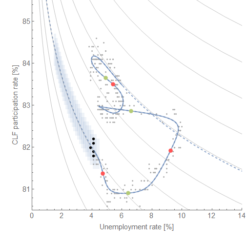
Click for larger versions. There are two models because the existence of a small positive non-equilibrium shock is a hypothesis (discussed here) possibly related to one apparent in the unemployment data, and which also leads to a novel "Beveridge curve" between unemployment and CLF participation:


The red and green points represent the center of the shocks to the two measures. Unlike the more traditional Beveridge curve, the non-equilibrium shocks are more spread out in time making the curves more difficult to see (and therefore why they hadn't been posited to exist). Their "equilibrium" (i.e. following the curves) values are directly related (rising CLF participation rate is directly proportional to declining unemployment).

In his Twitter thread, Bunker also references a graph from Jason Furman talking about the non-stationary trend in men's employment population ratio. It's times like these when I feel like the information equilibrium framework may really be a novel insight into macro; where Furman notes a negative trend, in my blog post from over a year ago I noted a positive trend (dynamic equilibrium) interrupted by recessions:


The decline is essentially due to a Poisson process (or similar) of recessions on top of an increasing trend. Since the recessions occur often enough with a great enough magnitude, the result is a general decline. In fact, the dynamic equilibrium forecast of an increasing EPOP has held up for over a year (a naive application of that secular trend would have been wrong by almost a full percentage point):


The other measure Bunker discusses is wage growth; I began tracking a forecast of the Atlanta Fed's wage growth data with the dynamic equilibrium model here:


Note that this also shows a non-equilibrium shock in the post-recession period. This is a model of dynamic equilibrium in wage growth, not levels, and so represents a constant wage "acceleration" [1].

Putting all of this information on a "macroeconomic seismograph", we can see the causal structure in the past two recessions (which are slightly different):


Click for higher resolution. A general trend appears of 1) a shock to unemployment, 2) a shock to wage growth, followed finally by 3) a shock to CLF participation. In between shocks there is a direct relationship between falling unemployment, rising wage growth, rising employment-population ratio, and rising CLF participation dynamic equilibria. However, the shocks to CLF participation are wide (the red and blue areas on the diagram above) so the limited areas where the variable follows the dynamic equilibrium (gray) make CLF less useful of a measure (it's more often away from equilibrium) — answering one of Bunker's questions.

But additionally, these dynamic equilibrium models describe the data well since the 1960s (where it exists) meaning they have a single dynamic equilibrium. There's no empirical backing to the concept of "slack" where wage growth might slow as unemployment or CLF participation reach some value. Unemployment will continue to fall until it rises again due to a recession. Wage growth will continue to rise until that recession happens. Those two things will happen with a 1-to-1 relationship, except where the non-equilibrium shock of recession has a different causal structure in the two time series.

Mathematically,

(d/dt) log (d/dt) log W ~ (d/dt) log U ~ (d/dt) log EPOP 

outside of a recession.
...
Footnotes:

[1] Continuously compounded wage growth is (d/dt) log W. Wage "acceleration" is (d/dt) log (d/dt) log W. It is the latter which appears to have a dynamic equilibrium.

Friday, May 11, 2018

Macro criticism, but not that kind

With all the tired and plain wrong critiques of economics out there that are easily shot down by even the most critical student of economics, I thought I'd try my hand at writing at one that might pass muster. I did write a book, but it was more aimed at taking a new direction; this will be a more specific critique.

First, let me avoid the common mistake of using the word "economics" but then exclusively talking about macroeconomics: my critique is being leveled at macroeconomics (macro). This is not to say I don't also have criticisms of microeconomics or growth theory, but rather let me just focus on macro because that is what most people are interested in. I'm pretty sure the comeback "Auction theory is successful!" isn't really going to cut it with the Post Crash Economics Society or in general anyone whose life was turned upside-down by the Great Recession.

Second, let me avoid the common mistake of saying macroeconomists don't think about X. They do. There's a good chance they've thought about X much more than you have. Instead, let me focus on how macroeconomists think about thinking about X — the context, the spoken and unspoken narratives, the institutional knowledge.

And finally, let me avoid the common mistake of decrying the use of math in economics (this time in general). Mathematics is an extraordinarily useful tool. I know — I'm a physicist. I don't think economists have "physics envy", but the charge does carry a nugget of truth that I'll get to later.

Many critics claim that macroeconomists failed because they were unable to predict the global financial crisis and global recession. Some critics of "mainstream" macro echo that claim and further claim that unrepresented schools of economic thought did in fact predict the crisis. Regardless of the truth of those claims, the real issue is that it is not currently known with any empirical certainty if financial crises or recessions are predictable (or whether the former cause the latter). There are decent thought experiments as to why financial crises or asset bubbles should be impossible to predict. This is frequently misinterpreted as an argument that bubbles can't exist. However I have to admit as a scientist that if you can only identify a bubble after it has popped it is at least plausible that the concept might not be useful.

But that real issue — that we don't know if major macroeconomic events are predictable — is further complicated by the fact that macro doesn't even know if macro time series of measurements like GDP or the unemployment rate are predictable outside of recessions. The best performing forecasting models tend to be things like vector autoregressions (VARs), but these models essentially 1) choose some set of macro observables, 2) measure their drifts, periodicities, variances and covariances, and 3) project into the future based on that knowledge. While this is a perfectly scientific undertaking, the understanding it delivers is little more than saying the time series are correlated randomness of a certain variety. The relative success of these kinds of models compared to models based on actual macroeconomic theory derived from thinking about people making decisions in some way or another should be a source of deep embarrassment for macro theory and theory-based models. It's as if the proverbial monkeys were able to type up Hamlet while the theorists were replacing the ribbon. However we still have economists like Olivier Blanchard and Lawrence Christiano [pdf] touting DSGE models as still useful for running policy experiments, or claiming they aren't designed for forecasting.

This failure points to the failure of what Noah Smith called big unchallenged assumptions. Theory-heavy models have lots of these, from the Euler equation (relating agents' view of the future to present consumption) to the Phillips curve (relating inflation and unemployment, i.e. the real economy). VARs have fewer assumptions — some assumptions still go into the choice of which macro time series to use. It is my impression that these unchallenged assumptions about the kinds of ingredients to use in macro models are the reason why including more of them leads to worse forecasting even when the economy is not in a recession. This is also why I think the foray into machine learning (championed by, for example, Susan Athey) might be extremely helpful for macroeconomics. Imagine if every machine learning model put zero weight on the interest rate!

This brings us to those meta-narratives. A lot of those theory-heavy macro models are generally based on the idea that the central bank's monetary policy and the government's fiscal policy are the drivers of GDP and inflation, and the sources of recoveries from recessions — or even their cause. The theoretical variables are interest rates, the price level, unemployment, and output (alongside their future values as expected by agents with ideal or bounded rationality). Economists like Paul Romer claim that the so-called Volcker disinflation of the 1980s represented "a clean test" of the importance of monetary policy, and that questioning whether the Fed under Volcker caused the 1980s recessions should be seen as a "yellow caution flag". Now Paul Romer isn't the only economist, but similar sentiments are expressed in graduate texts like David Romer's Advanced Macroeconomics. There are even people not named Romer that have written papers [pdf] about it. There is actually insufficient evidence to confirm or reject this narrative of events, and there are signs it might be the result of post hoc ergo propter hoc reasoning. For example, the yield curve inverts — often a good indicator of an upcoming recession in the US — and the stock market tanks in 1978, prior to Volcker's nomination to the Fed or the implementation of any change in monetary policy. Also note that a fall in conceptions [pdf] appears to precede economic decline measured by the unemployment rate by several quarters. Turnaround in Job Openings and Labor Turnover Survey data also tend to come before more traditional measures of economic decline. Neither of these were measured as indicators by macroeconomists at the time. There could have been many signs that the 1980s recession was already underway that went unreported because they are difficult to measure, or, as in the case of conceptions, not discovered until later. Note that the existence of possible leading indicators aren't the same thing as predicting recessions because macroeconomists don't know if they even have in hand the indicator with the longest lead nor know whether that indicator can be predicted.

Up another level of metaphysics, macroeconomics does not fully understand what a recession is aside from a general slowdown in economic activity. While heuristics such as two consecutive quarters of negative GDP growth are sometimes used, the NBER assembles a group of economists after a candidate for a recession appears to look at a large number of indicators and declare when that recession, if it is one, started and ended. Sometimes their results are not universally accepted — e.g. the early 2000s recession is given a fairly low probability using this metric. Now there is nothing wrong with this. Astronomers have revised their definition of what a planet is as recently as 2006. Physics has no idea what dark energy is. However, this lack of understanding does not seem to give macroeconomists pause when making assumptions about what a recession is or its cause in specific situations such as Del Negro et al adding financial frictions to explain the 2008 recession [pdf] that are independent of whether the model can describe other recessions. As Dani Rodrik says in his book Economics Rules, one model with a particular set of assumptions is applied to one specific situation while another with another set of assumptions is applied to another situation — usually the models and assumptions are selected post hoc. He says that's the "art" of economic theory. 

It's not the assumptions' realism or lack thereof that's the issue. The issue is that these models are the mathematical analog of Kipling's "just-so" stories. The leopard got its spots in this particular way, and that doesn't help you understand how the cheetah got its spots. As Feynman said in his famous Cargo Cult Science commencement address at CalTech in 1974:
When you have put a lot of ideas together to make an elaborate theory, you want to make sure, when explaining what it fits, that those things it fits are not just the things that gave you the idea for the theory; but that the finished theory makes something else come out right, in addition.
The model that is used to make the 2008 recession come out right doesn't make something else come out right, in addition. All too often, that's what the defense "macroeconomists actually do study X" really means: there is a just-so model that has been used to explain X

It's not just macro that has this problem; it has been brought up in evolutionary biology for example. It doesn't seem that there is a lot of internal criticism in macro of this kind of model-building, and in fact some economists actively seek out these kinds of stories. I also believe that it is a lack of an immune response of internal criticism to this kind of model-building lets a lot of "schools of thought" (usually just different sets of story elements) proliferate. Before I get the "there are no 'schools of thought'" rejoinder from a macroeconomist, let me just say that the aforementioned graduate macro text says:
Where the major macroeconomic schools of thought differ is in their hypotheses concerning [recessionary] shocks and propagation mechanisms.
While Romer says hypotheses, these tend to be more sets of assumptions about what a recession is.

The close relative of the just-so story is the escape from the self-imposed straitjacket; I can't do any better than the blog Mean Squared Errors in describing this:
Consider the macroeconomist. She constructs a rigorously micro-founded model, grounded purely in representative agents solving intertemporal dynamic optimization problems in a context of strict rational expectations. Then, in a dazzling display of mathematical sophistication, theoretical acuity, and showmanship (some things never change), she derives results and policy implications that are exactly what the IS-LM model has been telling us all along. Crowd — such as it is — goes wild. 
And let's be clear: not even the most enthusiastic players of the macroeconomics game imagine that representative agents or rational expectations are, in any sense, empirical realities. They are conventions, "rules of the game." That is, they are arbitrary difficulties we impose on ourselves in order to demonstrate our superior cleverness in being able to escape them. 
They are, in a word, Houdini's straightjacket [sic].
The meta-narratives that require these particular mathematical modeling elements end up making even the simplest macro models incredibly complex. The model of Del Negro et al contains an entire DSGE model, but the idea that a financial crisis can cause a recession doesn't really need that complex of a model — unless you're proving something else. It's only the fact that a DSGE model with Euler equations, Phillips curves and various microfoundation assumptions is the starting point for adding financial frictions that requires the complexity. And then, for all that complexity, the model doesn't actually do all that well (e.g. the shape of post-recession inflation is completely wrong):


This lackluster model has over 20 parameters (left-most column; the financial frictions correspond to the parameters that aren't in the other versions):


This is where that nugget of truth about physics envy comes in. Proving the existence of a just-so story that keeps the meta-narrative faith requires a level of complexity that far exceeds the accuracy of the model. When George Box said "all models are wrong", he was advising against building exactly this kind of Rube Goldberg device. The physics envy charge is leveled at exactly this kind of unnecessary complexity that doesn't result in better, more empirically accurate models. The charge is best understood as an attempt to answer the question: Why would macroeconomists do this? It can't be because they just enjoy algebra. I don't know; maybe they're just happy to write out lots of LaTeX symbols like in physics papers ... physics envy? Well, that's the best answer I've heard because otherwise it doesn't make sense!

One of the problems with the now standardized critique of unrealistic assumptions, failing to predict the crisis, or failing to add whatever "better" ingredients the author of the critique either personally researches or simply likes more is that it's so easily batted down because it's a caricature of macroeconomic theory from the 1990s or even the 1890s (in a similar way that many critiques of string theory are based on the state of string theory in the 1990s). More often than not the "better" ingredients (evolutionary biology, nonlinear dynamics, more accurate accounting) are simply another set of assumptions chosen to fit a narrative and build just-so stories — but a narrative and just-so stories the critic prefers. They aren't any more empirically accurate than the macro they're criticizing (and often haven't been used to construct models to compare with data at all — which is hilarious when coupled with the standard critique that macro isn't empirical).

Macro has no natural immunity to just-so stories because it doesn't have a robust internal criticism of them; it has to stick to debunking the caricature. This made me think that the "standardized critique" may well have adapted to macro like a virus adapts to a cell. When a macroeconomist sees the standard elements of the critique, the immediate response is to attack those: Macro does study X! Macro is empirical! The rest of economics is fine! Auction theory! These smack-downs increase the profile of the critique, and allow the critic's just-so story to invade the minds of many more readers.

There you have it: my critique of macro that avoids many of the pitfalls of the "standard critique". Macroeconomic theory simply isn't good enough to have any big unchallenged assumptions. They should all be challenged. Challenge the meta-narratives. Does monetary policy even matter? Is inflation always and everywhere a demographic phenomenon? Do people's decisions have any effect at all? Shut down just-so stories. Ask what else the model makes come out right, in addition. It's fine to use math and unrealistic assumptions to question these narratives, just make sure to use data.

*  *  *

Update 12 May 2018

It didn't fit in the narrative above, but one other criticism I had (that I talked about here in my post Lazy econ critique critiques) where some set of unrealistic assumptions or just-so story is used to explain macro/aggregated data but then the results are turned around to draw conclusions about the agents obeying those unrealistic assumptions. Unrealistic microfoundations are fine if they lead to empirically accurate theories, but you cannot then turn around and use those empirically accurate theories to draw conclusions based on those "microfoundations". A representative agent in a DSGE model may yield something reasonable for macro data (GDP, inflation), but you cannot turn around and say that individual rational behavior yields the result and policy impacting that behavior at the individual level would cause things to change. The representative agent (just as an example here of some kind of assumption) may give you a way to describe the macro data well, but it's an effective agent. You can't cross levels from an effective agent at the macro scale to actual agents at the micro scale and assume your unrealistic assumptions don't wildly impact the micro-level results.

Aside from the example given in the link about infectious disease, the neo-Fisher debate where Woodford applied bounded rationality/finite belief revision crosses scales from properties of micro agents to macro effects. I talked about it here (where I also found that the way macroeconomists treat limits is problematic). When the finite time to revise beliefs is taken as an actual property of actual humans that is proposed to have a the macro effect in the model, Woodford mistakes his effective agents for real ones.

Thursday, May 10, 2018

Gender differences in unemployment

The St. Louis Fed has an article about the difference between the unemployment rate for women and for men, producing the data in this graph:


If we look at the data alone, it looks like this measure is positive until it drops to zero/negative  after the 1980s recessions. However, women's labor force participation was accelerating during this time (effectively adding more women looking for work) — which had other effects such as potentially creating the Philips curve. If we subtract an estimate of this effect (I admit I just eyeballed this fit using a dynamic equilibrium shock which is approximately Gaussian in shape), we essentially get a flat curve with dips for recessions:


It's imperfect (especially the 1950s, which may have a bit of e.g. post-war labor force re-entry), but this representation of the data helps mitigate an "optical illusion" — the sudden drop in the 80s now just looks like a recession dip super-imposed on the declining dynamic equilibrium shock.

...

PS The other differences noted in the article are likely due to the fact that the dynamic equilibrium is logarithmic — falling from a higher unemployment rate falls faster than falling from a lower unemployment rate. The figure about gender differences in time shows the difference between the era of women entering the workforce and  e.g. the 2008 recession where women's labor measures become correlated with men's (click for larger image):


Validating my CPI inflation forecast

I forgot that CPI data (all items) was going to come out today when I wrote my post from yesterday (inflation oscillations as "gravity waves" due to labor force changes), but I'm glad I didn't wait because the update is pretty much what the forecast said (and has been saying for the past year). The original forecast overshot the size of the post-Recession shock by a small amount (original forecast is the solid line, updated shock size is the dashed line), but it was well within the model error. Here are the continuously compounded and year over year CPI inflation forecasts as well as the CPI level forecast (where that shock over-estimate makes the most difference):


Wednesday, May 9, 2018

Labor force participation and gravity waves

The latest in a long line of arguments about how monetary policy controls the economy comes to us in the form of a report by William Gavin [pdf] published by the St. Louis Fed about how monetary policy and the Fed is responsible for a bunch of macroeconomic observables (of course). The report produces this graph of CPI:


I guess that's one way to look at it. However, the dynamic information equilibrium model of CPI, that I  have been tracking the forecasts of for some time, provides an alternative macroeconomic history. Let's look at the overall model:


The dynamic equilibrium is about 2.5% CPI inflation, with three major shocks — a post-war slowdown, the demographic shift of women entering the workforce (see Twitter thread here, or download pdf here), and the post-Great Recession drop in the labor force. This model is fairly accurate, averaging only a few percent error over the 70 years. But the difference between the model and the data is also interesting:


The periods of large error are associated with transitions of people into the labor force (as well as a strong Phillips curve per the link above). Aside from those periods, the error is only about ~1% (in CPI level, i.e. a CPI of 100.0 ± 1.0). From this, we can re-make the graph at the top of this post:


So was it the Fed's actions, or are the trends and fluctuations in CPI primarily due to the labor force? It's true that any view of CPI data is going to be model dependent (of course, the dynamic equilibrium model is empirically accurate and has done a good job of forecasting). But what I found to be fascinating is that those fluctuations in CPI highlighted above in green and red look just like chirps. In fact, the data looks remarkably like the gravitational wave chirps measured with LIGO:


These chirps are formed by inspiraling black holes or neutron stars — as their orbits around each other shrink (due to shedding energy via gravity waves), the period of the orbit gets shorter and shorter resulting in higher and higher frequencies until the orbiting pair shed all of their orbital energy and collapse into a black hole.

What if the mechanism of people entering the workforce creates these oscillations in CPI, which cause more people to fluctuate in and out of the workforce with the accompanying recessions and recoveries? It's an hypothesis, but the chirp wave forms (red and green above) fit the data pretty well.

Thinking like a physicist: MaxEnt edition

Nick Rowe is really great at putting together explanations of economic models in a very intuitive form, and I would have loved to have had him as a professor. But sometimes "thinking like an economist" and "thinking like a physicist" clash so badly it makes my eye twitch involuntarily. Nick put together a simple model where he wanted to show that it was possible that people cluster in cities even though they'd prefer not to. He considered a scenario where there was a possible city in the east and a possible city in the west. He considered it to be a two-point domain; I imagined it as two islands, and I guess as long as there were more than half the people on one it was "a city".

Nick then introduces utility and proceeds to show that you can get any result you want. This made me think: how would I approach the idea of the formation of cities in the simplest model possible?

Well, first off I would look at a continuous domain rather than a discrete point set (because the idea of cities is that people form areas of higher density, not just choose one place over another). In math, we write this as [0,1]. Think of it as modeling Canada along the Trans-Canada Highway from Montreal (1) to Vancouver (0) — corresponding to Nick's cities in the east and west, respectively.

If I assume I know nothing about humans (agents), my best guess is that they'd be uniformly distributed on [0,1]. That's the maximum entropy (least informative prior) distribution on a finite domain given no constraints. But what if we observe cities? That macro observation provides a constraint on our micro (agent) model. If x is the position between zero and one, then the macro observation results in a constraint on the expected values of ⟨x⟩ and and ⟨1−x⟩. The maximum entropy distribution on [0,1] with those constraints is called the beta distribution:


Depending on the parameters (i.e. macro observables), you can get any results you want just like in the economic version. The uniform distribution on [0,1] is also a special case of  the beta distribution for α = β = 1. Note that you could treat the problem like how Nick does where instead of x being position along the Trans-Canada Highway, it is the population of one of the two cities on the original discrete point set (with the other population being 1 − x). His possible solutions (most people live in one or the other city, or evenly split) would look like this:


Since these are maximum entropy distributions, we actually are assuming we know nothing else besides what we observe (i.e. the cities). We don't know if agents like this arrangement or hate it. But we do know that it is entirely possible that it can arise from random, inconsistent (as Gary Becker put it, "irrational") choices with only slightly different weights on the state space (i.e. where or which city to live in).

What else is maximum entropy (MaxEnt) reasoning good for? Part of the reason for writing this post was the connection between Nick Rowe's post and email discussion I was having. Is the income (or wealth) distribution what it is simply because income is (roughly) bounded at the bottom, but unbounded at the top? Well, that's part of it. The maximum entropy distribution on [0, ∞) [1] with an observed average ⟨x⟩ (i.e. average income, 1/λ) is an exponential distribution:


However, this distribution has fixed inequality with a Gini coefficient of 0.5. If income was exponentially distributed, then inequality wouldn't change. That's not what we see in the real world.

Now Vilfredo Pareto made some of the first observations about income distributions, and there's a maximum entropy distribution named after him that can have different Gini coefficients. It's not on [0, ∞), but rather [x₀, ∞) with a minimum value x₀:


The constraint in this case is on the expected value ⟨log x⟩ (i.e. the average log income), and the Gini coefficient is 1/(2 α - 1) with alpha of about 1.7 matching the US Gini data. But while this is a decent description of the ("fat") tail (i.e. the highest incomes), it doesn't do well with the lower income. Is there a maximum entropy distribution that does a bit better at all scales? This actually took a bit of effort to show, but the piece of knowledge that we'd want to add (the constraints) is really about how quickly agents acquire money: the time to observe α events that come at a rate β described by a Poisson process (which generates the above exponential distribution). This is called a gamma distribution, but it's not really what we're looking for. If the time to acquire a lot of money is extremely short, you have high income; if it is long, you have low income. So the expected time T to get M money yields an income of M/T (i.e. a salary in units of dollars per year or wage of dollars per hour). If T is gamma distributed, then 1/T is inverse gamma distributed. It looks like this:


We have our Pareto tail, but with a more sensible distribution at the lower end. We're also back to [0,∞) instead of having an explicit minimum value x₀.

Now I didn't just pull this distribution out of the air; it was computed from a model that included agents exchanging, "betting" on a market, as well as taxes that redistribute wealth by Bouchaud and Mezard almost 20 years ago. A more recent paper (also discussed in that email) by Berman et al changes up the taxes such that income is redistributed upward (think economic rent, or just plutocracy) and gets different results [2].

Anyway, I hope you can see the sort of things the maximum entropy approach are good for (and not good for: income distributions don't really fall out simply in the approach except for an effective Pareto distribution at the high end). And I hope it elucidates the way at least this physicist looks at problems e.g. assuming only things you know or observe, thinking in terms of scales.

...

Footnotes:

[1] Unlike economists, mathematicians know that infinity isn't an actual number and so it doesn't make sense to include it in a domain (set). The square brackets mean "included", so that [0,1] includes 1, but [0,1) doesn't. The latter domain has every number as close as possible to 1 as you can imagine, but just not 1.

[2] I do not like the way this paper is framed at all. You cannot claim to be surprised by non-ergodicity when you set up your model to remove its ergodicity. We added a piece to the model that keeps people in one part of the state space, and are now surprised that people stay in one part of the state space. Your assumptions are invalidating the ergodic hypothesis.


No really; they said they were surprised:
"Our findings invalidate the ergodic hypothesis. The fitted reallocation rate is not robustly positive for any dataset we analyze. Indeed, for one dataset we find it to be consistently negative for the last thirty years or so. We cannot overstate our surprise at this finding."
I'm guessing Ole Peters wrote that line as he has a knack for putting something in a model and not realizing he put it in the model. I'm also putting "ergodicity" and "non-ergodicity" on my list of red flags that someone is about to embark on some dubious economic theory.

Tuesday, May 8, 2018

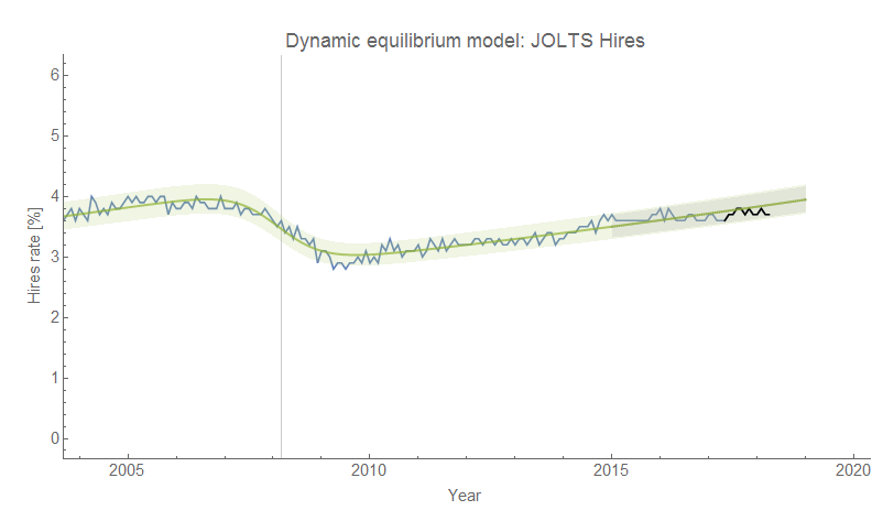
JOLTS data

Update: Ha! Apparently economists see today as extraordinary, but I predicted this back on 10 January 2017.

Update: Here is the most recent data (black) overlaid on the original forecast from here (which also shows the original code):


Original post:

I was busy running around doing work stuff today, so I won't belabor the fact that the latest JOLTS data doesn't really change things from the previous assessment.