Wednesday, February 8, 2017

Qualitative economics done right, part 2

Something that I've never understood in my many years in the econoblogosphere as reader and eventually as a writer is the allure of Steve Keen. One of the first comments on my blog was from someone saying I should check him out. He wrote a book called Debunking Economics back in 2001, claims to have predicted the financial crisis (or maybe others claim that feather for him), and since then he's been a prominent figure in a certain sector of left-leaning economic theory. He's been the subject of a few posts I've written (here, here, here, and here). But mostly: I don't get it. Maybe the nonlinear systems of differential equations are shiny objects to some people. It might just be the conclusions he draws about economics (i.e. "debunking" it), debt, and government spending ‒ although the words "conclusions" and "draws" should probably be replaced with "priors" and "states". Hey, I love lefty econ just as much as the next person.

UnlearningEcon suggested that Keen made ex ante qualitative predictions using his models:
Keen (and Godley) used their models to make clear predictions about crisis
This statement along with the accompanying discussion of qualitative models are what inspired this series of posts (Part 1 is here, where I lay out what we mean by qualitative analysis; Part 3 will be about Godley's models).  There are some that say Keen predicted the financial crisis, but there are several things wrong with this.

He only appears to have predicted in 2007 [pdf] that housing prices would fall for Australia. First, this is after the housing collapse already started in the US (2005-2006). The global financial crisis was starting (the first major problem happened 7 Feb 2007, almost exactly 10 years ago, and that pdf is from April). Additionally, housing prices didn't fall in Australia and Keen famously lost a bet. And note that the linked article refers to him as the "merchant of gloom" ‒ Keen had already acquired a reputation for pessimism. Aside from this general pessimism, there do not appear to be any ex ante predictions of the financial crisis.

Ok, but UnlearningEcon said predictions about the crisis. Not necessarily predictions of the crisis. That is to say Keen had developed a framework for understanding the crisis before that crisis happened, and that's what is important.

And with some degree of charity, that can be considered true. Most (all?) of Keen's models appear to have a large role for debt to play, and in them a slowdown in the issuing of debt and credit will lead to a slowdown in the economy (GDP). Before the housing crisis, the US had rising levels of debt. Debt levels (we think) cannot continue to rise indefinitely (relative to GDP), so at some point they must level off or come back down. And the financial crisis was preceded by a slowdown in the US housing market.

The problem with this is that Keen's model defines GDP' as output (Y, i.e. what everyone else calls GDP without the prime) plus debt creation (Y + dD/dt ~ GDP') (see here or here for discussion). Therefore it comes as no surprise that debt has an impact on GDP'. And since debt cannot increase forever (we think), it must level off or fall if it is currently rising. Therefore there must eventually be an impact to GDP'. And due to Okun's law, that means an impact on employment.

That is to say those qualitative predictions of the model (slowdown in debt creation will lead to fall in GDP') are in fact inputs into the model (Y + dD/dt ~ GDP'). I think JW Mason put it well:
Honestly, it sometimes feels as though Steve Keen read a bunch of Minsky and Schumpeter and realized that the pace of credit creation plays a big part in the evolution of GDP. So he decided to theorize that relationship by writing, credit squiggly GDP. And when you try to find out what exactly is meant by squiggly, what you get are speeches about how orthodox economics ignores the role of the banking system.
Basically we have no idea why we decided debt creation is a critical component of GDP' besides some chin stroking and making serious faces about debt. Making serious faces about debt has been a pasttime of humans since the invention of debt. However! Shouldn't we credit Keen with the foresight to add debt to the model regardless of why he did it? Maybe he hadn't quite worked out the details of why that dD/dt term goes in there, but intuition guided him to include it. The inclusion lead to a model that Keen used to make qualitative predictions, therefore we should look at the qualitative properties of the models. I'll drop the prime on GDP' from here on out.

This is where that series of tests I discussed in Part 1 comes into play. Most importantly: you cannot use a qualitative prediction to validate a model as a substitute for (qualitatively) validating it with the existing data. Let's say I have a qualitative model that qualitatively predicts that a big shock to GDP (and therefore employment by Okun's law) is coming because the ratio of debt to GDP is increasing. Add in a Phillips curve so that high unemployment means deflation or disinflation. Now how would that look generically (qualitatively)? It'd look something like this:


Should we accept this model because of its qualitative prediction? Look at the rest of it:


It was a NAIRU model with perfect central bank inflation/employment targeting that added in Keen's debt mechanism (trivially) when debt reached 100% of GDP. But here is Keen's model from "A dynamic monetary multi-sectoral model of production" (2011):


The qualitative prediction is the same, but the qualitative description of the existing data from before the prediction is very different. Here we have two "Theory versus data" graphs:


Actually the simplistic model is a much better description (measured by average error) of the data! But neither really captures the data in any reasonable definition of "captures the data".

The issue with using Keen's models qualitatively is that they fail these qualitative checks against the existing data. Here are a couple more "Theory versus data" graphs (the first of real GDP growth is from the model above, the second is from Keen's Forbes piece "Olivier Blanchard, Equilibrium, Complexity, And The Future Of Macroeconomics" (2016)):


And I even chose the best part of the real GDP data (the most recent 20 years) to match up with Keen's model. But there's a lot more to qualitative analysis than simply looking at the model output next to US data. To be specific, let's focus on the unemployment rate.

Unemployment: a detailed qualitative analysis

First, Keen's graph not only doesn't look much like US data as mentioned:


It doesn't look much like the data from other countries either (here the EU and Japan):


Additionally, Keen's graphs don't share other properties of the unemployment data. Keen's model has strong cyclical components (I mean pure sine waves here), while the real data doesn't. We can see this by comparing the power spectrum (Fourier transforms) [1] (data is dotted, Keen's model is solid):


Another transform (more relevant to the information equilibrium approach) involves a linear transform of the logarithm of the data:
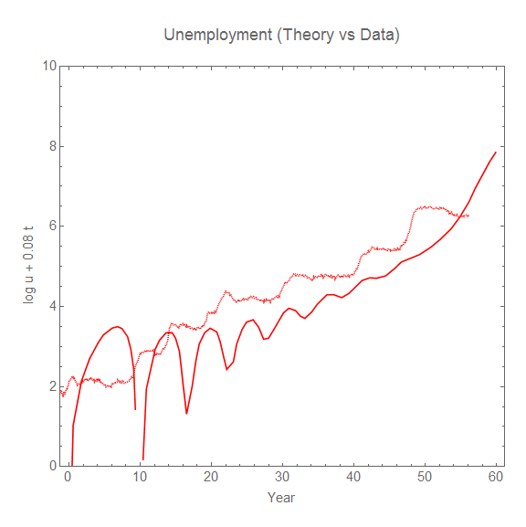

We can see the unemployment data has a strong step-like appearance, which is due to the roughly constant rate of fractional decrease in the unemployment rate after a shock hits [2]. This property is shared with the data from the EU and Japan shown above. Keen's model has the unemployment rate decreasing at a rate that is proportional to the height of the shock. Instead of flat steps, this results in trenches after each shock that decrease in depth as the shock decreases.

We can also observe that the frequency of the oscillation in Keen's model is roughly constant (it slightly decreases over time). However the differences between the unemployment peaks in the empirical data are consistent with a random process (e.g. Poisson process).

There's a big point I'd like to make here as well: just because you see the data as cyclic it doesn't mean any model result that is cyclic qualitatively captures the behavior of the system. I see this a lot out there in econoblogosphere. It's a bit like saying any any increasing function is same as any other: exponential, quadratic, linear. There are properties of cycles (or even quasi-periodic random events) beyond just the fact that they repeat. 

Anyway, these are several qualitative properties of the unemployment data. In most situations these kinds of qualitative properties derive from properties the underlying mechanism. This means that if you aren't reproducing the qualitative properties, you aren't building understanding of the underlying system.

In fact, exponentially distributed random amplitude Gaussian shocks coupled with a constant fractional decrease in the unemployment rate derived from, say, a matching function yields all of these qualitative features of the data. Here's another "Theory versus data" using this model [3]:  


The underlying system behind this qualitative understanding of the unemployment data has recessions as fundamentally random, predictable only in the sense that the exponential distribution has an average time between shocks (about 8 years). These random shocks hit, and then at a constant fractional rate the newly unemployed are paired with job openings.

Now it is true that the shocks themselves might originate from shocks in the financial sector or housing prices, or fluctuations in wealth and income (or all three). And there may be a debt mechanism behind how the shocks impact the broader economy. However, Keen's model does not even qualitatively describe how these pieces fit together.

So how does Keen's model stack up against the heuristics I put forward in my post on how to do qualitative analysis right? Well ...
  • Keen's models generally have many, many parameters (I stopped counting after 20 in the model discussed above). The model discussed above The Lorenz limit cycle version from the Forbes piece appears to have 10. [4]
  • If real RGDP is as above, then Keen's model does have a log-linear limit for RGDP growth. However, the price level fails to have a log-linear limit (since the rate goes from on average positive to increasingly negative, the price level will go up log-linearly and then fall precipitously).
  • As shown, there is a time scale on the order of 60 years controlling the progression from cyclic unemployment to instability in addition to the roughly 7-8 year cyclic piece. This makes it pure speculation given the data (always be wary of time scales on the order of the length of available data, too).
  • Keen's model is not qualitatively consistent with the shape of the fluctuations (per the discussion above).
  • Keen's model is not qualitatively consistent with the full time series (per the discussion above).

The overall judgment is qualitative model fail.

...

Update 10 February 2017

One of the curious push-backs I've gotten in comments below is that Keen's model "is just theoretical musings", or that I am somehow against new ideas. The key point to understand is that I am against the idea of saying a model has anything to do with a qualitative understanding of the real world when the model doesn't even qualitatively look like the real world. 

Keen himself thinks his model is more than just theoretical musings. He doesn't think the model just demonstrates a principle. He doesn't think these are just new ideas that people might want to consider. He thinks it is the first step towards the correct theory of macroeconomics. Here's the conclusion from Keen's "A dynamic monetary multi-sectoral model of production" (2011):
Though this preliminary model has many shortcomings, the fact that it works at all [ed. it does not] shows that it is possible to model the dynamic process by which prices and outputs are set in a multisectoral economy [ed. we don't learn this because the model fails to comport with data]. ... The real world is complex and the real economy is monetary, and complex monetary models are needed to do it justice [ed. we don't know monetary models are the true macro theory]. ... Given the complexity of this model and the sensitivity of complex systems to initial conditions, it is rather remarkable that an obvious limit cycle developed [ed. limit cycles are not empirically observed] out of an arbitrary set of parameter values and initial conditions—with most (but by no means all) variables in the system keeping within realistic bounds [ed. they do not]. ... For economics to escape the trap of static equilibrium thinking [ed. we don't know if this the the right approach], we need an alternative foundation methodology that is neat, plausible, and—at least to a first approximation—right [ed. it is not]. I offer this model and the tools used to construct it as a first step towards such a neat, plausible and generally correct approach to macroeconomics [ed. it is not because it is not consistent with the data].
Keen's model does not "work", it does not capture the real world even qualitatively, it is not "right", and there is no reason to see this as a first step towards a broader understanding of macroeconomics because it is totally inconsistent with even a qualitative picture of the data.

In my view, Keen's nonlinear differential equations are travelling the exact same road as "rational expectations" approach of Lucas, Sargent, and Prescott. They both ignore the empirical data, but are pushed because they fit with some gut feeling about how economies "should" behave. In Keen's case, per JW Mason's quote above, where "credit squiggly GDP". With LSP [5], that people are perfect rational optimizers and markets are ideal. Real world data is seen through the lens of confirmation bias even when it looks nothing like the models. This approach is not science.

...

Footnotes:

[1] Interestingly, the power spectrum (Fourier transform) of the unemployment rate looks like pink noise with exponent very close to 1. Pink noise arises in a variety of natural systems.

[2] The constant rate is related to the linear transform piece and the fractional decrease is related to the logarithm piece.

[3] I also made this fun comparison of Keen's model, the data, and an IT dynamic equilibrium model:


[4] The random unemployment rate model produced from the information equilibrium framework has 2 for the mean and standard deviation of the random amplitude of the shocks, 2 for the mean and standard deviation of the random width of the shocks, 1 for the Poisson process of the timing of the shocks, and finally 1 for the rate of decline of the unemployment rate for a total of 6.

[5] Not Lumpy Space Princess, but Lucas, Sargent, and Prescott.

Tuesday, February 7, 2017

Why not ask a scientist?

The editors of Bloomberg View ask Why Not Make Economics a Science?, and Noah Smith adds a bit more to the discussion on his blog. It's mostly good stuff.  One of the strange things is that when the editors put forward their thesis:
Reviving economics as a science will require economists to act more like scientists [pdf].
the link at the end connects you to Paul Romer's "The Trouble With Macroeconomics". Paul Romer is an economist, and gets a lot of how science is conducted wrong. His concept of a scientific model is mistaken, his analogy with string theory is misguided, his mathiness charge just demonstrates the real problem more clearly, and he's just as unscientific about his approach to explaining a theoretical result as any macroeconomist.

I have written many posts on how non-scientists get science wrong as it should apply to economics (here, here, here, and here, for example). The two biggest ways it goes wrong are an obsession with so-called unrealistic assumptions and an elevation of science to what I call Wikipedia science. Here are the editors making the first mistake:
Their ambition has been to build mathematically elegant and internally consistent models of the economy, even if that requires wholly unrealistic assumptions. Granted, just as maps have to simplify complex terrain, theoretical models must ignore aspects of reality to be any use. But there’s a line between simplification and gross distortion, and modern macroeconomics has crossed it.
This misses the forest for the trees, and misses the point of Milton Friedman's positive economics essay. The assumptions are not the issue. The editors do touch on the issue:
If models are refuted by the observable world, toss them out.
If models are refuted, toss them out. If they are not, then keep looking into them. However refuted models may have valid assumptions, and empirically valid models may have refuted assumptions. This is a principle of how modern theoretical physics proceeds -- it's called effective theory. Physicists have had to come to terms with the fact that it may be impossible to ever understand what is really happening at a fundamental level (due to e.g. lack of new accelerator experimental results) and so treat understanding as tentative, effective. Macroeconomists might have to come to terms with the fact that human behavior is not amenable to tractable mathematical description and may have to work around it (that's a good description of what I do on this blog using information theory to get around human behavior and provide a short cut to understanding complex systems). 

You may think that if the empirical validity of assumptions doesn't necessarily matter, then it doesn't matter if you use realistic or unrealistic assumptions. But this represents another problem illustrated by the editors:
Rely on experiments, data and replication to test theories and understand how people and companies really behave.
Maybe the editors are unaware of the SMD theorem, but it is entirely possible "real behavior" is not relevant to macroeconomics (or at least relevant to tractable macro theories). This restriction is exactly the kind of straitjacket that Mean Squared Errors put so well:
Consider the macroeconomist.  She constructs a rigorously micro-founded model, grounded purely in representative agents solving intertemporal dynamic optimization problems in a context of strict rational expectations.  Then, in a dazzling display of mathematical sophistication, theoretical acuity, and showmanship (some things never change), she derives results and policy implications that are exactly what the IS-LM model has been telling us all along.  Crowd -- such as it is -- goes wild.
Just substitute realistic behavior and empirically valid assumptions for rational expectations and representative agents. Until a rigorous framework is in place, macroeconomists will work their way around those straitjackets as well.

The thing is that you should add assumptions or take them away based on whether the resulting macro theory is empirically valid or not. Adding them or taking them away because you stroke your chin and make a "very serious person" face is not scientific.

It's not clear if the editors make the second mistake of thinking science is Wikipedia science. By "Wikipedia science", I mean the popular perception that science doesn't make mistakes, doesn't go backwards, or has everything figured out -- that you could look everything up on Wikipedia. These quotes give me pause:
Far from advancing, the science of economics has been going backwards. ... In just about every branch of science, theoretical research has been crucial to achieving breakthroughs. In macroeconomics, it has held progress back.
Sometimes going backwards is what needs to happen. And the second piece is not true. Theoretical paradigms in physics (ones based on making a "very serious person" face and stroking your chin) have definitely hindered progress. Aether and objections to the randomness of quantum mechanics are two that people might be familiar with. Full renormalizability is a more technical one (the rejection of that is what has lead to the embrace of all theories as effective theories). If theory doesn't make progress, that is ok. It's true that lack of progress is a heuristic that hints something might be going wrong, but it doesn't tell you what. If your car doesn't start, that just tells you something is wrong; it doesn't tell you what. You might be out of gas. Your alternator might be shot. In macroeconomics, maybe all this insistence on including human behavior is the problem (also here).

*  *  *

So, why not ask a scientist about if and how macro fails to be scientific? This scientist has put together a list (of both valid and invalid complaints, in my opinion). A short summary:

The identification problem (& complexity)

The basic point is more than one set of parameter values can result in the same macro observations. In science, we'd try to determine the values from the micro theory (which is what economists do [at least they say they do ...]), but also reduce the number of parameters by reducing the complexity of the theory. This is part of general problem that macroeconomic theories are way too complex given the limited empirical data.

Economics does not appear to treat limits properly & Economics does not deal with domains of validity (scope)

Is a model valid in a particular situation? Can you apply rational expectations when the system is far from a general equilibrium? What time period is considered a long time versus a short time? These are questions that not only aren't addressed, but often fail to be even asked.

Economics accepts stories too easily

This included making a "very serious person" face and stroking your chin. A whole lot of macro seems to proceed by narrative. Those unrealistic assumptions? Every one has a story behind it. They keep being used because of the power of the story.

Adding realistic human behavior? There's a story behind it involving a lot of psychology experiments and irrational decision making. I can assure you there isn't a macroeconomic empirical success behind every human behavior assumption (mostly because there aren't a lot of empirical successes).

... Note that the stories and lack of scope conditions are a toxic combination that mean you have no idea where to stop telling stories and adding assumptions. Just keep adding things you can tell a story about until you get some agreement with the data! Scope conditions help because they tell you whether a story is relevant.

Monday, February 6, 2017

The lack of uniqueness of Arrow-Debreu equilibria


A visualization of a macroeconomic equilibrium.

In the "ensemble of many markets" picture where the diagram above indicates a "statistical equilibrium" of a set of growth states, we have a definition of a general economic equilibrium that is describable in terms of a partition function.

First, this is one way you can make sense of economic equilibrium that Steve Keen says is impossible using an overly strict mathematical construct to represent neoclassical economics. Equilibrium is not a case where all relative prices are always the same (a ridiculous definition that we can see is not true of even a normally operating economy by inspection because e.g. sometimes things go on sale), but rather a case where the distribution of prices remains relatively unchanged.

We can observe examples of the distribution in profit rates, the prices of goods, as well as stocks, for example. Disequilibrium can be seen as strong deviations from the distribution (illustrated in the stock example) and macroeconomic forces as entropic forces (here, in the paper, or here as causal entropic forces) maintaining it.

Now let's go to a bit I wrote about the lack of uniqueness of the Arrow-Debreu-McKenzie (ADM) equilibrium before:
Let's look at what the ADM equilibrium says with regards to a partition function in thermodynamics. It effectively says there exists some set of occupation numbers [i.e. growth states] so that the energy of the system is the total energy, or more generally, there exists a microstate consistent with an observed macrostate. The SMD theorem then tells us that there are only limited properties of that microstate that survive to the macrostate. ... The other consequence of the SMD theorem should also be intuitive. If your macro system appears to be described by n << N degrees of freedom, then it seems highly likely that among the total number of microstates, large subsets of the microstates are going to be described by a given macro state -- i.e. the equilibrium (the microstate satisfying macro constraints) is not going to be unique.
Basically, since every re-labeling of the boxes in the diagram above is another macroeconomy with the same growth state distribution, every re-labeling represents an equivalent macrostate. Since each growth state (i.e. IT index k state) also indicates a price growth state [1], the price clearing vector is highly non-unique. This is a good thing, too. It means that macroeconomics is somewhat easier than applied microeconomics ‒ it's a different theory (like particle kinematics versus the ideal gas law). Additionally, consistent with the SMD theorem, the detailed properties of the microstates (the individual boxes) are not absolutely necessary to describe the macrostate. (It also means that agent based modeling is fine, but unnecessary.)

Instead of a single price vector pointing motionless in a single direction, we should visualize a rapidly changing price vector with elements drawn from a stable distribution (possibly even a Stable Distribution per here).

...

Footnotes

[1] If $n_{i}$ is the nominal output of the $i^{th}$ market with common "factor of production" ($m$ money, or it could be labor $\ell$), we have:

$$
\begin{align}
\log n_{i} \sim & k \log m\\
\log p_{i} \sim & (k - 1) \log m
\end{align}
$$

Basically, the distribution of $k$ states describes both the nominal output of the $i^{th}$ market as well as the price $p_{i}$ of the good in that market.

PS Snow day! Seattle tends to be useless with even a few inches of snow, so I took the day off.


Sunday, February 5, 2017

Randomly generated economies (a work in progress)

I have been in the process of constructing randomly generated unemployment time series based on the dynamic equilibrium model (partially inspired by writing my qualitative analysis post). I'm still in the process of working out the parameters (or rather, the distributions the parameters are drawn from). However, the work in progress looks neat on its own.

Here's what I mean by a randomly generated time series: effectively a series of Gaussian shocks with random centers, amplitudes, and widths. 

Here is the actual unemployment rate time series (red) alongside a randomly generated path (blue):


In constructing the model (still in progress), I came across some interesting mistakes. For example, if you (accidentally) use a Poisson distribution to yield integer recession transitions:


If you run it for 500 paths you get this:


And here is what happens if you use quarters:


It would be fascinating if there was some resonance with the annual cycle ... Again, this is a work in progress. I will keep you updated.

Qualitative economics done right, part 1

This post is Part 1 of a series. Part 2 (on Keen), part 2a, and part 3 (on Godley) are also available. Added in December of 2020: Part N (on Farmer).
I entered into a discussion with UnlearningEcon on Twitter about qualitative analysis in economics. Different people mean different things by "qualitative" ranging from vague handwaving to detailed order of magnitude estimates of magnitudes and directions of effects. However since our discussion concerned the models of Steve Keen and Wynne Godley, which are both mathematical models, I think it is safe to take qualitative analysis to mean:
  • Identifying scales (size) separating large effects from small effects
  • Identifying the scale (size) of error and noise in the data
  • The order of magnitudes of effects
  • The direction of effects
  • The relevant variable dependencies of effects
Qualitative analysis plays a major role in theory development. All theories must go through four tests:
  1. Qualitative description of the data
  2. Qualitative predictions
  3. Quantitative description of the data
  4. Quantitative predictions 
Now you could switch 2 and 3 in the ordering. And you could jump right to 3 and 4 (essentially using 3 and 4 to "test out" of 1 and 2). Sometimes you never hear about a theory because it fails 1 or 2. Sometimes you only hear about it when it reaches 3. However, under no circumstances should you ever start with 2. A theory that does not describe data even qualitatively should not be validated by qualitative predictions, and theories that do not describe the data qualitatively should not be used to make qualitative predictions. 

I think a lot of economic theory out there from RBC and DSGE to SFC and MMT, from the mainstream to the heterodox is suffering from something I'd like to call "data disease" using a metaphor with Baumol's cost disease. With the increasing availability of economic data, the productivity of theory (how much data a theory of a given complexity can explain) has noticeably decreased. Cobb and Douglas had very little data, but the theoretical model quantitatively captured a lot of the variation of the data:


That's two parameters for >20 data points over > 20 years. Today we have things like this (reference) that have 40-50 parameters looking out over three years:


Cobb and Douglas wanted you to know their result was quantitative. I think we're supposed to look at the the latter model as a qualitative model. I know; the latter model works out a lot more variables. I'd actually like to commend them on comparing the results to data at all! That was the first thing to go as a result of "data disease". And because the productivity of mainstream theory became so low, a lot of non-mainstream theorists decided they also didn't need to compare theory to data. I mean, why hold yourself to a higher standard than mainstream economists hold themselves?

I'd like to push back against this tide of pretending knowledge where none actually exists. Saying a model is a qualitative model ought to mean something. At least it should mean something besides "please don't compare this model to data". So what should qualitative description of the data mean for economics? 

The "mainstream separation"

There are a couple of possible starting points that I think can be illustrated using employment data. The first is what I'll call the "mainstream separation". As frequently happens in physical theories, in this case there is a scale that separates large effects (e.g. long run economic growth) and small effects (fluctuations, e.g. the business cycle). In economics, this actually separates two sub-fields (growth economics and macroeconomics). Qualitative analysis in this picture sets up one or more scales for "the long run" versus "the short run", as well as a scale for fluctuations and the size of expected error ‒ I drew a diagram using the unemployment level to illustrate this:


In this picture it can actually make sense to talk about fluctuations separately from economic growth (i.e. the two sub-fields don't have to talk to each other much). There could be one theory for the long run (e.g. Solow model) and another for the short run (e.g. DSGE). Additionally, the errors are separable as well. The errors in the former are set by the scale of the latter theory (and the latter's errors are irrelevant to the former). One theory's signal is another theory's noise.

However, if you've made this separation, your short run model is only valid (only has scope) in the neighborhood of the long run equilibrium. The rational expectations in your DSGE model may then only be valid if the fluctuations are small (discussed more extensively here).

This view can easily encompass most ideas from Minsky's credit cycles to Real Business Cycle models (RBC) using random AR processes. That is to say that this picture doesn't really eliminate a lot of theories since the next picture can be represented as this picture at least locally.

Multi-scale holism

The other possibility is that your long run and short run scales are too close to each other to be separated, or there exist many different scales. This approach sees a single complex system (nonlinear dynamics, or linear dynamics with multiple scales) and the relevant diagram looks like this:


In this view there is no independent "business cycle" and "the long run" and "the short run" cease to have well-defined meanings. The fluctuations are part and parcel of the long run process.

There is a particular interpretation of Minsky's credit cycles that sees credit cycles as having scales on the order of a generation (e.g. culminating in the Great Depression and Great Recession). You could even posit a self-similar fractal system where there are multiple scales from generational down to the typical time between recessions of about 8 years in the US.

Aside: dynamic equilibrium

One thing I'd like to point out is that the dynamic equilibrium approach I've been looking at recently is mostly an attempt to understand which of the two approaches above is the most economical way to understand the data and in the case of the former what the long run equilibrium is. For employment, the system really looks like a single dynamic equilibrium subjected to stochastic shocks that is deeply connected to matching theory.

What does the data say?

First, since we really only have about 60 years of decent data, we only have information about regular cycles that have a period of less than 20 years. You can immediately discount e.g. Kondratiev waves as a theory that either will be considered lucky (much like Democritus's atoms or Newton's photons) or pareidolia. This is a fundamental result of mathematics and information theory; enough information to determine long regular cycles simply does not exist.

The way out of this limit is to say we are not looking at regular cycles, but rather stochastic "cycles" (e.g. autoregressive processes). In that case, the limit of complexity is set by the number of data points. With at best monthly data over 60 years, that is 720 data points limiting complexity to about 36 parameters for the entire series (20 data points per parameter is a good heuristic for a qualitative analysis ‒ we'd expect an error on the order of 20% ~ 1/√20).

I pause to note that the dynamic equilibrium description of the unemployment data uses 22 parameters (one for the dynamic equilibrium plus 3 for each of seven shocks).

You may ask what the details of the data and the number of parameters in the theory have to do with a qualitative analysis. Let me illustrate with another diagram:


Theories above the heuristic complexity limit (i.e. cycles greater than 20 years and theories with more than about 40 parameters) lose explanatory power through overfitting (too many parameters given the data) or unwarranted extrapolation (which is actually just another kind of overfitting that uses too many Fourier components). Theories below the heuristic complexity limit have some explanatory power. However: theories pushing up against the complexity limit have sufficient complexity (a sufficient number of degrees of freedom) that they should be able to fit the data fairly well. Therefore we should expect a complex theory to be a quantitative theory. Qualitative theories that push the complexity limit are seriously underperforming.

This is why I tend to chuckle when 40 parameter DSGE models looking at 10 years of data are purported to be considered qualitative ‒ just a way to organize thinking. It would probably be best to re-organize your thinking around a completely different paradigm.

The data also tells us that the scale of macroeconomic fluctuations is on the order of a few percent for most large economies (the US, EU, Japan, etc) ‒ for example the unemployment rate fluctuates between 5 and 15% nearly all of the time. This means that with natural coefficients an expansion around a given state x (equilibrium) will be of the form

f(x) ~ c₀ + c₁ δx/x + c₂ (δx/x)²

and it will be good quantitatively to about the 10% level keeping just the (log-)linear terms. This sets a pretty high bar: most of the data can be quantitatively described by a fluctuations around a couple of log-linear macro equilibria (simple AR/ARMA processes do pretty well at forecasting too).

The performance of a simple line on a log graph along with the short length of decent time series data come together to tell us that the two pictures above (the mainstream separation and the multi-scale holism) cannot be distinguished at the qualitative level. They also cannot be distinguished at the quantitative level unless your precision reaches the 1% level (e.g. the second order terms above). This was the key point of Roger Farmer's argument against non-linear models that I discuss here:
But there is currently not enough data to tell a low dimensional chaotic system [ed.: nonlinear system] apart from a linear model hit by random shocks. Until we have better data, Occam’s razor argues for the linear stochastic model.
Summary

So where does this leave us? What should a qualitative economic model that fails to be a quantitative model look like? A qualitative model ...
  • ... should have only a few parameters.
  • ... should have a linear or log-linear macro equilibrium (or have one as a limit).
  • ... if it has cycles, those cycles should have periods of at most 10-20 years.
  • ... if it is just a theory of macro fluctuations, it should be qualitatively consistent with the shape of the fluctuations.
  • ... if it is a nonlinear theory, it should be consistent with the full time series data at the 10% level (i.e. have the aforementioned log-linear limit).
In part 2 and part 3, I will show how both Steve Keen's and Wynne Godley's models (the ones UnlearningEcon suggested I accept as qualitative models, but not quantitative ones) fail to meet this standard. Failing to meet this standard isn't necessarily conclusive. Most of the arguments above provide heuristics. A simple example of a similar heuristic you are probably familiar with is a p-value. We tend to look for p-values near 1% or 5% because that was set up as a heuristic. Now the heuristic became a problem in journals when it became codified (leading to p-hacking), so we shouldn't just blindly use heuristics to cut off discussion of some subjects (with p > 5%) and focus on others (with p < 1%). The idea behind the p-value heuristic is to do science ‒ i.e. ask questions. Does the experiment really test what it says it tests? Is there a sample bias? The thing is that we forget a p-value that is exceedingly low is also a sign of potential problems.

In the same vein, failure of qualitative models to meet these heuristics just means we should ask a series of questions:
Why aren't these models delivering quantitative results? 
Why are these models under-performing simplistic log-linear stochastic models? 
What is the model complexity helping us achieve? 
What is the model's scope? 
What does the model tell us we should get wrong versus what it actually gets wrong?
However there are also two questions we definitely should not ask: What are the policy implications? and What does the model predict?

Saturday, February 4, 2017

Worthwhile Canadian prediction comes true

[Vancouver home sales falling] is not the result of a "bubble bursting" - this is Bank of Canada failing to deliver on its 2% inflation target.

In my prediction, I said that Canada would start to undershoot its inflation target due to factors beyond the control of the central bank. Here's me:
I'm going to put forward a prediction, using the information transfer model, that Canada will either undershoot its inflation targets or will have produced significantly more currency than the current log-linear trend. ... The interesting thing about this prediction is that it should start to become apparent by the end of next year (Dec 2015).
Well, the currency (monetary base) is right at its log-linear trend. So where is CPI? Well below that 2% trend ...


This undershooting effect is exactly as expected for an ensemble average of markets as presented in my paper:


This is a pretty big success. The US was already undershooting an implicit inflation target back in 2014, so saying Canada will start to undershoot in the future is a genuine test of the theory. Additionally, the reason for the undershooting has nothing to do with monetary policy ‒ there are simply more ways a complex economy can be organized as many low growth markets than as a few high growth markets. This means the former becomes the more likely state as an economy grows. A more thorough and technical explanation can be found here.

Update + 20 minutes

I would also like to say that this success is also a major failure of most other approaches from theories where central banks set expectations, to quantity theories (well, unless they're modified quantity theories like the information equilibrium model), to Taylor rules. It's because this undershooting was predictable with zero weight placed on any of the actions of the central bank in the model.

Friday, February 3, 2017

Heterogeneous labor supply shocks

FRED posted a tweet linking to a graph of the unemployment rate by education level. I thought I'd try the dynamic equilibrium model out on it:


One of the interesting things is that while the dot-com bust and the housing bust/financial crisis hit all levels at roughly the same time (vertical lines in 2001 and 2008), the 2014 boom hits the lowest education levels first, followed by the higher levels. That boom might have already passed for those with less than a high school diploma (and might be a leading indicator of a future recession).

Another interesting thing is that the logarithmic rate of decline is roughly the same in each case (from highest education to lowest it is 0.087, 0.070, 0.091, and 0.081 (multiply these by 100 to get a rough estimate of percent decline per year). That is to say that while the shocks may appear at different times, the process of the unemployed finding work is roughly the same for all education levels.

[Update 10 October 2018: In thinking about this a bit more, while these are roughly the same, the matching rate for "some college" (0.070/y) is significantly less than the others. Discussed more here.]

...

Update 3 February 2017

I just wanted to note that the U6 unemployment rate tells basically the same story (rate of decline is 0.087 just like the others):


This means that given the U3, I could derive the U6 rate (as well as the rates for different education levels).

Unemployment forecast update

With the new unemployment data out today, I thought I'd update the forecasts I've made. The original dynamic equilibrium model (which didn't use the logarithm) continues to fall in uncertainty (I put the two graphs together so you can toggle between them ‒ the new one is second/on the right):


I also added a deviation forecast (like the one above) to the improved dynamic equilibrium model. Since I didn't show this before, I thought I'd show several different versions choosing a different baseline year from 2016 to 2016.8 in steps of 0.1 (i.e. fit the data up to the baseline, then look at deviations afterwards). Thankfully, the result is relatively stable (it just becomes more uncertain if the baseline is later). The red curve is the baseline fit (with 90% confidence intervals as the red band). The gray line is the deviation fit (the horizontal line indicates the "onset" of a new shock); it shows 50-70-90 percent confidence bands. The deviation fit always uses data from 2015 to the present, it is just the baseline fit that causes these to be difference.


Nearly all select a mid-2017 center for the recession shock (consistent with the naive linear model at the top of the post). Of course, the unemployment rate has paused and then continued downward before. But as I noted in the post linked at the top of this post, these metastable states usually don't persist for very long.

...

Update: I'm going to use 2016.3 as the "official" version instead of updating multiple graphs. The three graphs 2016.1, 2016.2 and 2016.3 are stable, they all show the greatest separation from the counterfactual (red), and the last one has the least amount of data it is being projected from. Basically, if it's going to be wrong, then the 2016.3 will become wrong the fastest. Also, the graph of the data looks like it breaks between the straight line piece (blue) and the beginning of the curve (yellow) pretty well.


Thursday, February 2, 2017

Monetary base and interest rate forecast updates

I am updating some forecasts that I last updated here, here, and here (see those posts for descriptions, but for the most part they are pretty self-explanatory). One thing to note is that while the monetary base has been pretty slow to respond to the interest rate hikes of Dec 2015 and Dec 2016, it nonetheless is pretty clear that its path has changed direction as predicted by the IE model.


A desired wealth to income ratio as a dynamic equilibrium


Part of stock-flow consistent modeling that doesn't actually have much to do with stock-flow consistency (see here) is positing that agents have a desired ratio of wealth $W$ to income $I$. Some unknown source with a Mark Thoma- or Scott Sumner-scale following recently linked to that post and that has suddenly made it the second most viewed post on my blog ever. It's not clear whether it was in a positive or negative context (regardless: thanks for the link!), but in any case it reminded me of the wealth to income ratio at a time when I've been looking at several different applications of the information equilibrium/dynamic equilibrium approach.

A desired constant wealth to income ratio $W/I$ would be

$$
\frac{W}{I} = \frac{W}{dW/dt} = t_{0}
$$

Note that the constant would have units of time: [dollars]/[dollars/time] = [time]. You can think of it as a "time horizon". For example a $1/t_{0}$ = 0.05/year (5% growth) represents a time horizon of 20 years. We can solve this differential equation:

$$
\begin{align}
W(t) & = W_{0} e^{t/t_{0}}\\
I(t) & = \frac{W_{0}}{t_{0}} e^{t/t_{0}}
\end{align}
$$

Note that

$$
\begin{align}
\frac{d}{dt} \log W(t) & = \frac{1}{t_{0}}\\
\frac{d}{dt} \log I(t)  & = \frac{1}{t_{0}}
\end{align}
$$

and

$$
t_{0} dI = dW
$$

So we have an information equilibrium relationship with $k = 1$

$$
\frac{dW}{dI} = \frac{W}{I}
$$

This means that

$$
\frac{d}{dt} \log \frac{W}{I} = \frac{k - 1}{t_{0}} = 0
$$

making it a special case of dynamic equilibrium/information equilibrium. So what happens if we try to fit the data (this, this, and this) to a dynamic equilibrium plus a series of shocks? We don't need to do the entropy minimization process since we already know the slope should be zero. The result involves a lot of shocks:


What is interesting is if we overlay the positive and negative shocks to the stock market (SP500 shocks, blue) and the positive and negative shocks to housing prices (Case-Shiller index shocks, orange), a general picture emerges (positive shocks come up from the bottom, negative down from the top):


If there is a desired wealth to income ratio, it tends to be afloat on a sea of markets. The decline from the 1960s to the 70s is associated with the general stagnation of the stock market. The boom and bust of the late 90s and early 2000s is the dot-com bubble. And finally, the boom and bust of the later half of the '00s is the boom and bust of the housing bubble (and subsequent financial crash). The 2013 rise in W/I might be associated with a rise in Case-Shiller index relative to the dynamic equilibrium around the same time. There is also a hint of a stock market rise around the same time. It could be a bit of both. I didn't think either of these were significant enough in the individual time series to warrant inclusion, but the additional evidence from the wealth to income ratio makes me re-think that.

However, the data appears to show that the causal mechanism is that fluctuations in asset markets (housing, stocks) cause the wealth to income ratio to change. There does not appear to be a "restorative force" keeping it at a specific level (a desired W/I ratio).

Additionally, this is written entirely in terms of information equilibrium rather than as a stock-flow consistent model. The only time I used any accounting is when I calculated net wealth to be assets minus liabilities. However, even this isn't necessary as the same story can be told using assets instead of wealth (A/I):


I am sure I will get comments from the SFC club that say the data series I am using is wrong (it includes non-profit organizations, and income is just disposable income) or that income includes revaluations of assets (note that I actually wrote it out that way first, but it reduces to the form above). Feel free to point me to the correct data sources -- but at least see how well the "correct" W/I ratio corresponds to the W/I ratio I show above first.

Aren't we looking for pluralism, anyway? Isn't it interesting you can analyze the macro effects and the wealth to income ratio with a completely different approach?

...

Update

I wanted to note that the information equilibrium condition is less restrictive than the wealth-to-income ratio equation (first equation at the top of this post). The former effectively allows any function $I(t)$:

$$
W(t) = c I(t)
$$

where

$$
I(t) = \frac{W_{0}}{t_{0}} e^{t/t_{0}}
$$

is a special case.