Showing posts sorted by date for query nominal shock. Sort by relevance Show all posts

Saturday, July 31, 2021

The recession of 2027

 From my "Limits to wage growth" post from roughly three years ago:

If we project wage growth and NGDP growth using the models, we find that they cross-over in the 2019-2020 time frame. Actually, the exact cross-over is 2019.8 (October 2019) which not only eerily puts it in October (when a lot of market crashes happen in the US) but also is close to the 2019.7 value estimated for yield curve inversion based on extrapolating the path of interest rates. ...

This does not mean the limits to wage growth hypothesis is correct — to test that hypothesis, we'll have to see the path of wage growth and NGDP growth through the next recession. This hypothesis predicts a recession in the next couple years (roughly 2020).

We did get an NBER declared recession in 2020, but since I have ethical standards (unlike some people) I will not claim this as a successful model prediction as the causal factor is pretty obviously COVID-19. So when is the next recession going to happen? 2027.

Let me back up a bit and review the 'limits to wage growth' hypothesis. It says that when nominal wage growth reaches nominal GDP (NGDP) growth, a recession follows pretty quickly after. There is a Marxist view that when wage growth starts to eat into firms' profits, investment declines, which triggers a recession. That's a plausible mechanism! However, I will be agnostic about the underlying cause and treat it purely as an empirical observation. Here's an updated version of the graph from the original post (click to enlarge). We see that recessions (beige shaded regions) occur roughly where wage growth (green) approaches NGDP growth (blue) — indicated by the vertical lines and arrows.


Overall, the trend of NGDP growth gives a pretty good guide to where these recessions occur with only the dot-com bubble extending the lifetime of the 90s growth in wages. In the previous graph, I also added some heuristic paths prior to the Atlanta Fed time series as a kind of plausibility argument of how this would have worked in the 60s, 70s, and 80s. If we zoom in on the recent data (click to enlarge) we can see how the COVID recession decreased wage growth:


This is the most recent estimate of the size of the shock to wage growth with data through June 2021 (the previous estimate was somewhat larger). If we show this alongside trend NGDP growth (about 3.8%, a.k.a. the dynamic equilibrium) we see the new post-COVID path intersects it around 2027 (click to enlarge):


Now this depends on a lack of asset boom/bust cycles in trend NGDP growth — which can push the date out by years. For example, by trend alone we should have expected a recession in 1997/8; the dot-com boom pushed the recession out to 2001 when NGDP crashed down below wage growth. However, this will be obvious in the NGDP data over the next 6 years — it's not an escape clause for the hypothesis.

Epilogue

One reason I thought about looking back at this hypothesis was a blog post from David Glasner, writing about an argument about the price stickiness mechanism in (new) Keynesian models [1]. I found myself reading lines like "wages and prices are stuck at a level too high to allow full employment" — something I would have seen as plausible several years ago when I first started learning about macroeconomics — and shouting (to myself, as I was on an airplane) "This has no basis in empirical reality!"

Wage growth declines in the aftermath of a recession and then continues with its prior log growth rate of 0.04/y. Unemployment rises during a recession and then continues with its prior rate of decline −0.09/y [2]. These two measures are tightly linkedInflation falls briefly about 3.5 years after a decline in labor force participation — and then continues to grow at 1.7% (core PCE) to 2.5% (CPI, all items).

These statements are entirely about rates, not levels. And if the hypothesis above is correct, the causality is backwards. It's not the failing economy reducing the level of wages that can be supported at full employment — the recession is caused by wage growth exceeding NGDP growth, which causes unemployment to rise, which then causes wage growth to decline about 6 months later.

Additionally, since both NGDP and wages here are nominal monetary policy won't have any impact on this mechanism. And empirically, it doesn't. While the social effect of the Fed may stave off the panic in a falling market and rising unemployment, once the bottom is reached and the shock is over the economy (over the entire period for which we have data) just heads back to its equilibrium −0.09/y log decline in unemployment and +0.04/y log increase in wage growth.

Of course this would mean the core of Keynesian thinking about how the economy works — in terms of wages, prices, and employment — is flawed. Everything that follows from The General Theory from post-Keynesian schools to the neoclassical synthesis to new Keynesian DSGE models to monetarist ideology is fruit of a poisonous tree.

Keynes famously said we shouldn't fill in the values:

In chemistry and physics and other natural sciences the object of experiment is to fill in the actual values of the various quantities and factors appearing in an equation or a formula; and the work when done is once and for all. In economics that is not the case, and to convert a model into a quantitative formula is to destroy its usefulness as an instrument of thought. 

No wonder his ideas have no basis in empirical reality!

...

Update 19 November 2021

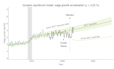
The stimulus of 2021 seems to have pushed up both GDP growth and wage growth. In fact, wage growth appears to have returned to its prior equilibrium:

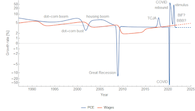
If this trend continues and the BIF (and/or BBB, if passed) doesn't bring GDP growth above its historical 3.8% average outside of shocks, then that brings the recession date back to ... around now. Looking at PCE (consumption) instead of GDP (as the former is updated more frequently than the latter, but both show almost the exact same structure), we are back to being above that long run growth limit (click to enlarge):


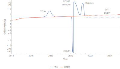
Zooming in on the more recent years (click to enlarge):


PS: New arctan axes just dropped.

...

Footnotes:

[1] Also, wages / prices aren't individually sticky. The distribution of changes might be sticky (emergent macro nominal rigidity), but prices or wages that change by 20% aren't in any sense "sticky".

[2] Something Hall and Kudlyak (Nov 2020) picked up on somewhat after I wrote about it (and even used the same example).

Tuesday, April 7, 2020

JOLTS data — and the twig crack that caused the avalanche?

Back from a long hiatus — things were crazy at the real job trying to get set up to work from home for a month or longer. Happy to report my family and I are doing well, and I hope everyone out there is staying healthy.

The drop in the JOLTS job openings rate I noted in the previous post (from February) has continued and it appears we're showing a definite deviation:


While you may be thinking "Yes, the COVID-19 shock", I should point out that this data is from February 2020 — and the deviation starts with data from December 2019. As I put it in a tweet from last month's data: What if there was a recession brewing and COVID-19 just triggered the market, like the old trope of a tree branch breaking causing an avalanche?

I saw that in the 2008 recession the JOLTS measures were some of the earlier indicators in the labor market with job openings being 4-6 months ahead of the shock to the unemployment rate. That was based on a single shock, but the hires data averages about 5 months lead using multiple shocks (in both directions) from the 1990s recession to today.

And last month's unemployment rate showed the first signs of a non-equilibrium shock with March 2020 data by either the Sahm rule or my "recession detection algorithm" threshold:


December 2019 to March 2020 is 4 months — right in line with the previous recession.

Now I understand it seems odd — how could JOLTS data predict a pandemic? Or as I put it in my twitter thread referenced above — how could the yield curve predict a pandemic? Even the "limits to wage growth" [1] hypothesis predicts a recession!

But in this view, the pandemic was just a coordinating signal. Often, these coordinating signals come from the Fed — an interest rate hike, lack of a cut, or even letting a financial institution fail — and coordination causes recessions (we all cut back on spending, we all sell our stocks, etc). Because the pandemic signal was so sudden and so unambiguous, we got a much sharper signal in the unemployment rate than usual and a bit of a compressed period between JOLTS and unemployment. For example, total separations is only barely registering a signal (it's there) while hires shows nothing yet (click to enlarge):


COVID-19 was the twig crack that caused an avalanche that was already building.

I've seen that some people think the recovery will be rapid. I doubt this because we are seeing a shock to the labor market — for example, initial claims spiked into the millions. A typical "surprise information shock" that evaporates has a distinct pattern:


It would look something like the red dashed line in this graph of S&P 500 data (while I show a non-equilibrium shock the size of the 2008 recession as a counterfactual recession path for reference):


However, unemployment is already rising and it falls at basically the same rate over the entire history of the data. This "remarkable recovery regularity" became the basis for the dynamic information equilibrium model (first here, then here). This implies that we are unlikely to see a sudden shift back to low unemployment but rather something more like this:


I added a step response (i.e. "ringing artifacts" or overshooting) to this qualitative non-equilibrium shock because the shock seems pretty sharp, however it is possible it won't happen as the step response has been gradually disappearing over time in US data. It's possible it won't be this big — though some people like James Bullard are are saying 30% is possible so it might be even bigger. But even the rise to 4.4% already in the data will take 3 years to get back to 3.5% along the dynamic equilibrium path.

It's going to be a long slog.

...

Footnotes:

[1] In the past several decades, when wage growth exceeds the nominal GDP growth trend, there has generally been a recession.

Monday, August 26, 2019

A Solow Paradox for the Industrial Revolution

I've been toying with the idea of applying the Workers' History methodology to the Industrial Revolution and the rise of "capitalism" for my next book. The recent 1619 project articles in the New York Times magazine set off a weird firestorm on the internet involving this very subject.

The underlying debate here appears to be a moral/ethical one — are capitalism and the industrial revolution (IR) the offspring of slavery (and therefore "tainted" morally), or did they help bring about slavery's demise (as a technocratic "white savior")? Was the wealth of the US (and/or the UK) built on slavery or was growth and industrialization in the Southern US hindered by it?

I'm not going to be the person who answers this moral question, but one thing that I do think I can contribute to is analysis of the time series data. If we can get the events in the time series straight, then it helps focus the discussion of moral questions.

In fact, I already have looked at this a bit, inspired by Dietrich Vollrath's great blog post on the question of when "sustained growth" started [0]. Recent analysis of the data seems to point to an earlier starting point around 1650:
"... the onset of sustained growth in annual earnings much earlier than the actual Industrial Revolution. Both the GDP per capita and the annual earnings series being to accelerate around 1650."
Emphasis in the original. When I looked at the UK annual income data index with the dynamic information equilibrium model [1], I came up with similar results — possibly even earlier due to an overlapping negative shock to income growth in the late 1500s. This earlier shock may be purely a nominal one due to the so-called price revolution.


Important observations in this framework are that:

  1. The growth shock to UK income matches up with the slave trade
  2. The IR comes along as surge in income growth fades (i.e. no income growth from the IR)
  3. It's not a permanent shock to sustained growth, but rather part of a series with the second shock coming in the 1830-40s possibly associated with the railroad boom in the UK

As an aside, I noted parallels between the IR the Solow paradox/IT revolution — both occurring as a growth shock fades (slavery, women entering the workforce), and neither showing up in macro growth metrics. This discussion brought up some additional questions about the causality — did the IR cause the decline in the slave trade? But the data on the number of African slaves trafficked shows the fading of the growth shock had already begun before the IR:


This graph shows that if we just look at data before 1780, we still see the same saturation (purple dashed curve). It also shows that abolition comes as a genuine surprise in this data at this resolution (25 years) — only appearing in the last data point.

A plausible interpretation of events here is that exploitation of slaves began to see diminishing returns so that investment was directed elsewhere (i.e. seeking "alpha") — in particular the rail boom (that took over transportation from the canal system). The products of the industrial revolution — specifically rail — were a plausible target [2]. Whether abolition forced this shift in attention or instead just came after slavery was no longer as lucrative (and rail became lucrative) is not definitively adjudicated in the data, but the latter proposition has slightly stronger evidence.

This doesn't really say whether slavery caused (e.g. funded) the IR, but it does say that the IR did not cause the decline in slavery — slavery might have just been limited by its own logistics. The Haitian revolution (1791-1804) might be seen in this light as evidence of the limits of controlling slaves. In the aftermath, white Southerners in the US moved toward tighter controls which may have impacted exploitative growth in slavery. It's also possible practical limits on the number of slave ships traversing the middle passage intervened. Whatever the reason, slavery's expansion slowed because of factors that would have been already apparent in the first half of the 18th century.

The other question is whether "investment" in exploiting slaves delay industrialization of the US South (or even more broadly in the British Empire). This counterfactual analysis is possibly unanswerable as it involves knowing what redirecting investment to other areas (like industrialization) would have accomplished. However, there's something that came up when I began reading about this aspect — a myth about Eli Whitney's cotton gin.

I was reading this Bloomberg article by Karl Smith summarizing one case that instead of being a source of growth, slavery held back growth in the US compared to a (dubious) counterfactuals. In it, Smith says that:
"In 1795, the year after the invention of the cotton gin, the U.S. produced 8 million pounds of cotton. Widespread adoption of the gin raised that to 40 million pounds by 1801."
The implication here is that the cotton gin had an impact on cotton production. However, the only apparent change in cotton production in the US is a surge that begins sometime before 1790, with the gin coming right in the middle of that surge in 1795:


I made the cheeky suggestion/hypothesis that the legal framework established by the adoption of the US Constitution was a more likely cause of that jump in cotton production. But it's also plausible that the end of the US Revolutionary War resulted in some "catch-up" growth along with opening up new markets besides Britain — remember that aim of the revolution? In any case, the data shows precious little else happened between 1790 and 1860 except for that 10 year growth spurt at the beginning. The war of 1812 is almost indistinguishable from a statistical fluctuation.

Likely because of my claim, Sri Thiruvadanthai sicced Pseudoerasmus on me who agreed with my point about the cotton gin but then said my interpretation of the time series was "silly and preposterous" [3] before sending me a time series that not only didn't support Pseudoerasmus' claims about it (there is no "surge" in British demand evident in the data) but in fact confirmed my claims that if anything happened, it happened before 1790. Pseudoerasmus' time series came without a source, but covered cotton imports to Britain from 1778 to 1819. As you can see there are very few features in the data besides a surge around the end of the US revolutionary war and a fluctuation around the war of 1812.


There's actually a bit of below trend imports right in the middle of the US production surge!

My claim that nothing happened after about 1790 holds up even if you look at that data with a pure logistic description (per discussion with Michael aka @profplum99 on Twitter):


You might ask what level of confidence we should have in using these simplistic models to describe the data. The truth is that there's so little data (~ 70 points for US production, ~ 41 points for UK imports), it cannot support a complex model. In fact, a heuristic estimate (1 parameter per 20 data points) says that anything beyond 2-3 parameters is probably over-fitting leaving us with log-linear models. With circumstantial evidence (independent measures of the timing of the wars), we can probably add a couple more.

Of course, Pseudoerasmus takes it a bit further (here, here) ...
England imported 7 million lbs of cotton in 1780 but 56 mn lbs in 1800. There was this thing called the Industrial Revolution going on, Jason might have heard of it. At the same time, there was a surge in cotton output not only in the USA, but also in the West Indies & Brazil. 
The USA just prior to the Louisiana Purchase in 1803. the southern states but especially Georgia opened up new (within-state) frontier lands, one major reason being to plant cotton to meet suddenly booming British demand. 
It's pretty simple: the extra 50 million pounds of cotton (esp long-lint cotton) England imported by 1800 (relative to 1780) could not be all met from traditional sources. Also states like Georgia only acquired its hinterland after 1776.
As we can see, these claims from Pseudoerasmus are not supported by the data. There was a surge around the US Revolutionary war and a statistically significant drop around the War of 1812. There is no signal from the industrial revolution, and growth proceeds at roughly a constant rate from 1800 to 1860 (US production data) or 1790 to 1820 (British import data). Any causal factor happens before 1790. It is possible these claims might be supported by evidence besides this data — however, that would mean his claims still had no impact on the recorded time series and historical estimates.

To a great degree, it seems there's a "Solow paradox" around the Industrial Revolution — it shows up everywhere except the macroeconomic statistics [3]. The primary effect is that the IR appears to have provided the technological substrate for the railroad boom in the UK that ended in the Panic of 1847. The IR might have had an effect on manufacturing and industrial processes, but many of those got their start in gun manufacture (which incidentally, was a "medium of exchange" for the slave market). Plus, any growth beyond the 1840s is more likely dwarfed by sanitation improvements and the resulting population growth. 

Where are the macro effects of the industrial revolution?

...

Update

Also in Karl Smith's article, he makes a claim about growth in cotton production that is basically false — while the saturation level might have been higher (likely due to cotton being grown in more areas of the US without having to compete with slave labor), the growth rate was only 8.5% after the Civil War while being 9.0% before it:


...

Footnotes:

[0] It also points to Malthus possibly being wrong even in the time he was speaking — or at least his mechanism had a smaller impact than is commonly assumed.

[1] Paper here. The model itself is a maximum entropy approach to complex systems where exponential growth is an equilibrium with sparse non-equilibrium "shocks" away from it. In a sense, we are making minimal assumptions about the underlying processes given the guiding assumption that growth rates are well-defined observables. If growth rates aren't well-defined observables, then pretty much any question about economic growth is actually moot.

[2] As a second parallel between the post-WWII period and the IR, we have a rail boom and bust coming after the growth surge of the 1700s fades while in the US we have a dot-com and a housing boom (and respective busts) after the growth surge of the 60s and 70s fades.

[3] It seems to show up in the micro statistics — in the productivity of individual laborers given industrial equipment to run. But it's a fallacy of composition to assume these micro impacts aggregate to a macro effect.

Thursday, July 25, 2019

Continuing decline in the median house price

Every decline of the same (log) scale in the median house price (FRED) as the current one has been associated with a recession. Of course, there have only been three times in the data since 1963 — the 1970 recession, the 1990 recession, and the 2008 recession.


As I have noted previously on twitter (and in my book), the Case-Shiller housing price index and wage growth have similar structure since the 70s (click to enlarge):


My hypothesis here is that "white flight" and de facto segregation has set up a dynamic where white people essentially drive up housing prices so much that they price themselves out of housing — requiring a crash of some kind. This dynamic is not entirely dissimilar to the hypothesized "limits to wage growth", where nominal wage growth between recessions climbs until it exceeds nominal GDP growth and triggers a recession. Which of these mechanisms is the more fundamental is not clear, but there was a recession without a (significant) decline in housing prices (Case-Shiller or median) in 2001. However the 2008 and 2018-9 (i.e. recent) declines in housing prices seem to have preceded (be preceding) declines in labor market metrics.

In any case, this looks like it could be a leading indicator — and some proposed mechanisms of recessions involve people thinking they're poorer than they used to be (e.g. their house isn't worth as much) and cut back on spending. As a side note, in the once hot housing market in Seattle where I live the "For Sale" signs seem to be sticking around for a lot longer than they used to [1].

The latest data came out this week and we're still seeing the non-equilibrium shock (per the Dynamic Information Equilibrium Model or DIEM) we saw in the last update:


Also, rental vacancy data came out today and depending on whether the DIEM has a slightly negative dynamic equilibrium rate (−0.5%) or a 0% rate is still undetermined:


I've been following this for over two years now. However — no non-equilibrium shock to rental vacancies.

Footnotes:

[1] Actually true! (Especially accounting for the seasonal cycles).


Friday, May 31, 2019

TCJA and PCE growth

The Personal Consumption Expenditures (PCE) data came out today, and as this measure is informationally equivalent to NGDP but available more frequently I thought I'd take a look at the dynamic information equilibrium model (DIEM) to see what we should expect for Q2 GDP — I noticed something (click to enlarge and maybe you'll see it better):


The model is really quite accurate, but the latest data appears to fall somewhat above the error band in a correlated and persistent way. Zooming in we can see it does fit the profile of a small non-equilibrium shock in the DIEM:


The big tax cut passed at the end of 2017 may account for it, so I added a counterfactual shock (red). The center is at 2017.98, corresponding to the "Tax Cuts and Jobs Act" (TCJA) of 2017. If the counterfactual shock accounts for it, then it 1) boosted nominal PCE growth from 3.7% to 4.7% at its peak, and 2) added 249 billion dollars (integrated, i.e. total) to PCE level over the past year. This is essentially the same as the 270 billion dollars difference between the forecast CBO tax revenues for 2018 (3.60 trillion) and the actual revenues for 2018 (3.33 trillion). These are all nominal measures. Here's the growth graph:


The effect over the next ten years (absent a recession) would be effectively 3.7% growth of that 249 billion, so in 2028 PCE will be 360 billion dollars higher than it would have been without the TCJA (1.8% higher). Cumulatively over the next 10 years, it will increase PCE by 2.96 trillion dollars. Of course, the budget deficit is estimated to be 2.29 trillion dollars over that period so reasoning from an accounting identity here basically works out within a couple percent (i.e. GDP = C + S + T with lower T has increased C).

The "active" (i.e. non-equilibrium) effect of the TCJA appears to be over leaving only the "passive" (i.e. equilibrium) effect of compounding growth rates. however the previous two non-equilibrium shocks increasing growth (late 90s, mid-2000s) were followed by negative shocks and recessions (dot-com bust, housing bust/Great Recession) in the "asset bubble era". Even the 2014 mini-boom seems to have been followed by a 2016 mini-recession:


But absent a recession (or a mini-recession), we should expect this quarter's nominal GDP growth to come in roughly around the "new normal" (post 2008, after the fading of the demographic shock of the 60s, 70s, and 80s) of 3.8% — similar to the (nominal) PCE measure's new normal of 3.7%.

Tuesday, March 26, 2019

The beginnings of an information equilibrium macro model


I've been trying to put together a summary of the information equilibrium/dynamic information equilibrium models that comprise a single (still preliminary) macro model. It's mostly for my own notes. At the top of this post is a graphical representation (click the graphic enlarge) of several posts. This recent post explains the relationship between information equilibrium and dynamic information equilibrium (there is also this "tour of information equilibrium" presentation) — these are represented by blue double arrows and purple single arrows, respectively. The gray dashed lines represent vague "links" (obviously NGDP is related to NGDP/L, it being in the numerator, but the "limits to wage growth" connection is more speculative). The black line relates NGDP with its growth rate by a mathematical operation (log-derivative a.k.a. the continuously compounded annual rate of change). There are two "exogenous shock" inputs — one is the business cycle (which is behind recessions, possibly based on the "limits to wage growth"), and the other are social factors (women entering the workforce, Baby Boomers retiring after the Great Recession).

We have:


I left out the interest rate models because they're not terribly relevant at this level. Not that interest rate signals are irrelevant — it's entirely possible the limit to wage growth mechanism functions because the Fed raises rates until wage growth stagnates at a level at or below NGDP growth, so then starts to lower rates which sends a signal to markets that a bear market is approaching creating a self-fulfilling prophesy. I'm still agnostic on that.

However, all the IE and DIEM  relationships (blue double and purple single lines) above are empirically valid. It's essentially the connection between the top half and the bottom half of the graphic that is speculative.

...

Update 27 March 2019

If you were wondering where we are regarding that "limits to wage growth" picture:


The Hatzius band is from this post. The dashed line is the mean NGDP growth rate from a dynamic information equilibrium model.

...

The various abbreviations:

HIR = JOLTS hires rate
JOR = JOLTS job openings rate
u = unemployment rate (UNRATE on FRED)
U = unemployment level
L = employment level (PAYEMS on FRED)
NGDP = nominal gross domestic product
K = "capital"
PCE = personal consumption expenditures
PI = personal income
CLF = civilian labor force (CLF16OV on FRED)
W = wages (wage growth is Atlanta Fed wage growth tracker)

Thursday, March 14, 2019

Policy in information equilibrium: job guarantee

One of the things I've found about the information equilibrium approach is that the results are remarkably stubborn in showing any effect of any government policy whatsoever on things like inflation, unemployment, or output. However, there is one kind of policy that does seem like it would have an effect: a job guarantee or some WPA-style government employment scheme. That's because the size of the labor force directly impacts inflation and output (here, or here, with shocks to labor happening before changes to inflation and output). To that end, I assembled a model like this one where the relevant variables are the labor force size (CLF16OV), GDP per employed person (GDP/PAYEMS), headline CPI inflation (CPIAUCSL). I also included working age population and the unemployment rate to look at labor force participation rates (it's not exactly the traditional EPOP measures, but it gives an idea).

Now there are far fewer shocks than in that model, so the relationships are somewhat uncertain (the most uncertain is the relationship between inflation and labor force because the Great Recession shock is buried in the noise of the inflation rate, effectively leaving only one shock to estimate the relative sizes). But overall, it gives us a way to estimate the effects of a policy like the Job Guarantee.

First, we assume the policy is implemented in the next administration and employs about 20 million more people than otherwise (without the policy) in 2030. That (along with normal growth) brings us up to something over 90% labor force participation. Most of the effect takes place during the next administration (2021-2025) but it's a logistic function that's asymptotic so effects continue for a few years after. We also assume there aren't any recessions between now and 2030. (Ha! I mean, I could add one, which would create a Phillips curve like fluctuation in inflation but that's for another time.)

The dynamic information equilibrium model (DIEM) seems to say that CPI lags CLF increases by about 3.5 years and are a bit narrower, and somewhat larger. GDP/PAYEMS also lags CLF increases (by roughly the same length of time) and are about the same width as the CLF change but are bigger in magnitude. In this logistic function page on Wikipedia, the magnitude is L, the width is 1/k, and the delay goes into x₀. For more on the DIEM, see my paper. This means if we know what the shock looks like to CLF, then we know what it looks like to CPI and GDP/PAYEMS. Here's the forecast with and without the JG policy:


Since the inflation effect was a bit more uncertain, I included both the average and worst case effect. Here's the effect on labor force participation (note the lack of recessions, one — implausible —assumption):


The purple curves are the size of the labor force as a fraction of the working age population. Note that 100% of the working age population in the labor force is not necessarily a successful policy since it means e.g. students working.

Now for the funny bit: here's the effect on (year over year, or YoY) inflation (I went back to the 1960s just to give you a flavor):


I cracked a smile when that came out of the models. We'd be looking at 70s-style inflation which people were not happy about at the time. What about growth? Here's the effect on nominal GDP per employed person:


Unfortunately, the CPI-deflated real GDP per employee in 2019 dollars is uncertain precisely because the inflation effect is uncertain (in general RGDP is a much more uncertain measure because it combines errors in NGDP and in CPI or other price level measurement):


So there you have it: the effects of a Job Guarantee. It definitely seems more like a policy you'd want to implement during a recession (a la WPA) rather than one that's permanent.

...

PS Does this make Job Guarantee now an information equilibrium policy? I mean MMT now claims it as if it made it up when it is kind of the whole point of Marxism and Roosevelt included it in his "Second Bill of Rights".

Saturday, November 3, 2018

An information equilibrium history of the Great Recession

I mentioned at the beginning of this year on my book website that I was thinking about writing another book about the macro history of the US as told through dynamic information equilibrium and the resulting economic seismograms. I've been collecting the various models on this blog to put them together into graphics that tell at least one version of history. Previously, I've given evidence that women entering the workforce leads nearly every other measure of growth and inflation in the 70s and 80s. Lately, I've been working on the Great Recession. Here's the seismogram (click to enlarge):


Red-orange indicates negative (i.e. bad) shocks, while blue indicates positive (i.e. good) shocks (rising unemployment is "bad", but rising income is "good"). The labels are identified in footnote [1].

While much of the focus of commentary about the recession was on the Lehman collapse and the Fed meetings immediately preceding it (along with the fall in the stock markets as measured by the S&P 500), these actually come in the middle of the recession process . The first thing that happens by far is the drop in hires in construction (labeled "HIR 2300" based on the JOLTS code) in mid-2006. Around that time, Paul Krugman (e.g.) was talking about a housing bubble deflating (he had been forecasting it earlier in mid-2005) [2]. The shock to housing starts (HS) doesn't come until later (though the shock to starts occurs over a longer period, you can see that hires begin to decline just before housing starts begin to decline).  The drop in construction hires also comes right before the halt in the Fed rate increases that had started in 2004.

Before the NBER-defined recession gets underway, there's a drop in conceptions (per this NBER working paper) that's roughly coincident with (but genuinely followed by) two Fed conference calls in 2007 about the financial markets reeling in the collapsing housing bubble (the negative shock to the Case Shiller index) as well as the first Fed rate cut. The rest of the stuff that is associated with a recession in the media (stock market drops, GDP declining, unemployment rate rising) all come much later during the NBER-defined recession.

Personal income (PI) continues to climb ahead of its typical pace through most of 2007, and wage growth continues to increase (i.e. accelerate) almost until the NBER recession end.

While I've heard many stories about excessive debt being a cause behind the Great Recession, most of the negative shocks to debt measures come later (i.e. debt became a problem because of the recession). Although not shown in this graph, consumer credit takes a hit only as the NBER recession is ending. This is not to say that debt levels didn't contribute to the size of the recession (i.e. making it worse), but rather that they didn't contribute to its timing (i.e causality).

Any causality analysis would put construction hires at the beginning of the story, but oddly the shock to construction job openings comes along with the rest recession — barely leading the shock to job openings of all kinds. In fact, there's a surge in openings around the same time. It's the largest difference in timing for all the JOLTS sectors. That is to say jobs were still being advertised in 2006 (until 2008), just fewer were being hired. This doesn't indicate a pessimism about the housing market (which seems like it would show a fall in openings), but rather a labor shortage of some kind. Were employers unwilling to raise wages? Unemployment had reached its lowest level since before the 2001 recession, so maybe there was a genuine shortage of workers.

Was it xenophobia?


I am going to offer a speculative answer that I do not think I have ever seen offered as a possible reason for the Great Recession: xenophobia. There were a series of protests from March of 2006 to against anti-immigrant legislation being introduced (some of which passed, and in various jurisdictions E-verify was mandated in 2006 to prevent employers from hiring undocumented workers). The shock to construction hires begins right around the same time as those March protests, and every year since 2004 saw a decrease in immigration from Mexico:


The linked article doesn't get this causality right:
Immigration from Mexico dropped after the U.S. housing market (and construction employment) collapsed in 2006. By 2007, gross inflows from Mexico dipped to 280,000; they continued to fall to 150,000 in 2009 and were even lower in 2010.
According to their data, immigration started dropping before 2006 (the peak is in 2004), but given noise in the data and the annual temporal resolution the best we can say is that construction employment and immigration from Mexico dropped approximately concurrently.

I have written before on how much of an effect a drop of 2 million people in the labor force due to immigration restrictions would cause — about 1 trillion dollars in NGDP. Assuming a linear trend past 2007 in the increase in just undocumented immigrants (using Pew data), by 2009 there were 1.8 million fewer undocumented immigrants (11.3 million) than would be expected by the trend (13.1 million). While there would need to be more detail added (accounting for the decline in documented immigration as well as fraction of those two populations in the labor force), this gives us an order of magnitude that is not trivial compared to the size of the Great Recession.

Again, this is speculative. However it is not implausible that the anti-immigrant sentiment of the mid-2000s ended the "housing bubble". Employers continued to look for workers in construction, but suddenly were unable to hire as many starting in 2006 due to declining immigration. The worst hit states in the housing crash were California, Arizona, Nevada, and Florida — the first three being major destinations for documented and undocumented immigrants from Mexico. Since even undocumented immigrants spend money at the same grocery stores you do, sales decline. Declining construction hires is followed by fewer housing starts, and when a new family can't find a bigger house with more rooms they'll not only delay having children but opt to hold off on that house. Housing prices decline from their peak, but by now the general economic outlook is mediocre enough that the Fed starts to lower interest rates in 2007. Pessimism sets in along with the rest of the recession and a financial crisis that goes global. 

...

Update 6 November 2018

A correspondent sent me a link to some work by Kevin Erdmann about how there was actually an under-supply of housing going into the 2008 recession. Now Erdmann is writing for Mercatus which generally means there is a possibility of an ideological slant or at least a particular view of how economies work. Here, that reasoning is an attempt to say there was no housing bubble because there was a "fundamental" reason (short supply). But then, there was a limited supply of tulip bulbs as well. If there was no housing bubble, then it's arguable that the Fed had unnecessarily tight monetary policy (i.e. the desired conclusion in this case). Seeing as monetary policy tends to lag other measures, it's probably not the cause (but may e.g. contribute to the broader conditions and the depth of the recession).

I also want to emphasize that it is almost entirely unlikely the shock to construction hires was the only causal factor. I see it more as a trigger or a straw that broke the camel's back — in an environment of higher interest rates and general pressure from policymakers to cool the housing market, a sudden shock to labor supply makes that "cooling" suddenly look worse in a way that could change one's outlook. In the information equilibrium approach, it's sudden coordinated action (e.g. panicking) causing agents to cluster in the state space that causes recessions. Sometimes that coordinating signal is the Fed, but it could easily be shock to labor supply due to an unwarranted immigration freak out.

...

Footnotes:

[1] The labels are:

HIR 2300: JOLTS hires, construction (JTS2300HIR)
HS: Housing Starts (HOUST)
C/F: Conceptions/fertility
Case Shiller: Case Shiller housing price index (also here)
HIR: JOLTS hires
HIR-ext: Extended JOLTS hires data
JOR 2300: JOLTS job openings, construction (JTS2300JOR)
Debt growth: Growth of debt (All Sectors; Debt Securities and Loans; Liability, Level)
JOR: JOLTS Job opening rate
JOR Barnichon: Job openings in data from Barnichon (2010) [pdf]
QUR: JOLTS quits
SP500: S&P 500
U: U3 unemployment rate
PI: Personal income
PCE: Personal consumption expenditures
NGDP: Nominal Gross Domestic Product
W: Wage growth (Atlanta Fed)
Debt to GDP: Ratio of previous debt measure to NGDP
CLF: Civilian labor force (CLF16OV)


The arrows on the top of the diagram indicate the two Fed meetings (black arrows) prior to the Lehman collapse (red arrow). The arrows on the bottom of the diagram show the first Fed rate increase since the 2001 recession, the beginning of the period of steady rates (mid-2006 to mid-2007) as well as the first rate cut going into the 2008 recession.


[2] I'm not tying to make any point here about "who saw the crisis coming" — only citing some news that I remembered from the time for context.

Tuesday, October 16, 2018

Are consumption, income, and GDP different measures?

I read this great blog post by Beatrice Cherrier on macro modeling, and I plan on having more to say about it in the future. However, there was an example of discourse on modeling consumption and income that made me wonder: What is the relationship between consumption and income? Does income drive consumption? I used the idea here — that dynamic information equilibrium models (DIEMs) with comparable shock structure are related — to take a look at Personal Income, Personal Consumption Expenditures, and Nominal GDP (FRED series PI, PCE, and GDP, respectively). But the best I can conclude is that these data series represent the same information, and it is likely the differences are entirely measurement errors (questions of e.g. what is treated as income versus what agents think of as income). It's either that, or there's no fixed relationship — sometimes increased income drives consumption, sometimes increased consumption drives income.

Here are the DIEMs for the three data series — they consist of the demographic shock (increasing labor force participation by women) of the 60s and 70s and the boom-bust-boom-bust cycle of the dot-com and housing bubbles. There is a residual "business cycle" element on top of the demographic shift that I will discuss later. PCE is red, PI is purple, and GDP is turquoise (click to enlarge).


As far as can be gleaned from the data, the demographic shock as well as the 2001 and 2008 recessions are effectively simultaneous (the "asset bubble era"). The dot com asset bubble has income precede consumption and the housing asset bubble has consumption precede income (they both look statistically significant based on the errors estimates of the shock centers). If we look at the residual "business cycle" (the "Phillips curve era") after extracting the demographic shock, the measures are all over the place in terms of causality (aside from simultaneously falling during recessions):


The bottom line is that it seems more likely that the various discrepancies could be accounted for by measurement differences than, say, a nonlinear and complex relationship between consumption and income that fails to be measurable at this level of fidelity. True, it's Occam's razor, but the idea that to a good approximation consumption is 68% of NGDP [1] and 78% of income seems both useful and reasonable. Especially given the alternative is an armchair behavioral relationship that couldn't be rejected by data for at least another 100 years.

...

Footnotes:

[1] Actually, consumption is about 60% of NGDP before the demographic shift and rises to 68% after. A similar story is told using wages.

Monday, October 1, 2018

Brexit and growth

There is an updated analysis at VoxEU that makes a claim that Brexit will has reduced real GDP growth going forward. I want to take a look at this using the dynamic information equilibrium model (DIEM, details in my preprint).

First, let me note that since the DIEM model of the GDP deflator is constant over the period 1990-present for the UK, without loss of generality we can look at nominal GDP. There are two local minima for the dynamic equilibrium growth rate we'll call gamma: one around 4.9% and one around 3.7%. The former essentially sees the era from 1997-2008 as the equilibrium growth rate; the latter sees the post Great Recession growth rate as the equilibrium. I stopped the model parameter estimates in January 2016 (or earlier) in order to get an idea of the counterfactual pre-Brexit.

We'll first look at the former over the longer run (click to enlarge):


The "story" it tells starting in the late 80s is first the brief so-called "Lawson boom", followed by equilibrium growth until the Great Recession. After the recession (and in order to be consistent with it), there's some kind of constant drag that begins in or around 2014 [1]. This drag begins too early to be attributed to Brexit (zoomed-in version of the previous graph):


The lower growth rate makes for a more plausible sequence of events that is more consistent with history:


Again, we have the Lawson boom, but this is followed by a long boom in economic growth from roughly 1997-2008 which matches up with the two financial booms in the US in the late 90s (dot-com) and the mid-2000s (housing). With London as a major financial center representing a growing fraction of the UK economy at the time, the interpretation of this accelerated growth shock in terms of a global financial boom is plausible. Post-2008 growth has been roughly as expected:


There might be hints of drag due to Brexit (the data has disproportionately fallen below the model expectation since 2016, while it was more symmetrically distributed before), but it's too early to tell. Future data will shed light on this.

I'd also like to note that the lower growth rate equilibrium is consistent with a naive log-linear model post-2008:


The key to understanding economic growth is understanding not just what trend growth is, but how the various events in the economic time series interact with that trend. If it's hard to square a particular model of the past with the historical events (e.g. thinking of the financial sector boom in London as "normal" growth, or per footnote [1] a Great Recession shock with the wrong timing), then it's possible some of the underlying assumptions are wrong. In this case, it's hard to construct a picture where Brexit has a strong effect with the proper timing without changing the effects of the Great Recession or financial boom leading up to it. Seeing as nothing has actually been implemented yet — any effect on GDP would be entirely in terms of plans and expectations — an undetectable effect on GDP is plausible.

This is not to say Brexit won't have an effect if some of the more egregious scenarios come to pass. I imagine a "Brexit In Name Only" (BINO) as the most likely outcome, possibly with an "eternal Brexit" aspect (i.e. negotiations that kick the can down the road for years like the Greek debt crisis). These scenarios would have little effect on economic growth. Effectively, this is what the current administration in the US has done with NAFTA (basically re-named it "USMCA", as announced today). But the "hard Brexit" scenarios would likely impact GDP significantly [2] — possibly triggering or looking exactly like a recession.

But in the "hard Brexit" scenario, we'd be looking at more likely a temporally isolated event (like other recessions) rather than a continuous drag on growth which is hard to achieve in the DIEM (but not impossible). Then again, maybe the DIEM approach is incorrect.

...

Footnotes:

[1] In the graph, I cut off the fit in 2013 instead of 2016. If you make the cut-off date January 2016, it distorts the shape of the Great Recession (it's no longer a temporally isolated shock):


In fact, any cut-off date after 2010 extends the length of the Great Recession (and increases the model error), meaning the model parameters aren't stable with respect to new data. This is a sign that the higher dynamic equilibrium growth rate is wrong after the Great Recession. This is evidence in favor of the lower growth equilibrium when combined with all the other evidence.

[2] Back of the envelope: half of UK trade is with the EU, and UK exports are roughly 20-30% of GDP. With a 50% efficiency factor (accounting for the fact that imports would drop as well, so that some loss of trade would be a wash [3]) we're looking at a hit of 5-7% of nominal GDP — about half the size of the Great Recession.

[3] This would be a number between 0 and 100% modifying the loss of all exports to GDP. In the ideal scenario (0%), all the imports and exports would be completely offset (i.e. apples imported from France and blackberries exported from the UK would be mitigated by increased UK apple production taking up the newly created slack in blackberry production due to loss of trade partners). In the worst scenario (100%), the UK loses all of the GDP due to exports. My guess is somewhere in between (50%). But it's just a guess.